
Apologies for the late Rate the Dress. But, the late post means I found an dress I’d entirely forgotten about in my inspiration file, and it’s so fabulously fascinating I’m hoping it makes up for a late post!
Last Week: an Empire era spencer & petticoat
I’m not usually a brown fan, but I’m obsessed with the particular ochre shade of last week’s spencer, but alas, many of you do not share my love. And even those who loved the spencer weren’t sure about it paired with the frilly petticoat – though you liked each garment on its own merits. However, I’m afraid I may have cheated the score every so slightly by showing that interior view, because I suspect some of the costume nerds among you were so charmed by the details you gave the outfit a higher score for it!
The Total: 7.9 out of 10
An improvement on the week before, but hardly brilliant.
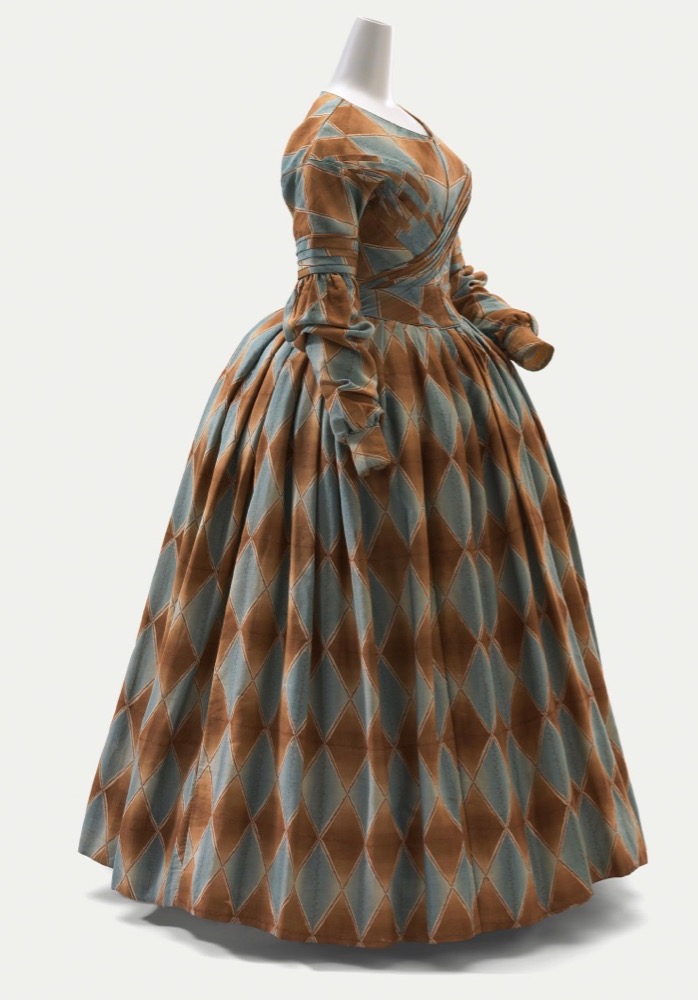
This week: an 1840 dress in harlequin pattern
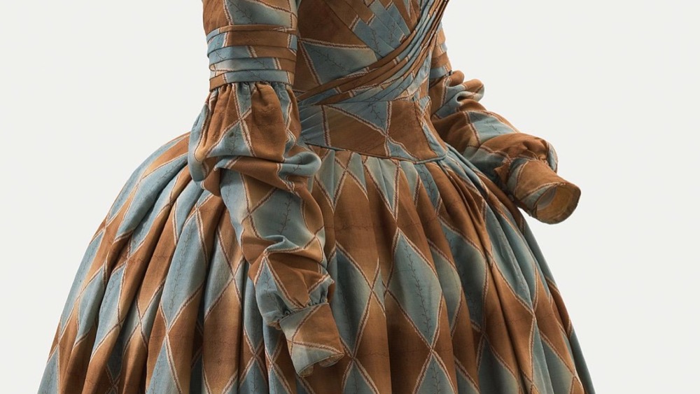
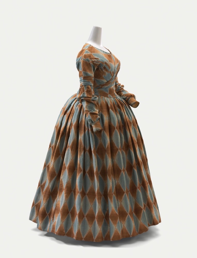
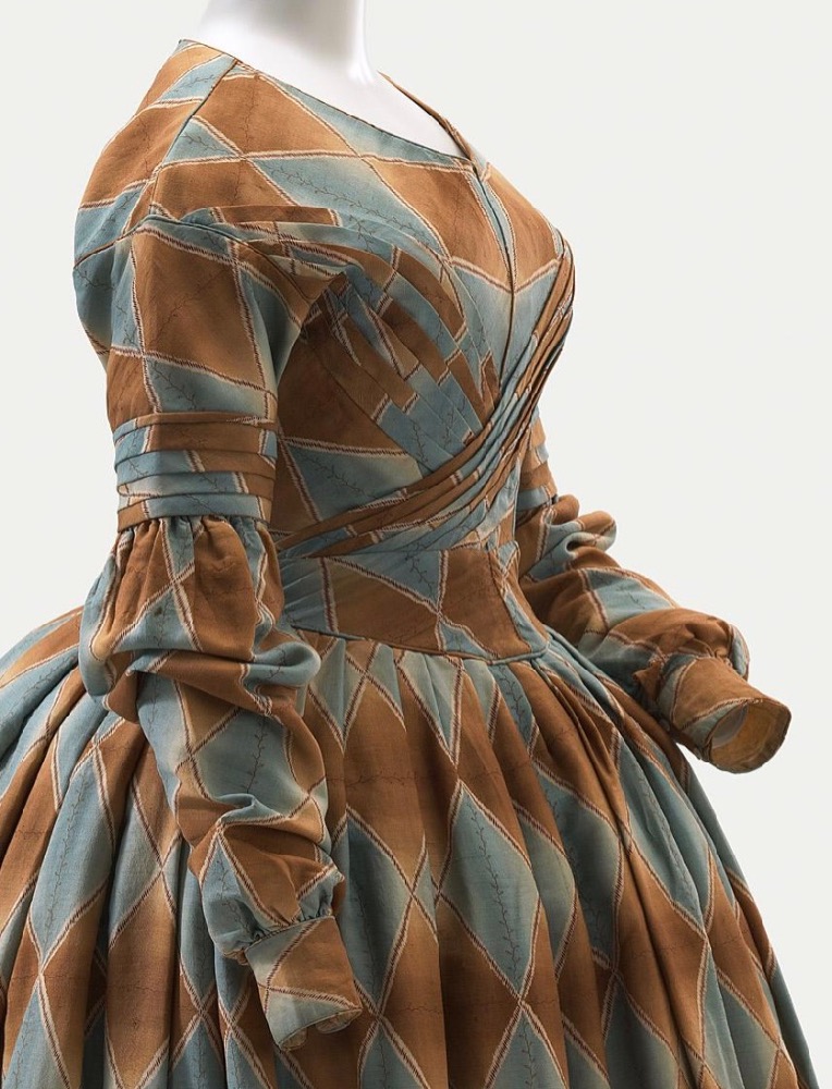
This week’s Rate the Dress carries on my love for rust-y, ochre-y hues, this time paired with a blue-grey. It also carries on the blend of simplicity and frivolity seen in last week’s outfit, although here the order and the whimsy are spread evenly across the dress.
Purchased through The Art Foundation of Victoria with the assistance of David Syme & Co. Limited, Fellow, 1977
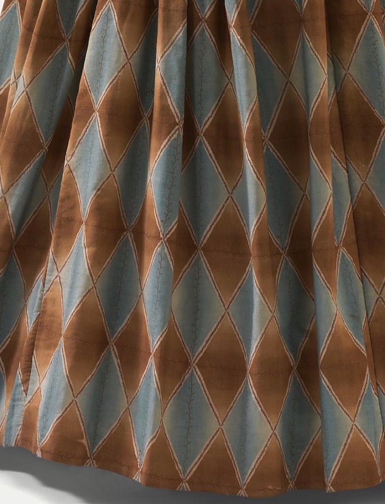
The whimsy is easy to see: the entire dress is made in harlequin patterned fabric (wool or silk or a blend of the two, according the catalogue record), albeit in a very restrained colour scheme. Note the very delicate vine pattern running through the centre of each blue-grey diamond.
Purchased through The Art Foundation of Victoria with the assistance of David Syme & Co. Limited, Fellow, 1977
The cut is also 1830s ridiculousness moving into 1840s restraint. The sleeves retain a bit of detailing and the last of the Romantic era poof. The elaborate bodice decorations so often seen in the 1830s have resolved into subdued pleating wrapping across the front of the bodice.
Purchased through The Art Foundation of Victoria with the assistance of David Syme & Co. Limited, Fellow, 1977
It’s a perfect example of one era merging in to the next, all done in a memorable fabric.
Purchased through The Art Foundation of Victoria with the assistance of David Syme & Co. Limited, Fellow, 1977
Of course, a perfect example does not necessarily mean something is perfectly elegant. How do you feel about large scale harlequin print and Romantic heads towards Gothic details?
Rate the Dress on a Scale of 1 to 10
A reminder about rating — feel free to be critical if you don’t like a thing, but make sure that your comments aren’t actually insulting to those who do like a garment. Phrase criticism as your opinion, rather than a flat fact. Our different tastes are what make Rate the Dress so interesting. It’s no fun when a comment implies that anyone who doesn’t agree with it, or who would wear a garment, is totally lacking in taste.
(as usual, nothing more complicated than a .5. I also hugely appreciate it if you only do one rating, and set it on a line at the very end of your comment
I love the wrapped bodice pleating & I’m all about the 1840s Columbina thing it’s doing. I think an early 1950s play on this dress would be great! 9.5 of 10
1838-1842 is probably my favorite era of dress – it’s the era that got me into costuming! I love the way the 1830’s over-the-top-ness and the 1840’s severity are combined. This dress is indeed a perfect example of the era. Do I need another 1840 dress in my closet??
10/10
As a plus-size woman myself, I always look with suspicion on tight-fitting bodices, thinking of how uncomfortable they must have been. This one strikes me as very well done; the sloping band under the waist would let you sit down without your stomach being compressed, and the pleats on the bodice are flattering and interesting without adding more bulk to an already ample bosom. I’m not wild about the harlequin diamonds but the cut of the dress and those wonderful pleats make me like it on balance. 7.5
I do like autumal brown, ochre, rust shades. But I’m not sure about the color combination of today’s dress–pairing a bluish color with a caramel color. I love the styling of the dress (the pleated crossover bodice is great!), and I like the pattern of the fabric–I’m just having reservations about the color scheme
I’ll say 9 out of 10 for this one.
It is kind of an odd colour combo isn’t it? Maybe it’s partly screen colour. For me it’s more light brown and pale grey-blue.
Sometimes timing is everything
I am currently a bit obsessed with plaids in garments
Especially plaids and pleats
The bodice wrap is fabulous
I also love the barrel cuff-It appears to be a little elongated and the sleeve to cuff ratio is particularly pleasing.
I agree with the first poster (Emily) that an 1840’s meets 1950’s play on this dress would be great.
10/10
Oh my goodness, this is just gorgeous! I love the fabric, the vines also run longitudinally across the brown diamonds too. So pretty. Highlights include the pleated bodice (dying to add pleats to a sewing project now) and the lightly puffed sleeves, but the proportions are spot on, the piping around particular seams, and the waistband are also perfection. The more I look (those elegant cuffs!), the more I see (the mother of pearl(?) buttons!), and the more I see (the pattern matching on the bodice), the more I like. Gorgeous dress…
10/10
Love it, making an 1840s dress myself
Meant to add, it’s a 10 from me
Although I very much like the color combination, and the style, there’s something about the harlequin pattern that puts me off. I think it’s because there’s so MUCH of it that it confounds my eye.
8 of 10.
10. I love it!
I love the cut, and the bodice is fabulous. The harlequin pattern is just terrible to my eyes.
8/10
This is not a gown for a shy wallflower. I do like the harlequin pattern in the skirt, but I feel the drama of the pleats on bodice and sleeve loses something in fighting with the diamonds. 8/10
I adore this so much. I love the tiny piping details in the seams and the way the pleated front matches the pleated details on the sleeves. However it loses half a point because of that odd belt-type thing on the bodice, and another half point for the fabric. Overall, I would absolutely make this as a costume with only a few adjustments.
9/10
Like Cyranetta, there is something about the harlequin pattern that I dislike. I am unsure why. I love the design of it otherwise, it is just the fabric that is not working for me.
8/10
10 its beautiful
I like the pleating on the bodice. The harlequin pattern is too much for me, and while I like the russet color and the blue gray, I don’t care for them together. 5/10
at first glance, i thought it was hideous. but once i really looked at it, i realised that it had a harlequin pattern. and i am unreasonably indulgent toward anything harlequin or chequered… so it gets a thumbs-up from me. the detailing on the bodice and sleeves is nice, too, and the colour combination is well-judged. it this had been an identical dress done in a different print—perhaps a sprawling floral, or ditsy dots—i would have given it at best a 5 or 6/10. because of those bold, mad, joyous diamonds, though, i give it:
8/10
Love this dress: the colour, the harlequin pattern, the pleating, the sleeves. Restrained yet playful at the same time.
9.5/10
There’s something about this dress that suggests subdued respectability while actually being Hullo World Look At Me. A restrained cut, a fairly restrained palette, and then whammo! that bold all-over pattern.
I like it, although the way the pattern jumbles in the pleating detracts a bit from the overall look in my opinion.
8/10.
I love this. Without the muted colours or could be hideous, but with? Amazing. I wish we had a better view of the front, but the crossover bodice is elegant, the plates give just enough detail without overwhelming, the cut is gorgeous. It’s not quite as blow-me-away as some but i can find nothing wrong.
9.5
9.5/10, just because I want to see the front of the dress to see how those pleats and diamonds work on a straight-on view. Basically, I think it’s lovely and, even though that shade of rust would not be something I would wear, on the right coloring it would be fantastic.
9/10 beautiful!
Omg, this fabric is to DIE for, and I don’t normally like this shade of brown at all! But it’s fabulous on this dress. I wish there was a straight-on picture of the bodice, and a back shot would be nice as well, but we make do. Love the fabric, love the sleeves, 9/10.
I’m not a fan. I think the style is unflattering – the word dumpy springs to mind- made worse by the big fabric pattern. The pleating and the piping are a redeeming feature as they are beautifully done.
5/10
The more I look at it the more I love it- I absolutely echo the late 1830s, early 1840s love- transitional periods can really go either way, but I think the transition from over the top 1830s poof to (comparatively) subdued 1840s fashion really highlighted the best of both periods. Those sleeves are just lovely, and the skirt has just the right amount of swoosh. The print is… well you either love harlequin or you hate it. I love the medieval nod, and the print really services the tailoring/pleating details of the bodice well- kind of wish I could see it face on.
8/10.
I like it! It could easily be horrible, but the colours are so calm and restrained that it works beautifully. The colours and the fabric feel sort of.. wistful and nostalgic somehow? Not sure why, but I’m picturing this being worn as a movie costume in a hazy sort of flashback scene.
I’m not very fond of that style of sleeve, but overall I can’t find much to complain about. I’d happily wear a dressing gown in that fabric!
I think I love this dress. There’s just something charming about it.
I really love the colours and the pleated details on the bodice and sleeves. I should really hate the pattern of the fabric but I don’t, it just works with the colours. The silhouette is lovely too.
I wish there was a front and back view though because I’m really curious about how it would look from another angle. I have a sneaking suspicion that I would not love the front. The way that pattern is matched (or not) on the belt thing looks like it would be very distracting.
8/10
And now that I’ve gone and read all the comments I would like to have met this lady. I think she would have been an interesting person to know.
I love this dress. With slight reservations. I agree something about the bodice looks like the pattern may not work so well there, and – because I’ve known of this dress for a long time – I do agree that the colour combination takes getting used to (although it’s grown on me).
I love the construction bones of the garment, though. This fabric is not for me, but in another colour / print I’d sooo want to wear it. And even this print is pretty (just not for me) – I like how the vines ever so slightly and subtly soften the stark contrast of the diamonds.
9/10
P.S. I’d take the blue-grey as is because it looks like it may be exactly that shade that’s a perfect match for my eyes. Unfortunately, reddish-yellowish brown tones on me are unfortunately usually not a good match, so I keep imagining this dress on someone with more reddish hair.
😉
Mmmh well, I‘m not loving it. It‘s one of those dresses that tend to wear the wearer. If she could manage to turn that around and make it work for her…ok. But I don‘t think that would happen with many. The problem is, that the thing that makes it interesting ( the pattern) is the thing that actually bothers me. I wouldn’t even get rid of it though, because it’s really what makes the dress. I wouldn’t change the colors either. I’d just prefer some details to be different. First: The upper sleeve. It seems to start halfway up the bust, and falls awkwardly around the shoulder. That ain‘t pretty and would need some work. Maybe it‘s better on a person with actual shoulders though. I often think the skirt support of the dresses displayed in historical museums isn‘t how they should be in order to give it a graceful silhouette. In this case I think, the skirt support should have a little less volume and be perfectly dome-shaped. Also I’d prefer the skirt to be an inch longer. I suppose , since it’s a day dress a woman would have worn something blouse-like underneath the dress or just a collar, probably cotton or so and white; in this particular case, I think, a simple collar could work to calm the color scheme around her neck and make her face/ complexion look better. I generally think, that the whole look needs something monochrome, so I think she needs a large shawl in only one color, maybe a warm shade of white. But like this: oh well… 7/10
I like the Queen of Diamonds vibe this is giving. So much fun. I like the wrapped/pleated bodice and the big skirt. Don’t care for the sleeves. They look ill-fitting, rather than… whatever look the designer was going for. I wish we had a frontal view. A pretty good get-up. A petite woman might get lost in this look, so it needs to be worn by a true queen.
7/10
Rust isn’t usually my colour, but the blue is lovely. What really sold this was the bodice pleating, as mentioned by some others. I’ve never done any detailed pleating work, am rather intrigued by how this may have been done. The skirt falls quite nicely, and the sleeves are fine until the elbow – perhaps it might have had some stuffing in them for a bit of poof, rather than the limp creases shown here? Regardless, I’ve ended up being rather taken by this, so …
8
This is not really an era I know much about or care for — but I the shape of this gown is lovely. I really like the cut of this dress and how it blends the two era (I’m particularly a fan of transitions in clothing).
The bodice is quite nice with the pleating on the bust — and that lower waistline extended below bringing from late-Regency to early Victorian. The neckline isn’t too high (as it gets in later years) and the bell shape skirt is wonderful. I bet it sways beautifully when walking.
I’m decidedly *not* a fan of those balloon-y 1930s sleeves, but these later style have nice details, and are cut closely enough to prevent looking deflated and droopy.
My one connection to this era is based on Quaker dress (not all of them were Plain, just modest) and this shape would fit right in — perhaps excluding the print (but not always! There’s were plenty of ‘peacock Quakers out there).
I even like the harlequin pattern, with those delicate vines vertical in the blue and horizontal in the ochre, but the mixed colors? UGH. I know that blue/brown are great contrast, but I really don’t care for it. Separately, they’d be lovely, or perhaps pared with rose (ochre/rose or blue/rose) for a better balance.
Maybe I need to get with it and actually research and plan a dress of this era.
8/10
I wonder about the history of this dress. The fabric looks pristine; maybe the dress was not worn often, due to the flashiness of the print. I’m in love with the inventive design. I think the original dress design was from the early to mid 1830’s, when poofy sleeves were the norm and dresses were more high waisted. The belt-like waist insertion could have been created from the leavings of the cut-back sleeves, inventively pieced to create the longer waist in vogue during the 1840’s to 1850’s.
My imagination runs riot: Miss Harley Quinn is gifted an outre print in the 1830’s and has a sweet girlish, flirtatious dress made of it. She succeeds in making a good marriage, and has to put away her immature fashions for maternity wear. Years later, she pulls it out and modifies it for her teen daughter, who says, “Mom! That print’s just not me!”
Oops, forgot to rate it: If only it were in a different print…I give it a 7, because it stimulates my imagination.
7/10
Shape of dress: pretty, flattering, looks easy to wear, love the crossover bodice detail.
Huge diamonds: not my favourite.
Blue and brown colour scheme: strikes me as both muddy and violently clashing.
7/10 for nice shape.
I‘d like to add that. at second glance I spot the mistake in the blue. It is too pale and faded. Therefore it‘s not talking with the brown. Both colours must be as strong to make this pattern work.
I love it!
10/10
I like the dress, the mix of restraint and playfulness is interesting, but I can’t love it.
7/10