
This week on Rate the Dress we’re looking at a garment from the end of WWI, featuring a very modern application of a very old technique: embroidery.
Last Week: a 1780s dress in apricot and peach
Votes on last weeks dress fell into two camps. Camp #1 felt that the dress was the epitome of all that was best in 1780s fashion, and rated it 9-10. Camp #2 felt it was a little weird and unbalanced and basically hated the trim – but that it was still an OK dress, so you rated it 6-7.5.
The Total: 8.6 out of 10
And, as happens with two divided camps, a rating that reflects neither: there wasn’t a single rating for 8 or 8.5! Yet here we are…
This week: a late 1910s dress with very modern embroidery
I’ve had this dress on my ‘to-be-rated’ list for a long time. This week seemed the perfect time to bring it out. One of the criticisms of last week’s dress is that it was too old fashioned in its choice of fabric. This dress is very modern in cut, fabric, and embellishment.
Goldstein Museum of Design, Gift of Charlotte Karlen, 2004.001.007
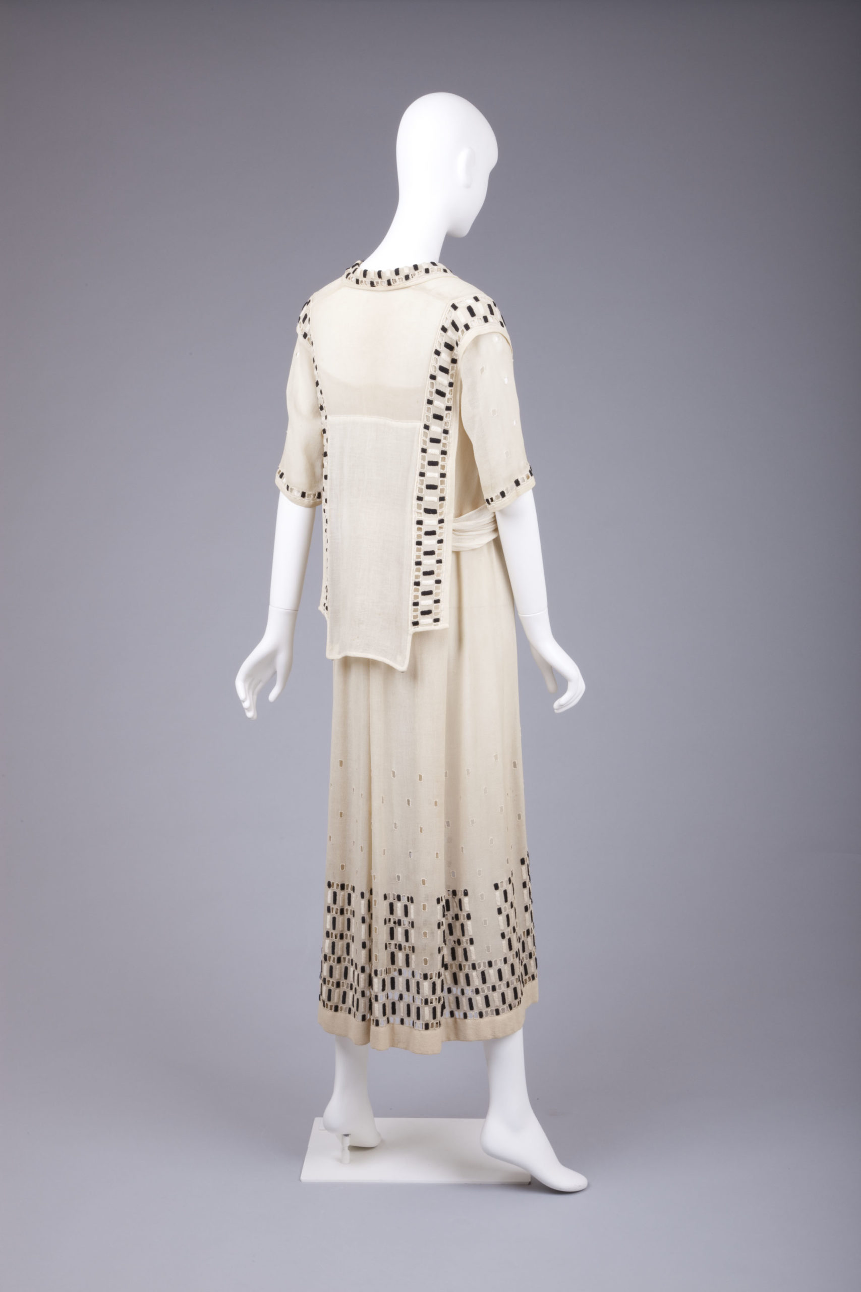
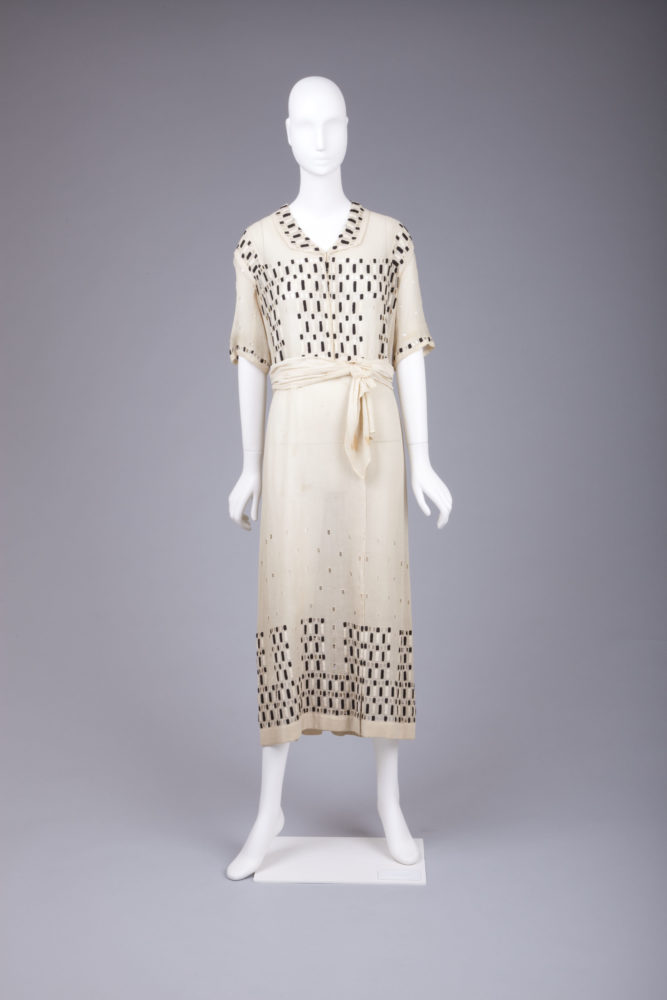
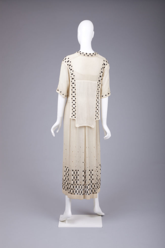
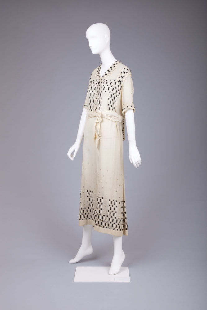
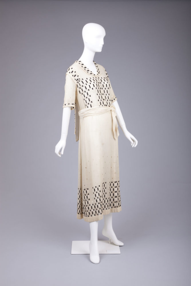
The Goldstein Museum of Design dates this dress to 1915, but I don’t think it’s quite that forward thinking and revolutionary. I would date it to 1918-22. The slimmer skirt, very slightly dropped waist, short sleeves, and flat collar are all in keeping with a very late ‘teens-early 20s date. The real giveaway is the tabard effect at the back of the dress.
Goldstein Museum of Design, Gift of Charlotte Karlen, 2004.001.007
This slightly odd variant trend was very a la mode 1918-22, and appeared both in caped variations at the back of the dress, as in this example, and as apron-like hangings at the front. Most fashion plates and patterns show the tabard worn under the belt or sash, so this loose variation is unusual – or styled incorrectly. It may be as fashion-forward as the rest of the dress, and anticipate the many cape effects seen in 20s fashions.
Goldstein Museum of Design, Gift of Charlotte Karlen, 2004.001.007
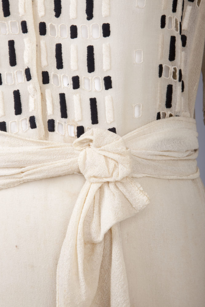
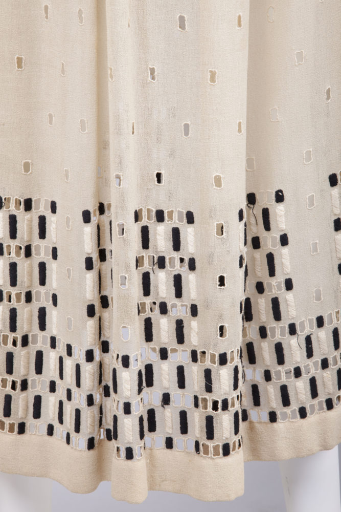
Speaking of fashion forward, let’s talk about that embroidery! It’s a very simple concept, used to great visual effect. Rectangles of satin stitch in black or ivory are interspersed with cutwork/broderie anglaise rectangles.
Goldstein Museum of Design, Gift of Charlotte Karlen, 2004.001.007
The resulting pattern is both a nod to the beading lace seen on so many pieces of Edwardian lingerie, and a extremely modern touch that evokes Cubist art and skyscrapers (and anticipates computer programmes).
Goldstein Museum of Design, Gift of Charlotte Karlen, 2004.001.007
Note the clever placement of the embroidery across the bodice: mirroring the hem decoration, and minimising the bust.
Goldstein Museum of Design, Gift of Charlotte Karlen, 2004.001.007
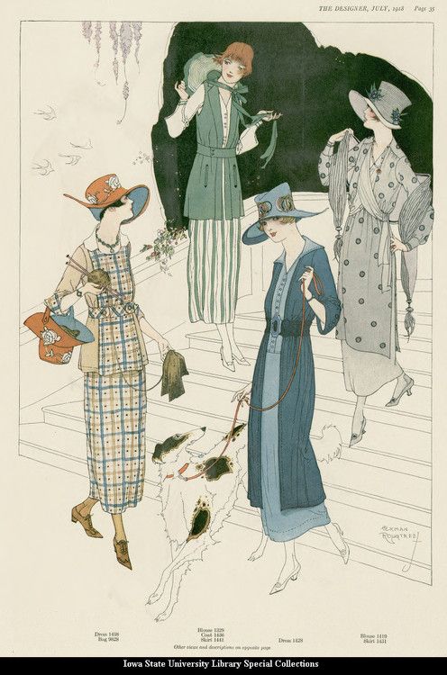
I don’t feel that the display is quite doing the dress justice. The mannequin is a little too tall and long in the torso for the dress. It’s also a garment that would be brought to life with the right accessories: it needs stockings and shoes, a hat and a parasol. They aren’t exact duplicates, but here’s some ideas of how the dress might have been styled in its time.
Note the wrapped sash on the white with blue, and the pink numbers, and the vest effect at the shoulders on the green plaid and blue dress with the poppy hat – elements you see in the dress we’re looking at. The pale apricot dress has a tabard bodice.
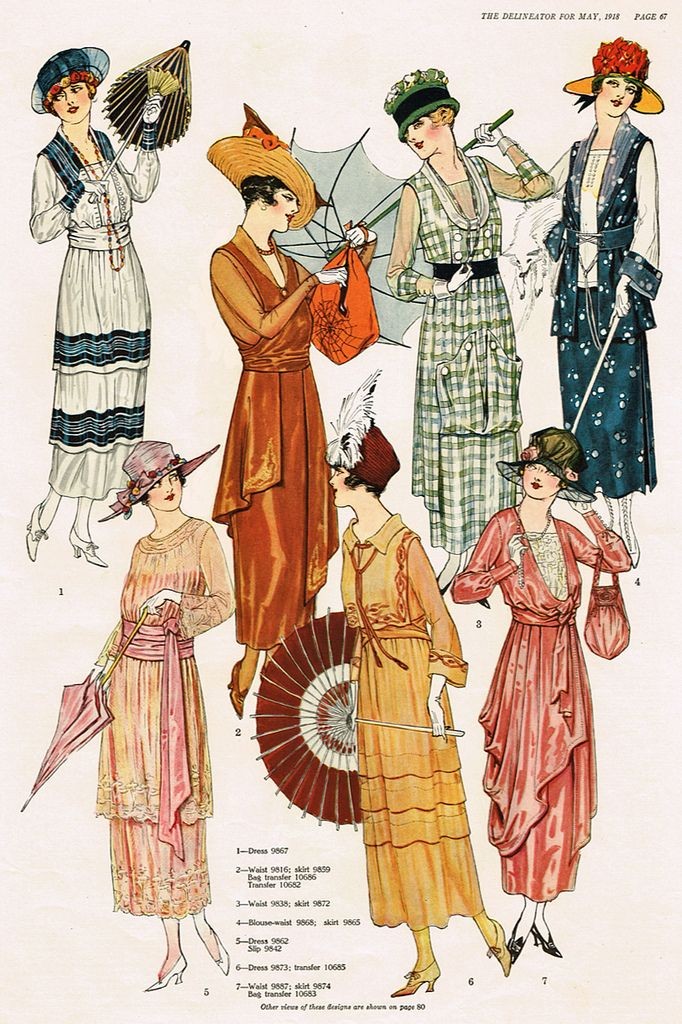
Slim skirts and flat collars for summer 1918:
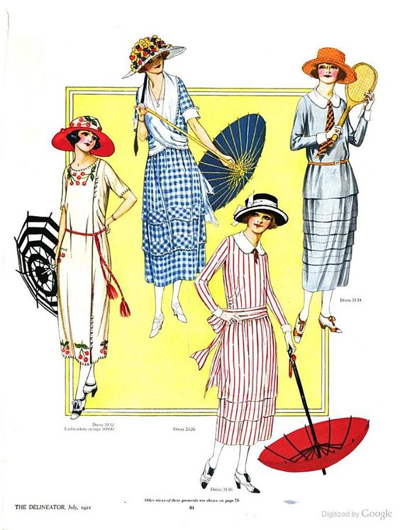
It may be 1919, but hems are still almost at the ankles, although short sleeves are in:

See the flat collars, and the slightly dropped waist, with sash effect on the red and white number:
What do you think? Is this fashion forward done right?
Rate the Dress on a Scale of 1 to 10
A reminder about rating — feel free to be critical if you don’t like a thing, but make sure that your comments aren’t actually insulting to those who do like a garment. Phrase criticism as your opinion, rather than a flat fact. Our different tastes are what make Rate the Dress so interesting. It’s no fun when a comment implies that anyone who doesn’t agree with it, or who would wear a garment, is totally lacking in taste.
As usual, nothing more complicated than a .5. I also hugely appreciate it if you only do one rating, and set it on a line at the very end of your comment.
If I saw only the back I would rate it a ten. I find the back view quite stunning, but for some reason, I don’t care for the arrangement of the embroidery motifs on the front bodice – perhaps if it was arranged in vertical bands as in the back, I would find it more attractive.
8 of 10
I admire the embroidery and cutwork, although I don’t much like the embroider around the shoulders. I don’t like the tabard. Somehow the whole thing just isn’t coming together for me. 7/10
I was going to say I like how the embroidered rectangles mimic the slim rectangular silhouette. Hit “Post” too soon.
I agree that is isnt styled correctly. Worn on the correct body with all the accessorys… Divine!
I love the cream and black and the embroidery is stunning in its simplicity.
9.5
Totally off topic, the poppy hat in one of the fashion illustrations is wonderful. I can’t focus on anything else.
Regarding NZ’s positive handling of the pandemic, I believe it is a service to highlight the benefits as frequently as possible rather than inappropriate to mention it. We need some examples of the advantages of wise decision making, citizen responsibility, and leadership.
ceci.
I should love this dress — ivory and black, embroidery, geometric shapes, simple silhouette — but there’s something off , as Elaine said above. I think it’s the collar — makes the whole dress too informal/sporty for my taste. If it were a simple U or V neck I’d probably rate it much higher, but I’m at 8 right now.
For starters: You get a 10 for the great reference pictures
As for the dress: I am not sure if I like it or not. The embroidery is intriguing and I am currently speculating that I might use some sort of paean on a blouse I am considering making…
7.5
As a fan of cubism and anything which minimises the bust, I approve of this frock wholeheartedly. I love the 1920’s but the styles aren’t flattering to my shape. The embroidery and the placing of the sash around the waist are very clever ideas to help flatter the less gamine figure. I love the style of the embroidery, the open work, the texture of the fabric, the monochrome tones and the sleeves, which are my favourite length. Oh yes. Thank you for sharing this one. I am so glad it finally made it to us from your queue.
A rare 10 out of 10 from me.
I absolutely love this! The only improvement might be to lose the first two rows of embroidery on the bodice, providing more white space which I think would relate better to the other large undecorated areas.
9.8
What a stunning dress! The embroidery is indeed simple, but the design is so clever!
I do share your reservations about the display of the dress – it would indeed love shoes and a hat at least. Something is not right about the knot on the sash, either – it makes it look as if someone has knotted and elastic bandage round the waist. Not quite right for the fabric of the dress, and rather too casual.
But I do not blame the dress for these issues. It is wonderful. So elegant, so sophisticated, so modern!
10 out of 10
This is an odd comment, but I can totally see my grandmother in that dress. 19-teens was when she was born, so it’s a tad old (even for grandma, who’s been gone since 91) but the geometric prettiness was utterly her style.
I don’t much like it for myself, but for Grandma? 10/10. For someone, this is perfection.
It’s nice, it’s different, it’s interesting. 10/10
It is a very elegant frock, the embroidery and cutwork is utterly modern and like PalK above, I have saved it in my inspirations folder for future reference.
Interestingly I am currently in a deep dive in my family’s archives scanning and storing photos. My grandmother (who had the perfect tall slim small busted figure for this fashion) was wearing something very similar in the late teens/early 20s in rural NSW (Australia).
9/10 and thank you for the excellent detail pictures.
I love it! The embroidery is gorgeous and suits the dress to perfection. I find it beautifully simple and elegant.
10/10
beautiful in my eyes! this is nearly the 20s—i think you are correct in the dating of it—and you can see broad hints of what is to come. but to me, it has a graceful quality and nuance that most 20s dresses have left behind (especially in daywear), and so i think it prettier than its heirs. i like the geometric embroidery, which reminds me more of charles rennie mackintosh and the squares motif employed by gustav klimt in some paintings than it does cubism. it’s modern, alright, but in a way that feels more aesthetic than brutalist, if that makes sense. i particularly like the clever way the black and white embroidery interplays with the cut-out eyelets in the same shape to produce a range of tones and liveliness—a sort of dialogue with light and shadow.
there are two things that will elicit a high to perfect rating from me: either a dress that i would wear myself with no or minimal modification, or a dress that is a perfect example of its moment in time. this one scores tops marks on both.
rating: 10/10
It reminded me of Josef Hoffmann (see below), sooo… there’s definitely something very Wiener Werkstätte about it – a mixture of Art Nouveau with more modernist styles like the aforementioned cubism.
The embroidery is clever. The overall look of the dress strikes me as very “meh.”
7 out of 10
Oh Gosh, I cannot look at the front view of this dress and not see the computer punch cards that were used to do programming in the early 1970s. They were that shade of ivory and the scale of the embroidery, which I think is very well executed, just about exactly approximates the holes and black markings on the IBM version of the cards! 7/10
I really don’t like this. While I admire the time someone devoted to the embroidery , on closer inspection the satin stitch is rough and clumsy. I feel rather bored with this dress. Definitely the lack of styling is not helping . A reluctant 6.
The black-white(-cream) geometrical style reminds me very, very much of Josef Hoffmann, and it has to it that same character of modern design paired with old-fashioned quality manufacture. I have a huge soft spot for that even though it’s not really my personal style.
Something about this does seem a bit unbalanced, though – yes, something about the difference between the front and the back leaves it a bit unresolved, I think. Like it can’t decide whether it wants to be a fairly demure if fashion-forward number (front), or play further with stark modern shapes (back). And I’m also unimpressed by the close-up of the satin stitches (although I also appreciate how hard that is to do on such a flimsy fabric).
7/10
10.
I really liked it at first, but looking at it fir longer makes me feel like there’s something off. Maybe it’s the collar, or the shoulder embroidery, or the colour of the fabric. Or maybe it’s just the styling, and if it was styled better I would love it.
8.5/10