
Do you know how some weeks are great, and some weeks you start out feeling like you’ve been punched, and just doing the absolute minimum is all you can manage? Yeah, this was one of the latter.
And just when it looked like it was getting better, we found out that an Australian tourist (we have a travel bubble with Australia) who went everywhere in Wellington last weekend had Covid, so may have infected people…including people I know.
So I’ve got so much sewing done this week, because I sew when I’m stressed, but not much writing, because words are hard when my brain hurts. But I’m now so pleased about all the sewing I’ve got done that I can write! So we have blogging!
And I can’t wait to show you the sewing I’ve finished!
Last Week: a 1910s take on the tea gown
A lot of you really loved last week’s tea gown, which didn’t surprise me. It’s really nice to see something for an older woman, and something that’s a little less constricting than many historical fashions.
A few raters, however, just weren’t sure about the colours, or how easy it would actually be to wear.
It’s true that I wouldn’t want to sweep a floor or make a cake while wearing it, but that wasn’t it’s purpose! It was definitely a gown for looking glamorous while the servants did the work, but at least it was a comfortable gown as long as you didn’t have to do any work!
The Total: 8 out of 10
Not a bad total for a dress that one rater only rated 2/10!
This week: An evening dress from the very end of the crinoline era
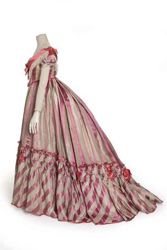
I’ve been researching a 1910s hem technique which uses fabric (usually striped) cut on the bias for a decorative finish, so I couldn’t resist choosing this dress, with its bias hem ruffle, for this week’s Rate the Dress:
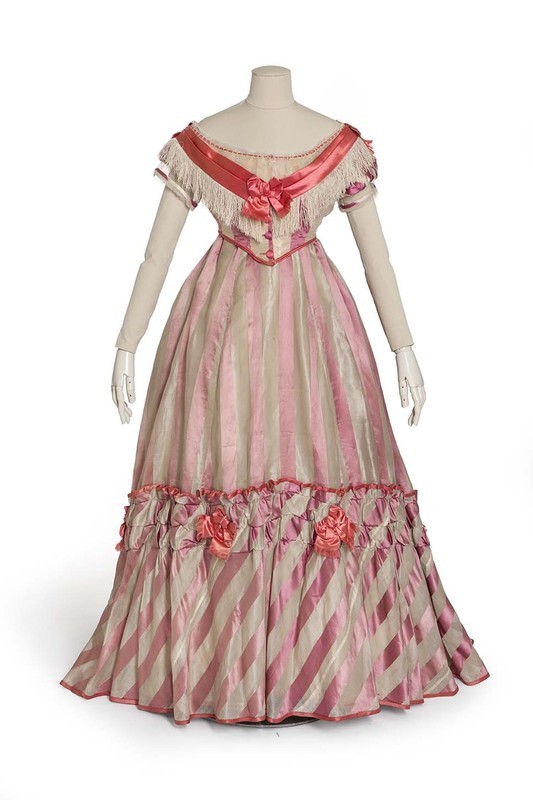
Evening dress, 1869, Les Arts Decoratifs
It’s unclear if the colours of the fabric have faded and changed over time, or if the contrast between the cool purple-pink of the main striped fabric, and the warm orange-coral of the trim, are intentional. The 1860s were an era of bold colour choices, so it’s not impossible that the clash is intentional.
Evening dress, 1869, Les Arts Decoratifs
This dress is a great example of the crinoline era transitioning in to the first bustle era, not only in its silhouette, but also in its cut and trim.
The berthe effect bodice looks back to earlier in the decade, as does the fringe trimming. The hem treatment, on the other hand, anticipates the elaborate skirt trimmings that would characterise 1870s and 80s fashions. The bodice has points front and back, rather than the newly fashionable square waistline, but the bold buttons would have been a very on-trend touch.

Evening dress, 1869, Les Arts Decoratifs
What do you think of this dress with combines bright colours, stripes, and old and new fashion elements? Would it have been an attractive addition to the ballrooms of the time?
Rate the Dress on a Scale of 1 to 10
A reminder about rating — feel free to be critical if you don’t like a thing, but make sure that your comments aren’t actually insulting to those who do like a garment. Phrase criticism as your opinion, rather than a flat fact. Our different tastes are what make Rate the Dress so interesting. It’s no fun when a comment implies that anyone who doesn’t agree with it, or who would wear a garment, is totally lacking in taste.
As usual, nothing more complicated than a .5. I also hugely appreciate it if you only do one rating, and set it on a line at the very end of your comment.
I think this dress is okay. It doesn’t inspire strong feelings in me in any direction, except for the stripes. I think the stripes are really interesting and neat, partly because I’ve been daydreaming about making an 1800s dress with stripes like that but I wasn’t sure if it would be historically accurate.
7/10
Like the previous commenter I do like the stripes, and the large bias ruffle lends a sense of movement.
I don’t care for whatever bunches of the coral on the skirt are supposed to be – roses? – which make it seem like the seamstress just wanted to use the leftover fabric somehow
My overall first impression was of the kind of birthday cake that was popular when I was a child where a fashion doll was inserted into the center of an angel-food cake, and the whole was frosted to make the cake look like the doll’s skirt. I can see it being worn by a lively young lady, but it’s somewhat too confectionary for my tastes.
8 of 10
I really don’t like this much. To me, it has a gaudy look more appropriate for a bordello or a dance hall (despite the long hem and the train effect in back). The color difference in the stripes and the long fringe on the bodice contributes to that gaudy effect.
5 out of 10.
Mmm, for some reason the dress reminds me of a theater production. It’s perfect for the stage given the bright coloring and the dynamic stripes. The design is fun, though, and full of movement, and I think the coral is a nice touch that adds pop. (Then again, I like a bit of clashniness on occasion, a la 1960s.)
It’s just such a vivid piece that it seems best suited to a young someone with a strong personality — able to carry off something so very pink and eye-catching.
For design, 9.0 (didn’t give it a 10 because it verges on the loud and outre)
I love the stripes, and I wouldn’t have expected that. The rest of the dress doesn’t strike me as anything special, but I don’t dislike it, either. 7/10
It looks like a dress out of the Music Man (1962 movie set in 1912)
Happy
Would love a whole blog post on use of stripes
10
for me, the stripes, particularly at the hem, are the best thing about this dress. otherwise, i’m not feeling love for it. not one of my preferred periods/silhouettes, not my colour palette, just not my thing. makes me think of a petit four for some reason…
rating: 4/10
I agree with the other reviewers who said it looks theatrical. I find it sickly sweet and garish and yet I am also oddly fond of it. There is some kind of method in the madness.
8/10
I neither like nor loath this one. The striped fabric is pretty and the coral bindings edges of the ruffles and bodice edges work well to break up the stripes and hide any mismatches. Even the rosettes on the skirt are fine. The bertha, though, is just too much; it’s too bold and gaudy with the fringe, which makes the whole thing look a little circus-y.
5/10
I like it. I find it kind of weird and I think most of it’s decorative elements clash with each other but the bias cut stripes are fabulous and I really like the silhouette. I’m also kind of in love with the fringe and ribbon combination on the bodice.
9/10
I think it’s a lovely cupcake of a gown,although the coral touches jar a bit. The wide band at the neckline is too heavy, giving the impression of a Congressional medal. Just the fluffy lace would have been perfect. I love the play of stripes, both straight and bias, especially as they fall from the back waist. Certainly a gown for a vivacious young Miss, but I don’t mind admiring one I could not wear. 8.5
I like the handling of the striped fabric best. I imagine the bias ruffle moving beautifully during a dance. To me the fringe is the element that doesn’t tie in with anything else. The fringe does look a little “dance hall” to me, but that’s probably only because I’ve seen too many Western movies; maybe it did not to people in that era, so I won’t knock it down for that. But, I think the satin ribbon on the bertha would not be so awkward (a la “Congressional medal” as Kathy posted), if it didn’t rest atop the fringe, but only against the striped fabric–as the other satin trim does with the skirt and shoulder bows and edging. You could also see the pretty buttons better without the fringe. 7
Like this.
8/10
Oh I like it. I love the energy of lines with the vertical sweeping sideways into the bias. I love the details, it manages to be sweet and bold and a bit military all at once, which shouldn’t be possible but I can’t unsee that. Like Polly Perke’s first ballgown.
7/10 because I really dislike the the profile, but love the rest.
My guess is that it is faded somewhat. If you look at the stripes on the back of the skirt and the side of the ruffle they look brighter. Unless it’s just a trick of the light. It would be so neat to see it in it’s heydey!
I’m not a big pink fan, but I think this one is alright. I don’t find the coral decorations clash. Different matching ideas from a different era I guess.
I love the idea of a bias cut skirt bottom like that. Otherwise though it is kind of an underwhelming dress, though I’m sure on the right woman it would be lovely.
I’m going to go with 6/10.
Thanks for doing this! I don’t know if I would have been able to appreciate this dress a few years ago. I’ve learned a lot from this blog!
This dress reminds me a little on the kind of ballgown the mice would have made for Cinderella. Well meaning but not that…sophisticated. I don’t like the fridge. I don’t think it needs it. I like the coral silk a lot, but not in the way it’s been used here. It seems like they didn’t have much of it left and then they decided to „make do“ with it. Because the way they used it is a bit odd (…not the mice. The taylor/ seamstress). If they just had little of it left, I think they should have just used it for the piping, but more consequently, which means also for the sleeves and the collar (…and possibly for the drapings above the bottom ruffle at the skirt). I think the coral bows are too much. That bias-cut ruffle: well, I think if this is their main feature, they should have made the effort, to match each and every bias-cut stripe to exactly one of the straight stripes. It would have lifted that ruffle theme in my eyes. So I don‘t know: I feel a bit sorry for those mice, because they did their best. I think it’s a sweet dress, but…(6/10)
This dress didn’t really speak to me at first, but then I imagined how it would look on a dance floor at a ball. The movement of the fringe and ribbon trim would add visual interest and the bias stripes would bring a touch of optical illusion as the skirts spun around. The colours are fun and lively, if potentially a bit too cutesy on the wrong person. If I could see this dress in motion, I would give it 7/10.