
I’m currently on holiday* in Hawai’i, visiting my parents, but there’s no rest when it comes to blogging! But I have picked a nice relaxing tea gown option for this week’s Rate the Dress…
Last week: An 1830s evening dress in gold and white
Two numbers kept popping up in the rating for the 1830s evening dress. Two quite different numbers. 9 (wooohooo!) and 6 (ergh). It mostly lost points for the sleeves (which may not have been original), and for the elaborate border halfway up the skirt – many of you felt it should have been placed near the hem.
The Total: 7.8 out of 10
Pretty good for a dress that got a 5 and a 2 as ratings! I should have posted a new Rate the Dress sooner – the worst ratings came in at the very end.
This week: A 1920s tea gown in silk velvet.
This dress isn’t exactly Hawai’i appropriate. Silk velvet and heat and humidity aren’t good friends. But something about the turquoise and the block print seem quite tropical. And the relaxed fit definitely fits my mood!
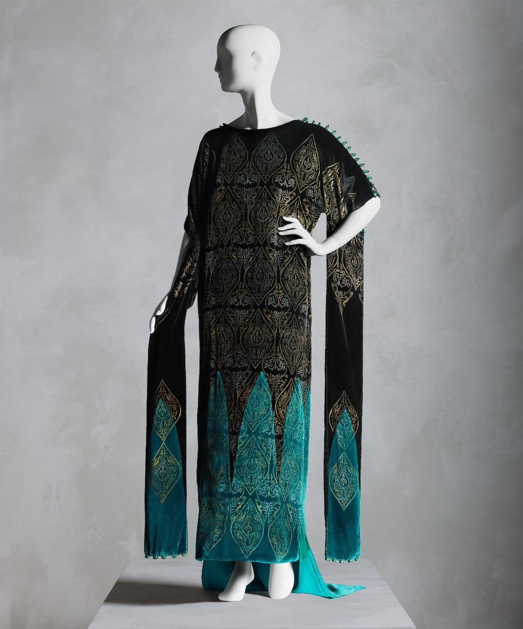
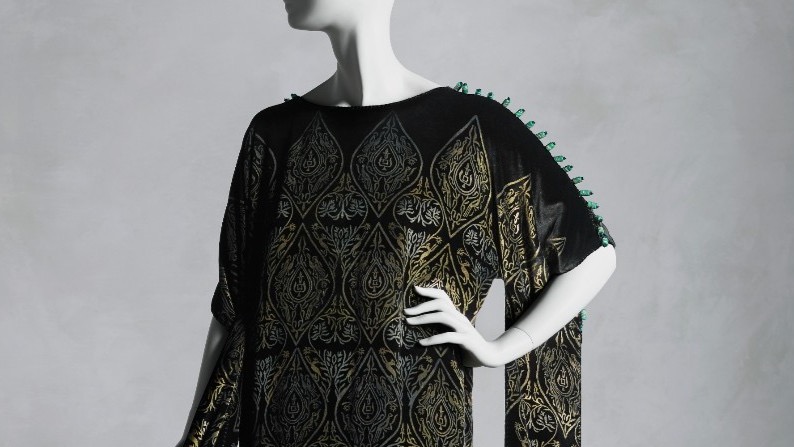
Tea gown, 1920s. Silk, glass, Gallenga (Italian, 1918–1974). Maria Monaci Gallenga (Italian, 1880–1944).
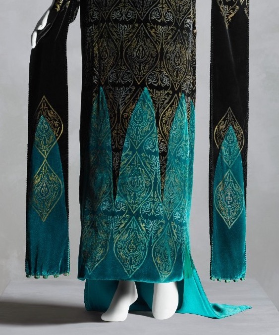
The Renaissance-inspired metallic block print is a classic Gallenga touch. Maria Monica Gallenga invented the unique process that allowed her to block-print metallic paints, making her clothes instantly recognisable to those in the know.
Tea gown, 1920s. Silk, glass, Gallenga (Italian, 1918–1974). Maria Monaci Gallenga (Italian, 1880–1944).
Gallenga’s interest in Medieval and Renaissance art is evident not only in the print, but also in the arch shapes joining the turquoise and black, and in the long trailing sleeves which evoke Medieval sleeve lappets.
What do you think of this 20s take on Medieval?
(wondering what a tea gown is? Read this post!)
Rate the Dress on a Scale of 1 to 10
A reminder about rating — feel free to be critical if you don’t like a thing, but make sure that your comments aren’t actually insulting to those who do like a garment. Phrase criticism as your opinion, rather than a flat fact. Our different tastes are what make Rate the Dress so interesting. It’s no fun when a comment implies that anyone who doesn’t agree with it, or who would wear a garment, is totally lacking in taste.
As usual, nothing more complicated than a .5. I also hugely appreciate it if you only do one rating, and set it on a line at the very end of your comment.
* ‘holiday’ meaning I’m deep-cleaning my mum’s kitchen, tackling the mending bin, and helping with all the usual farm chores…
I adore the material and the metallic print, and those decorative buttons on the top side of the sleeves are a nice touch. Also, trailing sleeves are my weakness.
I’m less sure of the way the black joins the turquoise, but it’s a minor distraction.
I find the whole thing too top- heavy, with the black up high and the lighter color on bottom of the garment. Also, I suspect that the original fashion image/idea was at least a head longer, for the proportion to be really striking or graceful. I was scrolling down and when the hem came, I was – oh no.
8/10
It looks matronly due to the cut, that is the word I was searching for.
Like the above comment, I did enjoy the material and decoration. The style, though, is simply not my thing. So…
6/10
Stunning. I can imagine this on a Downton Abbey character. I imagine it would take someone who has absolutely nothing practical to do, other than be lovely, to wear this gown because I imagine the lappets getting in the way. Especially love the toning glass beads on the shoulders. They not only echo the color on the hem, but they echo the shape of the turquoise insets. Very, very pretty. I’m only taking one point off for the lappets.
9/10
Absolutely LOVE it. Texture, drama, simplicity, bold design choices, yum. 10.
I am a big fan of Gallenga’s work. Her textiles are incredibly detailed and beautiful. I am having trouble with this tea gown however. On the plus side, I think the black with the striking use of the turquoise is genius. I love the glass buttons and I even like the sleeves. Tea gowns were not meant to be worn for anything but lounging, so the long sleeves are an indulgence that works here. The gown in a very weird way reminds me of the green velvet dressing gown Vivian Leigh wore in Gone With The Wind.
Now to the negatives. I don’t know what it is, but the gown looks awkward and uncomfortable. The way the top of the gown is cut makes it hang badly and causes the person wearing it to resemble a linebacker in a sausage casing. It looks too big and really constraining at the same time. It looks like it would be very difficult to raise your arms without the entire dress rising with them. And it might just be my OCD kicking in, but the stencil doesn’t line up correctly on the center front turquoise arch and I can’t look away.
I want to give this more love, but it’s a 6.
Those sleeves say trip hazard to me though they look lovely . I am not a fan of 20s fashion, but at the same time the simple style does show the beauty of the fabric ..it’s the kind of dress that could look wonderful on someone tall with a rectangular body shape as it needs the height to carry off the sleeves
Difficult style to wear but love the fabric
I give it 7
metmuseum.orgmetmuseum.orgI’d never heard of Maria Monaci Gallenga – she sounds amazing! And I loved this little bio and video about her from the Met.
https://www.metmuseum.org/toah/hd/glth/hd_glth.htm
https://www.metmuseum.org/perspectives/videos/2023/12/gallenga
I’ll give it an 8.5 – I can imagine swanning about in this dress! Just the not-perfectly symmetrical lineup of the block printing makes my eye twitch a bit.
This is beautiful! If it didn’t have the lappets/tippings, I’d want it to be shorter to not look matronly. But with these, the length makes it look like a regal bliault.
I am not a fan of the train, it juts out like a square of fabric was added as an afterthought. Maybe it’d look more natural in motion. Due to that, I’ll give it a
9
I adore it except for the train, which makes me think of a mullet. The lappets don’t appeal to me, but when I picture it without lappets it’s not as special. So I am now open to the lappets.
9/10
I love the 1920’s, and this is a beautiful and intricate piece, so I want to give it a perfect rating, but as pointed out by others the arches don’t match up to the stencil, so I’ll have to knock off a couple of points.
8/10
It’s a solid 8. I like the turquoise, but find it a bit too strong against the darker colours. I like the general cut, but don’t like the train. Interesting dress, but not an total hit
8/10
I love the turquoise and the block print on top! The little bits on top of the sleeves are so fun too. I could definitely see myself wearing this although between the heavy velvet and everything else, I’m not sure exactly where… Maybe an evening out?
8/10
I love it. Such a great combo of Renaissance (the print, the arches) and 1920s (the straight cut, the colors). I have nothing to complain about. 10/10
PAX
I’m not a huge fan of the sleeves and train, but it does give that Medieval/Renaissance feel Gallenga was going for. The block print and arches remind me of the stained glass in Medieval cathedrals. If I owned it, I’d wear it.
This picture of stained glass windows really reminds me of this dress:
https://upload.wikimedia.org/wikipedia/commons/thumb/0/03/Chartres_cathedral_2857.jpg/1024px-Chartres_cathedral_2857.jpg
9/10
Absolutely gorgeous! I can only think that the gores, glass, and metallic print would have been gorgeous in motion.
10/10
I’m sorry, but there is not a single thing I like about this dress. I’ve never yet seen a dress on this site where I couldn’t find something substantial that I liked. 1/10.
I like it so much, but for the mildly embarrassing reason that the points along the shoulders and arms make me think of dinosaurs. Maybe adults shouldn’t think that way, but to this day I’d still wear anything that makes me feel like a dinosaur.
8.5/10
I think that is an AWESOME reason to like a dress, and that the world would be a much better place if we embraced adults getting excited about things like dinosaur dresses! Be enthusiastic, not blasé!
I like it. I think it’s a fun blend of 1920s and medieval dress, especially the dramatic sleeves! I like the pop of turquoise and the overlaid metallic print. Although I prefer the alignment of the metallic print on the sleeves to the main dress. I wish I could see the back of the dress to see how the train is integrated & decide if I like it.
As I can’t see it I will assume the best & give it a 8
I want to love this dress. Really I do. But somehow, the more I look at it, the less I like it. The harsh visual division between the black and the turquoise is grating. The more I insider the sleeves, the more I realise how annoying they would be. The train is a trip hazard. I’m not much struck by the buttons or whatever they are on the shoulder and sleeves either.
Despite all that, I still do kinda, sort a like it.
6/10
Love it! 10/10
OMG, I love it, I have a dancer friend who is tall and slender who would look A-mazing in this. It’s almost architectural in its design and so luscious!
One would have to have a darling tiara, a cigarette holder and a set of amazing, long beads to finish off to whole look.
I don’t normally go for a lot of 20’s designs because of their boxiness but this boxiness works for me!
As long as you have no hips and no boobs this will look amazing, I give it a 10