Reaction to last week’s be-bowed pink and black confection was quite divided: you either loved pink and black and ruffles, or found it revoltingly saccharine. There were also two camps of thought on what it represented. Most of you thought commedia dell’arte. Like Isabella though, my first thought was definitely 17th century, and I do think that even if she was meant to be a commedia dell’arte figure, all the details of her dress were taken from 17th century costume – the match is just too spot-on.
Personally, in many ways I liked the outfit, but like Hana, the overall look left me a teeny bit cold. It was just too perfectly matched and meticulous. I think it would look amazing in real life though, on someone who wasn’t exactly the same colours as her dress and whose hair got a teeny but frizzy and windblown as she danced! I’d probably rate it 7 10ths of a point lower the 7.7 out of 10 that it actually rated.
This week let’s look at an actual extent fancy dress costume.
Well, maybe.
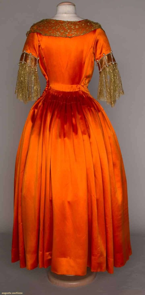
The sale record for this garment claims it is a fancy dress representing Elizabethan costume. Lanvin, however, was noted for drawing on historical garments for inspiration, basing gowns on Velazquez portraits and Renaissance icons, so perhaps this was just a somewhat more theatrical creation. I’m inclined to think the gown is fancy dress (the lace is rather unsubtle for Lanvin), but am not sure that it was meant to represent the era of Elizabeth I. 1920s fancy dress did have a particularly vague grasp of historical costume though!
Your task, dear readers, is to make your best guess as to what this gown was supposed to be, and to rate in on its aesthetics.
I’d recommend judging it on its merits from a period perspective. Modern fancy dress is supposed to be witty and clever, but obvious. From a 1920s perspective, historical fancy dress was meant to be “picturesque” and “quaint”, and even if we can’t guess the intended theme, in-period it may have been obvious.
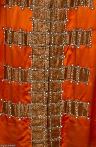
The dress, whatever its theme, employs a classic Lanvin motif. The same motif, a stylised crucifix that was one of the many religious symbols Lanvin utilised in her garments, appeared as early as 1922 on a white chiffon robe de style, was featured on a Lanvin advertisement from 1925, and continued to be used on Lanvin creations into the 1940s.
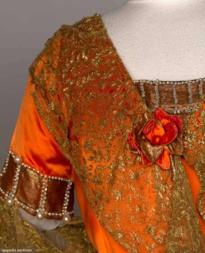
What do you think of the gown? The vivid orange silk, paired with the rich gold lace, with the pearls for relief? The historical-references meet Lanvin’s extremely refined, feminine 1920s aesthetic?
Rate the Dress on a Scale of 1 to 10.


I suspect it would find a happy home in the costume insanity that is “Reign”.
The color of the fabric is startling may be the least period aspect (those with more expertise can chime in on whether or not the dyestuffs of whatever period this dress is aiming at would be capable of producing such an aggressive color).
The fuzzy aspect of the lace is at odds with the angularity of the cross motif, but I suspect that the lace would have been less droopy when the dress was new.
I find myself weirdly charmed by its “what the hell” approach, so 6 of 10.
This is definitely NOT Elizabethan in feel or look at all. What can I possibly say. There are hints of the 18th century in the sleeves; but, all the extra lace in the front does not show off a stomacher. This is a fantasy dress — a fantasy that I would not like to be included in (and I usually love Lanvin). Orange is definitely NOT my favourite colour (it hates my skin tone and reminds me too much of the actress who portrayed Miss Bingley in the 1995 Pride & Prejudice). Rating — and only because it is for Mme Lanvin — 4/10.
On first glance: Ugh. It looks like a costume you would buy at a discount store. The color combination looks awful (it could just be how the color came out in the picture). The crucifix motif down the skirt weighs down the rest of the dress. Looking at the close-up shot, the lace, the rose, and other details look much nicer, but the fact remains that it’s an ugly color combination.
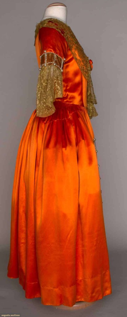
It seems like the dress is trying to emulate the Renaissance/Elizabethan times with the dark gold cross motif and pearls, but it’s hard to tell. There seems to be a bit of the 1700s in it with the sleeves and the fichu-style collar. So who knows?
I rate it a 4/10
I’m going to say it’s supposed to be a Stuart lady, but I can’t make a call on whether that is Restoration Stuart or Charles I Stuart.
Orange is not one of my favourite colours, but at the same time, I love this rich, glowing, intensely warm, marmaladey orange colour. The gold works quite well with it too, like an additional level of warmth and flame – silver would have been too chilly a contrast.
I rather like this. Not absolutely sold on this particular long-waisted fitted bodice cut/construction which is very Laura Ashley/Disney Princess/1980s formal frock – I only usually like it when it’s REALLY fitted and corseted, in a pre-1900 context, or really, really sharply tailored and fitted, so this kind of “should be tight, but isn’t really tight” effect does little for me as a rule. (The cut does occasionally work really well with 1940s medieval-style bridal dresses, though…)
Hmmm. Hovering between 6 and 7 out of 10 here. So I’ll say 6.5/10
I think I really shouldn’t like this dress, yet I find myself being oddly charmed by it. Really, it doesn’t quite make sense, but I like it in a somewhat odd sort of way. With a different color scheme I would really like the style of the dress. I would guess that the wearer was supposed to be Ann Boleyn. (Why? I don’t know. The dress isn’t really very Tudor at all. But still, add a necklace with a B and you are good to go. Instant party costume that gives you a great excuse to be super flirty. And with that orange color I am guessing the wearer wasn’t a shrinking violet to begin with…) Anyway, I think the gold lace and details are pretty, and that is winning me over.
7/10
Just too much! The color, the lace, the trim… ugh! 2/10
That is funny! Looking at last week’s RTD, I assumed that it was s obviously 17th C, all we were doing is working out what 17th C character she was portraying. Clearly not Melanie Lynskey – wrong century…
This on, LOVIN’ the colour. Other than that, I am baffled beyond bafflement. I’ll go ponder…
I feel very much the same about it as MrsC – I love the orange, the rest leaves me baffled. I think I’m going to go with 4/10, because that’s about the same as the proportion of things I do like to those I don’t (4/7 for those two groups, that is…).
Like: 1) Colour
2) pearls
3) rather the overall cut (like the shape of those side seams on the bodice and those seams on the top of the skirt – there’s some potential for gracefulness there), and
4) rather the lace as such, with its soft pattern.
Dislike: 1) The crucifix motif – the colour of it (at least on my computer, it looks blah in comparison to that bright bright orange)
2) the geometricness of it in relation to the rest of the dress (it would look better on a simpler medieval-y dress, I think)
3) the droopiness of the lace (as others mentioned, this could be just an effect of its age, though – it’s certainly come undone from the dress in some places if you look closely)
4) the very 1920s placement of the lace on the bodice that’s supposed to be historical-like
5) the assymetrical placement of the rose (at least, it looks decidedly off-centre to me)
6) the aforementioned fitted-but-not-fitted bodice, and
7) the obvious hem – okay, now I’m nitpicking, but with the dress’s overall unbalance/poor display, that visible line of stitching at the bottom is another thing that’s distracting me from imagining it in a better glory.
I thought this dress was more Colonial or 1700’s than the advertisement of the frilly Southern Bell pseudo-Colonial wanna-be (I just couldn’t find any words for that costume). With some tender love & care, I could see it being some wealthy aristocrat lady’s ball gown. I love that orange and gold.
7/10
As a dress I like it. It’s a bit too blazingly orange for me to consider wearing it, but on a dark-haired Latina, or a black woman, it would be sensational. I even like the brown and gold applique work on the skirt. 9 out of 10 (if only because the gold lace on the bodice seems rather limp by comparison to all that blazing orange).
As for the allegedly attempted historical period, I haven’t a clue. The lace-ended sleeves whisper 18th century, but the decorations are all wrong in shape and placement for that. The gold lace around the neckline whispers 1840s, but the sleeves are blatantly wrong for that. The sleeves are too flat for 17th century and the shape and decoration of the bodice and skirt are wrong for the 16th (to say nothing of the fact that you don’t see gowns worn without sleeves in the 18th century except, perhaps, on peasants).
18th century comes closest in my opinion. I’ll just guess “18th century” and leave it at that.
Re: Last week’s “Rate the Dress”; now that you mention it, the 17th century was a period that was really big on ribbons and bows, for both sexes. Perhaps our Venetian was a 17th century commedia dell’arte character.
One point for the fabulous orange fabric!
One point for the amazing gold lace!
One point for the cartridge pleating!
that’s 3/10
As a ’20s effort at Elizabethan Turkish style it works for me even though if it were just described or if I just saw the lace or fabric I would be in total agreement with those who use extreme to describe it. But Elizabethan and Turkish fashions could run to extremes that this does not even approach, so it’s all relative. 9/10
Cool, I love playing Guess What It’s Supposed To Be with historical fancy dress. I’m going with “Restoration Period” for this one, though that really is a wild guess. Sadly, I don’t love this dress. I do like the orange and gold colour scheme (a good choice for Halloween if you have the colouring for it), but I think the design is clunky. I admit this is partly because it reminds me of a bad Ren Faire outfit, but even by the standards of its time I don’t think it stacks up all that well. The decorative elements and the overall shape aren’t well balanced. I know the 20s didn’t tend to go in for historical realism, but they did produce some very elegant, cohesive fancy dress. This one looks like it doesn’t quite know what it wanted to be. 3/10.
As a footnote, I don’t think those of us who dislike the dress should necessarily blame Lanvin. This may well have been what the client wanted.
But a good couture should be able to balance taste and the clients demands. What I actually wonder is if the lace is original to Lanvin’s design. Take it away, glorious as it is, and suddenly the dress becomes much more Lanvin-y. I also think age and presentation aren’t playing this dress fair.
Those are good points. I do think better presentation would help, although I’m not sure it would help enough to really shift my rating.
I love this dress. Well, most of it anyway. thepanel on the skirt is kinda weird, but the rest of it is very cool. I suit orange and would wear it in a flash, every day, just for fun. I am having trouble getting over the 1980’s-ness of it. I wonder if someone else has added the lace at a later date? Perhaps the intended period was something Russian/Orient? Maybe inspired by Ballet Russes?
Awww, no rating?
My first guess, without looking to closely on it would be 17th century, maybe a Spanish pirate, since the lace can remind you of a mantilla, or one of the three musketeers, with the cross in front.
Unfortunately that’s the most positive, and fun, thing I can say about it. I don’t like the colour, or the lace, or the geometric decorations. It’s not a total disaster so 2/10.
I love the gold lace and the pearls.
This looks like a dress that Cinderella’s fairy godmother would zap up from a spare pumpkin!
Knew I had seen that lace pattern elsewhere. LOTR – the lace sleeves on Galadriel’s dress.
I forgot to include my score.
7/10
PS.
Have you heard about the Darrell Lea Emerging Designer Award here in Aussie, for the 2013 Spring Fashions? Edible dresses.
http://dlea.com.au/news/melbourne-fashion-week-darrell-lea-emerging-designer-montage/
Just a thought – the colour, pearls and crucifix motif shout Byzantium to me, rather than Elizabethan London – especially if you lose the lace as the Dreamstress suggests. I’d love the dress sans lace and flower – 8/10. As it is, I’m afraid . . . 5/10 🙁
You know, I can definitely see it as a Byzantine outfit minus the lace and flower. If that were the case I think I might possibly like it if the skirt was cut differently.
I think they were aiming at the Stuart fashions, unfortunately they’ve somehow managed to turn luxurious fabrics into halloween rubbish that you’d find at The Warehouse. I think it’s partly the colour which is a really cheap looking colour. I have to score it really low due to that 3/10
I think MientjieB is on the right track. My first impression was that that the dress is definitely not Elizabethan inspired – though that may indeed have been Lanvin’s intention. Looking at the design elements, I was struck by the Byzantine-ness of them (minus the lace). With the lace it gives me a more of a Victorian/Edwardian fancy dress interpretation of Byzantine style.
Personally I would love the dress more without the lace – it seems at odds with the rest of the design. Otherwise, I love the rich colors and trim! I’ll rate it 8/10.
That is very, VERY orange. It makes the satin look cheap and shiny, especially with those little strings of pearls. I do like the geometric trim , but I don’t think the lace belongs there. It looks like an afterthought.
Whatever historical fashions inspired this dress, they appear to be very muddled and confused.
4/10
It just looks so cheap and icky, like something from a high school drama production.
Helps if I add my score – 7/10 I’d wear it!
[WORDPRESS HASHCASH] The poster sent us ‘0 which is not a hashcash value.