Last week’s 1873ish mourning dress did extremely well, coming in at 8.5 out of 10, despite many of you expressing that there was something not quite perfect about it. Of course, you all thought that different things weren’t perfect: fringe, apron, train, belt, waist, asymmetry, symmetry, dags…everyone had their own complaint!
Since this is basically ‘Corset Week’ on the blog (like Shark Week, only with whale teeth, not shark teeth!) I thought I should present a corset heavy (or at least heavily corseted) frock for your consideration.
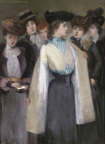
What about a corset worn on the outside? Pierre Carrier Belleuse painted this intriguing image of a group of woman with the central woman showing off her tightly cinched waist and blue-trimmed blouse.
The painting documents such an interesting moment: the act of removing a coat, as well as an interesting time in fashion as styles transitioned from the tightly bodiced and high-shouldered 1890s to the drooping pigeon breasts of the 20th century, and from formal, coordinated bodices and skirts to blouses with interchangeable jackets and skirts.
Has our lady done a good job of mixing formality and spontaneity, and of matching her simple black skirt with an ornamented waist cincher, a blouse trimmed with blue satin ribbons, a buff coat and a front heavy black hat? Or is it all too much of a mis-match?
Rate the Dress on a Scale of 1 to 10


Now this one is easy. I hate the (perfectly described) drooping pigeon breast malarkey. From the waist cincher down it is fine. I am trying to find something nice to say about the upper half, but my 20/21st century instincts are so repelled by the shape that they cannot. I don’t actually even like the colours. Is this just cultural blinkers? The expressions on the faces of the ladies are fun though.
2/10
I’m not a fan of the pigeon-breast look either, but at first glance, I liked the blue trim. I thought the triangular design helped balance out the overall “roundness” of this silhouette.
Then, I looked at it a second time. And a third. And I noticed that the area emphasized by those triangles. And I realized that with the droop factor of that blouse, the last thing it needs is the optical illusion of an enormous bosom! 1/10
This whole thing is so blah. Top is saggy droopy. Corset down is fine but boring. Hat is ok? I guess? I sort of like the color combo, but I sort of don’t. I find that I have to keep going back to look at the picture because the entire thing is so utterly forgettable. I mean, I don’t even care enough to hate it. Difficult to rate because I am so ambivalent towards it. I tend to reserve low numbers for something so vile I can stand it, but it is too forgetable to be worth too many points. Hmmm…
3/10?
I love pouter-pigeon blouses and I love contrast Swiss waists and I even love diamond stripes – but I don’t like this!
The waist comes up too high for the blouse to have a flattering shape, the lower stripes don’t do her any favours, and she should have matched her hat to her coat, not her skirt. 4/10 and I think that’s generous
I like the idea of the blue trim on the bodice. . . but something just looks off about it. The droopy bodice does nothing for me. I am curious to see what the rest of the sleeves look like without the coat.
On the other hand, I love the waist cincher and the skirt.
Bodice – 3/10
Waist cincher and skirt 7/10
Overall – 5/10
Em
I agree on the colors. I like sky blue and black separately, but not together. I don’t care for the bodice shape, either, pinched at the shoulders while droopy at the front. 3/10
This loses points from me because I don’t like the pigeon breast look, but from the waist down I like it. 7/10.
Once I’m done staring at this poor lady’s bird nose, I have to say that I’m not excited about this. I don’t like the blue stripes, the poufy shoulders, and especially how narrow the skirt is. It seems like if you’re going to go through all that trouble of cinching your waist, you should accentuate it with fuller skirts. Also, why did she steal a hat from a man in the 1770’s? 4/10
6/10 – the blouse is nice, the cincher is nice, the skirt is nice, the hat is nice… it’s all nice. Um. That’s it, really. Nice, in a smart, unexceptional way. Nice.
“What should I wear today? Hrm…I’ve been dying to get out great-great-grandad’s old hat from the revolution for so long and show that snoody Elsa who beat whom–you know what? I’m going to do it! It may be a bit dark for a fundraiser, though. I know! I’ll pair my niece’s blue and white day dress with it! It’s a good thing she’s a heavy set child, or I would be a laughing stock without a pigeon-breast blouse. Now then, I need a skirt–this dress is far too short. I’ll use Ma’s old mourning skirt! That will complement the hat! Now I just need a belt… Oh! None of these will do! Oh, I’ve got it, I’ll just wear a little corset on the outside of the top! I’ll be the prettiest girl there! Let me just grab Pa’s jacket…”
I’m sorry, but nothing about this outfit is doing it for me. It looks like she’s blind and no one was there to help her pick out an outfit, so she just grabbed whatever. Separately, the pieces would be better.
Four out of ten.
It looks odd. A black skirt is unobjectionable, even with the tight corset-belt, but the pale, pouter-pigeoned blouse gives a very odd silhouette. I like the blouse itself, though (I’m assuming the long white things hanging down from her arms are the ends of a shawl, and NOT part of the sleeves), and the skirt, and the combination is not necessarily unattractive. 8.5.
I like the hat. If I owned that hat, I would wear it to play pirates with Mme O.
The rest of the combination is just oddly proportioned. Perhaps the coat is obscuring some skirt, making her look top heavy.
1/10, for the hat.
I agree with Daniel. Apart from her ridiculous waist, there’s nothing exceptional about this ensemble. 6/10.
As a painting I like the movement as your eyes wander over the different hats the women are wearing. Don’t you think it looks like she is saying: “Thank goodness I wore this external corset as my monoboob has fallen off.” I think these are working girls coming home on the train waiting in a train station don’t you? So working clothes can’t get higher than 5 can they, unless your job is something fabulous like the Queen of France. Anyway this girl is definitely no the queen of France.
For someone wholoves detail. I have to say: bland bland boring dull and not sexy at all: but I do like the detail on the front of the waist cincher – 3/10
There is a burgundy corset that looks similar dimensions to this one in the collection of the Brain Watkins House that I should post to see if you think it is from the same era. Unfortunately I cannot post at the moment, but will put it up later in the week.
Check it out then: http://zhozhofabart.blogspot.com
I don’t think the painter is recreating a real outfit, he has chosen shapes, colours etc for composition. So not sure I’m taking the whole thing too seriously. I like the bodice and jacket/hat to the left, and of course the ladies around her have great hats and collar details as that is the bit of them we are seeing.
Her coat had to have a white lining to frame her against the dark background and make her the centre of attention. Interesting also that she is in profile when every other woman is either looking out, or seems to be caught in a moment of just looking down. Profile is not her best angle and all the others have dainty, bland faces. So many things to make one wonder about the context of this painting.
Anyway, I quite like it. I see her skirt as grey not black so working for me with the blue. I like the cream and egg shell blue together, and the chevron pleats or tucks or self stripes.
But really, I think I like the painting more than the outfit so 5.
7/10
I like the blue, I like the cincher, I like the suggestion of diagonal pleats in the blouse. Really, there isn’t really anything *wrong* with it, but it just doesn’t have the *wowsa* factor that most of the entries on this blog do. Blame the era (and the pigeon breast).
I love the muted colours but I’m with all those who detest the style. It has the double whammy of looking uncomfortable and grotesque at the same time.
4/10 – mainly for the shimmery satiny sheen of the coat and the blue detail.
I have to agree with the majority here. In theory I should love it (blue and white?), but I don’t, it’s too bland for that.
But it would look just about perfect in a Sherlock Holems TV film or something like that, it kind of defines the era. For that, it’s a 6 from me, because I liked it a lot at first glance. And that still counts with me, and I think it’s what counted with the painter, too.
Holmes, I mean, of course.