Last week I showed you a Gilbert Adrian dress with a simple silhouette and a muted photographic print of bread and milk. Alas, quite a few of you found the colours, silhouette, and print a total dud, dragging the rating down to a disappointing 6.5 out of 10.
I think the dress lost a lot in the translation of time: for us, photographic fabric prints are common, and thus uninteresting, an the use of mundane images on fabric has been done multiple times. In 1951 photographic printing on fabric was groundbreaking, and pop art was still half a decade away. While novelty print fabrics featuring food and kitchen tools were very popular, Adrian’s use of an everyday scene in muted colours turns both the novelty trope and the classical tradition of still-lifes on its head. (Obviously I thought the dress was incredibly clever, subtle and bold, both less and more in exactly the right ways. On a tall, slightly curvy woman with Hepburn-esque colouring and attitude? Oh my! It would make every other woman at the afternoon soiree in Hollywood look cliched, common, and completely un-memorable in their hyper-pretty, hyper-feminine, skin baring, colourful floral, lace and polka dot frocks.)
This week, let’s go back in history 150 years, and look at some menswear:
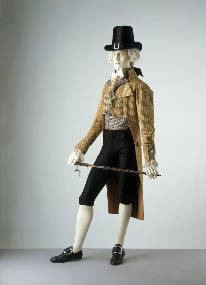
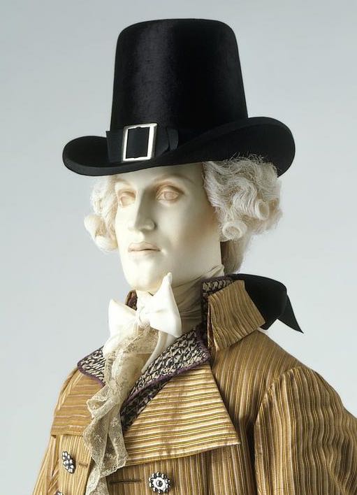
This outfit from the last years of the 18th century shows the transition between the elaborate, detailed outfits of the 18th century gentleman, and the more severe, restrained styles of the early 19th century.
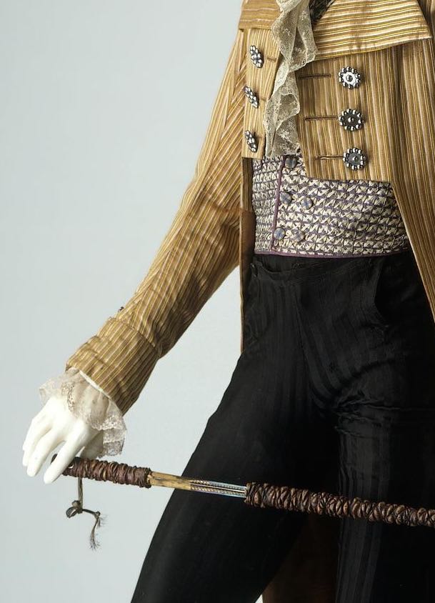
The colours and patterns used in this outfit are definitely more toned down than they would have been a couple of decades earlier, but while florals (or animal prints) have given way to stripes, and cerise to mustard and mauve, there overall look is still layers of detail and combinations of shades. From the satin striped breeches, to the gold, mustard and peach jacket, with shiny, spotted buttons, to the waistcoat, patterned with a lattice of interlocking ribbon, to the lace peeking out from the cuffs and spilling down the waistcoat, and even to the swordstick, with tromp l’oeil branch effect, the whole outfit is about combining texture and pattern.
What do you think? Do the multiple textures and tones add up to sartorial splendour?
Rate the Dress on a Scale of 1 to 10
* I was only able to find the link to the waistcoat in this ensemble on the V&A website, so if you know the link to the other pieces, please let me know!