
Last week I posted a ruffled 1850s dress in muted mauves and puce. Some of you found it far too frilly and fussy, others too muted and boring. Some though, found it oddly appealing, strangely compelling, and liked it in spite of themselves, which is exactly how I feel. It came it at 6.9 out of 10
This 1920s evening coat is attributed to Paul Poiret. The construction is quite fascinating when you study it, and I strongly suspect it breaks down into a series of rectangles, so perfect for ‘Squares & Rectangles & Triangles‘. It’s also got some slight Orientalist overtones.
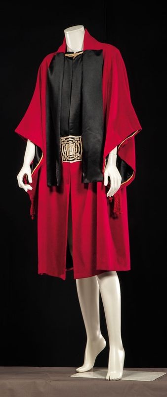
Evening coat, 1920s, attributed to Paul Poiret, via here
I’m afraid the display is letting it down slightly. I imagine it being worn over a full length silk sheath, perhaps something a bit Fortune-y. Or maybe this dress (would pairing Poiret & Vionnet be a bit too much?). You’ll just have to imagine the coat as a full ensemble, or judge it on its merits as a single garment, without being distracted by bare legged mannequins.
What do you think? Do you like the bold red and black? The clever, intellectual construction, with touches of extravagant detailing? Or is it too conceptual – trying too hard to be witty and clever? And does the minimalist cut jar too much with the little elaborations: the tassels and embroidery? You decide!
Rate the Dress on a Scale of 1 to 10
I *love* the Vionnet dress you linked to in your post, but it would be a shame to wear the Poiret coat over it–it would hide the motif on the dress, which is its best feature!
But back to the coat….It’s beautiful, but odd. Not something I’d wear (I don’t look good in bright red, and the shape would hide what figure I have), but beautiful. I think it should be worn over a long, flowing dress (or perhaps wide culottes in matching black). 8.5 (because I can’t decide whether those odd black shawl-like tabs hanging down the front are a feature or a defect).
Yes. 10/10. That is all.
I want to love this, but something is off. Is it because the silhouette isn’t the modern “ideal”? Is it because a black and red combo isn’t as original now as it would have been in the 1920’s? Why do I want to think it could be easily adapted into a comic book costume? These are the questions that could keep me awake at night. The sleeves could be a cape and the medallion in front probably could shoot lasers or emit knock-out gas or something. Yeah, pretty sure that wasn’t what the designer had in mind. Since that’s where my mind went, I’m going to say that it was a good try, but it must be too costume-y for my taste. 3/10.
I think it’s cool. I say 9/10.
I love this coat! Perfect for the era. Gorgeous colour combo. I give it a 9/10.
It kinda reminds me of my town’s high-school graduation (red and black are the school colours) It has the possibility to not look awful with the right dress and wearer so, hmmm….4/10?
What a strange garment. I’m intrigued by the construction as you mentioned, but I still find it a bit… either matronly or somewhat like a boxer’s pre-match robe with the heavyweight belt across the middle. I’m not really digging it. The dress you linked, the Madeleine Vionett dress, is really beautiful and I’d have fawned over it like mad.
This one I rate a 3/10. I’m just not a fan.
I’m not usually a fan of the pillowcase silhouette of the 20’s, but this is quite fantastic. I love the sleeves and the applique buckle thingy.
I give it a 9 because of the two big satin rectangles, they have a cheap, shiny sort of look. The coat would be much improved if they were in a matte fabric, and perhaps if the collar was black too.
You might have chosen this for me! 10 out of 10. I’d give it 11 if you’d let me. The little white legs are very disconcerting, but that’s not the coat’s fault. It would love a Fortune-y sheath. Or perhaps a nice pair of wide black silk satin pyjama-type pants. I have just the pair!
Okay – how do I love this? Let me count the ways! (a) The colours. I have always loved black and red, and that is a splendid deep rich yet vibrant red, and the black satin is perfect. The gold is the absolute cherry on top. (b) The shape. I love the simplicity of the pieces, their generous cut, and the resulting beautiful drape. The way the sleeves are cut, with the point coming down to end in the tassel gives a really pleasing diagonal on a garment that is resolutely vertical in its lines. (c) The embellishment. The gold piping, the gold cord? fastening at the neck, the generous red tassels, and then that stunning embroidered gold on black square placed firmly at womb-height. Just beautiful. And it is the placement of that piece that really dates the garment – isn’t that interesting? Shift that square six inches up, and it’s 1930s. A kimono is a kimono, in many periods, but this is just so of its time.
A ‘forever’ garment!
I love Poiret, so definitely a 10/10 for me. I’ve already decided to do designs for him for both Rectangles and Orientalism.
I love the simplicity of his construction after the fussiness of previous eras – (don’t get me wrong, I do love me a corset!). It is the contrast of the elegance of the lines with the restrained use of rich embellishment makes his pieces work for me. Sadly I’m too busty to wear most 1920’s fashions but can definitely manage a coat.
This particular colour combination doesn’t appeal to me, I’d rather have seen red with taupe, but it still gets top marks 🙂
I think it’s the display that makes it kind of…unfinished.
To me, it seems look something is missing from the piece. I thought that Poiret’s tops were always paired with some skirts or harem pants. And he did this awesome black front piece and that’s it. No more black, as far as I can see, in this garment.
On a positive note, it’s a very practical wardrobe piece. Beautiful colors and I really like embroidery on the front.
9/10
Brilliant. 10/10. I love the colours and the shape and the clever construction.
I adore this piece, and I think that black dress would be marvelous under the coat. I’m glad the red isn’t really a really “red” red, if you catch my drift (though that may just be my phone screen)–the color works greatly with black, unlike primary red (at least in my opinion, from what I’ve seen, though I’m not saying it absolutely can’t be done). Oriental influences in garments excite me, and this is no exception! The only thing I don’t like is the black scarf-like strips and the fastening at the neckline. If the maker of the garment had made the red part above the black rectangles look more like a separate collar (like it was a black scarf underneath a red pointed collar), I would have liked it a little more.
Eight out of ten for today.
10/10. Oh yes. This is simply gorgeous… I had to come out of my usual lurking about to add my vote.
I love it.
The inside of the sleeves… the gold…the black…the red…the shape. but the legs! it shouldnt be allowed to display such clothing with plastic legs all unadorned.
9/10
9.5 out of 10.
I love it, I adore it, red and black are my colours, and I think that shape would be flattering on a lot of figures. Pair it with black culottes (as someone upthread mentioned) and it would be just about perfect!
The only thing that brings it down that half-point is the tassels. Nope. Too far. Take them off and it would be a ten.
I love it! 9/10. The only issue is the gold square being a bit uncomfortable-looking. I see it as being worn over a draping black soft ankle-length gown.
mymuseumoflondon.org.ukPuts me in mind of a perfume bottle…….and then I Googled Poiret and read his started up perfume and cosmetic companies. Doh!
Have you seen this frock?
http://www.mymuseumoflondon.org.uk/blogs/blog/miss-levy/
I’ll pass on the vote as I am new to your blog and still drooling through your archives. I’m in Heaven.
Something’s a bit off about the black in the front. Wrong proportions or something – I cannot put my finger on it, but it keeps bothering me.
9/10. It’s stil gorgeous, in its own way.
Intriguing, but not bowling me over. 6/10
Incidentally, any UK readers who want to see a REALLY distracting presentation of a coat should get themselves to the Fashion Museum in Bath, and the “50Fabulous Frocks” exhibition. That has an embroidered 1780s man’s coat displayed on a mannequin with no other clothing at all. Very disconcerting indeed.
It’s not my usual style, but for some reason I love it anyway. Love the colours and the shape, 10/10
It’s like a stylized version of a judge’s robes, actually, apart from the decorative piece. I do like Poiret a lot, although for me, many of his designs, particularly later ones, tend not to bear up to closer scrutinyu and inspection. I think I would adore this coat as part of an ensemble, but in isolation, it feels as if it is lacking something. So I will rate it 6/10, but it would probably have been closer to 8/10 or even 10/10 if it had been part of an ensemble.
I feel exactly the same way about Poirot. I think he had a lot of brilliant ideas, and then ran out of steam, and didn’t have Chanel’s talent for ‘borrowing’ ideas and then taking the credit for them (oh yeah, I went there!), or reinventing the same look over and over again. And certainly finish was never his strong point. He was an ideas designer, not a construction and finish designer.
Love it! 10/10
Gorgeous. Quirky. I’d love to see it move. 10/10