
Last week I showed you Maria Feodorovna in muted blue and lace, all 1870s Russian empress. Most of you found her and her frock very attractive, and yet, something wasn’t quite right about the ensemble for most of you, and you couldn’t give it your wholehearted approval. So it came in at 8.3 out of 10. Not a divided 8.3 (there wasn’t much range in the ratings), but a rather unanimous 8.3 where (almost) everyone liked it, but few thought it absolutely perfect.
It seems appropriate that today’s Rate the Dress be green, and while I kept finding amazing green frocks I wanted to show you, they were all in tiny, terrible images, so I ended up choosing something that I suspect I already know what you are going to think of, which I hate doing. But I might very well be wrong, because I often am!
This week’s selection is going in to all sorts of dangerous waters: it’s by Charles James (and let’s face it, you haven’t been the biggest Charles James fans since the infamous ‘is that supposed to look like lady bits?’ dress I posted exactly years ago), and it features one of his attempts to dabble in surrealism (another thing you don’t often care for), and it is quite boldly patterned fabric (but at least it isn’t whale paisley). So rather risky!
But it is clingly 1930s glamour, which is often popular, so perhaps you’ll love it! What do you think?
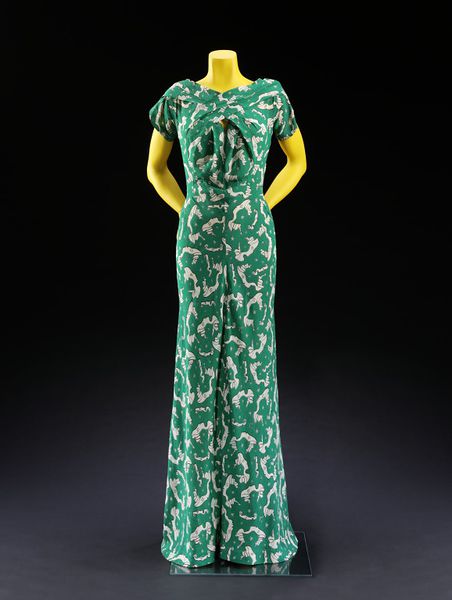
Slinky 1930s silhouette…
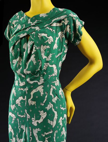
Masterful pleat details in the bodice…
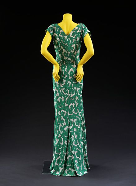
Sexy back silhouette…
Oh, and have you noticed the fabric?
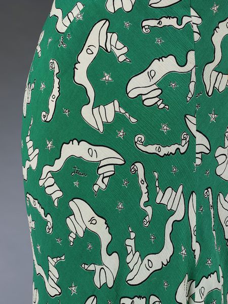
What do you think? Pairing busy prints with elaborately cut garments was quite typical of the 1930s, but usually the fabrics were cluttered florals, not wild twisting profiles. James usually worked his sculptural manipulations of fabrics in plain textiles, to better show off the seaming and pleats: to the point where even in his own time the clinging evening gown in one colour had become a cliche. By using a mad surrealist print has James successfully subverted both the trends towards cloying florals, and almost aggressively feminine and seductive silhouette that sometimes typified 1930s evening gowns?
Rate the Dress on a Scale of 1 to 10
* And apparently the dress is on display at the V&A at the moment, if you are lucky enough to be in London…
Love the back.
The front looks like a preamble to chest-bursting scene from Alien — the pouffy detail created by the fabric manipulation is in an unfortunate place.
Don’t care for the print, not because it’s surrealist, but because it gives the visual impression of things wriggling all over one, and upon close viewing, those things have faces.
5 of 10 for the back half.
I think the dress looks fabulous, but then I’m a sucker for the slimm 30s silhouette (probably because I would probably burst the seams just by looking at it, I wouldn’t even have to try it on).
The colour is unusual and just stunning.
The only thing I don’t like are these strangely pale and maimed ladies heads. Don’t know why anybody would put this on fabric, but I suppose it was le dernier cri when produced.
I award it 8 points.
(This is FUN, BTW. Just like the European Song Contest. *g)
I am a sucker for sophistication. Bring me back to the Algonquin Room — please! 9,5/10 only because someone may not like the shade of green (BTW, Loved the blue paisley!)
I love the green color of the fabric and love the silhouette. The face fabric pattern is a little creepy but, as you said, it’s a refreshing change from the usual floral patterns. Also, I never liked keyhole openings in the front of a dress, but it’s not too bad here and overall I like criss-cross shape of the bodice.
But overall, I really like the dress and think it’s simply lovely
9.5/10
I’m going to venture that the front pouf was a little more laid down during the original wearing. I think it is fun, and I approve of subversive. It reminds me of Fiona Apple wearing an apple-printed dress in the 90s, or some of the fun patterns that have shown up more recently on the red carpet (are we going to get an Oscar dress column?)
9/10
I love the shape, the details, the tiny peek-a-boo, and oh my do I love that fabric! I love the colour, and I love the creepy creepy little faces. So unique and strange. Solid 9.
I love it. Although I do agree with one commentator that the fullness at the front is a little strange I am willing to give it the benefit of the doubt and assume that it will be fine on a live model. The pleating (and cutting) on the other hand is fab.
I give it 9.5 out of 10 (just in case the puffy detail looks odd when worn
I like the print but hate this color green, I like the silhouette but hate the ‘saggy boob’ front part… what is going on there D: I would never pick it to wear it myself.
I rate a 5 out of 10
Love the print, HATE the dress. I’d love to see this print on a skirt with minimal seams.
And, I love fabric manipulation experiments, but on solid fabric. If he was gonna do the crazy front cross-over crease sculpture thingy, it would have benefited from a solid fabric. And, I hate the center and diagonal seams at the front because it breaks up the print in a really awkward way! Argh. I don’t think you’ve posted a dress that’s upset me this much, ever. So much squandered potential!
3/10 for sheer frustration
When I first looked it I didn’t like the draping in front, it looked too poofy, but I liked the print. On the close up photos I got impressed by the draping and fabric manipulation, but the print put me off with all those faced. I like the general silhouette, and the colour is smashing. All in all I think it’s a 7.
For one thing, it doesn’t help that it’s on a yellow form!!! ;P My first impression said I didn’t like it, but I think if it was worn correctly, with the proper accessories, and hairstyle, etc. it might actually look good.
6 out of 10
I love it! 8/10. What a print….
Can I give this an 11? No? 10 it is, then. I think this is simply delicious. To the point that I have the strange urge to taste that juicy green fabric – Cocteau would be pleased. This is also one of the few 1930s dress cuts I’ve seen that makes any accomodation for a bosom at all. The faces are sinister, other, mask-like – an ostensibly beautiful print that says so much. Perfect for your lesbian salon or for sitting patiently through a Futurist dinner party.
Now I’m going to go Google Cocteau fabrics@
Love it and would give it a 10. Looks like it’s for someone with a bigger bust. Whoever she was, she must have felt like belle of the ball in that boho dress. Is it cut on the bias?
Love the silhouette, love the green, so vibrant. I have mixed feelings about the print, though. I seem to like some of the profiles more than others, and some I quite dislike. I got distracted, trying to see how many different versions there were.
I really like the criss-cross, but feel a bit less happy with the pouffiness under it.
All in all this is a 7 for this interesting dress.
Gorgeous construction and I think that the ribbon-y faces match the flowing lines perfectly and the wee stars give it enough spikiness to stop the effect being too matchy. Adore the green, it’s definitely my sort of colour. Loses a point because… actually, no, it doesn’t lose a point – 10/10 from me.
This one is definitely a 10. It´s simply amazing.
Very few people have a lot of green in their wardrobes, so when people try to dig up something green for St. Patrick’s day, they usually find something unattractive.
This dress reminds me of that phenomenon. It is green, but a little too blue a green to really speak of spring. It’s not a shade of green I like.
I also don’t care for the print. I admit I generally prefer solids and very simple patterns (stripes, polka dots, restrained plaids). This print looks elegant and clever close-up, but from a little distance looks like either impressionistic clovers or a mold colony.
Finally, though the silhouette is elegant in general, and I like the styling of the dress from the back, I’m one of the people who dislikes the poofy detail in the front.
So I come out with a 5. Sorry, I have too many problems with it to give it anywhere near a fabulous grade.
It reminded me of this German children’s song “Green Are All My Dresses”.
And I’ll give it a 6, for the cut and the shade of green. But somehow, the faces are a bit too much. 😉
My first thought was that I don’t like the cut at all. My second thought was that the print is fabulous. I’d like to give it a high rating because of the print, but I really don’t think this is the right dress for that print, and I suspect I’d think the sleeves and that weird pigeon breast effect in front were ugly no matter what fabric it was made of. 4/10 is the highest I’m prepared to go on this one.
Fabulous…and love that the fabric is by Cocteau…..9.5
I love most things about it but the middle front reminds me of the sandworms in Dune…. I just can’t get over that visual. Love the neckline though, as well as the seams that form the waist shaping….
4?
10/10
Of course Charles James is a master but oh my lord that print! So wonderfully quirky on what could have been a very stuffy dress.
I love the silhouette, quite like the fabric but am displeased by the mess over the bust so I’ll give it a 7.5
The front of the bodice is a giant bellybutton. Why?
I see nothing about this dress that I like. The construction details are all jumbled looking and the print is blobby faces on squiggly white scrolls. Ick!
I find the shade of green rather repulsive, especially when paired with the white, but I think that this is at least partly due to the way it contrasts with the ghastly bright yellow of the mannequin. That colour belongs on dandelions.
The more I look at it the more I hate it(and I’m not even in a bad mood right now). 1.5/10
I like the pattern. I like the cut of the dress. Just not sure if I like them together. It’s not hideous, but neither does it thrill me. 6.5
At that first photo from afar, I thought, “ugh, it’s weird there in the center.” But up close, it’s divine. Isn’t that what you’d want in this dress? Someone to come close and ogle your chest? While you drink a G&T? 10. Love the color, love the cheekiness of the print and cut, and love the come-hitherness. Which is a word I apparently just made up.
Yes, love. 9.5.
Nope. Not feeling this at all.
I rather like the cut (maybe minus the poofy bit in front) and love the slinky 30’ies silhouette, but there are no words to adequately express how ugly I think that print and the green colour are.
3/10
10 / 10, naturally!
Somewhat distracted by the mannequin’s achy back, but perhaps she’s just trying to draw even more attention to the Thing on her front. It’s a pity that the otherwise beautiful cut/drape is completely overshadowed by the contorted mass in the middle. Although it does disguise the unmatched seam centre front.
On a more minor note, the print seems a little large for the (otherwise) sleek cut of the dress.
I’d say a 4.5 from me.
It’s all sorts of gorgeous, except for the blousy front which is out of place in this slinkyness and once more, makes one wonder… um. No specific idea there, but it bugs me just as well.
Plus I’m not a big fan of slinky 30s in busy prints to begin with, so I’ll give it a 7.
I’m a fan of this dress. I’m not a fan of florals, so this print piques my interest. Beautiful colour and lovely cut.
I’ll give this dress 8.5/10
Ten out of ten. But I’m biased. This is the dress I chose as the Textiles and Fashion object for LGBTQ History Month a few years back. The print is by Jean Cocteau and apparently shows him and his new boyfriend, Jean Marais, gazing at each other in their new -found love – something you can bet the lady who wore the dress probably didn’t know. I love how the sleeve swirl out from the bodice and spiral round under the arm to become sleeves. It’s much more wearable than his later architectural gowns, and I think it is wonderful on so many levels.
I love this background story, I’ve been watching Jean Marais in La Belle et La Bete for the upcoming HSF challenge! Thanks for sharing!
I’m active in LGBT rights, and it’s amazing how little I know of queer history. Thanks for sharing.
And I cannot WAIT to see what La Belle et La Bete inspire!
When I picked this dress for RTD I thought of you, and knew you’d have something fascinating to say about it! I kinda hope that the lady who wore the dress DID know the background story! 😉
It was given by the designer though. I wonder if that means it was only ever worn by models?
I’ve an idea that James was known to get back in touch with his clients to demand his dresses back once they were done with them, or that they give his work to museums for posterity.
I love it! Even though it is an ‘evening dress’ it has that casual, confident, Kate Hepburn-ish confidence that doesn’t need a lot of fluff to make an impression. Just glide in an hold the room enthralled with your self-confidence. I enjoy this surrealist period in fashion.
9/10 for me.
Why am I thinking of Nora Charles, sitting with a martini glass at her elbow, waiting for Nick to either say something shocking to one of her stuffy relatives, introduce her to yet another guy he sent to prison, or unmask the high-society murderer?
My second thought was “Charles James? Seriously? Where’s the civil engineering grade understructure?” Which is a base canard, because when he started they were all in full flapper mode.
My third though is 8/10, because this is a dress for a woman who wants to make a noise, and on the wrong woman it’s going to be dreadful*. Also, match the damn front seam. Dammit.
*If for, example, you aren’t the type that makes a noise and enjoys the attention you get as a result.
Stunning! I love the colour and the pattern of the fabric. And, of course, the actual cut of the dress is gorgeous. The surrealistic faces made of ribbon are seriously cool! I would totally wear this! 10!
10. I saw this at the V&A and I Want It! Gorgeous. I’m not usually much for green, or surrealism, but it just works.
I think I like the dress. I get the sense that the print might give me nightmares–it reminds me of some vague nameless childhood horror, and I certainly wouldn’t want to see it anywhere but in a well-lit room with lots of people. But that’s a personal reaction and actually makes it more fascinating. So like an 8? Because I wouldn’t want this dress in my closet.
Like the back, don’t like the front (to me it looks like an angry face in the first photo), find the print interesting
5/10
I love the silhouette and the print, can almost feel the texture of the fabric but that green reminds me of feed-sack/flour sack green. It’s so blaaah – it’s beautiful
8/10
Dreamstress, I have just recently discovered your wonderful blog again. 🙂
I actually like this dress quite a lot even though I am no big fan of green and I think the print is rather hideous from close-up. And the weird burst-up area in the front is really not very flattering (I like the comparison to “Alien” that one of the first commenters made)…surprisingly, I still like it though because it has very pretty lines. It almost looks like a stylish jumpsuit. I think the weird front part is the only thing I can’t accept. Color is a matter of taste anyway so that shouldn’t reduce the points and the print is still a lot better than the whale paisley (OMG!) because it actually looks quite good from a distance. I’d say 7 out of 10.
For me, this one is no doubt a 10. Nice lines, nice color, uncommon print. Also, is it sewn on the bias? I can see a thin redhaired model inside the garment. Gorgeous!
I don’t know if someone with a fuller bust than the mannequin would make the pouching at the front a little less… pouchy, but if not, it’s the only thing I don’t like about this dress. Love the print. 7.5/10
I love this dress so very much! The color is amazing and the print is very out there but in a cool way. Of course the 30’s silhouette is beautiful. 10/10
Front construction lovely. After that, there is not one thing to recommend it. 3/10
Oh my, I think I have gone to dress heaven. This dress is like a TS Eliot poem, full of layers of meaning and the more you look, the more you see.
The scrolling faces echo the folds and flow of the construction. All those clever, playful lines that reveal themselves with time.
And yet it has impact before the details set in. It is sophisticated, playful, intellectual and sensual.
I can’t fault it. Not loving the WTF yellow dummy, but that’s not the dress’ fault!
27/10 (which I guess means 10/10) 😉
Hehe, I love how enthusiastic you get about things you like! But yes, no more than 10/10! 😉
Dang, I want to play too, but the “subscribe by email” just doesn’t seem to work! So I’m late to the party 🙁 Anyhow … love the pattern; it’s so ’30s surrealism, all doodly and weird, with a graphic deco flair that makes it look like a hallucinated theatrical program. I’m not a fan of all-over prints as a rule; I just prefer more variety and a less in-your-face style. But this is unique, plus it’s got to earn an extra point for Daniel’s wonderful back story on Cocteau. As for the green, I’m mixed; it seems like the kind of shade that would look great in a faded old smock from the back rack of a vintage store, but not so wonderful fresh and bright. All in all, I’d rather have it in fabric and put it on a table. But I’ve got to appreciate the impact it must have had … I’m picturing a flamboyant and theatrical lady surrounded by goggle-eyed martini drinkers and trading brittle repartee while these avante-garde faces crawl up and down her dress, which (being a ’30s dress) has that great silhouette … so it gets an 8/10 for cool design and the fun factor.