
I did wonder what you would make of the 1950s Paquin dress last week. I find it emotionally appealing, because it reminds me of those flowers so, and aesthetically not quite as appealing, because it looks exactly like a dress based on those flowers which I would have designed when I was, I don’t know, nine? It’s just so literal. In the end, I was the opposite of Fidelo: I wanted to hate it, but I just couldn’t. I also couldn’t love it though, and so the 7.3 out of 10 that you rated it is just a teeny bit higher than what I would have given it.
I know this fortnight is supposed to be Separates, and I had the perfect Separates ‘Rate the Dress’ all picked out, and now I can’t remember where on earth the link is, and all the other separates I can find seem to be beige and white, and I’m quite sure you’ve all had enough of pale tones for a while, and it’s time for something vivid and colourful!
So today’s Rate the Dress is quite vivid and colourful, and slightly inspired by last week’s Rate the Dress, as the paisley design rather reminds me of sea creatures.
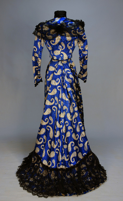
Afternoon dress of printed silk satin, ca 1902, via Whitakers Auctions
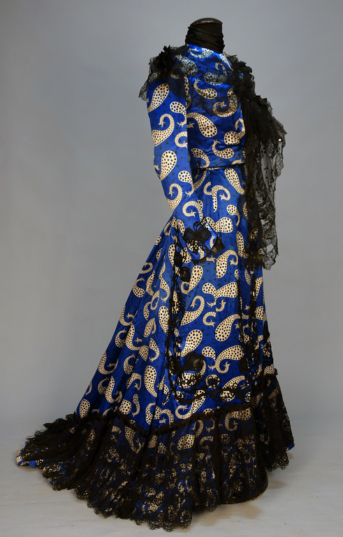
Afternoon dress of printed silk satin, ca 1902, via Whitakers Auctions
The fabric is certainly very bold, and vibrant, and distinctive. It’s also surprisingly modern, which shows that modern isn’t as modern as we think, in some ways!

Afternoon dress of printed silk satin, ca 1902, via Whitakers Auctions
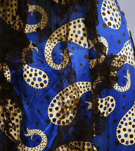
Afternoon dress of printed silk satin (detail), ca 1902, via Whitakers Auctions
Modernity actually seems an apt theme for a dress from the turn of the century. What do you think? Is this the way to blend bold modernity and old fashion femininity, the way to MAKE A STATEMENT in a sea of pastel frocks, or has it missed the mark?
Rate the Dress on a Scale of 1 to 10
Although normally I love early 1900s garments, this is just an assault on the eyes. The print is extreme, all harsh contrast and too large-scale and reminds me of disease parasites. I know the black lace is supposed to coordinate, but it just doesn’t quite do so for me, so it again reminds me of disease, as a moldy overgrowth.
3/10 because I still like the shape
It’s whale fabric! I’m actually a fan of the blue color, but the paisley print isn’t much to my taste, even if the shapes do look like little whales. It’s a bit too big and makes the dress look like it was made for someone REALLY short. A smaller print wouldn’t have had the same effect, I think. I’m also not keen on the black accents. It’d be a bit different if you couldn’t see through it, but as it is, I really don’t care for it. If you’re going to go all out with a shade of blue like that, I say make ruffles at the bottom and neck out of the same fabric. With the black on there it takes the dress from bright and cheery to dark and somber.
I’ll give it a seven out of ten for not being in the wrong direction. It just isn’t headed completely in the right one.
I may be harsh, but for some reason the black lace and the BRIGHT blue just aren’t mixing very well for me. 6 out of 10, though I want to go lower than that, except that it might look better without that shawl like thing.
Me too! The black lace against blue and gold just ruined it! That fabric belongs on couches, not on people.
3/10 (oh dear, so low!)
I love this shade of blue, and the paisley, and the lovely shape, but not such a fan of the black lace over it, especially at the bottom. I’ll give it a 6/10 with the 4 points off largely for the weird effect of the tan paisleys peeking out of the lace at the very bottom of the skirt.
Much as I like the shape and colour, I despise paisley in all forms so I must give it a 3
The lace is beautiful but the print takes away from it and you just don’t know where to put your eyeballs. I give it a 4 as is. The lace really is beautiful, though
I love the shape. I also love both the bright, bold blue and the black, and I usually love a combination of the two. But this, somehow, is less than the sum of it’s parts to me. The floral lace and the modern-ish paisleys with the dots in them don’t really go together very well. They seem to be elements of two seperate and very different dresses, as ifthe lace from another dress got stuck on this one by accident.
I’m also not keen on the tan paisleys. That colour just doesn’t go with neither the blue nor the black. It’s just … there.
For the blue+paisley dress, instead of lace, pleated rows of matching blue or tan fabric would have been a better trim. Or polka-dotted mesh instead of floral lace. Also, maybe not black, but beige.
Actually, they do look like parasites.
3/10
Missed!!! By a long shot. The only not horrible thing on this dress is the lace at the bottom.
1/10
At first I was all like: OMG! SO FABULOUS! ALL THE BLUE! GOLD! CRAZY RUFFLES! LACE!
Then I saw the front and my happy bubble burst.
What’s with the giant lace beard down the front?! I can only hope it’s the remains of an overlay or something…
9/10 for the back, 3/10 for the front, overall score: 6/10
The black lace kills it for me. The shape of the dress is nice, and the blue color is fantastic, but the black lace and crazy print are just too much going on in one dress.
2/10
I love the print and the color, so exciting! The lace, however, does not go with it at all, and it’s so ugly and somber. Take the lace off and we’d have a fun, fabulous dress.
5 / 10 from me.
This is a perfect costume for the character of the Embarrassingly Outspoken Elderly Female Relative who Gets Into the Gin a Bit Early in some very English play or other.
I’d like a bag or cushions or something made out of that paisly though.
1/10 for the fabric that should be awesome but isn’t in this context. Unless this is actually a costume for the stage, of course.
I had to go away awhile and ponder this…it’s just so, odd. I actually love the fabric, and would totally wear it, but in this context no. Just..no.
I think you summed up my thoughts exactly on who would wear this! 1 out of 10. I know I’ve ruined my fair share of fabric, but all I can think is that somebody somewhere should have known better.
YES! You nailed it! Or may be it is Crazy Aunt Bertie upstaging the hostess again. Love the blue. Love the shape. Love the lace at the bottom. But the print and the crazy lace shawl thing are loud and UGLY! 1/10
Hahahahahaha! Hahahahahha!
Oh, I want to give it a 10 because I love the fabric, colour and print. but… that black lace. too much 80’s sensibility for me!
So it’s a 6/10, sadly
I have never seen a garment in real life that so resembled one of the works of Edward Gorey. And +2 on the black lace taking it out of “so bad it’s good” territory. A 5, simply because I can see it somewhere in the background of “The Gashlycrumb Tinies.”
1/10
The only mark it receives is for the vivid blueness of the silk.
Otherwise it looks like a lot of amoebae swimming in a pond. The print is too big, and really the whole thing looks like a 1990s satin dressing gown with a big strip of lace tied around the shoulders in a big knot. Oh and lace dribbling down the front, and a lot glued on at the bottom.
That busy, big pattern clashes with the fine lace, especially at the bottom where the lace is laid horizontalyl on a swirly print.
Take away the print and have that lace on a solid blue dress and it would be different – the lace would stand out, and where it swirls down the cuffs and front ,and the waterfall on the bodice would look lovely.
I love the bold print and the overall shape of the dress, but the lace doesn’t fit at all. The delicate lace doesn’t match the feel of the large-printed fabric. In my opinion, the fabric could have stood alone, without requiring a lot of embellishment. 3/10 from me.
The color and print are very bright and cheerful. But unfortunately the cheerful doesn’t, in my opinion, save this one from being ghastly. The print looks too much like something a grade schooler might have designed, and the black lace dripping from it looks as though the wearer walked into the sea and some seaweed stuck onto the dress in random places. I can’t go higher than 4 on this one.
Wow! The first thing I thought was Cruella De Vil in a bordello. The second thing I thought was that this is what Cheery wore to the coronation. It’s just, like, all wrong. Was the lace added later? I give it a 3/10.
Well, I love electric blue and I love paisley, and I think I love electric blue paisley. What I don’t love is the black lace trim. To me, it looks like the dress has mould growing on it. 4/10.
I love the print and the colour is stunning.
I think that the black braid is a bit lost in the bold print, though. I think that the lace might have looked better in a cream to match the paisleys and lighten it up.
Soooo Maybe a 7/10
Beautiful, but not as beautiful as it could have been.
Love the fabric, hate everything else. 3/10 for the print alone
Yuck! If it was just the blue with the black lace around the hems then it would be nicish, if they removed the vomit of lace on the bust area.
I like the paisley, but not on that dress, it needs a squishy sofa. 2/10
hideous. all of it. especially the lace front thing.
0/10
What a figure this woman must have cut walking down the street! I love the modern sensibilities of the fabric but agree with most everyone else when I say why, why, why throw on the lace? I could almost handle the heavy piped motifs on the cuffs, but that explosion of black froth at the bottom and down the front? Noooo. Dress sans lace 7/10 for chutzpah, dress as it is 2/10.
Love the fabric! It does indeed look so modern. If only they had left off the black lace – it would have been such a sleek, smart outfit. That bit outlining a sort of pseudo apron at the front is particularly bad. One of those cases where the fabric is way ahead of the courage of the dress designer.
I’m trying something here – ignoring everyone else’s comments until I have finished my own.
7 out of 10
ICK!
oops, & 1/10
What a waste of lace! It might have scraped a 4 if it weren’t for that, as the lace scrambles the already confusing pattern. Really, really hideous. That lace would look so beautiful on a plainer dress.
1/10.
AIEEEEE~! MY EYES! MY EYES!
😛
On a more serious note, I have to agree with everyone who said it would look much better without all that black lace. I like the little black bows and piping etc on the sleeves, but all the foofy bits around the hem and the black lace dribble down the front, no. 5/10
I like the shape of the skirt (I’m not sure about the bodice I can’t see enough under the lace.) However, I tend to like things that are rather understated, even sedate, especially in regard to colour and trim so whilst I like the blue I would prefer it if it were left to shine on it’s own with minimal trim (perhaps a small amount of lace or plain black bands or something of the sort). So I don’t think adding a pattern that is equally as eye-catching as the blue and loading it all down with a lot of lace was a great idea. 2/10
Oh My.
Really, NO.
2/10.
The elements would look great anywhere else. Just not like this. And the pattern mismatching down the bodice back is an extra level of OFFENSIVE. Two points for the gorgeous blue and the lovely lace and fabrics, but together – NO. NO. NO. NO. Just NO.
I would elope with this fabric for a wild fling somewhere, possibly in a 1950s style fit and flair sort of dress. Or maybe in a late 1960s A-line.
One wonders if the original owner was sober when she placed the order with her dressmaker, and the dressmaker hated her and talked her into it.
Or perhaps she was the sort of woman who wants you to know she’s terribly artistic and daring when she just has no eye for style or what’s becoming to her at all.
The fabric–interesting.
The lace–nice black lace, never hurt anyone in its life.
Together–two great tastes (well, two interesting tastes) that don’t taste great together.
0/10. Because it’s a sin to waste fabric.
Perhaps the owner was very tall. Sometimes people tell tall women to wear really bright colors because, “you’re so tall, you can carry it.” 🙁
“Or perhaps she was the sort of woman who wants you to know she’s terribly artistic and daring when she just has no eye for style or what’s becoming to her at all.”
You’re totally right. This is a dress for Edina off Ab Fab.
I’m not sure I like, no let me rephrase that, I KNOW I don’t like the lace bit at the top. It looks like they just plopped it on as an afterthought. I don’t mind the lace at the bottom, and I do like the black sutache around the cuffs…perhaps they should have just done that around the hem and on the bodice. Either way, I love the fabric. I always love the printed fabrics of this period because they seem so modern and they are fun pops after all the solids! Overall, I give it a 7 out of 10…the printed fabric totally carried it!
I like how the bold blue color and crazy pattern make the dress very ahead of its time. However, as a whole, it’s a mess. The black lace completely clashes with the crazy pattern. In fact, the dress never seems to ever come together…it’s just a jumble of black lace, bold blue, and crazy pattern.
And the color combination of black and bold blue just doesn’t work here (perhaps it would have if it was a plain blue dress). There’s just too much going on. The crazy pattern would have worked on a much simpler dress in the 30s or 60s.
3/10 (being generous)
I have a weakness for the horrible obnoxious prints of the late 1960s, and so I admit I really like the fabric! That shade of blue is fantastic. But that black lace, which would be lovely on another dress, is just jarring and wrong on this one. 6/10 because I like the fabric that much!
I find it to be a rather violent assault on the eyeballs.
The black lace itself is lovely, and the placement of the lace is nice, except for the bit that hangs down the front too far. But this fabric is so very, very wrong for showing the lace off. The intricate design of the lace is completely lost against the bright blue and the thrashing giraffe tadpoles. Actually, up close they look more like the hands of a Dr. Seuss character.
The print itself isn’t actually that bad, it’s just completely wrong for this dress.
4/10
This could very well be the ugliest dress you’ve yet chosen for Rate the Dress. HID.E.OUS.
If only they’d stopped at the shape (back skirt is lovely) and blue fabric. Every idea they had after that was bad.
0/10.
0 isn’t on a scale of 1 to 10 😉
Oops.
The black lace just doesn’t do it. It looks like the designer wanted to trim it with SOMETHING, and couldn’t find anything that worked well, so used a lesser evil. Should have gone with a self-trim on the bottom, a bit of ruffle on the front, and nothing on the shoulders. The fabric pattern is just too bold to play well with anything.
Little whales everywhere! That combination of colours is giving me a headache. And the black lace around the bottom just doesn’t seem to quite fit.
3/10
3/10 It’s all sorts of wrong in my eyes, but yes, the shape underneath it all is still pretty.
Oh dear – makes me think of a drag queen! The only thing I like is the sleeve trim – so 1/10