
Last week I showed you a 1920s dress in aqua and gold lace with velvet poppies trim, and you DID NOT LIKE IT. Ok, a rare few of you loved it, but most of you didn’t: you had trouble envisioning it as it would have been worn in the ’20s (yes, it would have had a slip, almost certainly in a slightly paler shade of aqua), you found the poppies too heavy and clashing, and didn’t like the transition from lace to satin. For general dislike, the dress came in at an extremely disappointing 4.7 out of 10.
This week to make it easy to visualise the whole picture, here is a whole picture:
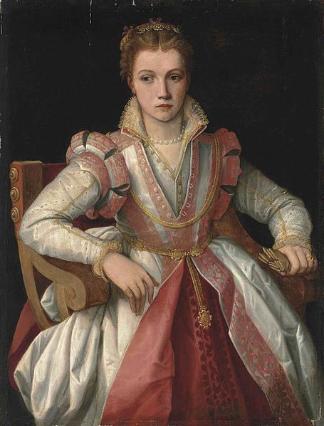
Portrait of a Lady, Follower of Francesco Salviati del Rossi, 16th century
We don’t know who the artist of this portrait is, or who the subject is, but the portrait does give us all the details of her ivory and pink dress.
The dress features heavy ivory overskirts, lined in carnation pink, with border of brocaded patterned trim that extend up on to the bodice in stripes. The same fabric forms slashed shoulder wings
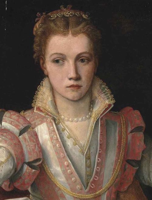
Portrait of a Lady, Follower of Francesco Salviati del Rossi, 16th century (detail)
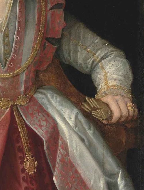
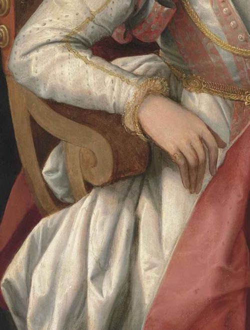
The separate sleeves are probably made from the same heavy silk satin as the skirt, but with delicate pinked slashing, narrow gold braid, and fine blonde lace trim around the wrists.
Portrait of a Lady, Follower of Francesco Salviati del Rossi, 16th century (detail)
Around her waist she wears a gold belt. Further gold chains hang around her neck, and gold buttons fasten her under-bodice.
Portrait of a Lady, Follower of Francesco Salviati del Rossi, 16th century (detail)
She wears a string of baroque pearls around her neck, and her hair is drawn back simply from her face, with a fillet of pearls sitting high on the crown of her head.
Whoever the sitter was, she was clearly wealthy: her dress and jewellery would have been extremely expensive, and the portrait is quite the status piece.
What do you think of the unknown lady and her ensemble? Has she pulled of the perfect blondes in pink look?
Rate the Dress on a Scale of 1 to 10
For this era of heavy fabrics and buttoned-up stiff necks, this is wonderful. 10/10
She looks almost like she’s too small for the chair she’s sitting in, but that’s not the fault of the dress.
My thoughts exactly. What a beautiful softening of the style. And I love the combination of soft white, soft pink, and soft gold.
Ten of ten, taking in consideration the stiffness of the period.
And I still love the twenties frock.
What disturbs about the dress is that it makes me question the “lady”‘s age. I cannot decide whether she is a fresh-faced 20-year-old with an forcibly infantilized upper body shape or a 12-year-old that has been aged up in the face by the painter/whoever is responsible for her hair, eyebrows and lip color. It gives me the creeps either way.
But the dress with its flattened bust, high and wide waist and narrow shoulders bears most of the responsibility. It gives it the shape of christening gown. On its own, it would get perhaps a 10 or 9 (it is very pretty). On the lady it gets 6/10.
Wow. So I Loved last week’s dress and this week’s dress. 10! The ivory is lovely and her expression is possibly the best portrait expression “things are happening just over there and they could be cool”. I don’t usually like pink and yet this is just so lovely.
I’m usually not a fan of pink but this hue, combined with the white and gold is just beautifull. I love the whole dress, the layers, the way the colors are spread out over the whole, and the patterns/textures. I feel it’s very well balanced.
10/10
What an exquisite painting. It’s so detailed and clear – you can almost feel the crips silk and hear it scroup. I am ridiculously in love with the neckline that reminds me of an Airtex shirt – the string of pearls and this echo of a modern, counties look tickles me no end. Of course it has nothing to do with the dress. But I love all the fastenings and layers and details. It is quite full on, but the restrained colour scheme means it is not too overwhelming.
I wonder what she is thinking, is she hoity toity, refusing to meet the eye of the common painter, is she bored? Is she terrified that the husband the portrait is meant to tempt will be a violent boor? And what is she holding Whatever it is will no doubt be meaningful.
I have to give it a 10.
I have always loved this dress, one day I shall make it, 10/10
It’s a lovely dress, but just short of perfect to my eye. 9/10
Quite an unusual style for 16th century; it uses a lot of the standard 16th century fashion tropes, but combines them in a very different way.
I mostly like it. The waist seems to be placed a bit high, but otherwise it’s a very harmonious symphony of pink and white, flattering to the depicted wearer. A 8.9 (yes, that’s an eight point nine, don’t ask me why that feels right to me, but it does).
Sorry, I can’t do ratings that are more complicated than .5s – it just gets too hard!
Off subject – did you hear the National Radio program about the origin of Aniline Dyes and Perkins mauve?
What a beautiful dress. The fabric and the colors are stunning. The only thing I don’t care for, which may have been quite popular in the 16th century, are the shoulder wings. I give it a 9.
7 This woman is a beauty and I love her hair and the simplicity. The lace and the stand-up color at the neck is lovely as are the sleeves and the lace at the wrists. I do not like the “wings” at the shoulder. All that satin would have been really heavy, too. Did you notice that it’s as if she had NO breasts? Looks like she was wearing all her jewelry which was always a reflection of wealth/status.
This is just lovely, an unusually delicate treatment of the era’s sumptuous fabrics and trims. The pink hits the sweet spot, neither insipid nor garish nor fusty. 10 of 10
Something not related to the dress itself: the painting of the girl’s face is extraordinary, conveying more expression than is usually seen.
I can’t judge portraits as the faces distract me too much from the dresses, so I won’t – but isn’t that face something? Reminds me so much of teenagers that have been made to do some hated chore, how she must have hated sitting for that portrait. Oh the misery!
Exactly, if everyone had seen ME in last week’s dress, it would have been a ten of ten! The RTD is always interesting, because I believe that portraits are affected by the person more than the mannequins.
That loopy sleeve part looks very uncomfortable and she doesn’t seem to be pleased by it either! Look at her posture, so rigid and she has to extend her arm not to ruin the masterly adornment! Wouldn’t want to spend a moment in that dress! 1/10
I really like the portrait itself. Her glance to the side and the way that her left arm isn’t resting on the chair makes it look as if she’s about to get up and leave.
As for the dress, the colors and patterns are wonderful, though I’m not sure if I like their dispersal throughout the gown or if it looks a little jumbled. I like it more than not.
The layering of the two necklines is very appealing, particularly set against the split skirt. The dress is very excessive and opulent, but maybe those two elements help the wearer from getting lost in all that fabric.
The shoulder wheels … Well, they don’t look out of place, but I don’t much like them either. I do really like the high standing collar though. Its sharp angles give the dress a little edge and authority.
7.5/10
Love the painting, love the colours, don’t like the dress. R said it all when she talked about the shape of the bodice and skirt. The details are gorgeous, but as a whole it is unflattering. 5/10
Ce tableau est genial !! Cette Jeune Fille est particulièrement jolie pour son epoque et sa robe est sublime !!
It is definitely 16th century (maybe early 17th) — but not England. I’ve seen this portrait before and absolutely love the sitter’s face. Her ennui is just perfect.
I do love the ivory and rose colour scheme. On the other hand, I never was a fan of the flattened breast look of the era. I also like the bodice (the implied sexiness of the undone buttons).
All in all, my rating is 8.75/10
I still love last week’s 1920’s dress ;-).
Of course it’s not England! It’s an Italian painter!
Unfortunately I can’t do ratings more complicated than .5, it just makes it too difficult.
I think she looks gorgeous. Love the pink and white combination and the complete ensemble works well for me, with just enough detail to be interesting, but not too much that it’s an overwhelming blast of embroidery and ornamentation. I can’t really see a single thing wrong with the ensemble, it all just harmonises together so well, and yet it’s not QUITE 10/10 for me, but I can’t quite say why not…. it’s still a 9.5/10 for me.
I kinda missed the last couple Rate the Dresses…. I quite liked the pleated/tucked teagown, but felt so completely indifferent to the green 20s dress that even though I didn’t hate it, I just didn’t feel like I could say anything much about it.
You wouldn’t be indifferent about the dress if ME ME ME I were in it! I really think that a person (or portrait) can affect the ratings.
I love how enthusiastic you are about that dress!
I think it’s lovely, the colours are harmonious together and the proportions pleasing to the eye. The wheels on her shoulders are possibly a bit much, but that’s with today’s eyes.
9.5/10
What a lovely portrait. The sitter looks relaxed (as far as one can relax in 16th century stays), her buttons undone, and her pose natural. She looks as though the artist has only just caught her in a moment of stillness and reflection before she gets up and walks away. The pink, white and gold combination is a delight. 10/10
Oh, to know what was going on in this young lady’s mind – and heart. Is that a fan she is clutching – crunching – in her left hand? The barely concealed dislike of something – or repressed rebellion against something – the painting procedure, possibly the reason for it? – is very evident on her pretty face.
“Here I sit, all decked out in my finest jewels and gown – for what purpose? How soon can I be done with this?””
As for the dress, it is sumptuous. The fabrics and colors are gorgeously depicted, but the dress includes a few elements which are not particularly flattering to the wearer (or I suspect, ANY wearer). Those shoulder “wheels” put American football in mind, but perhaps they are intended to convey or symbolize the power of the wearer. The flattened bust is typical of the era, and doesn’t bother me particularly – actually, the young lady does not seem to be particularly well-endowed in this area, as the bodice of the gown doesn’t appear to be terribly constricting. Perhaps she is younger that she first appears, and cannot wait to get out of the finery and go climb a tree!
(I also suspect this may be a portrait intended to convey the wealth and charms of a young noblewoman destined for an arranged marriage with someone she may have never met…).
8.5/10
noblewoman destined for an arranged marriage with someone she may have never met…
=> my impression exactly.
And you imagine a nurse and mother fussing in the background, like in “Romeo and Juliet”:
Sit up straight, dear…smile a little for dear [Lorenzo]…you know that your father and his father have planned for you two to get married in a little while…keep your chin up, dear…
and so on and so forth ad nauseam… 🙂
I think it’s refined… in a pretty literal sense of the word: anything extreme about the fashions of the day is ground down here to be less offensive. The prevailing style of the time is not flouted, challenged, or carried to extremes; instead it’s executed with thought for the details and how they interact. So the rich fabrics and colors of the era are present, but not garish. Rich decoration of the bodice can be found, but she doesn’t look encrusted by it. Lace graces her neck and cuffs, but doesn’t scream for attention. It’s hard not to like this gown, because it’s the best of its kind. Something a woman of good taste might choose to wear when she wants to make a quiet statement instead of a bold one.
Also, the woman’s face (“Are we done yet?”) is great! And is it just me, or does she look a little cross-eyed? I think those are gloves she’s clutching like they owe her money.
8/10. It’s perfectly lovely and inoffensive. I might rate it higher (or much lower) if it took a few risks.
The overall ensemble is cohesive and interesting. The gold is reflected and repeated nicely throughout the whole outfit, and the different textures add interest. 10 out of 10.
This is lovely. Her dress is elegant, with plenty of interesting details, the colors are very pretty and well balanced. The overall effect is very light in spite of heavy fabric and so unlike many looks of the era, which are sometimes rather overpowering. I love the delicate lace round the neckline, and even her jewelry is rather dainty. Her hairstyle is cute and even a little “perky”.
The perspective of some parts of the painting seem a bit off, but it doesn’t detract from the beauty of the subject and not much from her dress. She looks a little unhappy. Perhaps sitting for the portrait took too long, or her sleeves were rather uncomfortable? 🙂
9.5 – a very small subtraction, because the lower part of the sleeves look a bit odd, but I think that may be partially due to the way they were painted.
Looks like an early example of ‘bitchy resting face’ to me! Resisting the urge to tell this lady to cheer up! But the dress = 10/10
I like it. Nice color combo. Fabric a trim look very pretty. I bet it was a knock out look back in the day. If I needed an ensemble like that for an event, I would copy it. 9/10. (I reserve 10 out of 10’s for dresses that make me drool.)
I saw this at Christie’s South Kensington a few years ago. I wished I could buy it then. As others have commented the lack of bust seems wrong: can you comment on why that may have been?
I love the dress and love the sitter, however. Coral and gold is one of my favorite combinations and I would love to make this. 10/10
As someone with a lack of bust of her own, the lack of bust seems RIGHT! 😉 Her body really does look an awful lot like mine would in that dress, so it’s entirely possibly for a fully mature adult woman to look like that. Though, as others have commented, she’s probably quite young, so less bust makes even more sense.
It’s most likely gold embroidery, not gold lace around the wrist – you see the gold embroidery on the high neck camica around the neck. The doublet over gown over the doublet and skirt is a common one in late Italian Renaissance portraits. The tabbed shoulders are lovely. Her pearls – any woman who was not a courtesan wore either pearls or coral around her neck depending on her status. Courtesans were forbidden from wearing pearls (also, it wasn’t baroque yet! Got to wait a few decades). However, brides in Venice wore TONS of them. She most likely is holding a glove in her hand – a common aspect of most portraiture during the 16th Century.
10/10
Thanks for the added info about the Italian Renaissance.
If you look closely at her wrist, you can see that in addition to the gold braid or embroidery mentioned, there is indeed blond lace. Blond lace is lace made from unbleached silk, and it first became popular in Italy during the Renaissance due to the silk trade through Venice.
And baroque refers to the type of pearls – an irregular, oblong pearl, not to the artistic period. The period was named after the pearls, but the pearl name came first 🙂
I adore this dress: 10 of 10!