
Last week I showed you a fascinating (even if you didn’t like it you have to admit it was fascinating) 1890s gown (probably a tea gown) with tucked shaping and floral appliques. The dress received a lot of criticism for the heavy lace (too coarse and gut-like (lace styles are clearly one of those things that goes in and out of favour)) and placement of the applique (too literal), but an equal amount of praise for the amazing shaping work with the tucks. So, for masterful sewing, but slightly less masterful visual design, the dress came in at 7.2 out of 10.
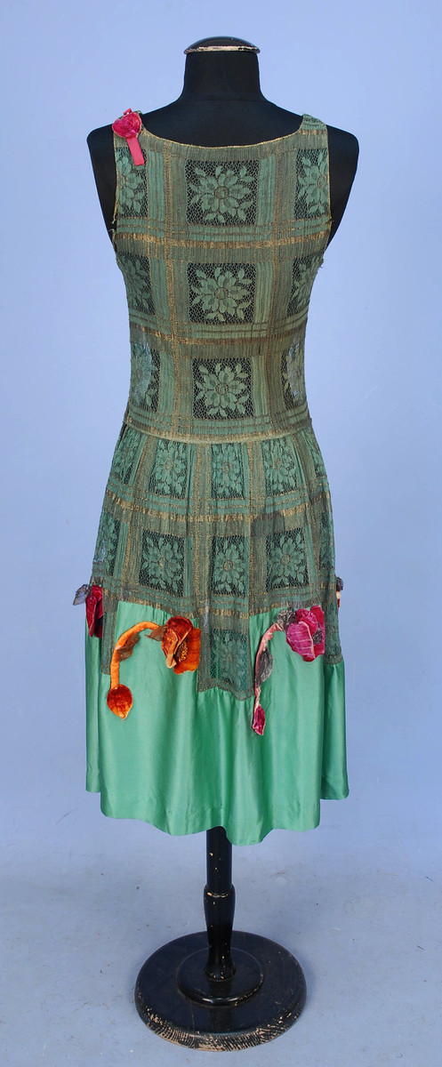
This week’s frock features more floral applique, in the form of velvet poppies dancing along the silk charmeuse skirt of this aqua and metal gold lace frock.
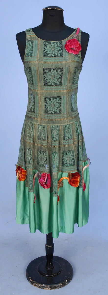
The cerise pink and sunset orange hues of the velvet poppies are an unusual choice to pair with the aqua of the lace and silk charmeuse, but are a classic example of the ’20s fondness for saturated hues and deco pastels, with a nod back to wild pairing of ‘exotic’ colours made popular by the Ballet Russes and designers like Poiret in the ‘teens.
Evening dress of metal and cloth lace with silk charmeuse and appliqued silk velvet poppies, 1920s, sold by Whitaker Auctions
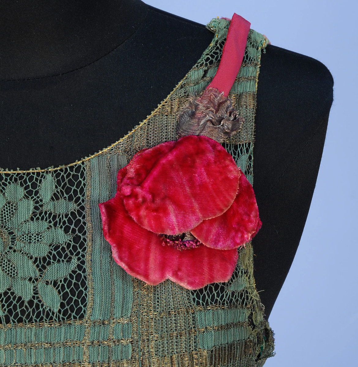
The velvet applique are a good example of the ’20s fondness for three dimensional design elaborations. Along with velvet flowers frocks and accessories often featured flowers of elaborately folded ribbons, or bits of silk fabric.
What do you think of the frock, with its unexpected colour pairings, and juxtapositions of the heavy velvet flowers with the delicate silk of the dress and light openness of the lace?
Rate the Dress on a Scale of 1 to 10
Just, no… I find the poppies bordering on ugly on their own (particularly those somewhat suggestive ones at the hem), but as an ornamental element to the dress, they look totally unrelated, as if a child at a fair gathered award ribbons and brought them back to Mummy, who found the only place to keep them was pinned to her dress. Although I find the bodice arrangement of the lace “tiles” fine (at least the solid stripes are placed to conceal the bust points), I don’t like the effect of the gathering of the skirt. 3 of 10, with regret.
Those poppies at the hem look like sad, droopy penises.
But I like the one at the shoulder and the overall shape of the dress, as well as the aqua lace itself. The almost crenelated (?) effect of the lace and satin at the bottom of the skirt is interesting and inspired, as well.
I’ll have to give this a 5/10.
I like the general shape of this frock a lot. I also like the green-and-gold lace (it’s faded now, but must have been glowing and cheerful when new) and the charmeuse skirt.
Unfortunately, I don’t like the poppies at all. Red and green together seldom work except perhaps for a Christmas outfit (which this is not), and the red velvet of the poppies is *too* powerful and overwhelming on this particular dress. They don’t work well with it–if anything, they look as though they have invaded from some brighter, more assertive dress or gown.
Without the poppies, I’d probably have given the dress a 7 or 7.5 With them, a 5.
I love the simple cut of the dress – and am kind of surprised by it, because I’m not used to seeing 20s frocks that are so form-fitting. Mint and dull gold is a great combo – sharp and youthful but still softened. What I like best is that the pattern stops just below the hips, which seems perfect for the dress.
I’m not that happy with the pattern itself, because it makes me think of a tablecloth. But the black mannequin is probably defining it more than it would be with an underdress. Give it a cream color underneath and it’s probably not too bad. Similarly, the solid green block on the skirt looks so bright and jarring, but that may be because it’s offset by the black.
For the poppies, there isn’t much hope. The shoulder one would be fine in another color (like mint, or dull gold, or even something more contrasting, like a darker blue-purple). As for the skirt ones, maaaaaybe something poppy-related could have been done there (like much smaller poppies, and no stalks, and not those colors) but those are awful. Just awkward and large and hideous, badly placed, and completely foreign to the dress itself.
Though, maybe with a lighter underdress, you could have thrown in some orange accents. Not those orange accents, but something else.
So for me it’s a dress with some nice aspects, lots of stuff that’s debatable, and then some horrible overwhelming accents that can’t be ignored and, really, dictate the grade.
3/10
8/10
I love this dress! The color combo is intriguing, and I love all the different textures. Personally, I also like the flowers, though others don’t seem to be as fond of them, and the shape of the dress is surprisingly flattering for a 20s piece.
I think the only thing I’d take off points for would be the fabric at the bottom and how it’s worked in with the bodice fabric. The blocks between the flowers aren’t symmetrical, and that kinda bothers me. I wish they had used a more sheer, muted fabric rather than a shiny one. The shininess makes it a bit much with the lace AND the flowers AND the metallic threads.
It is quite form-fitting for a 20s dress, isn’t it? I wondered if it was really meant to fit so snugly, given there is not much if any visible shaping and it apparently comes from the lacy fabric having some inherent stretch to it. But… it probably was meant to fit that way, or it would have had to be worn by a really slender woman! That itself makes it interesting, although I don’t really like the overall effect of the colours and shapes and textures that much. 6/10
(But as “oh, look, a 20s shape I could totally wear! and fake off the dropped waist by the existence of my already dropped waist”, it would get a 10. 😉 )
Last weeks rating of the dress didn’t come through on the post. What was the final verdict?
This weeks dress makes me think of the line from Sound of Music. ” I’m Brigitta, she’s Louisa. She’s thirteen years old, and you’re smart! I’m ten, and I think your dress is the ugliest one I ever saw! ” I agree with Brigitta. The color is horrible, the flowers are equally as horrible. I give it a 2 out of 10.
This is my first comment, and I’m afraid it is negative! This is the sort of dress that gives 1920s fashion a bad name.
At first sight, I really hated the whole thing. The sad, tablecloth-y upper part, the not-quite-matching turquoise skirt part, the oh-so-not-matching poppies…then I looked again and I felt that the colors of the poppies were so radiant and exciting against the aquamarine background, and the tablecloth-y top was using a very clever pattern that I almost began to love the thing.
Then I realized that the fringe of poppies looked so… sad, so wilting, so lifeless, so…impotent that I felt that they’d all profit from a good dose of viagra and there went my affection for this dress.
PS: I really, really do love the color of the poppies, impotent or not, so
4,5/10
I like the lace and the shape of the dress, and if it had been all lace without the silk charmeuse at the bottom I could even have forgiven the (as others have also pointed out) suggestively shaped appliques as I think the colour does actually go well in a strange way. all combined though, I can only give it a 6/10
The poppies are looking pretty droopy now, but probably looked very bright and attractive in the day. Minus the silk skirt, if this dress had only been made in lace and lined in the silk it would be a 10.
Sadly, it’s a 5
What was for UNDER this dress? a similar slip in … cream? rose? pale green?
I agree I love the shape. I see the poppies as being ‘of the period’ and not offensive even if they look tired. The obvious geometric placement of the lace on the top bothers me more than the poppies and sharp color contrast, and I don’t know why. It must be because I feel the dress is incomplete without a slip underneath.
I have the feeling the only reason this dress has survived is that it was so ugly the original owner put it to the back of the wardrobe and forgot it forever. But – having said that, I also think it is incredibly badly staged. Couldn’t someone have put a light coloured slip underneath? And steamed those flowers so that they had a little life in them? Talk about saggy and baggy! The colours don’t surprise me, they are fairly typical of the time, but the choice of fabrics does – definitely looks like Aunty Flo’s tablecloth with a frill of curtain lining to make a dress in an afternoon for a sudden invitation for that evening! So – 4/10 for the dress (mainly for the courage it must have taken to assemble it) and 0/10 to whoever set it up for display.
Well, haters are going to hate, but that’s ok, because I will OWN this dress, kiss the guy, then lay on the piano to croon a swell song to much applause.
Ten!
I don’t think the silk goes with the lace, the silk is just too bright in comparison. There’s something just not quite right about the poppies, especially the pink ones; the orange onces aren’t too bad. I do like the shape though
5/10
6 out of 10. I like the poppy at the shoulder and I love the lave. For me, the dress goes horribly wrong by adding the satin lower skirt and those awful poppies! Why not carry the lovely lace all the way to the hem?
I love poppies! Poppy everything please! But sadly this dress is just no. I do wonder what it would look like if the flowers were perked up a bit because I think the flowers are pretty. The dress itself is kind of ugly in my opinion. I don’t like the way it flows or the pattern in the lace. I’m really not sure about the stems, if that is what they are, of the poppies at the bottom. The colors are pretty but I’m not sure they are pretty together. It’s sad that I have to give the poppy dress 2 out of ten for effort.
I adore this. I love the colours and would wear it any day – very fauve!
I like the sheer fabric, the simple cut, the green&gold pattern. But the velvet poppies freek me out!!! 5/10
The bottom and the poppies are downright ugly. And it’s not merely that they look sad and droppy after 90 years, they probably always looked tacky. The fabric of the top might have looked nice once upon a time, but now it looks like the sort of couch that you would find rotting in a back alley. (The black dummy is not helping this dress at all!) I like the shape of the top but that shape is a dime a dozen in any modern store. 1/10
When I look at this dress I see the perfect frock worn by some 1920’s socialite on Remembrance Day. Perhaps she visited war wounded in a veterans home, or attended the laying of wreaths or dedication of a memorial for those who had fallen in World War I. It speaks to me greatly of Frank Llyod Wright’s tiles and stained glass windows. I can imagine that in its day it had the same bright shimmer of the sun glowing through the glass. While it may not be the prettiest dress by our modern tastes this dress could have a beautiful meaning to it’s history. 8/10 for the dress of Flanders Fields.
I love it! It makes me smile. It’s a great representation of the era and style, while also being something that you might see worn today. 9/10
You have got to be kidding! This dress made me cringe. Perhaps the decorative bits were added as a makeover for a family member. The material, when new, would have been exotic quite on its own, but there’s something desperate about it. There’s a story behind this dress, its wearer and the occasion.
2/10
I LOVE the lace, and I love the colours, but that lower skirt ruins it for me. Although, if the lace ran all the way down to the hem it wouldn’t be very 20’s would it? I do love the shaping, though. For the period I give it an 8/10, but as for personal opinion I would have to say 5.
The lines of this dress are just wonderful. Even though our own aesthetics do creep in, I first try to keep it to basics. The faux corsage is just fine; and, I do see it as being a fun cocktail dress. People were a lot more daring back in the 1920’s. It was after WWI. Alcohol was illegal, so you had to go to private night clubs (speakeasies). Yes, this is the dress.
My rating…… 9/10
On the dummy the dress looks kind of…funny. Well funny itself isn’t really a bad thing…is it? But on a person? I mean to which occasion would a “funny” dress the right choice….maybe….a children’s birthday party? I mean Mummy coming in with the cake wearing this? Other than that the dress has no potential to ever look stunning, but it has the potential to be serviceable, by making it a simple sheat dress in that checked fabric, without the flowers.Add interest with some fab jewellery…and voila!…it’s…well…serviceable. Like this it’s a 5.5 for me.
Serviceable might not the best word. I mean kinda decent/ neat.
…Actually there’s another solution. The first one: as I just described: the no-nonsense sheat dress entirely in that checked lace fabric. Combined with some darling jewellery this would make it the neat “bourgeois” solution. The other one is the “bohemian” one. For this one you really don’t give a rip if the peanut gallery likes the dress or not in the first place. So lets say you like it. Then just leave it the way it is. The more interesting question now what to combine it with. I think one of these russian coats with the fur collars would be nice. Wear it with attitude and it’s just fine.
I don’t like it.
I like the fabric of the dress, and even the shape, but the poppies don’t fit and I hate the skirt transition that happens half-way done.
4/10
Assumptions: That the lace and silk were originally the same brightness. That the sheer lace meant that the dress was intended to be worn over a slip, probably solid color, probably silk. That the poppies are droopy with age and would have have more bloom in them when worn.
Result of Assumptions: The brightnesses being equal helps and I almost like it. The poppies being, well, popp-y would make them look less tacked on and kind of fun. But unless the underslip was the exact same color as the dress’s silk, this thing would be a gaudy mess, and even so, all these colors are pushing it.
Overall: On the right person, it could be fun, it could be happy, but it’s a little desperate for attention and requires some serious assumptions to get it out of yackville. 5/10
“You’re out of the woods, you’re out of the dark, come into the light…”
This dress would seem to symbolize the poppy field just outside of Emerald City, I finally realized, after trying to figure out why it was making me think of Munchkins. No Munchkins here – they are much earlier in the film (and book), but this dress does seem to have an OZ-like quality.
As a costume for a “come as something literary or something from the movies” party, and in fresher condition, it would work splendidly, especially with ruby slippers (silver, if you want to be accurate to the book) plus a giant poppy headdress/hat (petals down, framing the face in bonnet-fashion). 8/10 for this purpose only.
Otherwise….not so much so. For all other occasions, 5.5/10.
Not sure how that averages out.
I can’t help feeling this is just half the dress and that the corresponding underdress is missing. If so, was it self coloured or contrasting? Would it have made it better and pulled the whole thing together or would it have added insult to injury? Maybe it was even the same colour as the poppies. So how do you rate half a dress! Half marks? 5 or 2.5? Oh, let’s just go with 4.
ps. That black dummy isn’t helping things either.
There would have been an under slip, and it would have been a shade lighter than the aqua of the silk. 🙂
I love lace and I love poppies, but this dress does nothing for me. Real life poppies are crepe-y in texture, and sometimes see-through. So who’s idea was it to make them in heavy velvet? Even if they were nicely steamed and perky, they’d still be too heavy. I like the color combo but dislike the silky bottom of the skirt. I wouldn’t buy it off the rack at the mall, nor would I linger to look at it in a museum.
3/5 because at least it’s wearable, and I think there is the seed of a good idea in there somewhere.
The colors seem very 1920’s, but even if they didn’t I’d love them for themselves! Even though I rather like the flowers on their own, the stems are pretty awful-so heavy, and awkward. Over all this dress would like way better over a cream, or maybe pale blue/green slip, and if the materials in the skirt were better proportioned in relation to one another. 7/10
10. The poppies are fabulous, the dress is a lovely shape and the lace is perfect with the silk.
A rather lovely fabric in an attractive colour combination that just doesn’t seem to work with gathers, too much shaping, a shiny skirt thing and a frightening attack of big, alien, velvet, poppy monsters. 2 out of 10
I think it’s lovely! The poppies were probably more perky when it was new, and I think it’s a fun mix of colorful and elegant. I say it’s at least 8 out of 10!