

Last week’s rate the dress was almost universally unpopular, and also quite confusing: what colour was it? Gold? Green? Grey-faune as the auction listing gave it? To simplify the confusion, this week I’ve picked a dress in a very simple colour. It’s pale pink. I don’t think anyone is going to argue with that! (We could get quite detailed about the exact hue though…cherry blossom? Blush? )
Last week: an 1876 reception or day dress said to have been worn by Empress Eugenie
I’m actually away for the next week, rusticating in the glorious rural swathes of New Zealand, away from reliable internet. So I haven’t tallied the votes yet. But I can tell you what the overall verdict is going to be: not good.
Update: Now with the Total! : 4.9 out of 10
With ratings ranging from 1 to 9.5, I find it very satisfying that the aggregate total is exactly at the mid point!
This week: an 1870s gown with historically inspired details.
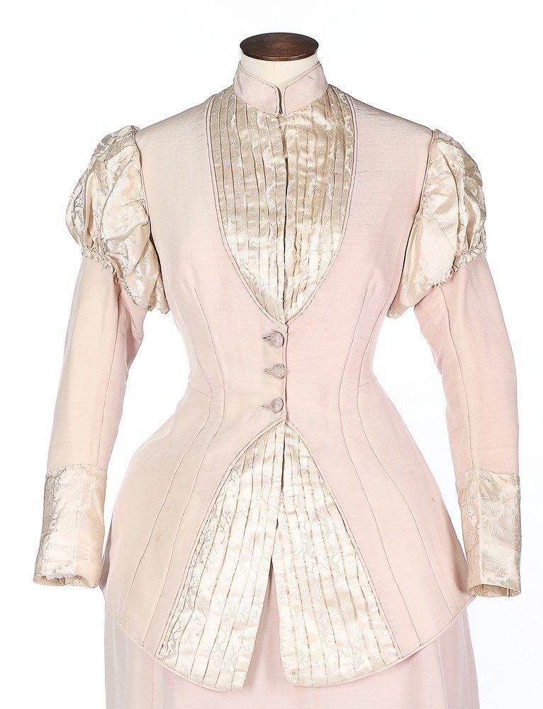
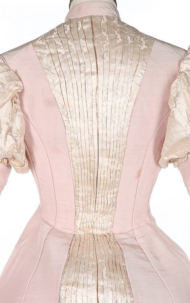
This week I’m sticking with the same timeperiod as last week, but going for a very different look: a prim gown in palest pink with ivory damask trim
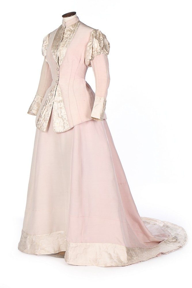
Kerry Taylor Auctions describes this as an evening gown, so I’ve included that in my description, but I’m not convinced. The high collar of this dress is anything but evening-wear. The rest of the dress, with its restrained shape and historical touches, suggests early Aesthetic dress – and the Aesthetic movement wasn’t so far removed from standard dress that it flouted the normal conventions of what you covered and what you exposed in Victorian fashion.
I suspect this is more of a reception dress: worn to formal events earlier in the day.
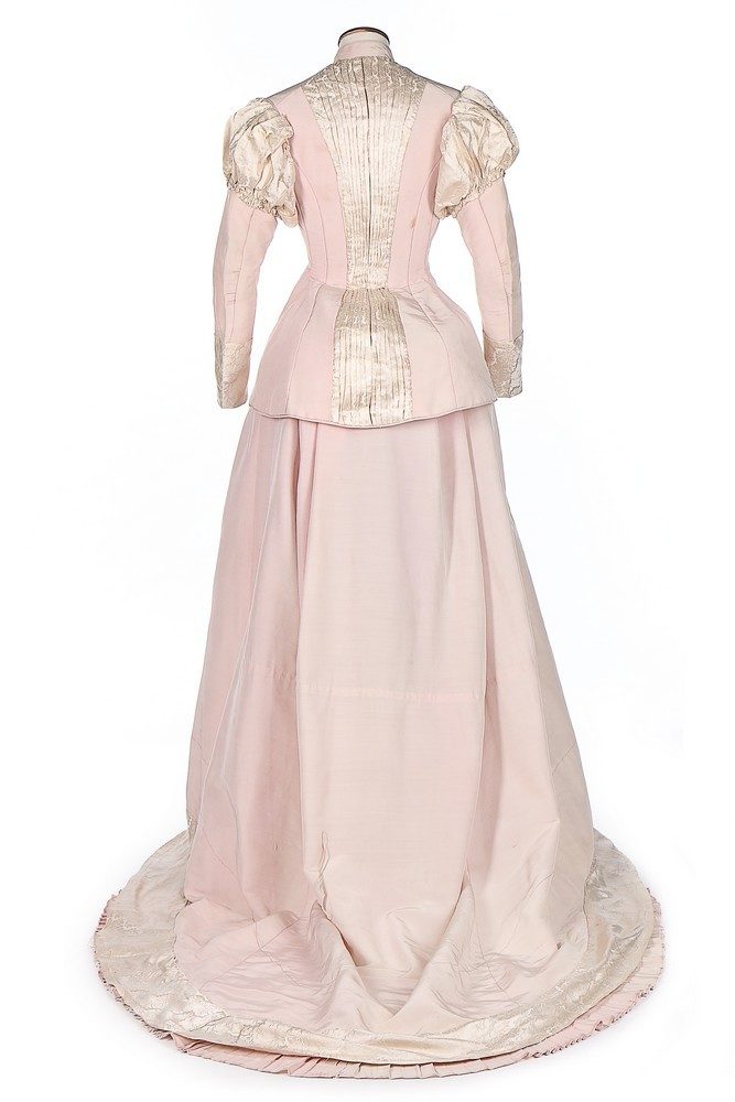
Despite the historicism so beloved of the Arts and Crafts and aesthetic movements, and the removal of many of the extraneous details you normally associate with late 1870s dress, this garment sticks to the standard fashionable silhouette, with emphasis on the small waist. There is space in the hips and back for hip padding, and a small bustle. Slide back up and look at the front view, and notice how curved the dress is over the stomach. Flat abdomens certainly weren’t the Victorian ideal!
Rate the Dress on a Scale of 1 to 10
A reminder about rating — feel free to be critical if you don’t like a thing, but make sure that your comments aren’t actually insulting to those who do like a garment. Phrase criticism as your opinion, rather than a flat fact. Our different tastes are what make Rate the Dress so interesting. It’s no fun when a comment implies that anyone who doesn’t agree with it, or who would wear a garment, is totally lacking in taste.
(as usual, nothing more complicated than a .5. I also hugely appreciate it if you only do one rating, and set it on a line at the very end of your comment, so I can find it! And 0 is not on a scale of 1 to 10. Thanks in advance!)
9/10 Pink is not usually a favorite, but with the damask to add interesting texture and the tailored design, this dress avoids frivolity. Respectable, but feminine ensemble.
I love the colors, and the beautiful fabric. The pleated detail is gorgeous. I don’t care much for the jacket-styled top, though. It’s long hemline gives an overall impression of dowdiness. I’d much have preferred a top that ended at the waist and (perhaps) plain sleeveheads instead of the patterned ivory fabric.
7.5 out of 10.
Can I save myself some typing and just say I agree with you on every point? 7/10
The top reminds me of armor. It seems afraid of being anything too daring. I dislike the color and the interaction of these two fabrics. The pleats in the front, especially at the bottom, remind me of the mouth of a Blue Whale. At least last weeks dress took some risks. This seems so lackluster. So boring, in a severe way. This, is meh. But at least it appears to be well constructed.
4/10
I love the contrast of the delicacy of the color and the severity of the pleating.
The one thing I do not care foris the cut of the front of the jacket. it makes the abdomen look bulgy to me, rather than fashionably rounded.
8 of 10
Very pretty, with dignity, yet a friendly warmth to it. Wouldn’t this be nice on a willowy redheaded lady, perhaps of a certain age?
It appears to be very much an afternoon dress to me, for a matinee, perhaps. The color is spring-like, while the long sleeves and high neck would make it appropriate for the uncertain weather of early spring.
I do dislike the distracting imbalance of the hips of the dressmaker’s model or whatever this is displayed on. But that’s not the dress’s fault.
9/10
Gorgeous! I can think of several people this would look lovely on. I really like the pleating in the bodice. At first I wanted the pink just a
touch darker, but the more I look at it the more it grows on me.
10
I’m surprised by how much I like this. It risks being boring, but manages to pull off elegant and refined. The jacket style bodice also appeals to me, and I wouldn’t have thought it would. Maybe it’s the contrast with the soft pleats?
9/10
It’s lovely.
9/10
This one makes my evil-queen heart sing–that strict pleating, and severe tailoring, paired with the almost-monochrome effect of the blush and oyster, yes please! The sleeves are nifty, from top to bottom, and the contrasting hem trim is eye catching, but I find the overall effect is just too costumey for me. I wonder what her contemporaries would have thought of the dress…
7/10
It’s weird. Is there really fullness at the hips, or is the front bottom of the jacket pulled open beyond plan? I can’t figure out that part, and I don’t like that part. Basically, I don’t like the front at all (buttons and severe coverage); the back is quite nice.
6/10
But if it’s really 1870s, I’ll give it this: it seems to anticipate some elements of fashion to come.
Which, however, also makes me wonder if perhaps they got the date wrong? Somehow this makes a lot more sense to me as an 1890s-1900-ish dress with no fullness in front and moderate and *loose* fullness in back? If that makes any sense.
I could do without the sleeve puffs, and the pleated inset in the back comes off a bit odd, even with the match of pleating in the front, but other than that? Yesplease. I love that it’s restrained enough to go to a formal event, but still feel super-girly.
9/10
Wow…
My first impression was that it is almost wearable today…
The double darts on the lower front add shaping and vertical lines continuing the vertical of the pleats
I’d dump the puff sleeves (but not the 2 piece sleeve) and close up the inverted vee in the peplum but I love the tonal use of color and texture (especially the pleated damask) and the extended contrast cuff and what appears to be (but not sure) shaped damask on the hem…
The soft pink is lovely…
10/10
The pink is lovely, but I am not a fan of the pleated abdomen or the length of the bodice. It seems to make the hips look a mile wide and overall a bit frumpy.
I give it a 7.
The feminine shape is lovely. The damask pleats and details are very pretty. The poofy sleeves in the damask fabric distract me with their shine. For some reason I think of a spacesuit when I see them, so that’s a point off. The long length/ train/trailing back of the skirt is a little confusing for a daytime outfit, so another deduction. (is this gymnastics competition?!) It’s spring in the US and I would definitely wear this to a fancy ladies’ tea. Not my favorite ever, but classy and properly ladylike.
7.5/10
I really really like the color combination.
I like the fabrics.
I like the way the fabric is pleated in the back and front, visibly narrowing the waist.
I am very, very confused by a heavy fabric on the arm and a shiny soft fabric on the sleeve poof. I’m not totally sold on the cuffs/hem in the damask, but I’m not burningly offended by them.
Not enough wonderful, and a few things odd.
5/10
There are some elements I absolutely love, and others I’m somewhat indifferent or even dislike a bit. I love the pink and the pleating, and the play of the different types of fabric.
The length of the hem on that bodice is frustrating me. I’m with the others who said they’d like to see it shorter, which I find interesting because I’ve often liked that length for shirts myself.
The sleeve puff is meh. I think if it was just the puffs I”d like it more than I do with the long sleeves after.
7.5/10
I agree with lots of comments, I especially dislike the puff sleeves, totally unnecessary. I don’t think it is an evening dress, maybe a walking out dress for spring? The full stomach and hips, maybe the wearer was in early pregnancy? Or she may have had biggish hips, anyway we’ll never know, wouldn’t it be nice to have known what these women looked like who wore all these clothes, shame there are no photos as there were ones at this date. Anyway the dress is very pretty and quite elegant.
9/10
Very curvaceous stomachs and hips were fashionable in this period. Full hips and a round stomach give the impression of a smaller waist, because of the contrast. Women wore bustles and hip pads that emphasised the hips, and corsets were really designed to exaggerate them far more than they were designed to make the waist smaller. So the wearer could have had a very slim figure – just with lots of fashionable padding to achieve the body ideals of the time.
Strange dress. I’m a bit unsure of what I should make of it. It’s pretty atypical. I love the sculptural quality of the jacket, the darts are perfectly balanced and it has presence. The colour is a bit too sugary sweet and I don’t actually like the dress that much. Everything just seems to be just a tiny bit off despite also being very well done. Lots of conflicting messages. I suppose it’s a dubious 5.5/10
Very crisp and cool, rigidly prim and proper. Exactly what Madam Undersecretary Professor Dolores Umbridge’s great grandmother would have worn.
– for the front gap (bad underpinnings?)
– for the plain band on the hem (a pleated trim like the back insert would have been.
9.0
I really like this shapely garment–I just can’t muster the words right now to explain to myself why. It isn’t like pink is a favorite color of mine. I guess it works well in this combination? I do like the pleats, for sure.
Anyway, I’ve just never seen anything like it!
8.5
You know when, in the 21st century, someone says “she looks pregnant in that dress”, and that it is criticism, instead of a compliment? That’s how I feel about this dress. As stated in the text, 19th century aestetics were very different, but my modern eye has a lot of trouble looking past that, mostly due to the cream inset. The colorscheme of very pale pink and off-white combined with the simple design gives it a kind of soft, submissive femininity that gives me the jitters. Also, the sleeve-heads are droopy (but that was probably better when the dress was worn)
So, 4/10
Funny, but I think the back works nicely and might have made an interesting vest front. Even if the front had been mounted more carefully so that the bodice fronts met, the angle of the jacket opening could have been less extreme. Otherwise, the dress is nicely designed and works as a unit in both cut and color. As a fashion plate it’d have been an “ooh”. 7/10
-glorious damask!
-I like the colour combination, but possibly a bit too pale and sweet? I feel like it could do with a bit of contrast somewhere.
-fun fake-waistcoat effects, and I’m enjoyimg the way the damask inserts visually narrow the waist
-I feel like that colour doesn’t work on pale Northern Europeans unless they’re /extremely/ pale. Wonder what colour the original owner was?