

This weekend I gave a talk on the ways in which the Pacific influenced Western fashion, including goods made from very Pacific birds: kiwi feather muffs, and bird of paradise bedecked hats. So I have feathers on my mind, and have picked a very feathery dress for this week’s Rate the Dress feature.
Last week: a 1910s dress from a brides trousseau
I don’t think anybody is going to be hugely surprised that last week’s frock was pretty popular. Sure, not everyone loved the muted colour, or the floral ribbon, and some of you thought it was almost boring in its tastefulness and elegance and general perfection, but only one person actually disliked it and rated it less than 8.
The Total: 9.3 out of 10
Nice!
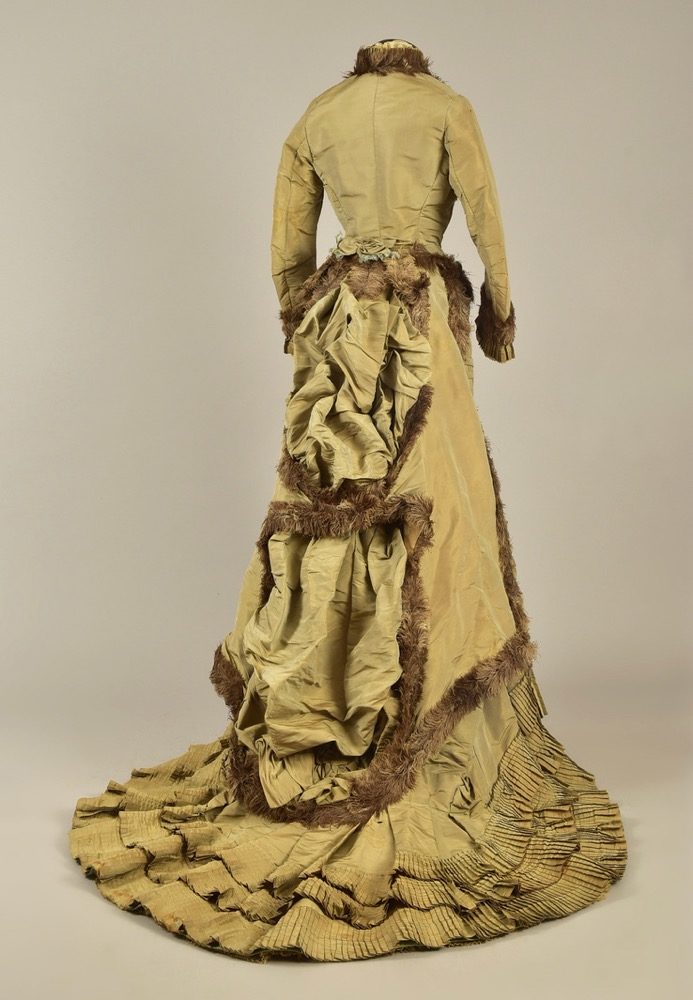
This week: an 1876 reception or day dress said to have been worn by Empress Eugenie
This feather bedecked dress is said to have been worn by Victorian fashion icon Empress Eugenie (in her post-Empress days).
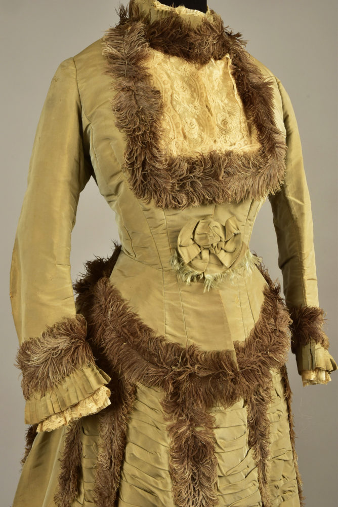
Eugenie was known for her excellent taste, which combined impeccable intuition of the right thing to wear with a willingness to be inventive and daring, and to set new trends. I suppose its easier to be a trendsetter when your husband is the monarch, though EE copped less criticism for it than Marie Antoinette, who she admired and purposefully emulated.
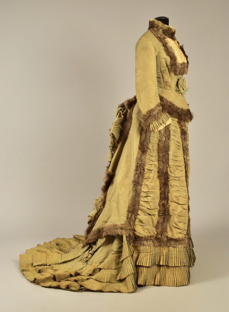
This dress is certainly inventive and innovative, with its fluffy borders of ostrich feathers (a feather that luckily, unlike the ones I discussed on the weekend, doesn’t involve killing its natural wearer to harvest).

The feathers create a little tail over the bustle, and delineate the lines of ruched fabric in the front skirt, and the picked up areas of bustling at the back of the skirt.
What do you think? Is this feathery frock a fun and memorable dress choice for a fifty-year old ex-empress, or a fashion faux-paus all around?
Rate the Dress on a Scale of 1 to 10
A reminder about rating — feel free to be critical if you don’t like a thing, but make sure that your comments aren’t actually insulting to those who do like a garment. Phrase criticism as your opinion, rather than a flat fact. Our different tastes are what make Rate the Dress so interesting. It’s no fun when a comment implies that anyone who doesn’t agree with it, or who would wear a garment, is totally lacking in taste.
(as usual, nothing more complicated than a .5. I also hugely appreciate it if you only do one rating, and set it on a line at the very end of your comment, so I can find it! And 0 is not on a scale of 1 to 10. Thanks in advance!)
Sorry but I think it’s absolutely awful, I don’t like anything about it.
So 1/10
Shake a tailfeather, baby!!
With this get-up, Empress Eugenie certainly could have done just that.
The lines of the dress are lovely. The color – not so much. Gosling inspired, perhaps?
The feathers?
Hilarious, but not in a good way. It is remarkable that there has been little or no molting over the 140 or so years since this well-preserved costume was devised, but that’s about all I can write that is positive about it.
For making me laugh out loud at the notion of the very lovely and dignified Empress appearing in this get-up, and for its well-preserved state and historical significance, I’d give it a 3.
I’m glad no ostriches were killed for this dress, not only because I dislike killing birds for ornament, but because the resulting ornament is, in this case, not very attractive to me.
The lines of feathers look almost like fur in the way they are used, and to me look clunky and awkward. I also do not care for the yellow-green/brown color scheme.
Otherwise, the dress is a fairly conventional gown for the period. But the color and the odd use of the feathers give a distasteful first impression, and a and even more dismaying impression upon further examination.
5 out of 10
And that’s saying nothing about the odd rosette placed over the solar plexus!
I like the dress but not the feathers. Maybe it’s because I’m used to thinking of feathers as hat material, or that I’m not used to seeing feathers used as trim. It comes across as OTT and not in a good way.
6/10
She couldn’t possibly sit done in it.
3
working on sculptures about the origin of the RSPB and the Audabon Society having been started by women campaigning against the use of birds of paradise, egrets, etc. So this is very interesting. do not like the feathers aesthetically but giving it a 7 for historical interest and the rest of the structure
7
There is almost nothing about this dress that I find pleasing, and a lot that I actively dislike. Although I like most shades of green, pea green is the one exception. The overall impression is of both feathers and rosettes as ornamentation is “lumpy.”
The one thing I do like is the fine pleating.
Regretfully, 3 of 10
Unfortunately, while no ostriches were killed in the making of this dress, it does remind me of the memorable sentence I read (though regarding a different sort of dress): “That one looks like someone did something terrible to a muppet.”
I wonder if it might have faded from its original colour. I wonder that about a lot of 19th century dresses in unattractive colours that aren’t quite brown or beige nor yellow or green. If they haven’t, it’s a colour trend I don’t get.
It looks well-made, though, and does have some wit to it when considered in comparison with other dresses from the era. It’s just not very pleasing to the eye.
6/10
The style of the dress is quite attractive, on the whole, without the huge bustle of a decade or so later. I am not sure about the colour, pretty but insipid, and the feathers while they provide a contrast of texture don’t really work. Velvet or satin in a dark colour would have given a much more elegant contrast. And the rosette could go too
Could have been nicer so a 6
It’s kind of awful. I kinda like it, but it’s still awful. I’m pretty certain the colour must have changed quite dramatically as I can’t imagine any time period where THAT particular shade of bogey green would have been considered attractive. The feathers are a nice idea but not exactly pretty, and again, must have changed colour to a certain extent as they’re not the best brown to go with that green, and unfortunately they read more as ratty fur than they do as fabulous feathers.
I could see it being quite striking in other colours, but whoa, that is one vile shade of green. It’s reminding me why I hated green as a kid.
The design/sikhouette is great, though. So I’ll give it 5/10
Eugenie would wow in this outfit; however, personally, the feathers gotta go. And that dried mustard color?? Hopefully it looked better in person!! I love the dress itself…in another color and no feathers (or fur or pompoms…). Solid 5
I’m sticking with the crowd. I liked Hana – Marmota’s comment, “That one looks like someone did something terrible to a muppet.” And I agree with Daniel about the green. I like green as a colour, but not that one. That bow centre front! “It looks a bit bare about the middle – let’s slap a random bow on it!”
The shape is pleasing, and the pleated ruffles are very nice indeed.
5 out of 10. Because it may have looked better before being faded by time. Call it fellow feeling.
It wasn’t my wording. It came from a fanfiction writer. (Coneycat & the Housemates series, if you’re into that kind of thing – I really enjoy that one.)
It’s awful. Colour’s not great, but a nice dress in it wouldn’t be bad. But the main attraction? Colour of those feathers clashes with the green(maybe it’s faded, maybe it looked marginally better with more vivid colours), the texture and the use doesn’t fit. maybe at some coat it would’ve looked nice but on a dress it’s 1,5/10
In its current state, 1/10 for horrific colour and bizarre straggly trim that clashes with the awful colour.
Maybe it was a nicer colour before it faded? But I’m pretty sure the trim always looked like that.
I am probably alone in quite liking the colour, I’d look sick wearing a colour like this, unfortunately. I also like the dress itself, but not the feathers, they ruin the dress for me. I’m also not fond of the yellow bib surrounded by even more feathers in the front of the chest.
I rate the dress 6/10
2/10.
No.
No for the color – such a huge no for the color. No for the feather trim, which understandably 150 years later looks tired, but probably didn’t look much better when originally worn. No for the “this is the summer version of fur trim” vibe which is what I’m getting. No for the way the ornamentation works in stripes, not using the airy nature of feathers to any effect whatsoever.
+2 points for pleating and a nice bustle.
I don’t like the color at all. Or the feathers. The only positive thing I can say is the pleating around the hem is very fine.
2/10 for the pleating because that’s a lot of trim and I know that’s hard to do.
I actually really, really like the top half of this one. The feathers do a nice job of mimicking fur trim – I’m imagining it as a cool-weather outfit with a matching hat and muff, and my response to that would be, “Yes, please.” The rosette isn’t doing much for me, but I could live with it. I think if they’d stopped with the feathers once they hit the bottom of the bodice, they would have come out much further ahead, because where it falls apart for me is the skirt. The feather lines on the front and sides don’t flow organically from the bits on the bodice, they seem very tacked on just to be there, and where they’re bustled up, they’re just wonky. I don’t even know what’s supposed to be going on with the “tail”, but I feel like even that could have been worked with if it didn’t end up scrunched into the rest of the bustlestuff. The hem pleats also have a not-matchy/too much with everything else feel for me, so where they might work just fine on another skirt, they’re not on this one. I’d love to see it redone with the same bodice, but leaving the bustle entirely untrimmed and putting just a single horizontal line of feathers near the hem.
I’m not getting the green in the fabric the way other people seem to be – what I’m seeing is more of a golden tan with sable trim, and I don’t know if it’s this monitor or just me, but I don’t hate the colours together. If I *was* getting the green, I might feel differently, but as it is it gives me kind of a wild fowl vibe, and that works well with the overall “I’m a lovely bird lady” theme.
For how well it starts off, and what it could have been, I’ll give it another
7.5/10
She must have been teeny tiny her whole life to have worn this at 50!
I really dislike the color and wish I could have seen it when it was new. I can’t imagine anyone looking good in this color??? I also dislike the bib lookin’ thing in the front.
I’n hugely entertained by the descriptors of the colour! On my PC it is a rather lovely shade of old gold. I don’t mind the mutedness of it. I wish it fit the model better as the seams are puckering so much I wonder if it has been run in.
But I cannot get on side with brown ostrich feathers, they remind me of feather dusters.
I want to like it, but I can’t get past that, and some kind of Dr Seuss thing to do with the Lorax or the Sneeches. And it’s really hard to get past that once it’s planted. 🙁
4/10
It’s not green on my screen, either. But rather than a lovely shade of old gold, it’s more like an ugly shade of old gold. Who knows what color it is in real life, or what it looked like new.
It’s that color on mine as well. All these complaints of gross green are confusing me.
2. Nice pleats, horrible colour and nasty feathers.
Ugh. My favorite thing is the butt rosette – the feathers are repugnant looking and conceptually, imagine having them up near one’s face!
ceci
I kind of love this but also admit it’s kind of ratty. But endearing. Sort of.
I feel like this dress would fit right into a Wes Anderson production. There’s something a little comedic about it, rumpled and rarefied and, underneath the pomp, just a little sad. It may not be beautiful, but it has such character.
8/10
I like the shape. And I love all of the tiers of fluted trim. Which makes me wonder if a dress maker took advantage of the Empress. Did they try to over adorn the heck out of this frock, just to upcharge the commission? Then insist this was the highest of fashion?
Yes the color is pea-puke. But I tried really hard to imagine the entire dress in the color of frayed thread hanging down from the bottom of the butt bow. So in that green, with the waterfall of a bustle in the back, unsmooched from storage, I can say that I don’t hate it. The ostrich detail on the cuffs would have been lovely. I reall love the cuffs. It would have offered beautiful movement each time she gestured. But ostrich around the neckline gives me a rash just looking at it. If the vertical lines of ostrich were removed from the skirt, as well as from the neckline, I would like this. But as is, yet ignoring the color and brittleness, I give it a…
6/10
Susan B., first thing I thought–“Shake a tail-feather,” lol.
It isn’t that I don’t like each of the colors themselves, but the combination doesn’t sit well with me in this case. I think they come across as kind of garbage-y. A little of that ostrich trim might perk up a dress in cranberry, but it doesn’t compliment this green.
I really, REALLY don’t like the placement of the feather trim on any part of the dress. Without it, I think the bustle would be quite lovely.
3/10 for frowsy feathers.
To me, the bodice is jarring, the dress is lumpy, and the color is awful. The feathers don’t hurt it, except maybe at the bodice, but they don’t help. I can’t imagine it looking good on anyone.
1/10
I’m with the majority on this. My monitor shows the color as a very unattractive old gold; probably not quite as ugly as bogey green (thank you, Daniel). I don’t like the way most of the feathers have been used. Much to my surprise, I rather like the bustle, and normally I hate all bustles. For the pleasing shape of the dress: 2/10.
4/10 because the cut is reasonable, even if the colour is… well, see above, and the feather trim gives the impression of scrawny fur. The pleating and the fabric at sternum and wrists are both nice.
That rosette, though – reminiscent of anatomical models showing superimposed womb-contents or other entrails.
Good to know the birds were ok, no harm done.
I like the style and workmanship, very much.
I have studied Eugenia some and always admired her style, but this dress is just not right. I can’t reconcile it’s awefulness, even considering cultural and historical differences Eugenia and I have.
The color is so off putting, along with the feathers. I just say “ick” when I view it. I try to imagine myself wearing these rate the dress, and I would refuse to put this one on.
Just for the workmanship and lines: 2/10
Me too! Glad that we are happy-animal twinsies!
I wanted to look askance at the dress…but then I was reminded of wonder Jacinda Adern wearing a similar gold-ish dress (pregnant and unmarried) with an important feather cape (I forgot the name of the important feather cape) while visiting the UK.
So the power of association is strong. I give it a 9/10. Both because animals were not harmed, and happy feelings toward a woman I respect highly.
I don’t like the colour (although either the green or the brown would be better alone than together) and I really dislike the feathers. I don’t like the rosette either. The lace is quite nice though.
1/10
I like the colour scheme, and love the feathers (excepting the fact that harvesting them is not cool) .
The whole ensemble is fantastic except the really square bodice/decolletage line with the feathers round (square) it.
I would happily wear this, and don’t think age would be a factor at all!
7/10
Well, I can definitely envision her wearing it, and it does seem very”her”, the proportions are very well done, and the whole thing seems pretty harmonious, but I just can’t get past the colour and the feather trim, both of which, to my modern sensibilities are terribly garish. *sigh* aiming for impartiality, because it does seem like a masterful piece in its time (so long as I never have to wear it myself)…
7.5/10
It is a weird dress. But I kind of like it.
The color is a nice sedate shade and it is well constructed. But I am not a fan of the feathers.
8/10
I like the bustle and I think the feathers look pretty good back there. I’m not a fan of the front, the color, or the overall heaviness of the dress. I can see a certain fashion-forwardness to it all.
6/10
“And the baby said, ‘Buh’.” That from one of the boy’s toddler books, and the first noise that I made on seeing the dress.
The design and non-feather detailing are handsome: the dress lines play up the nice parts of 1870s styling, especially the vertical bands running down the front. Marie (the Drunken Tailor)’s comment about “bustlestuff” was fantastic!
The feathers when they were new were probably less flattened, much more floofy like maribou, but, but….buhhhh. They’re too wide, and overused. The deep decolletage, even lace-covered, also makes me wince. My emotions and associations ran immediately towards can-can dancing, over-late nights, ennui, and the demi-monde.
4/10
I like it for standing out. That sort of pale green/brown combination isn’t what you’d normally think of it when it comes to luxury. The treatment of the feathers feels very unusual, rather like a fur trim. The dress has a very natural, organic look, despite the highly stylized aesthetics of the 1870s. In fact, the dress makes me think of those lovely old trees with the moss growing in their cracks. And I do love all those little tiered pleats around the hem – what a nice bit of fussiness there.
That said, my overall impression isn’t entirely positive. I enjoy its uniqueness, and there are some good elements. But the dress feels both too bland and too strange. The boxed-in double puffs on the back seem particularly graceless.
If I was designing a Victorian wood nymph/wild woman character, this would be a great starting point for her couture. But as it stands, I don’t love it.
7
I’ll just assume the whole dress once had the same color as the chest-inset, that would make the color-scheme quite nice.
Nevertheless I find the feathers still hideous.
5/10
I was actually confused by all the complaints of it being green, until I saw someone else comment it looks like a gold color to them too, I hadn’t thought of screen differences.
I rather like it. The bottom of the skirt takes the feather treatment a hair too far for my taste, but overall I found it amusing.
8/10 because I hate for it to get too low of marks
Oh! I love me some early bustle and Natural Form(and while 1876 would put this dress right on the cusp between the two eras, this particular dress is clearly more early bustle in shape and style)! Also, I love anything and everything with feathers. Except the kind that come from slaughtered exotic birds 🙁
I can’t help but complain that I feel like the display badly needs a couple more petticoats underneath. The train sags a bit. It doesn’t seem fair to complain though, since this is an auction display.
As far as the dress itself, I only wish the neckline were filled with something else. That looks like two strips of wide Valenciennes lace laid flat. I would prefer a delicate ruffled voile chemisette or one of those tuckers with an overlapping V neckline with tucks and narrow lace insertion. The flat lace in that heavy cream color is a bit too rich. I want something airy and delicate to contrast with the rich silk of the gown. And exposing the collarbone would be most pleasing without any hint of impropriety for daywear.
Other than that, I can’t really think of anything to criticize here. What I have learned about my own tastes from doing RTD is that I am nearly always happier(and more willing to be generous) with dresses that take risks, are over the top, experimental, eccentric. I would take this gown over last week’s oh-so-tasteful number any day of the week. The ostrich trim, and especially the “tail” really does it for me.
9.5/10
First off, if this dress is from 1876, she was only 3 years after the death of her husband, so bright colors were probably not what she would or even could wear. Secondly, I believe from these photos, original color is impossible to determine, it was probably a lovely shade that hasn’t ages well. Third the feathers have deflated over time and even though the vanes are still present, imagine these as new, full and fluffy, trembling in the slightest breeze. Since it is a reception dress, it is not designed for sitting but to be lovely when standing or moving from all angles. Just imagine that bustle and train puffed and full, the ruching rounded, the pleats flowing as she walked, the feathers adding to the movement of the dress. I imagine it as a golden color originally, set off by the natural soft browns of the feathers, then I picture the lovely, sad, woman of a certain age, still graceful, smiling despite the sadness, and I can’t help but like this dress. 7/10
I feel like if the feathers had been arranged differently or perhaps in a softer colour it would recieve better comments however as is it comes off as blocky and harsh. That aside I am in love with the general cut and colour and concept the dress itself.
7/10