
Last week most of you loooooved the late 1870s gold dress, with its asymmetry and embellishment. But some of you found the asymmetry off-putting, or the restrained colour a bit dull, dragging the rating down to 7.4 out of 10.
I actually really wanted to show you something 1930s this week – something bright and modern and Art Deco. But I couldn’t find a single garment that took my fancy, so I’ve decided on a Rate the Dress that is a retaliation against other clothing that doesn’t take my fancy: modern menswear. Modern male clothing is sadly devoid of embellishment, but that hasn’t always been the case.
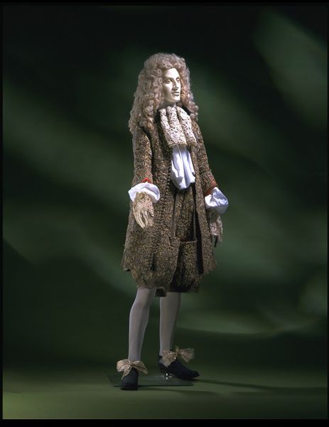
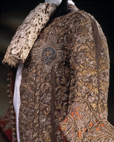
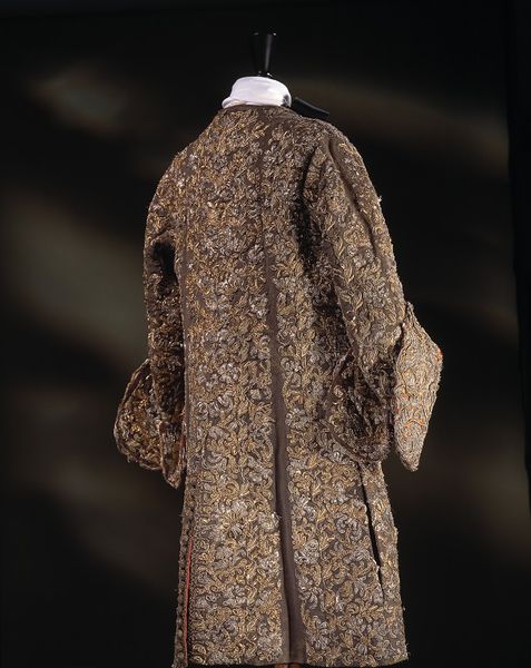
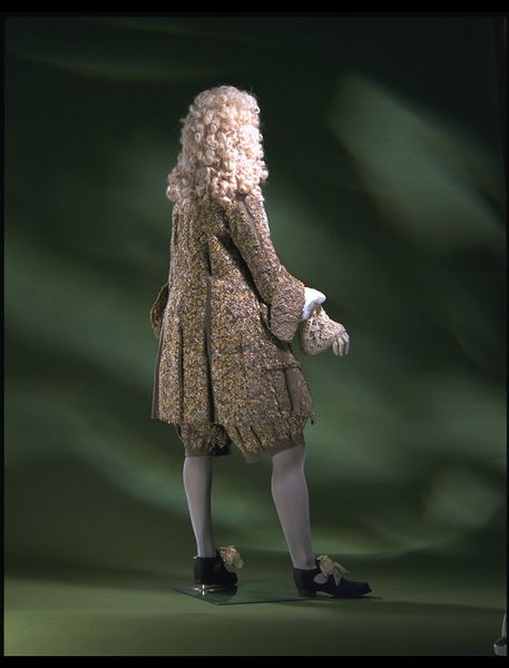
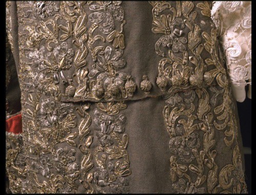
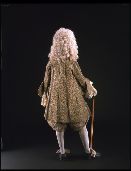
This 1670s formal suit from the V&A, worn to the wedding of James, Duke of York, is extremely embellished, with almost every surface covered in gilt embroidery. Despite this, the suit looks subdued, but this is a bit misleading: the green background fabric has faded at least a few shades, and would have contrasted with the vivid flame (that quintessential later half of the 17th century colour) cuffs, and the bright gold and silver embroidery. I imagine flame bows on the shoes as well.
Would that be fabulously bright, or Christmas cracker? Let’s see:
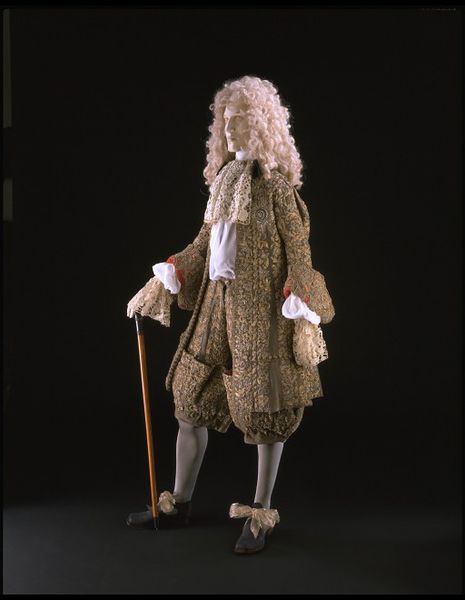
Wedding suit, English, 1673, Wool, embroidered with silver and silver-gilt thread & lined with red silk, V&A
Wedding suit, English, 1673, Wool, embroidered with silver and silver-gilt thread & lined with red silk, V&A
Wedding suit, English, 1673, Wool, embroidered with silver and silver-gilt thread & lined with red silk, V&A
Wedding suit, English, 1673, Wool, embroidered with silver and silver-gilt thread & lined with red silk, V&A
Wedding suit, English, 1673, Wool, embroidered with silver and silver-gilt thread & lined with red silk, V&A73

Wedding suit, English, 1673, Wool, embroidered with silver and silver-gilt thread & lined with red silk, V&A
Wedding suit, English, 1673, Wool, embroidered with silver and silver-gilt thread & lined with red silk, V&A
Wedding suit, English, 1673, Wool, embroidered with silver and silver-gilt thread & lined with red silk, V&A
What do you think? Do you love the embellished man? Do you like it better bright or subdued? Are embellishments all the thing, but the silhouette, with the full breeches, just a bit too much?
Rate the Dress on a Scale of 1 to 10
How hilariously ridiculous! That embroidery is wonderfully over the top, isn’t it? I’d like to think that I would wear something of that sort, had I been born in that time period. I do think a darker green would have looked amazing with the gold and flame colors (just imagine the vibrancy of it: the rich foresty green, the bright red accents and the shining gold–it is too bad that gold embroidery fades and loses it’s “goldness” after a while!). Personally, I would have used different lace. The “point de venise” (that is what the name of that lace, right?) in not my favorite, by far.
Ten out of ten!
I love the long coats of the late 17th-early 18th century. What I don’t love are the weirdly poofy breeches with the narrow cuff just above the knee. Ugh. I’d say 7.5 of 10 because of the cut of the breeches.
I know, those coats are amazing. I want to do one for one of the HSF challenges.
Maybe you know the answer to this, then: Although it’s labeled as a Wedding Suit, would the gentleman have continued to wear it after the nuptials? It’s gorgeous and deserves many outings, but maybe a guy (dandy) like this wouldn’t have worn the same thing twice.
I’m not even remotely an expert, but my understanding is yes, wedding clothes continued to be worn after the wedding.
Absolutely yes, this would be worn after the wedding. And this was worn by a guest, not the groom.
However, with that said, there does seem to have been a little bit of emphasis on not wearing the same garment to court, based on writings from a few decades later, so the same may have held true at this time.
I have to give it 10 out of 10 simply for the “If you’ve got it, flaunt it” factor.
This is an item that must have been totally fabulous new and in context. It is still very very handsome, though it is hard to reconcile the strange construction of the breeches front. Are there any other examples of similar construction? Do you have any information about what was going on with that?
9/10
I love the embellished man. I find it so sad that the modern man has to wear dull, sombre clothes or risk having his professionalism or even masculinity questioned.
I bet the flame colour against the gold embroidery was spectacular when it was new. It’s still pretty stunning, even as a shadow of its former self. The detail and the time that went into this suit amazes me. I’m not so much a fan of this style of breeches, but I know it was the fashion of the day and over all I’d say the effect is stylish. So I’m giving the embellished man 10/10 for sheer in-your-face, look-at-my-enormous-bank-account style.
guardian.co.ukExactly! How funny that this RTD came out the same day as this article about men’s fashion being boring and only the women’s are exciting:
http://www.guardian.co.uk/fashion/2013/feb/18/fixation-red-carpet-fashion-sexist
That’s a great article. I completely agree with it and it sums up why I don’t really follow red carpet trends all that much.
Oh, I love looking at the dresses–especially the ones who dare to be themselves. But it does feel…a little rotten at times…
I love the coat, hate the breeches, just too full. With a slightly less poofy pair of breeks I think it would be perfect 9/10
I’m sorry. I’m really, really sorry. But my first thought on seeing those breeches was, “Weird shape, but those odd pocket bits on the front would be ideal for hiding a snack in case you got hungry during the wedding ceremony. You could probably get half a baguette in each side.”
It must have looked stunning in its time. So in the unlikely event that I’ve got any credibility left when it comes to rating costumes I’d say 7.5 / 10
I’m scoring just for embellishment, and for its relationship to the garments. 10 out of 10. Wonderful word – all praise to the embroiderers.
I agree with Catherine – the coat is beautiful, but the pants take some getting used to. I can see the elegance when viewed from the front and the side, but I lose it when I look at the back view. The big wig doesn’t help. It looks just like a very ornate toddler with actual ankles!
“Wonderful WORK” – I need to proofread.
This is the earliest wedding garment in the V&A’s collection with provenance. (a coat associated with Sir Thomas Isham’s wedding, although he died the day before the wedding, and anyway, it’s very debatable whether or not the coat was made for the wedding, is the second oldest…)
Anyway. Yes. ADORE these coats. So stylish. Have always been puzzled by the breeches on this suit though, and I see I’m not alone. Hard to work out what’s going on there. LOVE the embroidery and just imagine the flame coloured waistcoat that would have gone with the ensemble… wow! So I’ll say 9/10 with a point off for the breeches being puzzling.
How fascinating! I give it an 8 out of 10
The lace cravat/dicky kills it for me. 7. I wonder if I can restore some of the colour brightness in Photoshop.
Love the coat. the material is fine too. not the breeches. Never liked them. Weird things.
I intend to try and make men’s coats for my son in different styles just because they can be so elegant. There are some gorgeous men’s coats to be found on the internet and males look so good in them.
8/10
For the embellishment? An 8, because the embroidery is stunning but those lace cuffs need to go. Not only do they look ridiculous, I imagine them dragging in the soup.
The entire outfit…Egads. I truly hate this era of men’s clothing. The coat is a nice enough shape, but those pants. Why? Did it start as a joke–“I’ll wear giant poofy balloon pants so I look like my son in a clout! Dad and son full pants dress alike day!”? Regardless, the embroidery on the pants only serves to make them look more ridiculous. So a 5 for the entire ensemble.
Averaging to a 6.5 overall.
The embroidery is spectacular! I imagine the materials would have been brighter and shinier originally. Taking that (and the waistcoat that would have gone with it) into account, I love this outfit. The rows of little buttons are delightful.
My only complaint is the breeches, like most everyone else has already said, they’re too puffy.
9/10
I’m not a fan of the breeches, the sleeves, or the neck lace. If it was just the coat on its own and restored to its original bright green, I think that combined with the embroidery and red peeking through on the sleeves would make it stunning. I don’t think it would be “Christmasy” at all.
6/10
I agree with the majority that the breeches are a bit…odd. I much prefer my well-dressed men with slightly slimmer breeches (and more natural hair), but I also adore this style of coat, and I really enjoy that flame color. Also, the embroidery! So 7.5/10 (for weird breeches and hair), but I wouldn’t mind one bit if men’s fashion took a bit of inspiration and started producing more epic coats.
Having done metal-thread embroidery, the decoration here is just awesomesauce. I am impressed by how well the silver has held up, and that the silver-gilt is no dimmer than it is. I especially like the way the Garter star is worked in with the floral background decoration. It’s a shame about the way the green has faded, and I’d love to see if the Photoshop efforts work out. I love the red, and I wish I could see the effect of the original combination (go for it, Adela!).
The lace is, well, it’s there, and serves to demonstrate one of the facts of upper-class clothing: it is impractical because it can be. The drag-in-the-soup cuffs? This is a man who does not need to use his hands for anything much at all. (And if he does, he probably has a way of tucking the lace up inside the shirt sleeve to get it out of his way while he fights that duel or whatever aristocratic necessity arises.) And I don’t think they really gave a damn about how grubby things got, no matter how much it skeeves us out now! (Excuse me while I take a moment to cringe over the lace abuse that went on!)
Those breeches–I tell myself they could be much worse; the style was even baggier and more ridiculous a couple of decades earlier, after all. Sometimes it even works, too! Sometimes it doesn’t, of course, and like Black Tulip I’m wondering what he could pack away inside those pocket things…
Isn’t this done after the time Charles II instituted a dress reform “in the Persian style” with long coats and waistcoats for the gentlemen of the court? Everyone laughed at first, but it finished off the doublet for good.
I give this 9/10, because really, the breeches could be worse, but then again, they are what they are. Also, I’d have like to see this set up with a matching waistcoat, and red ties on the shoes, and quite possibly red silk stockings as well, instead of that plebian gray! Maybe the V&A didn’t want to over-interpret, but I don’t think such a dull, middle-class color would have been matched with this suit!
I agree that mens clothing are now boring but I can’t say something that wild would turn my head in the good way. That era made men look so prissy. Artistically and with all that work I’d give it a 10 but my tendency to think of the man in that thing as an annoying prissy fop drives it down to a 1. So my compromise score is 5/10.
When I imagine it in brighter green, I rather like it. 7/10