
Last week one suit faced off in a Dudes Dress-Off with two different looks: the first, as Joanne put it, Mr Darcy, restrained with a matching waistcoat, and the second Sir Percy Blakeney, with bright coral waistcoat and pompadour hair. While Joanna preferred Sir Percy, ultimately we’re all suckers for Mr D (which is not, as it happens, why my Mr D is Mr D), and the simpler styling came in at 8.4 out of 10, compared to 7.5 out of 10 for the pink waistcoat.
The biggest criticism of the suit with the bright waistcoat was how the LACMA had styled it: everyone agreed that the corsage was a thing of horribleness and a eyesore forever. Be glad I didn’t post the close-up of the corsage! It was beyond hideous…
This week, I’m presenting another corsage-bedecked bit of finery, but with this one the corsages are original to the garment. This striking natural-form evening gown makes use of at least three corsages, and pretty much every other type of trim possible. There is pleating, fringe, bows, more pleated ruffles, draping, plus fun with stripes involving two different striped fabrics.
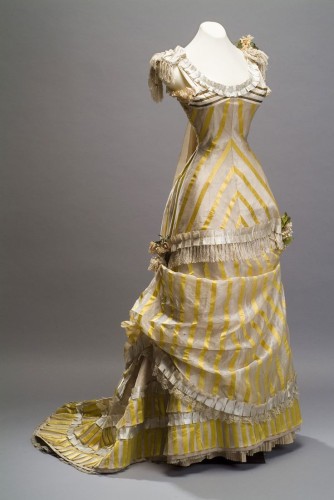
There is a lot going on! What do you think? Does the gown pull off elegant excess, or is it all just too much?
Rate the Dress on a Scale of 1 to 10.
I believe it pulls off all of it except the black and white stripes… it’s a weird, weirdly placed bit that looks either like someone ran out of fabric, or like a sort of bikini top… huh? It ruins the smooth if be-trimmed lines of the dress so much, I have to take two points off for it. 8/10, still lovely.
I think the pale yet contrast colours help make this look very clear and uncluttered, despite all the trim. Which is why those completely opposite bits of black look so weird.
“My face is up there. Yes. Stop trying to look at my A-N-K=L-E-S.”
I think the black and white stripes might actually be strips of gilt braid on white satin and have tarnished? Wish we could zoom in and see better, or see other views.
I think it’s lovely, beautifully cut and very restrained – limited colours work well with excess, and I rather like the whimsy of printed (or woven) striped yellow and white satin with Chambery gauze and satin stripes. IS that Chambery gauze? Although there is a lot of trimming, it’s all very restrained and seems to be in exactly the right places in the right quantity – the beautifully cut torso is left immaculately plain, the draping is subtle and feels quite natural, as if the skirt was just casually tossed around the figure and fell into those folds rather than being forced into draperies, and yeah…
Yet the yellow and white feels like there’s not QUITE enough contrast. Maybe in person it’s different – I would probably LOVE this in another colour to yellow, but has to be 8/10 from me because the yellow isn’t rocking my socks off, much as I like it very much.
OOOH! There IS an automatic zoom. And I was right – gilt stripes on white satin!
Bigger pic:
http://3museos.com/images/img_expo/img_coleccion/img_big/ms19_vestidos/66.jpg
I DO like it more now I see it bigger, and can really see all the details better. So can I bump my vote up to 9/10?
Good call, Daniel, but personally I’m sticking with my 8/10 vote. Even understanding that the top inset is tarnished gilt on white, it still clashes somewhat with the rest of the dress (the stripes are closer together up there).
As always, thanks for your super-research skills! They bring a lot to the conversation.
I really like it which has surprised me as yellow is not s colour I am fond of but it is elegant and beautifully draped. Love the bodice, the shaping is brilliant. 9/10 for me IMHO
Elegant excess. 7 out of 10, just because I generally like it.
I think that it’s charming, except for the white-and-black striped fabric inset at the tops of the breasts. It just seems out-of-place; what in the world is it doing there? 8 of 10 overall.
Gilt strips at the top give a very bizarre idea of the breast shape, so have to deduct for that.
The subtlety of the yellow/cream-white contrast I find very pleasing and helpful in “corraling” the number of different ornament details, and I also find pleasing the proportions of the stripes and pleats.
I’m not usually fond of fringe, but in this case, and from a distance it almost comes off as more of a frill like is showing below the hem.
8 of 10
Too much! Way too much. I feel like the design itself is pretty, and I like the style of the skirt a lot. But the stripes just kill it for me. If the fabric were a solid I would like it much better.
6/10
kci.or.jpThere is very little that I like about this dress. I don’t like the fringe, the flower placement, or the armpit ruffles. WHY are there armpit ruffles???
It looks like the whole dress is falling down. The bottom of the bodice and the overskirt are both very low and the draped bit on the side looks like it has come undone. I don’t like the colour either.
I do like the pleated trim though, and the stripe matching is excellent.
The fabric reminds me a lot of this 1820’s dress.
http://www.kci.or.jp/archives/digital_archives/detail_54_e.html
Even though I don’t usually like the 1820’s, I like that dress better than this one.
4/10
Phew. As no-one else had commented on the truly bizarre armpit ruffles when I wrote my comment, I was beginning to wonder if I was seeing things!
I’m not the only one who thinks the dress is sliding off of her! I appreciate the muted palette when wearing so many trimmings, but the dress seems rather…provacative–even dirty. Angelina Jolie, not Jennifer Anniston.
Sorry–on Catherine “Skittles” Walters, I give it an 8. On anyone else, a 5 for trying too hard.
Nope, even trying to imagine those stripes as gilt rather than dark brown, they still don’t feel like part of the design. Unless I’m missing something, there is nothing comparable anywhere on the dress.
The frilly underarm bits don’t improve matters either.
6.5 / 10
Kudos to the original seamstress for making the stripes match in a chevron. That’s rather hard to do, and even more so with slippy, slidey fabric. The stripes, however, are all over the place, and the fringe looks like something off a sofa pillow or curtains. I hate the all the ruffles, pleated ruffles included, and the box pleat at the hip only serves to make the hips look wider. And speaking of ruffles, wouldn’t one get some underarm abrasions from said stiff-looking underarm ruffles? And this was also before women shaved their underarms, too, so you’d have hairy ruffles there! I hate it so much, I’m giving it a 4/10.
Maybe widening the hips was the desired effect…
Love the stripes, colour, pleating and draping; do not love the fringing, the lace, the corsages, the ruffles. Unlike many others, the contrasting stripes on the bust don’t annoy me half as much as the dangly fringes and poufy ruffles. The only saving grace is that they are a restrained cream hue. Still, the dress is an 8/10 for me as its overall effect is elegant and would look stunning on a dark-haired, olive-complexioned beauty.
I luv everything about this and want to make one just like it for meeeeeeeeeeee 🙂
10/10
I’m with Amber!
I absolutely love this dress and it’s one of my new favorites!
I usually don’t care for yellow at all, but I love this.
Even those stupid little armpit ruffles are endearing. Actually, I’m not exactly sure how I feel about those. But the dress is still a 10/10.
Ah! It’s just so cute a feminine and I WANT IT!!!
:`)
I think the black-and-white stripes are adorable. They give the whole dress a sort of summery/beachy air.
However.
The horizontal ruffle across the upper skirt makes it look like a swimsuit that was lengthened. I think all three corsages should go. And I’m seeing some sort of trainish-thingy trailing off the shoulders, which is a look that I abhor with a passion. And is that another corsage at the ARMPIT???
Hmm… Its still adorable. 7/10.
Hi, I wanted to send you a post from the JFK library about Jackie’s wedding dress, but some how couldn’t manage it. You’d like to see it.
Marilyn
I love the gold stripes and all the details… except for the corsages. And the dark stripes at the bust!
7/10
I love the colour and the fabric. Then I start thinking how much better it could have been. The maker has managed to use the stripes going in most possible directions, not a good idea unless you want a tetchy audience with a headache. I do rather like the military reference of the fringed epaulets, and this time the corsages are rather charming.
7 out of 10.
First impressions: She-Ra Princess of Power does 1880s. Cool!
Second impression: Corsages. Oh dear.
Final conclusions once I’d looked at it close up with the link posted by David: Awesomeness. That fabric is incredible! And there is fringing, yet it looks neither military nor like upcycled curtains. 7/10 because I just can’t unsee that profusion of corsages, and I’m pretty sure She-Ra wouldn’t be into them either.
7.5 / 10, thanks Daniel for the link.
When I cover up the top portion, I like it a lot more than I do looking at the entire dress. I love that yellow color, and the striped fabric is beautiful! I feel like the way it is displayed in the picture makes it look worse than it actually is (or was), and those wrinkles are a bit of a mess. Is there any good way to get them out without harming the garment? It would be nice if there were. I feel like the draped portion is a little off–like something came apart or it just wasn’t set properly. I, like many others, am not a fan of the gilt striped fabric at the bodice (even if the gold had been the same as the yellow, it just wouldn’t look balanced to me), nor am I a fan of the strange ruffles under the arms. Why are they there? do they tie into part of the back’s design or something? While I’m not big on the bows at the shoulders, I feel like I could accept them were it not for the previously stated issues with the top portion of the dress. Even with all of these issues, I still love this dress.
I’ll give it a nine out of ten.
Gut reaction, partially because I’m currently crushing on all things natural form, but also because all the insanity in trimming is just so much…amazingness.
10 out of 10. Pretty much in spite of my better judgement about simplicity being better. 🙂
Totally love it. Love the Yellow, love the stripes, and would totally wear this if I was in that era. Love the bonkers-ness of all the trims.
The gilt stripes just add more whimsy – imagine if there was a hat made from the same gilt stripe fabric!
I’m a redhead and yellow is one of my best colours. 10/10 from me.
I think the draping at the skirt needs just one or two tucks to tidy it up a little, but not worth loosing a point on.
Oh oh – and armpit ruffles – why not? If one was dancing, then the armpits do get seen
I feel the skirt and top don’t work together. The top is fairly simple, clean lines; the skirt is a little froufrou to work with that top half.
7/10
It looks as if she is wearing an apron, but is in the middle of having it fall down. The placement of the front drape is too low, I find it drags the whole thing down, down downdown.
But I like the top half.
6/10
I think it may be the color…I often find yellow garish. 5/10. If it didn’t have the stripes on the boobs I might like it better as well. Shape is pleasing. So are the ruffles and flowers.
I love the shape of the dress and the stripes are used well, but I’m not loving the fringe on this one, nor am I overly fond of the corsage bits scattered about the dress. 7/10 for being more good than bad overall.
LOVE IT. Gorgeous shape, gorgeous draping of the skirt, and there’s just enough trimmings to make the dress decorative but not too frou-frou. Also, the stripes manage to not make things too busy and adds a counterbalance to all the lacy, flowery, and fringey goodness. And somehow, they pastel-yellow color works. Lovely.
10/10
I have been watching and reading all the posts for a very long time, and I often want to reply to the rating, but being in California, it seems all comments are in be can say supercalifragilisticexpialidocious, which is what I think about this dress.
I don’t dislike it, but somehow, despite everything that’s going on with it, I find it a little insipid. And maybe it’s just the angle of the photo, but I’m thinking the hip area looks too wide in proportion to the chest. That’s never a good look.
6/10.