
Last week for Rate the Dress I showed a late Victorian walking dress, which the Mint Museum had styled as a skating suit. The mad authentic steampunk-ness of the ensemble captured some of your fancies, but the overall response ranged from quite negative to ‘it’s nice, but I’m not impressed’, so 7.3 out of 10.
My description came in at top points though!
This week I present another ‘walking’ dress, but this one with even less pretense of practicality:
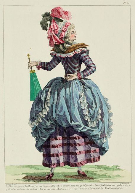
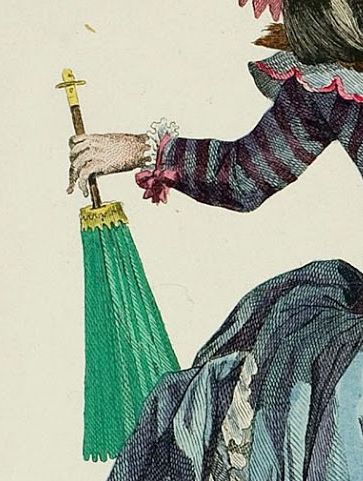
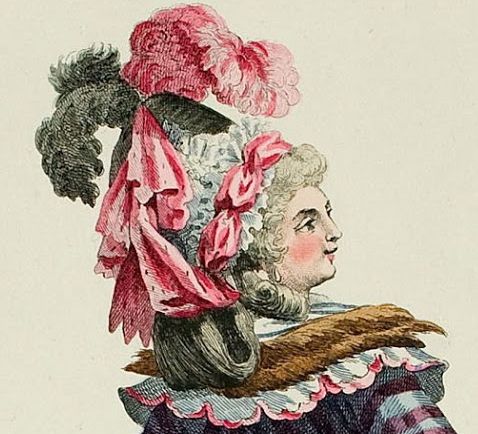
Believe it or not, this is an outfit for walking (in the late 18th century sense at least). Our ‘galant nymph,’ parasol at the ready, is hastening (‘tranquilly’, no less) toward the Palais Royal.
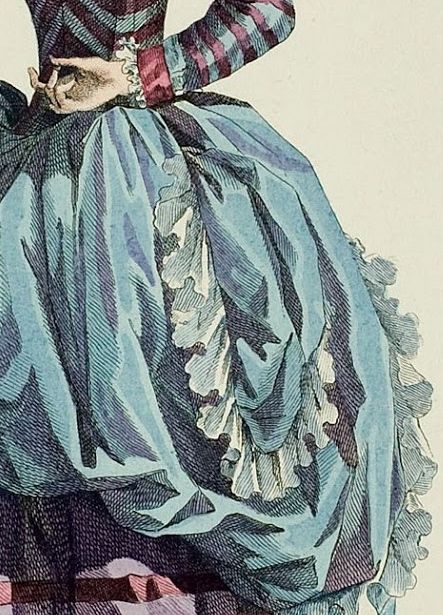
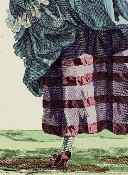
Her ensemble is described as a robe a la Chinoise (I believe that is meant to be Chinese inspired, and the parasol probably added to the effect), with the skirt lifted up to reveal her striped petticoat and tucked through the pocket slits (retroussee).
The nymph’s bodice is also striped, with a striking chevron placement going up the centre back, and uncharacteristic (for the 18th century) horizontal stripes on her sleeves. A double-layered pinked ruffle, fur tippet, and bouffant frame her neckline.
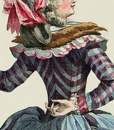
On her head she wears a bonnet á la Richard (inquiring minds want to know, which Richard inspired a cascade of pinked pink ribbon, a plethora of ruffles and poufs, all surmounted with a flourish of ostrich feathers in pink and grey? Is is supposed to be some sort of Medieval Lion-Hearted tribute?)
And her lifted skirt reveals white stockings and bowed shoes in a rich wine purple that perfectly coordinates with the stripes on her bodice and skirt.
Here she is again, in her be-wigged and be-poofed splendor, her deportment ‘majestic, noble, and proud’ (the writer who captioned the Galerie des Modes really didn’t hold back).
Clearly, it’s not an outfit for heavy exercising. But from the era of fashion excess, for a light promenade on a sunny day, when one can admire the outfits of the other ladies, and be admired in turn, it’s perfectly admirable.
Right?
Or is it resoundingly awful?
Rate the Dress on a Scale of 1 to 10
Quite the confection! At first it’s rather startling, but I actually like the color/pattern combinations. Go big or go home. I don’t think it needs that fur trim though, that puts it way over the top.
Good grief. That’s…. quite something. I love the stripy bits. I hate the blue skirt in this context. I loathe the green parasol as a colour match with the blue. The roadkill round the neck is overkill. And pink and grey feathers? Ye Gods. Oh no. No. No. No. Just NO. NO. NO. NO. The individual elements are fine but the combination is just horrifying – too much clash, too many clashing textures AND colours and details. But the purple stripey bodice is FABULOUS and if it wasn’t for the blue overskirt, if the gown was entirely purple, it would be so much better.
4/10. (8/10 for the purple bits. A nod towards the headdress as it would be great with a purple striped gown but with everything else it’s just a bit too much.)
*shudder* I wonder if some French aristocrats were
guillotined just for their bad taste in clothes.
3/10
I’m immensely disappointed that the skirt is not striped like the bodice. That would have taken it to a level of almost bad that would have transcended into good. But the sweet, feminine blue ruffled skirt? An odd, unbalanced juxtaposition with the quirky stripes.
Also, weirdest retroussee styling ever. The lack of structural pouf, the odd diaper effect. Un-poche, please.
I love the shoes and I’m going to add Richards and fur to all my clothes now. Maybe not all.
6/10.
The more I look at it–how DID they make a diaper out of the retroussees aux poches? Did they take the left side and pull it through the right pocket slit, and vice versa? Pulling through the same side gives a nice “curtain drape” with the middle longer than the sides. There’s something wonky going on here.
Note to self: Whatever it is, don’t do it.
This makes last week’s dress look staid and practical.
I bet her friends loved it and her maids hated it for all the extra work.
For sheer chutzpah I give it a 7.
Dear God, what a hot mess. Some of the individual components aren’t bad, but the stripes going in two directions, the weirdly shaped collar and tippet, the mound of lace and ribbon that is the Richard…. ugh. 4 out of 10.
I have a tradition of buying and wearing ugly clothes and making them look good (or at least, I think I make them look good.)
This is exactly the kind of horrible I love to pull off. It’s loud and distracting, but the colors are muted enough not to shout. I love the striping, the double collar with the fur on top and the bouffant on top of that. (hey bro, I heard you like collars . . .) I love the pulled up blue skirt that puffs out to ridiculous levels. And I love the ‘completely doesn’t match everything else I’m wearing’ sensible green parasol.
I would totally make and wear this monstrosity, and give it a 9/10.
I love blue and plum–and you are right, they are both muted enough to work well together.
Most of the styling I dislike, especially that parasol! But I do have a warm spot for surprises that happen in the back of a dress, and in this case, I like that the back is lifted up to show the fun petticoat.
6/10, because I don’t like lace and poufs.
Please tell me, smart people, when WERE horizontal stripes on sleeves popular?
18th century dresses with vertical stripes do tend to have horizontal stripes on the sleeves.
Awful, I’m afraid. It’s all too much, and I don’t think any of it really goes together. 3/10
I love the stripes, hate the blue balloon over her bum and the frothy lace makes me think they were going for milkmaid with extra froth! The swag in her hair looks like it’s falling out so that’s another bad point. I do like the shoes though.
4/10 for the bits I do like, otherwise it would be a 0
To my warm eye, blue and burgundy are deadly together. I have a strawberries on gingham print in my stash in blue and burgundy and it looks like something Wednesday Addams would wear ironically. So not loving this colour scheme. I wonder how many of these fantasy drawings were ever made up?
I’ll give it 2/10, because the en retrousse skirt is kind of fun.
The crazy thing is, the colours may be just the colorist having fun. Or running wild with it. I’ve seen different color versions (even different pattern versions) of fashion plates…
And this one looks suspiciously fantastical and made up to me on the whole. That parasol. How does it even work? It’s upside down.
But even if I imagine it’s the colorist running wild with it, I just don’t overall like it. It’s too fluffily ridiculous, unbalanced… even the drawing itself, her stading like that, with her hand like that, her head like that, on heels (and the tiny feet of the drawing!), with lots of fabric on her back and towards the back of her head… I just see her landing firmly in a muddy puddle in the next moments, ruining the whole confection. And there goes your tranquil hastening.
It’s fun to make fun of it, though, and a lot of the fashions of the era seem targeted towards being the topic of gossip more than anything else. So for successfully pulling that off, I think it deserves at least 3/10.
I love these illustration plates. They’re like the most ridiculous trading cards for 18th century fashion concepts…
Seeing as I’d love to have this one in my own hypothetical collection for pure ridiculousness — where did that green parasol come from?! — I rate it a 5/10 for audacity and non-conformist accessorizing techniques in full swing.
I wanted to add that this walker somehow reminds me a of a dodo bird. Okay, now that’s off my chest.
This is usually my favorite historical style of fashion, but I just can’t get over the striped petticoat and the skirt that just like some big cloud landed on her butt, maybe it got caught in all the stripes. Sorry since I ordinary love this style I’m going to be harsh on this particular version, since I know that there are so many nicer examples out there, it’s 4 out of 10 from me.
The chevron in the back was a bit redeeming, but not enough.
Wow – there are a LOT of fours here! Not so much frou-frou as four-four.
I actually rather like it. The galant nymph who wore it was probably quite an entertaining company at the palais royal. And as Diana Vreeland said: never fear being vulgar, just boring.
I’ m not sure how it worked in those days….but for sure you couldn’t just walk into a shop and buy a dress like this right from the hanger. So if a lady liked a fashion plate she probably went to her ” milliner” and commissionend it in the fabrics she liked….more or less in keeping with the design of the drawing. So in this case this would have served more as an orientation/ inspiration. Now if a good miliner like Rose Bertin made this up for you in a good quality ( including some professional fashion advice) , this would have probably turned out rather pleasing.
I’d have the whole skirt done in one fabric, all blue. And probably a different hairdo….maybe just a big hat.
It’s cute…I give it a 7.
Hi! I love your blog and been reading it for awhile 🙂 So I would like to join in 🙂
Now the first thing I had to think about this ensemble is “Poor fox, deid unworthy for this dress!” It’s a total mess! Stripy, plain blue, another stripy, fox, wig, feathers pink & grey, green parasol!!! Nothing match with nothing! Except the main colors… But this won’t make it better, not even Marie-Antoinette would fancy seeing it in her park 🙁 So I give it 3/10, sorry nymph!
As a picture, I really like it. Her stance and expression – the whole mood is very full of it (er, I mean gallant, in a tranquilly hastening sort of way), but also very pleasant and optimistic.
As a dress…
I like the blues and purples, I like the stripes. The shoes are darling, at least from the back.
The puffy blue skirt looks odd, dividing all those stripes. Not saying a skirt is out of place there, just a different skirt. The collar is a horrible layer cake. And that hat is just … It’s completely over the top, but a different over the top from the dress itself. But even if it cooperated with the dress, I don’t think I’d like it at all.
3.5/10.
Exactly–thank you, Dreamstress, for pointing out the fun description!
I like the fabric and colours, but the shape of the skirt in the back is awful. It also looses points for the horrendous green shade of the parasol.
It’s certainly interesting, but not well coordinated at all.
5/10
Insouciance illustrated! This is a delightful concoction. The back is exquisitely sewn. The only quibble I have is the tippet, which does not “go” with the spring/summer feel of the dress.
My rating is a much more generous 9/10.
It is a little known fact that, soon after meeting an eccentric gentleman with a blue box, Theodor Seuss Geisel embarked upon a brief career as a Parisian fashion illustrator.
4/10
I never thought I’d see a late 18th century confection that I couldn’t stomach, but here it is! The gown and petticoat alone would have been a fun-bordering-on-funny statement (and the bodice by itself is awesome), but then to go adding that hat and that tippet and that parasol?
I feel the caption should have gone: “Having raided half the laundry lines in the county, Lady H-‘s maid felt her disguise was not only complete, but so vulgar that none would dare question her nobility.”
I’m sorry to be so horrible, but it’s pretty gross.
2/10
Some of the elements are fun enough, but as an ensemble? Quel desastre!
2/10 for sheer nerve.
Plain daft. No redeeming features except the chutzpah of the lady wearing it.
As for the hat, I think we can absolve Richard the Lion Heart (though he was not a nice man, and I would happily saddle (or crown) him with this monstrosity) and just say, if you will all forgive the vulgarity, that the hat leads one to make a ‘dick’ of oneself.
1 out of 10. For the sheer audacity.
5/10 for the classic “Does this make my bum look fat”-pose and the crazy hat. The rest…not so much my thing.
I appreciate the effort it would take to create this dress, but it’s so dang garish. So gaudy. Which is fine for the time period, but I just can’t bring myself to like it. At all, really.
Well, maybe the shoes work.
I give it a 2/10.
I like the stripy pattern on the bodice, and the combination of plum, light purple, and blue- although it would’ve looked better if the blue was used as the underskirt- but otherwise it’s pretty awful!
I also don’t get the ‘Chinoise’. Now I am no expert on Chinese dress, but as far as I can tell the parasol is the only part of this that is even remotely Chinese. I’d say a 2. I’ve seen even worse, but not that often.
I have to agree with others who have admired the bodice. It is not only my favourite bit of the outfit, but right up there with Things I Like. I also very much like the green parasol and find it fun that it does not match. The underskirt is nice and even though it does not quite match the bodice it goes fine if you don’t mind an overdose of stripes. The other bits, I’ll pass on thanks.
Total 5/10 because the bits I like, I love.
Too much! 1
It just hit me how very I’m a Little Teapot that pose is.
O….M…..G….
This is so hideous, it’s fabulous!
10/10!
The colorists may have just been having a field day, but look at her sass! She is OWNING that outfit, crazy bottom-swags and all!
. I have to write you though to say that the Victorian era was considered from 1837 to about 1900. The walking dress above if from the Eighteenth century the 1700’s. 1800s are the Nineteenth century and so on and so forth
You’re confusing my introduction, which refers to the dress we looked at last week, which was Victorian, with the dress that is shown this week, which I clearly identify as 18th century. Have a close read and you’ll see your mistake 🙂