
Last weeks I showed you a Hattie Carnegie dress in pale pink & green, as worn by the 60ish Electra Havemeyer Webb, sparking an interesting discussion about colour, age, and when is pink too pink. The outfit copped some criticism for the colour scheme (Rate the Dress history on this blog suggests that pink + green isn’t always a classic scheme), for being too shiny (that’s satin for you: even in silk it has a lustre!), and for not looking comfortable, but it came in at a comfortable 7.7 out of 10.
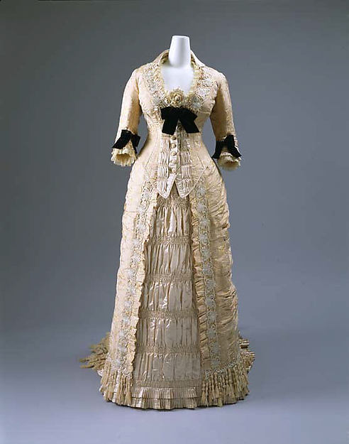
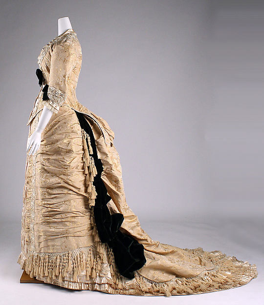
This week I’ve picked another two-tone outfit, but one that takes the idea in a very different direction. In contrast to the simplicity of last week’s dress, this champagne and black dinner dress by Mon. Vignon is the epitome of Victorian detailing, with every square inch of fabric patterned, beaded, ruched, pleated, trimmed, fringed, and otherwise ornamented:
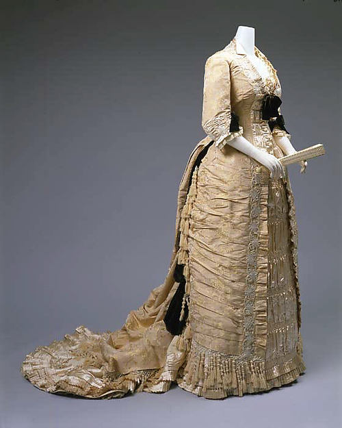
The front of the dress features a ruched panel down the skirt and bodice, framing the bodice buttons, and surmounted by a black bow at the bust:
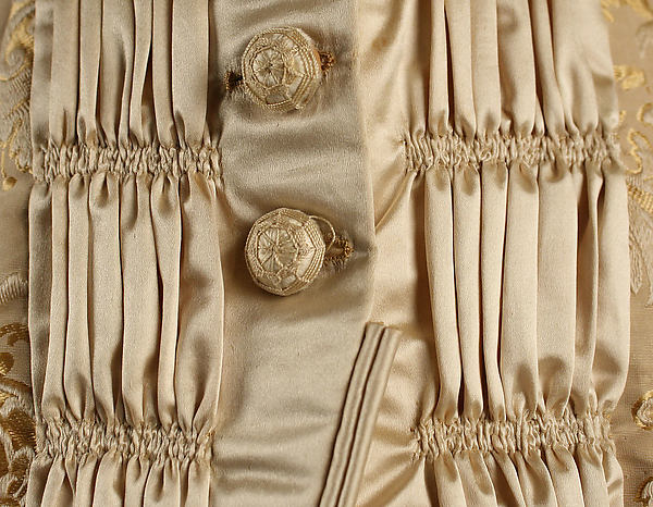
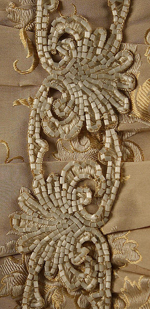
Even the buttons are detailed, with wrapped threadwork:
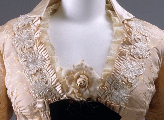
The neckline is edged with lace, fine pleating, and an elaborate beaded border. Plus, there is a collar, and a rose:
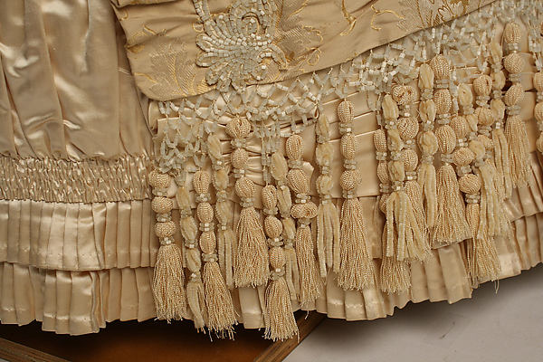
The rest of the dress is not left to languish unadorned. The train is bordered with black velvet swags, and beaded and tasselled fringe sways round the hem and climbs up the side of the skirt.
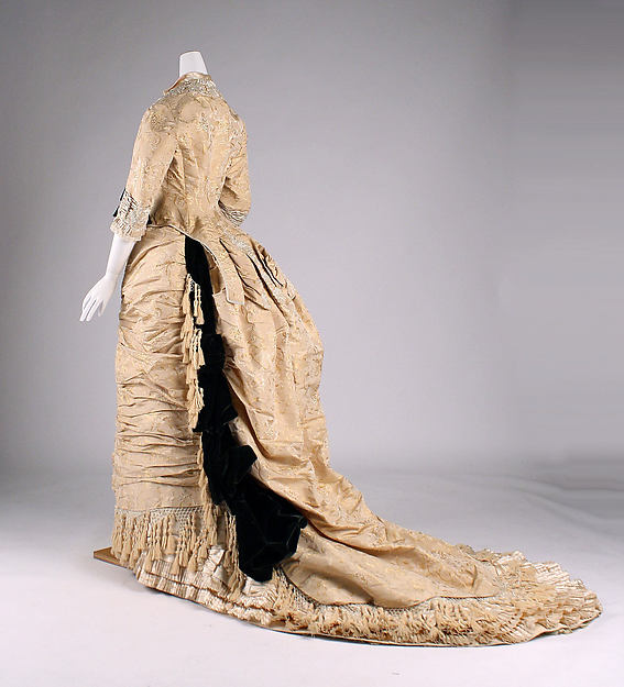
Underneath the fringe, there are layers of fine pleating:
The dress dress is definitely a paean to the idea that more is more is more.
Is it too much?
What do you think?
Rate the Dress on a Scale of 1 to 10
It’s way too much to me, it looks like she’s been attacked by a curtain warehouse, and lost. I especially dislike the tassles. Still a nice colour scheme, and the overall impression isn’t too bad, if you stand 10 meters away or so, so 5 out 10.
I actually like this dress because of its gracefulness. Any lady from her mid-20’s to her 70’s or later could have worn it with aplomb. Good design is like that, almost ageless. It is definitely not a dress for a debutante.
My rating: 9.5/10 because very few things are really perfect
It makes me exhausted just trying to look at it! bandykullan had the right of it with a curtain warehouse attack.
I do find the black too severe a contrast. One’s eyes try to navigate the excess of ornamentation (even though I like the basic color) and slam into the black like a slalom skier missing the course and slamming into a tree.
3 out of 10, points awarded mainly for the skill it must have taken to cram all that “stuff” onto one garmet.
This period is not at all one of my favourites, and I’m really a less is more kind of person. That being said I rather like it. As all the trim and other what’s-it are in the same colour it’s not overwhelming, just busy. I like the black bow on the bodice, but Im not wild about the other black details. 6/10
10/10!! This is absolutely GORGEOUS! This also happens to be one of my favorite periods in fashion, but I would wear that in a heartbeat (where I have no idea, but yes please!). I also like the surprising splashes of black on the tonal cream gown. It’s just enough to work as a nice accent without feeling too heavy on such a light colored gown.
Individual elements are gorgeous: the buttons, the front of the skirt, the (relative) subtlety of the rose, the black swags in the train. But it’s overwhelming. Plus, the color. If it matched the wearer’s skin tone too closely, with all those pleats and creases, the whole effect might be fleshy and wrinkly. I think I would have added more black or made the accents a lighter color. Even if the dress was a different color, I think you’d still run the risk of looking like an overstuffed accordion. Even the black swags are looking rupture-like.
On the right wearer, I think this could look bold and majestic exactly as it is, but on its own, I’d say scale it back some.
6.5/10
The curtain warehouse attack analogy fits perfectly, and deserves to become a classic saying whenever fashion fanatics meet! Thanks so much for the laugh, Bandykullan! 🙂
I am on the fence as far as late Victorian fashion is concerned, but this is one of the better examples. There is no garish aniline dye anywhere, the dusty pink (if that’s the colour) is rather understated, and so at least the more is more effect is slightly muted. The craft(wo)manship is exquisite, but of course fringe on top of pearl embroidery on top of ruches on top of ruffles on top of pleating on top of frills on top of huge big swathes of shiny fabric is a bit overwhelming.
Still, I somehow like it.
7/10
What you said. From a distance it’s very nice, close up it’s too much. 7/10 as well, would have been 8/10 from the distance.
I love the silhouette, the technical virtuosity and colour combination, but my god that’s a busy dress! It’s a bit much really, but I still kind of love it! I’ll give it 8/10
There’s definitely a lot going on here. However, I think the restrained colour palette prevents it from being too over the top. Not sure about the black swags on the skirt though. From the front, I rather like it.
I find it less appealing in profile, but that’s partly because I don’t really like skirts of this shape. 7/10
It reminds me of that part in Gone With The Wind where Scarlatt had just married Rhett, and she was shopping for clothes in New Orleans(yes, I had to go look it up to quote) ” More exciting than the people she met were the frocks Rhett bought her….Hoops were out now, and the new styles were charming with the skirts pulled back from the front and draped over bustles, and on the bustles were wreaths of flowers and cascades of lace.” This dress is just Scarlett’s side of bad taste. If you ripped off the fringe and the flower in front and at least part if not most of the black velvet bows, it would be a nice, if pretty ostentatious dress. As is all I can say is fiddle dee dee.
oh yes, I forgot (probably because I started reading the book now that I got it out) I rate it 7/10 for potential.
I also thought of Scarlett immediately. She might have thought the colour too pale, though.
I find it rather fantastic that one can have so many ornaments on one dress, I’m actually quite impressed.
I love parts of the ornamentation, The buttons are fantastic, as are the lovely rose. I have a hard time forgiving the fringe, though 🙂
So I’ll give this a 7
I’m with bandykullen, too. This is just too much. I’d like to applaud the champagne and black, but everywhere I look, the dress has been fussed with. Too many different things.
4 out of 10
It doesn’t look like it actually needs a person in it to stand up. Maybe look at it as a piece of statuary, rather than a garment? I wouldn’t want to wear it myself, but it’s nice to look at and definitely took some skill to execute! I don’t like the black velvet, though – too strong for the subtle colouring of the rest of the garment. 7/10.
Beautiful cut, beautiful trim, beautiful fabric! But as much as it pains my gothy sensibilities to say this… I think it would be prettier without the black. Those bows would look much better if they were crimson or blue, or just not there at all. And the cleavage flower must go as well. It’s awful.
Generally, I like it.
9/10
O M G …..Hurray for MORE IS MORE…! but really,how far is too far anyway…( snarky smile)…10 out of 10 for fabulosity…WOW!
I really don’t like it, too many tassles which make me think of lampshades and the black down the side of the train reminds me of a giant slug.
4/10 and that’s only because I like the overall silhouette.
I like it! It is a study in different fabric manipulations. But can you imagine wearing it with all the beading and layers? Heav-vy! I would love to recreate some elements of it. Hmmm. I have the jacket pattern already… 9/10
I know it’s a LOT, but I love it. It is the sort of thing where all of the extra embellishments should be too much, but they all sort of blend into a lovely composition. I love the silhouette of this gown too. I’m looking for something to criticize, but all I can think is “Ooooh, pretty.”
10/10
My post seems to have vanished! I won’t repeat my logic, just my result. For all its elaboration, this gown leaves me with a “meh” feeling. 7 of 10.
More IS more. And this dress proves it. I love every inch of it and would love to swing around dance floor in this. Oh! How the tassles would sway and the light would reflect off of every tiny bead! Though, I do love it, in all it’s glory – I see what the others mean by the black being a bit dark. I still love it! 9/10
I think from a distance this dress is gorgeous – elegant lines, beautiful delicate colour and superb craftsmanship in the ornaments.
However the ruching and the tassels make it just this side of too busy and while I like the idea of contrasting elements and I don’t think there’s too many of them, the contrast of the black is just too stark.
7/10 because it does have all the elements that can make this time period appealing, but takes them just a little bit too far.
Haute Couture tailoring, perfect details, the pale coloured dress with black velvet ribbons gives some sort of rleax feeling to it, afterwards your eyes were blinded by all that “bling”! I love bustle era, my favourite of all, but I hate fringes, especially this type of stiff, over-designed curtain ornament-likes. The design of the fabric is nice, opulent but got lost under all of the pleats, bead, fringes, etc… Sad for it 🙁 The fabric alone could have stolen the show! The pleats and bead works are stunning, would have been quite enough! More is always more, but here less would have been better. Hurray for the skills, boo for the over-trimming :(((
8/10
I love this kind of sheer extravagance and overdoneness when it’s done all in one colour. Not so sure about the black bits as they are too harsh a contrast but the overall effect is gorgeous, like intricately carved bone. 9/10, as taking a point off for the black spilled-ink effect.
WAY TOO MUCH! I liked the dress, until I saw all of the tassel fringe! Looked like she decided to tack on a piano runner as a train. No!
5 out of 10
A lot too see here, the ostentation is quite mind boggling. I like the black details myself, I also like the multi-faceted effect of layering of pale and dark which is a foil to all that texture. It feels quite harmonious when you consider all that is going on. 7/10
How many hours of work – hand-labor – must it have taken to complete this dress?? The dress itself, minus all the ruffles and flourishes, would not have taken nearly as much time as the trim, I’d wager.
It’s not my personal cup of tea, but the lines are very evocative of the era, and the trims themselves are beautiful and beautifully executed (wonder how much weight they add to the dress?). I’m not too fond of the black and ecru combination, but perhaps the dress was more pinkish originally, which would set off both the black trimmings and the glass and pearl adornments more effectively.
I bet the original wearer ate v-e-r-y carefully, to avoid spills on this dinner dress. And I expect the original “dinner” for which this extravaganza of a dress was made was more likely a banquet in a stately home or perhaps a palace. Feathers in the hair and all that…
So – hard to judge, but 8.5 comes close, considering all the factors.
I have yet to find a context in which I don’t hate bows. They always look fussy and infantalizing to me, always. So undignified. I really, truly hate them. I’d say remove the bows, change the black swag in the back to a really dark caramel/champagne brown, and we’d have something lovely. As others have said, the endless decorations look really cool in monochrome, and the pale champagne is a great colour. 7/10.
Usually my taste in fashion is decidedly minimal, but I am totally taken with this dress. I love that from afar it looks very simple, with a bit of texture to get you intrigued. From the side, the black details lead your eye to accentuate the “S” shape, and there is enough detail hidden in the monochromatic color that you keep looking back thinking maybe you missed something. Whoever wore this definitely knew what she was doing. 10/10
That dress is heaven on a stick! Totally adore it – I
want to be buried in it.
I wonder about the team of seamstresses who worked
on it. Truly truly scrumptious.
10/10
I second that about the team of seamstresses! I work as a seamstress for theatre, so I wonder if these ladies, like us, sat working together in the same room debating over the politics, art and social changes of the day like we do. Working together on such a huge project can really build strong bonds.
Nah, they’d have been talking about men, love, marriage and the new patisserie down the rue.
It’s the 1870s — too much is the name of the game! Much too much? Nah.
I give it a 9/10.
That’s a gorgeous amount of work, beautifully done. I love it. I’m not a fan of that color, nor do I like it on anyone, hence the missing point. But I just love the bibs, the bobs, the frills, the fuss, oh my it’s why I got into costuming!
I’m wondering if the black bows could have been added later?
Any suggestions
I really like it other than that so 9/10
Based on personal taste and its perfection for the 1870s, I rate it
10/10