
Last week I showed you a luxurious silk frock inspired by simple folk embroidery. The scores were all over the place: mad love, complete revulsion. Quite a few of you expressed doubt that it would look good on most women, which didn’t help its score. Overall, the dress came in at 6.9 out of 10 – very close to the 7 that was the most commonly given score.
This week, we’re leaving peasant chic behind, and going very upscale: Paris couturier fashions in the 1890s. It’s not quite Worth, but this gown reflects the decadence of late 19th fashion that he helped to inspire, and the cache that his work lent to Parisian fashions.
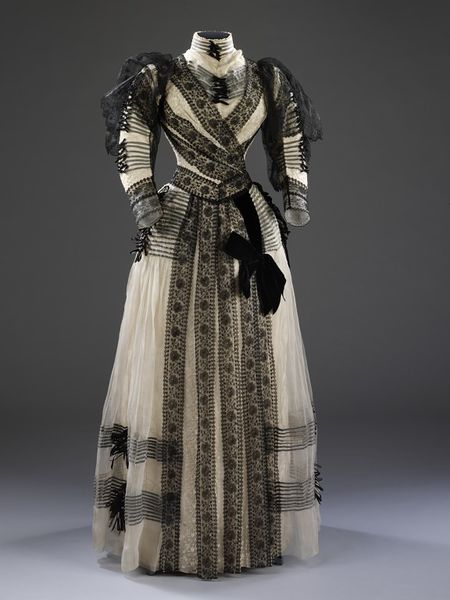
This gown was purchased by American heiress Cara Leland (nee Rogers) Broughton, either on a European tour just before her first marriage, or after she was widowed a year later in 1891, but before she married (only slightly) upper class Englishman, Urban H Broughton in 1895. His work as an MP and during WWI led to Cara being given the title of Lady Fairhaven after his death, meaning that Cara is sometimes used as an example of a Dollar Princess or a Buccaneer (though only in a fast and loose usage of the terms, I would contend).

While purchased by Cara, the dress may have been worn by her older sister Anne. The restrained black and white colour scheme means it is possible that the gown was used for the later stages of mourning by Cara, or by Anne, who would have had a much shorter, more relaxed mourning period for her brother-in-law (or either one could have been in morning for another family member).
While the colour scheme is restrained, the rest of the dress is anything but. There are lines of lace, ribbon, and bows. Layers of light frothy cloth and lace. Texture upon texture.
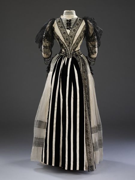
The entire dress is quite muted and diffused, until you get to the unexpectedly bold stripes of the back skirt panel.
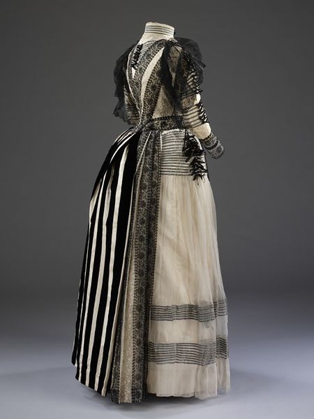
The more you look at the dress, the more details there are to find: the way the lines of ribbon keep the tulle flat over the hips, allowing it to escape in gathers below. The unexpected asymmetry of a few lines of lace on one side of the black and white striped panel.
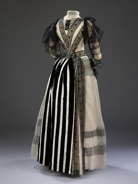
What do you think of the dress? Is it an interesting way to do a very simple colour scheme, perhaps for mourning? Is it the garish vulgarity of nouveau riche that the term ‘Dollar Princess’ usually implied (Cara’s family had been reasonably prominent for generations, so nouveau riche isn’t quite accurate). Does it say ‘widow seeking exciting new husband!’ or ‘woman with a more interesting story than meets the eye’?
Rate the Dress on a Scale of 1 to 10
Oh my, I rather adore this one. It is so over the top, such an extravaganza, so crazy with its esprit de “oops-we’re-short-of-a-couple-of-metres-of-fabric-never-mind-let’s-take-this-black-and-white-shower-curtain-she’ll-never-notice”.
Makes me speechless, really, and therefore deserves an equally over-the-top
10/10.
Although I like the way some of the lace lines direct the eye, when I saw the first picture, even before reading the description, the brain went, “Just Too Much!”
The shoulder “fluff” made me think that she had walked through sooty cobwebs, and I wanted to brush them off, and I foudnd the lace strips too wide for my tastes.
That back panel looks like someone trod on the wearer’s back hem at some event, ripping away the skirt and necessitating grabbing the nearest remotely compatible fabric item (curtains, maid’s apron?) to make enough of a repair to preserve modesty until she could return home.
I give it points for overall lines and entertainment value. 5 of 10
Entertainment Value.
THIS.
At first it was a 9, because it was so delightfully too much with all that sheerness (is that a word?). Then I saw the striped back panel and it dropped to a 7. But then I started thinking about a mummy wraped up in lace and that can’t deserve more than a 5. But I really like tulle so let’s settle on a 6.
Oh, my! Isn’t this all rather excessive. Usually I just love Black & White; however, this is probably the one dress to which I will say No, thank you. Where to begin, where to begin? How about everywhere! The sleeves with the weird black upper sleeve; the strange ribboning about on the torso; the BLACK VELVET on the spring-like fabric; etc; etc; etc.
The points given are only for the poor seamstress who had to sew this:
2/10
Oh my! This is very Tim-Burton-meets-My-Fair-Lady to me…..and I love it! How have I not pinned this already?!
I can very easily picture this gown worn with a hat veiled to match the sleeves and an equally over the top parasol.
The striped panel at the back catches me off guard. I think it’s actually too plain to match the rest of the dress. I would have much rather seen a whole train of the black lace “steamers” and a giant velvet bow to match the front of the dress.
I do love the rows and rows of thin ribbon with tiny bows! I can’t tell if it’s grey ribbon or not, but it appears the seamstress cleverly placed the ribbon under the top layer of tulle, but put the bows on top. The foggy effect is very romantic.
Definitely a character dress!
8 out of 10.
That darn striped back panel stole the final two points away. The rest of the dress went big, but that panel just needs to go home.
“Tim-Burton-meets-My-Fair-Lady” – the perfect description!
And I agree, the back panel is just completely out of place – it looks like an homage to WWI “dazzle camouflage” on ships’ hulls.
9/10 from me because so close to awesome….
Yes. This belongs in a Tim Burton movie. But it is not beautiful.
I want so much to like it; cream and black lace is a good place to start.
However, Coco Chanel was right when she said to “take one thing off before you leave the house.” In this case, it’s 75% of the trimming.
More points off for the striped panel at the back. To me it feels like the wearer stood too close to the fire, scorched the original fabric, and this is a replacement skirt panel.
4/10
Beautiful! The layers of tulle and lace give it this fantastic ethereal quality. 10/10 from me.
Ethereal indeed, except for the awful “LOOK AT ME HERE I COME”-bottom-wrapping black and white stripey thing.
I like the surplice lace on the bodice itself, but the rest is a hot mess, and OH LORD when you get to the striped panel at the back. What??? Overall I’d say this gets about a 3/10.
I like the surplice lace on the bodice itself, but the rest is a hot mess, and OH LORD when you get to the striped panel at the back. What??? I normally adore this period in fashion and all it’s eccentricities, but goodness. Overall I’d say this gets about a 3/10.
There are some very interesting things going on here and some good use of lines, but to me it’s all far too much. 5/10
I really liked the front, aside from the phantom-lace-puffs, but when we turned to the back I was floored. ANOTHER set of stripes!? Woo, busy busy…. I give the entire ensemble a 7/10 only because each of the materials used are gorgeous, just not together.
It’s just too much. I love those lines of lace and those narrow ribbons. If the dress limited itself to those design elements, it would be a 10. But then the shapeless black tulle at the shoulders come to my attention, the huge black bow at the waist, the striped panel… it’s too much. 6/10
… lace, not tulle. Still shapeless.
The good: Black and off-white. The wide lace ribbons running up and down being set off by the thin horizontal striping. The cuffs. I can even dig the crazy black and white back.
But: All of it thrown together looks enthusiastically bad. Much as I like the lace ribbon, its placement feels awkward. Much as I dislike the flappy black shoulder lace, I dislike the twitchy black bows down the bodice even more. As for the black and white back, I’d like it on a dress, but not this dress. The flat white’s just too sharp and abrupt. And worst of all is the huge bow on the skirt.
I really like the color scheme (except for the very back), and with some adjustments I think I’d really like both the wide and narrow ribbons. I could even get past the back and the shoulder lace. But as it is, it just looks so baffling, that big drippy bow, and the little spidery bows, and … and …
… What on earth is going on with the little bows up and down the hips?
Is it supposed to look like the dress just came out of surgery?
3.5/10
Oh, my gosh! This screams “Eliza at Ascot” to me. 🙂 Love it! 10/10
“Some of the nineteenth century garments are thought to have been worn by Cara’s sister, Anne (1865-1924). This elaborately trimmed dress would have been considered appropriate for a married woman (Anne married William Evarts Benjamin in 1886), less so for a young unmarried woman. The black-and-white colour combination probably represents half-mourning for Cara and Anne’s sister, Millicent, who died aged only 17 in 1890. (DMC)”
Um, should I point out that I am DMC? So I am obviously a bit biased here cos I know this dress and the Fairhaven collection. I actually don’t think Cara bought any of these early dresses, but that they were ordered/purchased by her mother and possibly her sister. But I am really pretty certain it is half-mourning for poor Millicent, and probably for Anne rather than Cara – or maybe even their mother, Annie, as quite a few of the dresses in the collection of this period do appear to be designed for an older woman (although I think this one is more “young matron”)
I actually find the hemline and bustle a bit awkward in this dress, it’s sort of a neither here-nor-there bustle, and the hemline doesn’t seem at all sure where it’s supposed to go in relation to the ground. But I love the bodice. I am not keen on the skirt, with the spidery bows and all the lines and the tulle overlay and the very stark back panel (actually there may have been tulle over the back striped panel or drapery, but not sure.) So I would say this dress is a 6.5/10 – the bodice is largely stunning, but the awkward skirt drags it down a bit.
Thank you for the clarification! I didn’t read the full notes on the dress – just thought it was interesting because I’ve read about Cara in discussions of the Buccaneers.
If all the horizontally placed trim and the black bow in front were removed, it would be quite lovely. As it is, there’s just too much stuff. As to the striped panel in back, it’s not too bad. I’ll give it a 4/10 overall.
I decided to make my own comments before I read any others.
The basic dress design is lovely…I like the sleeves (sans embellishments) and the fit of the waist.
That is where it ends.There is too much of everything…It makes me want to remove all embellishments and start over. I would like to see it in person to look at the finish, it is probably all hand work and lovely material. 6/10 for design & fit.
A previous effort to comment just disappeared into the air. Here’s my second attempt:
Without knowing the backstory, this dress would just scream “Merry Widow, who doesn’t intend to remain a widow, but who certainly intends to remain merry!!”
As others have noted, the lines and materials are beautiful. The effect – not so much so. It’s just too much of a muchness: the mummy-wrapped bodice, the frou-frou “wings”, the striped whatever-it-is in back: overkill.
Judiciously remove 33-50% of the trim, add a matching hat (large, with lace and a black ostrich plume), gloves and parasol, and it would be a knock-out.
As it is – well, the observer’s eye is more blackened than caught. The dress’s designer just didn’t know when to quit.
7/10, for missed potential.
The original idea–black on white with trim placed in stripe motifs–was a good one, but the designer took it too far. The tufts of black lace on the shoulders and the black bow on the left front of the skirt look like accidents, and the black-and-white striped inset panel in the rear of the skirt looks like a ghastly mistake. A 6, because the silhouette and the basic scheme of decoration is intriguing and reasonably flattering.
Heh, you basically think the exact same thing I do! That bow really is just plastered on, isn’t it?
amazing!!! love it!!! I would happily wear it!!! 10/10
Although I love it for existing – for surviving – the dress seems vulgar. I immediately thought of the gaudy finery of Miss Mabelle Jones in ‘The Family at Misrule’ – someone just didn’t have the good taste to know when to stop. It looks rather as if someone had sketched a design to be made up, only to have someone else come along and doodle every notion they could think of on top of the original design, which was then fowarded to the dressmaker.
Without the wide bands of machine lace, without the bows, without the lace sleeve tops, oh please without the alarming rear drapery, we see the bones of a lovely dress. But as it stands – 4/10.
Oh my, at first glance (the front of the bodice) this was a ‘I love this dress’ moment.
Scanning out to the lacy batman sleeve puffery, I thought ‘okay, maybe I could catch those in a door and lose them that way…).
Scrolling down to the rear vision, my eyes were bewildered by the zebra crossing panels and decided ‘what in heaven’s name were they thinking?’.
I adore the placement of the lace strips, the gauzey tulle and can even handle the wee bows… but that cascade of stripes a la derriere? A bridge too far.
8/10 and I’d stand with my back to the wall 🙂
Very Jo March of you!
My favourite Little Woman 🙂
I love the front with the asymmetrical lace. I think it’s very fashion forward but still refined. But the back… That striped fabric is so out of place! And the asymmetrical lace there is just odd. It really brings down my score.
So, 5/10.
Best,
Quinn
To me it says ‘more money than taste’ – just. I want to love it, but there are some scary things. Those black oversleeves look more steampunk than original, and the striped skirt back is a shock! Less would have been so much more. I like the lace, I like the front of the skirt, I love the black gathers on the hips. The shape is lovely.
7 out of 10.
Very Whovian! It looks like something the Silurian Madame Vastra would have worn in a light hearted mood, maybe after she had eaten Jack the Ripper.
On a different note the black bow on her hip looks like a manikin climbing up her shirt on his way to attack her face.
a 3 out of 10
http://en.wikipedia.org/wiki/Madame_Vastra,_Jenny_Flint,_and_Strax
I think Vastra’s black veil might improve the look of that lace on the sleeves, in actually matching it…
I rather liked the front, and then it turned around and all I can see is the drawing room curtains. 4/10
To where thy hallowed bones are laid,
Far from the busy haunts of men,
To converse, Mother, with thy shade,
I come again.
Oh! I have felt affliction’s wave.
3/10 for the rose-motif lace.
No, too much of everything! Ther decoration is overwhelming the eyes! The back stripy part is wholly needless also the many ribbon + bow decoration, would have liked it better with only the lace or only with the ribbons, and the back without that ugly part! 4/10
Rule of thumb–pick one thematic motif and go with it, not two that duke it out on the dress. No one wins that one. Here, there’s the muted ivory with lace–it almost puts me in mind of blackwork and I love it. Then there’s the bold striped back–which is graphic and I love it. But together? Nope.
This is before I even question why there are black lace bat wings emerging from the shoulders.
I’d love to see a re-do. FWIW, wouldn’t that be a good HSFN challenge? Re-do an off-the-rails historical garment that deserves a second chance?
4/10
This is one of those dresses that the more you look at it, the more your opinion changes. I loved it, until I saw the back, but then more I looked at it, the less I hated that sudden bold area. I think if the back had a tulle overskirt to soften the bold lines and add more detail it would be fabulous. As it is, there are excellent details and plenty of weird and fun bit to draw the eye.
8.5/10
I wanted to like the dress, too; but just couldn’t quite get my liker engaged. At first, it was just an uneasy feeling that something wasn’t quite right, then my eyes adjusted and I started seeing things that just didn’t seem to belong…namely those weird sleeve flounces… the awkward lace placement…and I found myself thinking, ‘A good example of why ‘Just because you can doesn’t mean you should’…and then I saw the back.
No words. Although the suggestion that the back of the dress was spoiled somehow and the stripes were a replacement would explain a lot.
3/10 just because someone worked hard on it. I wonder if they were enthusiastic about sewing it up or if they were tut-tutting the whole time.
I thought this was the prefect balance between black and white until I saw the back. I’m not sure where that back panel came from but I think it is way to loud for a dress that looks so dainty. I would give it an 8/10 because I’m not quite a fan of the lace over the shoulders either. But that could pass if it wasn’t for the back. I do love the black lace insets though on the skirt and bodice
Love the shape, thib black motives… but not so much stripes on the back.
10/10
I love it! The bodice details are so slimming and pretty, and I love all the details. The fabrics are beautiful, and the muted color palette obviously allowed the designer to play with texture and pattern instead! The only thing that is a little strange is the bold whiteness of the stripes on the back; it doesn’t seem quite right for the creamy-softness of the rest of the dress.
I give it a 9/10!
Just to much. 2/10
I saw this at the V&A in real life and it really floored me I give it an 8! The only reason I take away points is the back panel it clashes to much for me.
When I first saw the dress my immediate reaction was 10/10. But then I really looked at it and it started losing points, which is a shame because I really want to like it more than I do. However, the bad points are so bad that I’m knocking it down to 7/10.
I like the overall concept and the frilly-ness doesn’t bother me. I like the use of black lace on the ivory. I also like the effect of the black ribbon running underneath the sheer material, then popping out on top for the bows…there’s just too many of them. It would look less frantic with half as many.
The definite spoilers: the black lace puffs/whatevers on the sleeve caps, the detracting fussiness of the textured ivory fabric (is it lace?) and the velvet bow in front (yikes!).
The kill shot: the bold stripes at the back…just plain out of step with the rest of the dress.
If this was full mourning (obviously all black) all the lace and decorations would’t bother me too much. But this Black/ white contrast makes it too busy…Bustles were getting out of fashion at that time so I guess after 20 years they felt like there should be ” something” at the back ( could explain that striped back panel)….so i give it a 6.5