
Last week I showed you something a bit more recent than the usual Rate the Dress fare: a 1970s avante garde swimsuit. It, uh, mostly wasn’t liked. At all. Which wasn’t actually a surprise. In fact, I was surprised and delighted by those of you who did like it (and by a certain delicious rant – who doesn’t like a good rant?). Despite a handful of enthusiastic likes, it only managed 4.3 out of 10, which is one of the lowest scores ever.
In addition to not liking it, many of you thought it was just for lounging by the pool, not getting in the pool. You’re probably technically right that it was more of a sunning suit than actual swimming suit, but I both liked it, and would like to see it in the water.
There is a tradition in Hawaii of swimming in muu’muu, and there is a Hawaiian artist who paints lovely dreamy underwater images of girls in muu’muu swimming (sadly I cannot recall the name of the artist, and google searches were both fruitless and frustrating, because the internet has decided that everything Hawaii + female must be sexualised to the nth degree), and the swimsuit/playsuit reminded me of that. I’ve swam in clothes, and while they aren’t good for speed, the way a good voluminous garment floats and twists around you can be quite effective. I’ve got a bunch of viscose knit…might have to give that swimsuit a try!
This week we return to the usual Rate the Dress programming with a 1910s reception dress – with a twist.
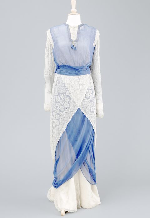
The Hull Museums Collection: Wilberforce House Museum have this lovely blue chiffon and white lace reception gown. Their current object photo shows the dress looking like this:
But there is also this version of the photo doing the rounds on pinterest:
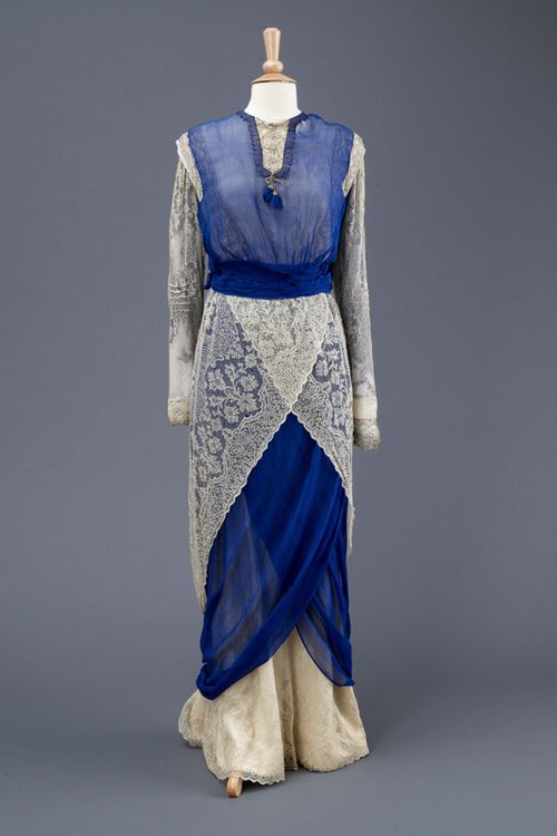
Same photo, same dress, very different colour balance, which gives the dress quite a different character.
Personally, I think the first photo is slightly washed out, and the second too dark and vivid. So here is my best guess at what the dress really looks like (though, of course, every garment is going to look different depending on lighting and circumstances):

What do you think? Do you prefer it in evening blue, cobalt blue, or copenhagen blue? And what do you think of it as a dress, regardless of colour?
Rate the Dress on a Scale of 1 to 10.
It looks like the way we used to drape old curtains on top of each other when we were playing dress-up as children
Sorry. No way.
1/10
I thought that, too! Scarlett O’Hara goes lower middle class!
I normally really like this era of dress, but like the previous commenter, I thought it looked less like fashion than housewares cobbled together (suspect it’s the style of the lace panels), and I don’t care for the neckline.
The darkest blue makes the contrast jarring, and the lightest blue makes the details hard to see, so the third option would be my preference.
6 of 10
This is so-so. I’m not quite sure why, as the different parts are all fine on their own. The lightest blue I am not particularly fond for evening, it is more of a summer day colour.
Score: 6/10
Sorry, I agree with mom. The colors are lovely (as shown in all the photographs, but I like the medium or “Copenhagen” blue version the best), but it does look like what you get when you let kids drape pieces from their Mom’s fabric stash over an old nightgown. A 4.
Oh, when I first saw the dress, I liked the color, but when I saw the even darker color, I liked it even more. I think the sleeves are a bit awkward… I can’t lay my finger on why, but I still really like the dress. It is just such a pretty combination of colors and fabrics.
9 out of 10
I’m really torn on this. I like the draping of the skirt, but I really dislike the lace fabric. I agree on that it looks too much like a kid playing around with mum’s old table cloths. The blue vest/bodice also feels a bit thrown on, but on the other hand it gives a bit of needed character to the dress, and I definitely get the feeling that the designer was going for some of orientalist/ottoman inspiration for the dress. As for colours I really like the deep blue, but then the lace gets even more visible and I don’t like that, so I think the third option is probably the best. If something else than lace had been used I would have given it an 8, now with the lace it’s a 6/10.
Exactly my thoughts: it looks like what I would have wrapped around myself when playing dress up. Or the sort of fantasy dress I would design in my early designing attempts.
Still, I like it more than just a 1. There are some clever unusual yet simple details in the bodice, and I kind of want the bodice itself for myself. The skirts, as bandykullan says, don’t work with the lace fabric, though, and do give off too much of the “child trying to design” vibe. 6/10
Awkward, awkward, awkward. Looks like a bunch of different fabrics wrapped round the skirt and the bodice is just too flat and two-dimensional to really flatter the skirt. The fabrics, especially the lace, are lovely, but design wise, I don’t think this works at all well. Everything either feels just a little bit awkward or unfinished, and the balance between bodice and skirt is a bit off, just like the colour balances. With a simpler skirt, the bodice would be understated and chic. I am not sure it works, though, so gonna say 4/10.
It is true that the color influences my impression. I much prefer the cobalt blue over the paler shades, but my guess would be that the Wilberforce House Museum object photo isn’t too far from the true color. However…the dress still looks like a last-minute attempt to come up with something for a costume (fancy dress) event. Or, as mentioned above, something cobbled together out of a child’s dress-up box. The lace, especially wrapped as the top layer of the skirt, really screams “tablecloth!”
Which is all very sad since, to make matters worse, it’s a hobble dress as well. So if/when you realize your dress is hideous you can’t even escape discreetly – you either hobble off or fall down. Double whammy.
I don’t suppose anything less than whole numbers are allowed? If so, I give it a 0.25/10.
If not, 1/10. And I usually like 1912 fashions. Sigh.
PS – A change in colors might redeem this poor thing. Keep the cobalt. Make the underskirt a different color and the lace yet a different color. Then it might look more purposeful and less accidental. Might.
Well, I think at least you would have worn a huge big flowery wagon wheel of a hat, so while hobbling off in shame and slow-motion, you would at least have been able to pull the hat over your face so at least nobody would recognize you. 🙂
I’m going to have to give this one a 10/10!
Really loving just everything about this dress. Either filter is giving it a lovely color and the tulip style drape in the skirt is fabulous! Add in the layers of lace and I think it’s perfect! Love it!
Remember the scene in the Disney animation of Cinderella where the mice remake her Ballgown? Where’s a mouse when you really need one. 4/10 for the fabrics and well, they did try.
It is best in Copenhagen, but still, I can’t escape the ‘dress-up’ feel the upper layer of lace on the skirt gives the dress. The blue vest (that’s what the top bit makes me think of) doesn’t work either.
I love Linda’s comment about the mice!
3 out of 10.
I think this looks like a curtain. I vote 5 out of 10.
I prefer the darkest blue colourway, but the whole dress looks like someone frantically making a dress from the dining room curtains. However someone loved it enough to keep it and store it safely, so it can’t have been that bad for it’s time. Considering the really beautiful dresses that there were around 1912 though, I give it a 5 for effort, and a 4 for attractiveness. So 4.5 overall.
Cobalt blue is my favorite, but the other 2 shots are fine too. 6/10 The hobble shirt I really hate and the layers should make it have a geometric feel, but doesn’t.
I think it’s the lace panels that are really letting it down – they look like hip doilies (and is that ever a good thing?). 4/10.
On the subject of swimming with fabric all about you, I swim in a burqini. It’s like a slim-fit shalwar kameez made of swimsuit fabric – a bit of swirl without a whole lotta drag. Feminine and fun 🙂
And worn by Kamala Khan as the new Ms Marvel, which apparently instantly makes it about 100 times cooler (even to her).
I didn’t know that – how cool. That gives me another weapon in my last-minute-costume-party arsenal 🙂 It does rather lend itself to the superhero look, although unsurprisingly lacking in the area of capes!
I really don’t like it, it looks to me like someone was inspired by oriental fashions for the top but wanted to make a nod to western fashion as well so grabbed the lace tablecloth and tied it round their hips.
2/10
The skirt looks like the tailor found some old lace in his granny’s attic and went to town. This wouldn’t be that bad if he didn’t end up layering into an ugly textured triangle over the crotch. The blue chiffon top looks very modern but in an unfortunate “I wore this to Coachella last year” way.
The sleeves look nice though. 2/10
I’, so sorry but this is one of few dresses I don’t like at all. I love the era, I like the colours, all of the blues, a bit depending on the time of day it’s to be worn. I like lace. So I like all the components, but I really dislike the result.
It could perhaps have been a pretty dress, but for me the curtains draped around the hips and the blue vest ruins it.
This poor dress will only get a 2/10 from me.
When we were little girls, we all, in an artless way, believed that draping lace around ourselves was pretty, because lace is pretty. Now we’re no longer children, do we think we’re so sophisticated that lace is no longer pretty? Just because we associate it with childhood play? Or that draping it around a dress is somehow childish? I once knew a woman who refused point blank to have any whitework embroidery on her costumes, however appropriate, because she thought of it as ‘childish’.
As historians, we should judge things fairly and look with eyes unprejudiced by our own 21st century conceptions.
Rant over. I like this dress, love the fresh colours, the brave way with drapery, the embracing of a new fashionable line. The owner must have cut quite a swathe along the streets of Hull. 10/10
I really like the shape and lines and overall idea, but my modern eye can’t see past the lace which is so curtain/tableclothlike. It is probably much nicer than that, but it ‘reads’ to my eye like something of that nature. The contrast blue makes this even harder to like.
If the dress had been all ecru, or all blue, I think the lace issue wouldn’t bug me as much.
I so love this era of dress, and in other ways it is a lovely example and nice to see a day dress too.
I’ll give it 8/10 because it is not the dress’s fault that I see table cloth. It was around before that issue after all!
In my opinion, it’s not the presence of the lace that keeps this dress from being pretty–it’s the way that the lace is used, and the shapelessness of the dress overall.
All those comments about it looking like a child dressing up in curtains? I think that’s what I like about it! I love the lace, the blue, the wafty voile, the draping. I want to make one! And I don’t usually like hobble skirts, but this one looks one could actually walk in it.
10/10
The draping on the skirt and the shapes the overlapping fabric create is what makes the dress intriguing for me. I’m starting to suspect I have no eye for fashion.
Regardless! I really really like idea behind the skirt-drapes. As for the lace, I’m not fond of it, but, while I understand all the tablecloth/curtain/little girls playing dress-up remarks, it didn’t bother me at first glance (on subsequent glances, yeah, but not horribly). The bodice doesn’t do much for me, and I think the bottom of the dress could be cleaned up, drape-wise. The hobble shape is fine as long as you don’t need to get anywhere.
All together, not liking it all that much, but I think it’s good for a 4.
Hmm, there is a distinct whiff of old lace curtains. Thing is though, I don’t think I would like it even if it didn’t remind me of curtains. It looks like layers of cloth wrapped on top of each other without much sense of an underlying theme, and there’s a sense of “I really like this lace so I’m just going to wrap a big panel round the skirt”. I really don’t like the bodice. It looks awkward and I don’t think it ties in well with the skirt. 2/10
…coming back to my first impression ( after reading a few comments):
No 1: It looks comfortable for 1912 ( the fit of the top reminds me on a sweater)
No 2: 1912 + no corset = fashion forward.
No 3: It reminds me on a “morning” reception and warm weather
No 4: In fact for the time it could be even considered comfortable for hot weather.
No 5: …so could have been worn during holidays at the seaside
No 6: The white + the blue remind me on those white villages in Greece with blue roofs and doors, that reflect the sea and the sky (it’s kinda like that blue)
No 7: The wearer seems to not give a damn
…so I find it cute: 7/ 10
…but I guess I’d like it more if the was just one blue “color block” as opposed to two of them…
I do actually quite like this. I prefer the lighter version at the top, strangely enough, but perhaps there is too much lace. 8/10
so, so close! a couple of points off for the unresolved finish of the lower blue drape fabric. Otherwise, a welcome return to form.
8/10
The artist you mention wouldn’t be Christy Lee Rogers, would they? I was interested, so did a spot of searching, and I found the most beautiful images of people swimming in floating garments.
The blue and white dress is lovely. 8/10.
PS I met you on Sunday, after the movie. Thanks for being OK with the uninvited person at the table. I don’t get to see some of my friends as often as I’d like, and it was lovely to catch up briefly with our mutual friend.
No, not Christy Lee Rogers. The artist I’m thinking of does MUCH more covered swimmers – which is a big part of what I like about the idea, it keeps it away from the whole ‘sexy’ thing.
It was lovely to meet you on Sun! I wish I’d realised who you were at the time. I’m afraid I wasn’t at my best – I was coming down with a migraine triggered by the flashy wobbly bits of the film, so hopefully next time I meet you I will be nicer and perkier and we can have a proper chat!
That would be lovely! I’m so sorry the movie triggered a migraine.
Me too! Not what I expected going to a film about couture sewing and crafts!
Is the artist perhaps Pegge Hopper? I haven’t pulled up a link to a painting yet but I remember a series of women flirting on their sides in mu’umu’u that would at least have been in a style similar to Hopper’s.
Oh autocorrect – not flirting, *floating*