Last week I showed you a 1920s playsuit in blonde silk and green paisley. Whether you liked it hinged hugely on your feelings about playsuits and paisley, and because those who don’t like them REALLY don’t like them, the playsuit came in at a barely acceptable 6.8 out of 10.
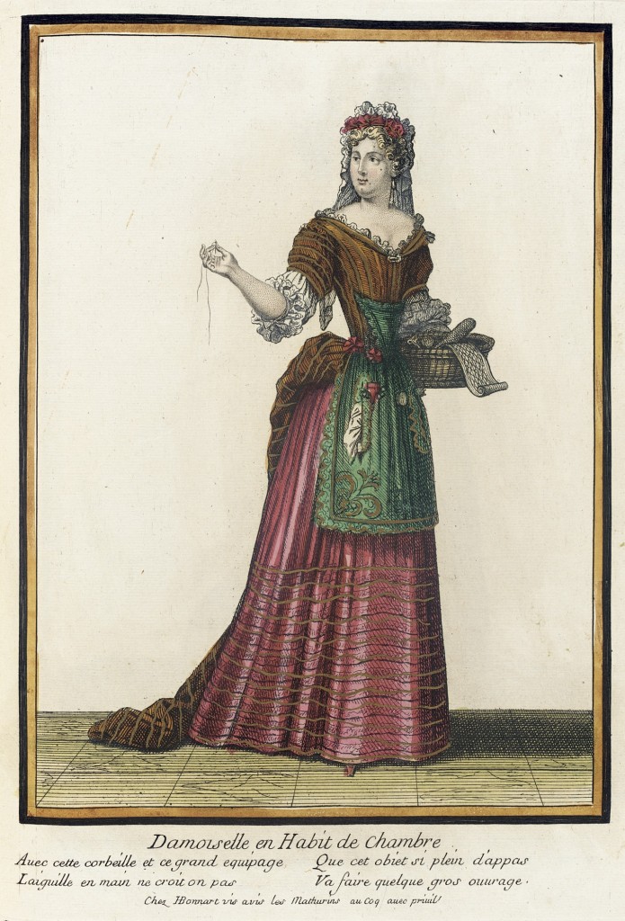
This week we’re look at a much more formal informality, but one that is equally about showing off your wealth and style by wearing the most sumptuous items to do the simplest tasks. This fashion plate from the LACMA features a lady in an informal ensemble doing her sewing.

Recueil des modes de la cour de France, ‘Damoiselle en Habit de Chambre ‘ Henri Bonnart (France, 1642-1711), France, Paris, 1678-1680, Hand-colored engraving on paper, LACMA M.2002.57.85
She wears a pink satin underskirt, trimmed with bands of brown, to match her golden-brown striped mantua. The pink of her skirt is echoed in the trimmings of her headdress, and in the rosettes on her dress. The full sleeves of her chemise extend well beyond the sleeves of her mantua, and a ruffled edge, To protect her dress and help carry her supplies she wears an apron in dark green silk, trimmed with gold braid or embroidery, and pink rosettes. A handkerchief peeks from one of the pockets of the apron. In one hand she carries her sewing basket, and in the other, a needle, though the text of the plate indicates that the author doesn’t actually believe she is sewing.
What do you think? The perfect bit of relaxed glamour for playing domestic goddess while receiving your intimate friends?
Rate the Dress on a Scale of 1 to 10

On the whole I find the color choices and uses quite pleasing and well balanced. I like the subtlety of the vertical striped effect of the mantua echoed by the horizontal of the skirt, especially since they are separated by a certain area of unornamented fabric. The apron is charming, but it does puzzle me how the bodice fits on — was it pinned at the upper corner to the mantua?
I do find it an odd choice as something to wear while sewing, and I have the suspicion that immediately after posing for the artist she handed off the basket to her maid.
Generally lovely, though. 9 of 10
I dislike the apron–the low bib looks ridiculous to me though such things were once common. The rest of the ensemble is lovely. Pink and brown go together well enough. Without the apron, an 8. With the apron, 6.5.
Seconded.
I really dislike the color combination, the pink and green are just meh in these hue’s and the brown only drags it down 🙁 way to yellowish brown for me to work with the pink.
I like the silhouet, and the funny apron has a really interesting shape, most I like is her chemise sleeve, that looks just pretty and floofy and nice. But overall it really irks me that it feels so unbalanced colorwise.
So I would give a 3-10 because I like three things about it.
Given the exaggerated shape of her body, I’m having trouble imagining this on a real person. That impossibly tiny waist offsets the dress’ puffiness, but a real woman might end up looking cluttered and overstuffed.
Based on what I can see, there’s a lot I like. The rich colors, the sharp, severe angles of the bodice alongside the rounded, frothy sleeves and train all feel very fanciful. The colors are jarring, but something about them still feels right. I love the skirt’s shape and the simple elegance of the neckline.
But there’s something extremely slug-like about that train. I know this wasn’t the creator’s intention, but I like to look at this dress as a character concept: a genteel, upper-class lady who’s extremely warm and polite and lovely, but secretly cruel, pinched and vile.
7/10
I like late-17th century styles in general (era of Charles II, William & Mary, Anne). Even though I am not a fancier of the colour brown, the mantua portion is actually quite attractive. In fact, given my druthers, the colours are harmonious together. My rating is an 8.5/10
Have you ever read Louisa May Alcott’s “An Old-Fashioned Girl”? This dress reminds me of the scene where Polly goes to sit in on Fan’s charitable sewing circle and finds that the wealthy young ladies there lack any knowledge of sewing or practicality. In particular, “Miss Perkins, a grave, cold-looking young lady, with an aristocratic nose, bowed politely, and then went on with her work, which displayed two diamond rings to great advantage. . . quirking her delicate fingers, and accomplishing about two stitches a minute.”
I am curious about the shape of this lady’s apron… is it really that low or is it artistic convention of the time to elongate the top of the torso and squish the bottom? Seems like an apron that covers only the solar plexus has ceased to be an apron and become an icon of one. So: frivolous, hinting at domesticity but actually showing off wealth… like the playsuit, this mismatch works if we take it as a message and not a practical garment. As for the dress itself, I imagine the muddy colors could be due to age. In un-faded condition, I rather like brown and pink, and I like the bodices of this era, and I even like the frilly lace caps, as long as they didn’t tower too high and become fontanges. I dunno, I’ll give it a 5/10, since I don’t love it, but I like many elements of it.
I rarely rate pictures, because it’s difficult to get a feel for the garment without seeing details that a photo can reveal.
However, by extraordinary coincidence, this is exactly the type of outfit I wear when doing my informal sewing, right down to the ornate apron.
8/10
Really???? How cool. I like to dress up, too, when doing work. Nothing gets done if I’m in my PJs, so I’m in day clothes as soon as I’m out of bed. And I do my best work in lipstick. I’m glad to have a fellow dresser-upper here!
Trying to imagine the colors as they were (someone mentioned fading), and it’s not horrible. I dislike sloped bodices with mantuas, but it’s interesting to see, nonetheless.
Meh. 5/10
I’m not very familiar with 17th Century dress, so I’ll just be going off what I see. I’ve always been particular to brown and pink together, I like that much. The apron however seems almost pointless, given how small the top portion is, and the green itself just doesn’t go with the other colors. Again, not familiar with this century of dress, but the outfit itself is just overdone for even an afternoon of sewing. Especially the lace cap. 6/10
I don’t like the apron, but the dress and petticoat work well together. I like the overall shape too.
8/10
I don’t think she’s going to ‘faire’ even some “tres petit ouvrage’. Dressing up was the thing for high class ladies, just because they could. No sillier than the Kardashians.
As for the dress – looks very uncomfortable, and pink and brown together always makes me think of ice cream. As for the apron – words fail me. No, don’t like it at all. 5/10 because at least she’s not flaunting too much bosom, but otherwise it’s a ‘take it or leave it’ that I would leave.
I dislike the shape of the bodice and the shade of brown (I don’t like the brown with the pink or green either.) I rather like the skirt, apron (except the bib) and chemise sleeves. I also dislike the headdress. 3/10
Things I don’t like: the color combination, the horizontal/vertical stripe mix, the low apron bib, the apron pockets and the lady’s Barbie-like proportions. Things I do like: the shape of the late 17th Century dress itself which this illustrations does show quite well. 5/10
Mmm. A chocolatey brown and a luscious pink. Mouthwatering colours. I love the combination. The green apron is a great combination for both too. I do like these early mantuas. They’re quite graceful and drapey and flowing. Overall, I would rate this 7.5/10 as while I like it, I don’t LOVE it – I think these look much nicer in reality than in the prints.
It’s certainly frivolous, and the apron is a bit too frivolous for my taste. I know that’s the point, I know it’s supposed to be impractical, but I’m still going to dock a couple of points. The mantua, however, I like. I like mantuas in general, and I think this one is very pretty with its combination of rich brown and pink, and the way it uses stripes. I love some of the things they did with stripes in this time period. Overall, 7/10.
Hmmm, what to do today…how about a little sewing? Hold on while I get my ABSURDLY TINY APRON.
Ah, that’s better. Now to my stitching…
The colors make me happy (I imagine the richness of these colors and fabrics in person would be more fetching than a faded print), but there’s something really unbalanced between the broad top of the mantua, the itsy apron, and the bands of trim on the skirt, which have a weird visual shortening effect. I like the mantua drape. It looks like the apron may serve a function, too–are there doo-dads sticking out of it or hung from it that might be sewing tools?
Neat ensemble with awkward proportions. 6/10.
Have to say, I actually really like the brown (looks more dark orange-ish to me), green and pink combination; it’s a bit strange, but in a really fun of way I think. I agree that the apron is weirdly short, but I still like the embroidery along the bottom (and that pocket is a really cute detail!). The stripes on the dress and skirt work really well too, especially along the front of the bodice and the bottom of the skirt. Of course, I generally love the mantuas from this time period in particular anyway, so I find it hard to go wrong with them. I probably would rate it about 8/10
7 out of 10.
Efficient. 😉