Oh dearie me! Last week I showed you a wedding dress in deep, rich aubergine, with a very assymetrical skirt that was dubbed: sloppy, saggy, limp, crushed, and like ‘stockings that got one leg twisted when you put them on’. Poor bride! Poor dress, and a very sad 5.5 out of 10.
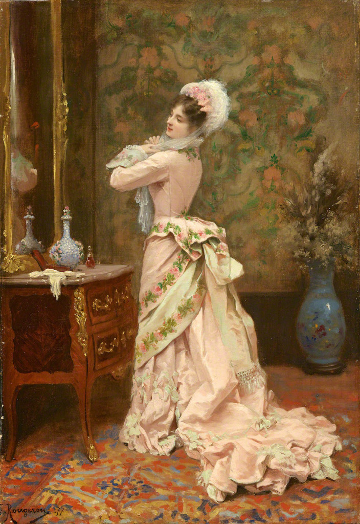
Some the criticism of the aubergine dress was of how limp and crumpled it looked, which is partly a product of time: you may have liked it a lot better had you seen it worn in the mid 1880s. For this week’s Rate the Dress we’re going back just a couple of years and looking at a dress that is as fresh and crisp today as it was in 1877 – because it’s a painting.
Jules James Rougeron (1841-1880) painted sweet, romantic genre scenes that met the popular taste for undemanding works that featured pretty women in pretty frocks. His works appealed to the same audience as his contemporary, Tissot, though Rougeron was, and is, less famous.
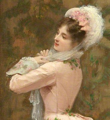
In “Toilette” Rougeron depicts a fashionably dressed woman admiring herself as she ties on her bonnet. Her side view, and focus on herself in the mirror, present her as an object to be gazed upon and admired, and emphasize the focus on her attire, rather than her as a person.
The model’s frock is the height of fashion for 1877, with the prominent bustle of the first bustle period just beginning to be restrained into what would emerge as the natural form silhouette.
The full underskirt of the dress clearly shows the influence of the wider skirts of the earlier 1870s.
The dress was probably a combination of an actual dress and artistic fantasy: the dresses in Rougeron’s paintings share distinct similarities in fit and drape, with details changed from painting to painting, suggesting that he was using the same frocks as a base for his inspiration.
What do you think? Is Rougeron’s rose-bedecked fantasy the epitome of romantic elegance, or revoltingly saccharine?
Rate the dress on a Scale of 1 to 10


This dress in this painting is a 10. But to be fair, the painter made sure to vague it up enough to allow that 10.
The dress in reality would be probably look somewhat less cute. The reality of the fringe at the back and the somewhat limp bows at the hem and the potentially mis-matched color mix in the floral embroidery are all the sort of things that usually do not work for me in a real object. But since I am just guessing that these things might not have worked out and might be wrong entirely, I stick to the 10.
I actually quite like the roses, but the skirt trim (bows?) is a little too much for me. The embroidery is feminine but still offers a clean line. If it had more understated trim I think it would push into elegant, but the bows make it a little too ‘sweet’ for me.
I would say that this looks like a wedding dress. I am sure that the artist has idealized the dress quite a bit, as Watteau, Gainsborough, etc. probably did as they would want the bride of an exalted house to look particularly exquisite. Still, I will give this a 10/10
I agree with others that this is probably a little fantasized. But judging it as it is, not what it would probably been in reality, I think the color is very pretty. The added decorations don’t really bother me, but the green in the floral design some reason throws me. I don’t think I’d mind the green as an accessory, but I don’t like how it was included in the design. 9/10
I agree with R.
I thought it was a ball dress for spring but could easily be a wedding dress, however, the painting would be odd to have a bride dressing by herself….
not sure…
For me the green is what saves it from confectionary excess, and the clean lines of the bodice (what can be seen of it).
Very pleasing overall: 9 of 10
The painting might be undemanding (I actually have some philosophical problems with the painting, regarding the way it treats its subject as an object), but the dress is pretty. The draping is elegant, and the green leaves help to prevent it becoming saccharine. Like other commentators, I’m sure the artist has idealized the dress — I’m almost certain he’s made her legs longer than would be the case in real life, and that affects the proportions of her skirt.
It’s hard to rate something that might look quite different in real life, but based on what’s there in the painting I give it 8/10. It loses a couple of points because I’d prefer it without the train.
The dress in the painting is sweet and cute, and goes well with the softness of the whole painting. I’m pretty sure that if I saw it as a real object I would deem it too sweet and romantic, but in the context it works. I like the silhouette, and in another colour I would probably love it. The main difference to me compared with last week is that this dress is symmetric, and the paining isn’t detailed enough so it doesn’t seem to be the big mix of textures that the Purple dress had. In total I’d give it a 8/10
Truly scrumptious fantasy dream dress! I dislike the train, but really like the rest, except for the wide 18th-century man-cuffs. But I really do like rest. Pink and green is so scrumptious! 9/10
I like the top, but all the bows and fringe on the skirt does not work well. 6/10.
I love the silhouette, the fit, the restrained but tasteful trimmings, and the matching bonnet; in many ways, Rougeron’s model is wearing the perfect outfit. It is a shame we cannot see the dress from the front.
On the other hand, there’s something that’s almost…*too* little girl about the combination of pale pink trimmed with pink roses. Rational or not, my reaction to the color scheme makes it impossible for me to give this outfit a 10 despite its technical perfection. I’ll go with 8.
This is breathtaking! I’d give it a 10. The color, the embroidery.. and embellishment it is all fantasy and prettiness. If you don’t like pink you’re out of luck!
10…it is exactly what it is supposed to be, ultimate femininity as perceived in its time. It is truly lovely on the model.
I love this period, I love this colour, I love the painting, and I love the details, both in dress and background.
I can’t give it anything other than 10.
Cor, this is a tough one. I love the dress down to the bottom of the drapes, then I don’t. I think the pink offset with the embroidery is really lovely, and its lack of lacy floofiliness is refreshing. But then all that paintilly stuff below evoking lace and frills kind of spoils it for me. I would have loved to see the under skirt maybe scattered with embroidered garlands but otherwise rendered in the fabric only.
So, I give it a 7.
Also, I am with you on feeling a bit uncomfortable about its emphasis on the dress over the person wearing it. In a fashion plate one expects that as it is overtly about showing off the garments. But in a painting, not so much. Oh well!
philamuseum.orgMy first reaction was basically “it’s a painted fashion plate!”
And even though it’s some years later, your vision of embroidered drapery immediately put me in mind of this dress: http://www.philamuseum.org/collections/permanent/104635.html?mulR=320244456|711 (And now I officially hate their website, because you can’t search by date and I had to wade through 40 out of the 43 pages of dresses to find the one I was looking for. OH, COME ON!!!)
…
So. I think I very much agree with your verdict, and that’s 7/10 from me, too.
Despite the stark difference in colours, it reminds me far more of this one: https://thedreamstress.com/2012/05/rate-the-dress-vignons-garland-dress-of-1878-or-79/
It’s probably because I remember the 1880s one much better – it was one of the very first extant dresses I came across online. 😀
I can put my hand on my heart and state that any dress featuring bands of embroidery is going to win me over. Because FABULOUS!!! I love both of the dresses you two linked to – especially the hard to find page 40 pin up!
But the cut of that little jacket and the drape of that overskirt in the pink one above are just delicious. But would these lines survive reality? Possibly not.
I LOVE the upper half, but when you get down to the train and the hem it makes me wonder what the artist was thinking. It is as if all of a sudden the beautifully restrained feminine design decided to explode suddenly into puffs and clouds of un-necessary frothiness. I would have loved it better with a simpler skirt that complimented the bodice and overskirt… so…
6 out of 10
It’s an Easter gift to us! Very much a confection of a dress. So pretty.
Flawless fit (the Photoshop of its time), lovely drape, soft pretty colours (very gentle pink), and the bit of green to keep it from being nauseating. But not completely. One feels a little guilty queasiness. A Cadbury Creme egg of a dress. (Sorry about the commercial – I actually prefer really dark chocolate!)
8 out of 10.
The painting definitely won me over…. Although I still think I would like this dress better aged and in real life than the aged real life purple wedding dress. 9/10
Absolutely adorable dress. 10/10 Although I agree with others that it had to be somewhat idealised by painter. So I have this feeling that a real life dress might only score 9
8/10. Pretty, very pretty, but at the same time, pretty ho-hum to me. That pale pink and pale aqua/blue combination for some reason is beginning to feel a bit cliched to me. I actually quite like the rose garlands and it does have lovely movement and drape and is well presented. But it actually doesn’t set me aflame.
Oh Hana, I do like that one! Although what’s with the front drapery? It makes me think of skirts caught in knickers, only it’s on the front rather than the back….
Haha, yes, I was looking at it as I was linking it and went “How come I never noticed that unfortunate bit?”
Lots of older dresses seem to have that feature. I wonder if it’s because they had different undergarments, so the “caught in the knickers” effect didn’t even occur to them. Since petticoats and skirts usually got put on over the head (practicality… it’s difficult to step into a dress when you have an underdress), clothes didn’t get “caught” in a chemise or corset in the same way.
It’s as if a box of sugared almonds all done up with pretty ribbon had come to life as a dress. For me it’s all too much, too sweet, too saccharine and too, too pretty-pretty. The train would weigh a ton as well. With that weight dragging behind it would be almost impossible to walk in either girlishly or elegantly, particularly over a carpet. A dress made to be seen and admired in, not to live or move in. I do, however, like what can be seen of the bodice despite a lurking suspicion there may be even more frills and furbelows billowing down the front. I know I’m being harsh and I’m in a tiny minority but I give it a sad 3/10.
A dress I actually remember! YES!
Okay down to rating business. I give it 10 out of 10.
I LOVE IT! I adore the green the most. I know there is only a little of it but that is exactly why I like it so much. Also, even if we were to see this in the flesh so to speak, we’d all find an issue with it. I think the train has bows for example. Thinking it and knowing it 100% are two different things. I get this uneasy feeling that the bustle was made to look like a big bow across her backside and I keep thinking “It’s not a package, you can’t unwrap it. At least not from there.” I see a little green at her neck so I’m assuming that it does indeed go down the front, which for me, that’s excellent. I’m sure the painter took liberty and made the dress in his opinion, prettier. I do wonder however if this color of a pale pink is not some color that he made up, the little beige (is it beige?) I see would not be what I’d say ideal. For all we know the entire picture is a figment of the painter’s imagination and for me that’s wonderful.
I forgot to mention that Worth created a dress sort of like this. Empress Maria Fyodorovna’s 1897 Evening dress, just saying.
I remember seeing this on the cover on Victorian Trading Co.’s catalog once and deciding i needed to recreate it, especially since its basically my bedroom made wearable. As a lover of all things pink and roses 10/10!
I adore this dress because it’s so over the top sumptuous and the colors so pleasing. My eyes like the picture because it’s pretty. My brain dislikes the picture because it’s just pretty. I don’t agree with the message the painting sends, but I can at least have fun dissecting it.
The message, as I read it, is that the female is merely decorative. Now, obviously there are a lot of portraits of beautiful women in beautiful clothes, and they don’t all send that message, so what makes this one different? The fact that she’s looking in a mirror, that she’s not looking at the viewer, that she’s primping, that the majority of the picture is her clothing… lots of little things. Mostly, the problem is that her prettiness is the only thing of note. There’s no other reason to look at her. And while this picture is just whispering that message, so are thousands of other pictures, ads, TV shows et cetera. My dislike is fueled more by a whole culture of dismissal than by any one instance.
Another thing: while this dress may well have existed in some form, the way it’s worn here is more like a curtain than a dress. Look how it “puddles” on the floor at the side/front, not at all like the front hems of real dresses, but a lot like a fancy curtain or tablecloth that is cut longer than necessary so it will overflow and crumple up at the base. (Search for “home decor puddling” images to see what I mean.) Over-long hems were common enough in a train, but I don’t think I’ve ever seen one in the front of a gown from this time; it would be too hard to walk. This woman isn’t meant to walk, just to improve the room by matching the wall paper. She is home decor.
The dress itself is quite pretty, though. And since it’s painted, not real, we get to see the ideal of the fashion, what the designers were going for when they draped fabric. It’s charming. It’s just too long in the front to work as a garment.
9/10 from me, rating the dress not the social implications.