Last week’s Rate the Dress was an 1880s maybe-Western dress in ochre and blue. It evoked a lively discussion, and a mostly extremely positive reaction – minus a points or two from most of you for the bead trim. Just a couple people really didn’t like it (Daniel called it a digestive biscuit of a dress), though no-one could dispute the skill of the dressmaker.
Overall, the dress came in at a rather nice, if not astonishingly fabulous, 8.4 out of 10.
I’m not sure if I loved the dress, and while I didn’t like the beads aesthetically, I liked them intellectually, as a representation of mica, and the bobble trim on sombrero and other Southwestern wear.
This week lets go all the way back to the 1670s, and look at Anna Caffarelli Minuttiba.
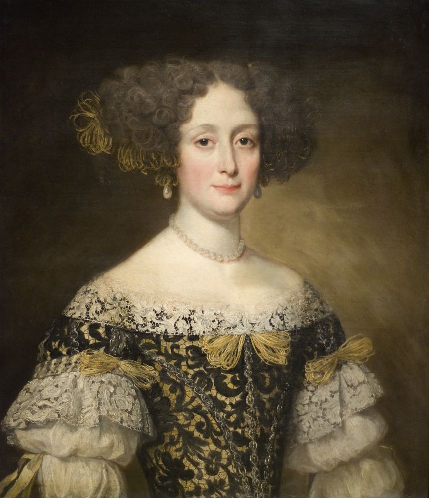
We actually have two slightly different views of the painting to consider, one, a little warmer and more muted:
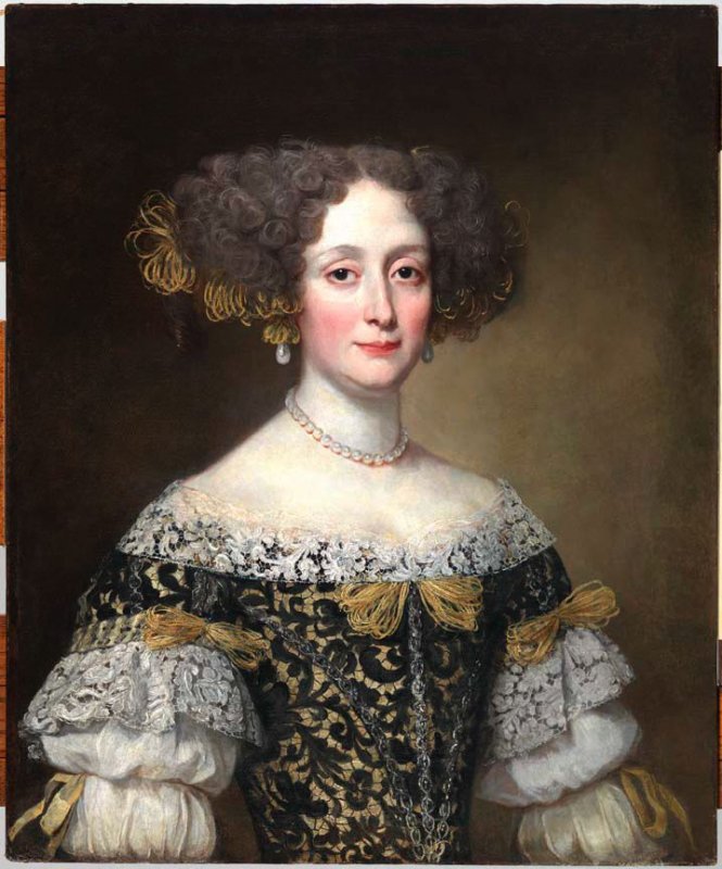
And another with higher contrasts, possibly after conservation, possibly just with the photo temperature adjusted significantly:
I haven’t been able to track down any information on who Anna was, but as Voet was one of the most fashionable portrait painters of second half of the 17th century, active in both France and Italy, she must have been a wealthy Italian noblewoman, arts patron, or noted beauty.
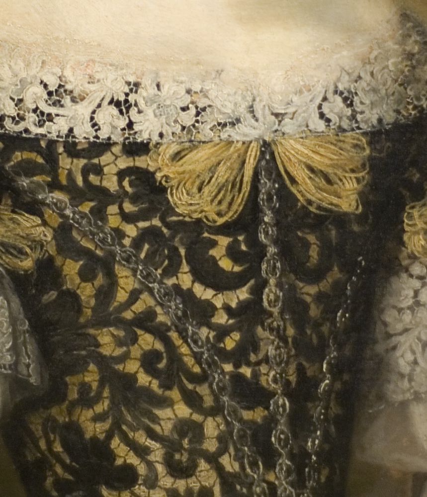
She wears the long, heavily boned, off-the-shoulder bodice fashionable in the 1670s, decorated with black lace over a pale gold ground, the seams embellished with metallic passementerie trim. Bows of narrow blonde-gold cord ornament the neck and sleeves. Over the bodice she wears a modesty panel of white lace, with matching ruffles of the same lace at the sleeves.
The full sleeves of her white linen chemise are caught up into puffs with silk ribbons in pale yellow.
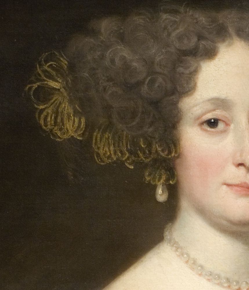
Anna’s ‘hurluburlu’ hairstyle is either decorated with dyed and curled ostrich feathers, or with loops of the same narrow ornamental cord that forms the bows on the bodice. It’s hard to make out exactly, but her earrings may have little tassels of the same cording, from which the large pearl drops dangle.
Voet rarely painted full length portraits of his subjects, but if he had, it would probably reveal that Anna’s full dress consisted of an overskirt which matched the bodice, pulled up to reveal a contrasting or coordinating petticoat in equally rich fabric, as seen in this portrait of Princess Teresa Pamphilj Cybo (although I suspect Anna’s would have been a little more restrained).
I’ve had this RTD image scheduled for weeks, when, in an amazing bit of synchronicity, Voet’s depiction of the hurluburlu hairstyle Anna sports popped up as a topic of discussion in the HSF Facebook group. It is obviously the time for 1670s fashions!
What do you think?
Rate the Dress on a Scale of 1 to 10


My first impulse is to call it striking, but there is one hesitation.
I quite like the white lace, the ornamental loops (a rather refined kind of ornament), and the trim defining the bodice seams.
I don’t particularly care for the combination of the black lace over gold – there’s too much contrast for my preference, especially with the white lace added. I would prefer the bodice lace to be no more than a few shades darker than the underlying fabric. As it is my eyes find the bodice to be contesting with the trim lace for attention.
8 of 10
I really prefer the first picture; I feel like it shows what the dress would be under candle-light. If someone was wearing black guipure lace over gold satin (is that what it is?) nowadays, I would find it tacky, but in low lighting I think the contrast is nice.. I feel like the white modesty panel would look nicer tucked into the dress–I don’t like it lying on top of the black lace. I find it lovely overall!
9/10
I prefer the more muted view of the painting. The depiction of the white needle lace is very good, you can almost feel the texture. So I’m puzzled by the bodice, which does look as though it ought to be black needle lace over gold fabric (especially because of the brides connecting the different motifs); but the brushwork there is so soft, and the edges so undefined, that the black lace doesn’t seem to have any weight or texture at all, and instead almost gives the impression of a black and gold patterned fabric.
I actually don’t care for the gold cord bows on the dress. While quite nice in themselves, they seem a little too frothy for the dignity of all that needle lace. They look quite pretty in her hair (if that isn’t ostrich feathers). I like the metallic trim, which is pretty and gives emphasis to the lines of the bodice, and is not overdone. And I’m very fond of the puffed sleeves. And I like the choice of pearl jewelry, very pretty and not overly showy.
Anna looks like an interesting person.
I rate the dress at 9.
The trim on Anna’s bodice looks oddly modern; I could swear it’s identical to a type of modern metallic gimp one can find easily in the chain fabric stores in the U.S.
Anyway, I really like this gown, despite the coarseness of the lace. The black lace over the gold fabric works surprisingly well, as does the white lace at the top of the bodice. Even the puffed sleeves, which are common for this era and often look overdone, work here. A 9.5.
P.S. I think I would have liked Anna as a person. The woman looking back at us seems intelligent, capable of self-analysis and appreciative of irony–qualities I appreciate in people generally.
I prefer the warmer version of the portrait as well. I like the dress overall, but I’m not a fan of the loopy plume-y bow things. It feels like the dress was complete without them, but someone wanted to add just one more thing…
8/10.
I like the “warmer” version of the portrait also. I think the dress looks much the same in both, but the colder version makes Anna’s face look too red, and that makes the dress’s coloration less attractive on her.
Hey, where did the post with my rating go? 9.5 out of 10. In it, I talked about liking the color scheme, too.
Ack, sorry, lost in my spam folder, found and restored!
I really like the first picture but the second picture makes all the colours look way too harsh so that they kind of clash. I’m going to pretend I never saw the second picture. The only thing that I didn’t like is the gold cord decorations. Everything else I really liked.
The smock sleeves are especially nice. They’re kind of soft and graceful next to the rigidity of the bodice. I also thought the gold ribbon on the sleeves was a nice touch. I like the black and gold of the bodice and the lace above the smock sleeves is lovely and goes well with the sleeves. The other lace I find uninspiring but unobjectionable. 9/10
Am I the only one who loves the black and gold and white? What I find questionable are the sleeves – but I’m at a loss as to what I’d replace them with to be less objectionable. Mixed feelings about the festoons of gold cord bows dangling from her head, too. I’m giving this an 8.5,though, because I love the overall effect.
No! I like it, too! It latches onto my love for a certain baroque costume from a Czech fairy-tale film that features a similar colour combination, though in a different way. 🙂
I like the sleeves, don’t care for the decoration and hairstyle either. 9/10, I guess?
Iowa Haweye colors. 😎 9/10
It’s interesting how the photo quality impacts the idea of the painting. The warmer version is better for the dress because it tones down the color differences and everything becomes very matchy-matchy.
Unfortunately, I suspect that the warmer photo is not the painter’s intended color scheme. It’s either taken prior to restoration or a really old color photograph that has the same yellow-ish tint as every family’s old color vacation pics. The colder one has a range of color that doesn’t exist in the warmer photo. So either they’ ve renewed the varnish or it’s a new photo.
The reason I focus so much about it because it does influence the dress and the way the lady chose to pair a hard white with yelllow and black instead being “matchy-matchy” in eggshell and cream. But I think it nearly works aside from the yellow strings and ribbon decoration. Although I suspect this is something the portrait couldn’t show properly: It’s likely that the stringy bits and probably everything else that is yellow are made of and with gold. It goes with the “money to burn” theme this dress has with the lace overlay over the bodice. That would have been extremely extravagent and costly back then.
So what looks like a symphony of yellow, white and black would have been in reality white, black and glittering gold. I guess if this was a modern dress that would have been equally made up to show off the wearer’s wealth the way this one is I would hate it and consider it extremely tacky. But it’s been 300 years and I have just enough reference to only suspect that’s Noveau Rich tacky, so I’ll give it a 10/10.
sewcharacteristicallyyou.comI am not sure how much to say on this dress. I love the amount of detail that has been shown in the lace, especially the white lace as someone else pointed out. There is so much texture to be seen.
I don’t like the stringy bows either. I think the idea of a bow was good, but the execution was poor. I won’t even go into her hair. I would have also like the chemise sleeves to no existent on the outside of the dress, but I am dreaming rather fancifully now. We can’t have everything.
7/10
Sarah
http://www.sewcharacteristicallyyou.com/blog
Ahh! When Anna gets tired of this dress I’m ready to adopt it. Like it, want it, and believe it or not, need it. For baroque dance performing. 10/10.
I love it! All except for the gold cord. The lace, trim, and fabric are lovely, and I quite like the lines of the bodice.
9/10 (minus a point for the weird twine bundle hair ornaments)
I actually really love the effect of the white lace against the black lace, because the black is so flush with the gorgeous yellow satin, and the effect is lovely. It has an almost timeless flavour to it. Less enamoured of the loopy bows and I think I would almost prefer the shift sleeves to be just a fraction more diaphanous and blousy, but I really like this. 7/10 as I can only rate the top half, but what I see I really like, apart from the silk skeins.
Black, yellow and white is such a strong combination of colours and seems to work really well here. Even the loops and stringy bows appeal to me. Can’t help thinking that if this outfit was real and not just created by the painter’s imagination that it might not have looked as well in real life as it does here. But as it is here it’s an attractive, well-composed and resounding 10.
I love the black over gold with white sleeves, but it’s really bothering me that there are two different colors of lace. The torso seems to have a completely different texture from the sleeves, and that’s bothering me a bit too, but I’m blaming that on the way it’s painted. I love the gold loops – but I can’t tell if they’re actually in her hair or behind it. I’m also not fond of the neckline with those weird upper sleeves, but that’s more of an issue with the era than anything about this particular garment. Overall I’d give it a 7.5 – not terribly striking, but quite nice with a bit of work.
I tried imagining this dress in several different colors and it still didn’t work for me. The size of the vines in the black lace are too big, making the dress look tacky.
I like the tassels in her hair, but don’t think they work on the dress. They look like craft string pasted on at the last minute to match her hair
Without the lace and tassels I find the dress pretty, but standard. 6.5/10
8/10
I like it! It’s very baroque, but then it was the baroque. I think the colours work slightly better in the higher contrast version, but I’d happily give either version 9/10.