

This week in Rate the Dress we’re going from 18th century silk hoodies to 1820s harlequin patterned cotton – with really, really, really big sleeves.
Last week: A lavender pink mid-18th century Brunswick
Last week’s Brunswick (or, as Anna pointed out, possible a Jesuit) was the most popular Rate the Dress in a while. Some of you felt that she did look a bit like a little girl dressed up in her older sister’s outfit, or just found the proportions of the bodice to be a bit odd, but those were the only real criticisms.
The Total: 8.3 out of 10
Better than we’ve had in a while, but not spectacular.
This week: A harlequin print 1820s dress
It’s cold, and rainy, and windy, and horrible in Wellington today. Luckily I’ve had the perfect sunny, cheerful, über-happy Rate the Dress option squirrelled away for just such an occasion:

1820s fashion is always a bit silly and over the top, but this dress takes it to another level with a harlequin patterned cotton print in yellow and white with red.
In addition to the fashionable bold and bright print, which takes advantage of advances in roller printing, bleaching & dyeing technology, the dress is a la mode in every other aspect. It’s clearly the garment of a woman who embraced the trends of her time. Someone who was more concerned with being as fashionable as possible, and with enjoying the vagaries of her time, than in being timeless.

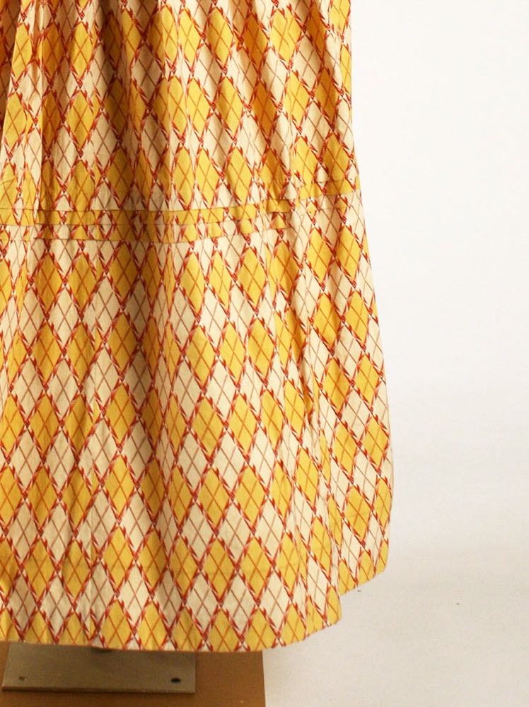
The high waist of the first three decades of the 19th century is dropping, but has not yet fallen all the way to the natural waist.
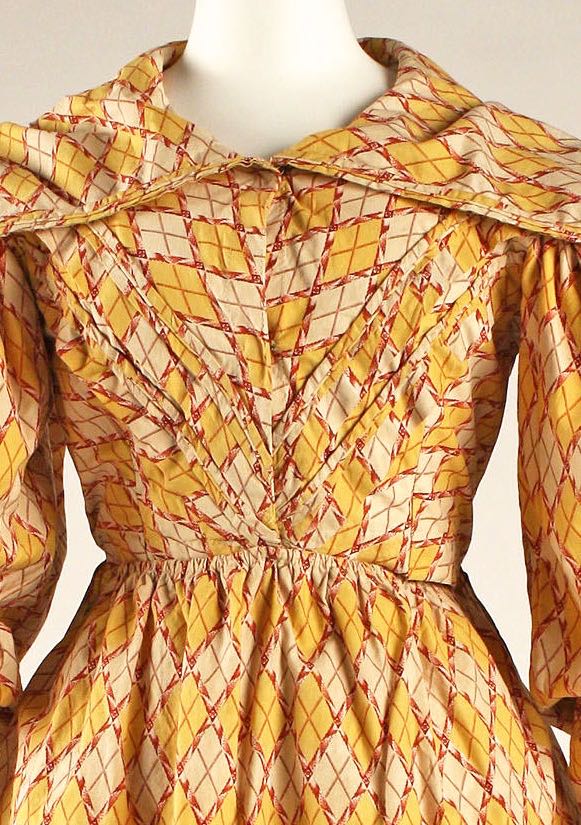
Although the waistline still sits slightly above the natural waist, the desired effect was a small, nipped waist. The impression of slenderness was created by balancing little with big. Huge gigot sleeves exaggerate the upper body, and the waist appears tiny in comparison. (when your arms are bigger than your waist, it’s hard for the waist not to look small!)

The large sleeves are linked to the dress by an equally large collar. The lines of the collar draw the eye out from the dress to the sleeves, emphasising their width and lines. At the same time the lines of the bodice point down to the small waist, providing a counterpoint to the visual lines of the bodice. The angled horizontal and vertical construction design lines provide a fun visual counterpoint to the dress fabric. It’s angles within angles within angles.
What do you think? Does this dress make you smile involuntarily? Or is it, even for an era known for over-the-top fashion, a bit clownish?
Rate the Dress on a Scale of 1 to 10
A reminder about rating — feel free to be critical if you don’t like a thing, but make sure that your comments aren’t actually insulting to those who do like a garment. Our different tastes are what make Rate the Dress so interesting, but it’s no fun when a comment implies that anyone who doesn’t agree with it, or who would wear a garment, is crazy/totally lacking in taste.
(as usual, nothing more complicated than a .5. I also hugely appreciate it if you only do one rating, and set it on a line at the very end of your comment, so I can find it! Thanks in advance!)
Haha! The 1820s are the ACTUAL best!
I give it a 9, for true sunshine in my day!
It’s a lovely, sunny print, and works surprisingly well with the big sleeve tops of the late 1820s. My only quibble is that the diamonds in the print look like they got a bit mashed and mixed up in the pleating on the front of the bodice. That sort of thing doesn’t usually bother me, but here I found it surprisingly irritating. It’s still a minor point, though.
9 out of 10.
I’m really love this era of dress and I love this fabric, but I’m having a few problems with the construction of this one. The front bodice is cut on the bias while the back is cut to match the skirt. I suppose the angled diamonds would help to emphasize the tiny waist if they weren’t interrupted by all the pleats and turned into a mishmashed mess. And why not use that optical illusion on the back where it would work better? Then the collar is cut on the bias and I can’t find a reason for this. The horizontal pleats on the skirt seem to me to be at an awkward spot. They would work better as an accent more at the calf level or lower. Having worn many dresses from this era having those pleats lower also helps add stiffness to hold the skirt out over all those petticoats that would be worn under this.
Being spatially challenged, I have had a fun time, trying to figure out how the diamonds went from being vertical in the front view to horizontal in the back. Since I DO love this era I wish I could give it a higher score. The construction just is too annoying for me.
7
For me – clownish, I’m afraid. The proportions of this dress make it rather ridiculous in my eyes unfortunately and I can’t like the colour scheme either.
1/10
I kind of love it, in spite of myself. And in spite of its flaws, which include the awkwardly placed horizontal tucks in the skirt, and the overly busy, messy looking detailing on the front. I keep wondering if it would be better with a matching solid colored piping to delineate seams and tucks, or if that would make it more garish; maybe the color or cream of the print would work?
8/10
This dress is a bit ridiculous which is not super surprising for the 1820s. Aside from the awkward tucks in the middle of the skirt (why aren’t they lower?), I’m actually surprising fond of this dress. The colors are cheerful and the ginormous sleeves manage to appear fashionable in an avant-garde sort of way.
8/10
Oh how I do love the 1820s! Any period in fashion history that experiments so boldly is a complete delight. I have to confess that I adore this little treasure of a dress,; and that even with all its faults, like Emma Woodhouse, it is in spite of them, faultless.
10/10
10/10 for most excellent literary allusions!
It’s awful & I love it. I wouldn’t wear it in a pink fit, but as an example of insanely over the top 1820’s, it’s fabulous. It would take someone braver that I to carry it off. Because the huge collar & weird pleating horrifies me, but does it’s job of hauling the eye outwards & emphasising the illusion of a tiny waist, I give it a 9.
Oh my, how beautifully horrendous! I don’t find anything appealing about the fashion of the late 1820s and the decade of 1830s, but this tip the scale. It is so bad it becomes good! You just have to love it despite its horror! Like you say this is the dress of that incredible fashion forward girl everybody gawk at and wonder what she is thinking, but then after a while they adopt it themselves because she just looked so wonderful in it. This is ‘my eyes are falling out of my head’ love! 10/10
This is pure Kim Kardashian in the 1820s! Overly fussy, very on-trend. This is a bonkers dress! 8/10, with points taken off for the messed up pleating in the front bodice. Swell dress.
I loooove it. Despite mashy pleats in front, and BECAUSE of giant sleeves. Cheery colors, indeed. Love this period. Only angry at museum for bad hunched posture on side silhouette. Let her have a “noble posture!”
Oops forgot 10/10
This delightfully mad garment just makes me smile to look at it, and the word that comes to mind is “bouncy”. I can see a madcap young lady trying to work off excess energy (and maybe knocking things off a table with those enormous sleeves).
10 of 10
I’m sorry, but I just cannot like this dress. The print and colors of the fabric scream “Bacon and Eggs” to me, and I will say it would make a fine kitchen tablecloth. However, for a garment, there is just too much of it. It would even serve better for a man’s shirt than for a dress of such proportions.
I don’t mind the sleeves at all, but the collar shapelessly sprawls. The bodice gathers come off as sloppy, and the skirt tucks are poorly placed and break the pattern unnecessarily.
I apologize for my strong opinion but, hey, it’s only an opinion.
1/10
I love the print, the colours are fun, I don’t even mind the ridiculous 1820’s shape, but by god they mangled the construction. Like, If this dress was appropriately pattern matched, it would be glorious, but as it stands, with nothing aligning in the bodice, that awful bias cut collar, and the baffling tucks in the skirt that do nothing except interrupt the diamond pattern, the whole effect just looks like a muslin for a nice dress cut out of some old bedsheets.
4/10
I don’t particularly like this dress. I like the style of that era, but this is too much. It needs some solid contrast areas for the eye to rest on.
I suspect the reason it doesn’t show it’s age as much as another of the period is because it was hardly ever worn after the first outing!
3/10
I’m really trying hard to like this dress, even if just for those sleeves. But I’m not fond of red and yellow together so I’m not loving the fabric as much as I should. And I’m not sure that the dress and the fabric are well suited to each other either — that pattern is heading in so many different directions, the front of the bodice seems to have gotten way too chaotic, and the way the fabric was cut for the collar is a bit trying. I like the back view more than I like the front — though I do think a larger, wider skirt would have balanced the weight of those sleeves a bit better. I think that even the headless, legless mannequin may have groaned when she saw this dress heading in her direction.
5
I do not love this one. The particular yellow and red combination also reads to me as bacon+eggs that Nicole B. aptly described. I can’t pass the colors to appreciate the sleeves or the collar. Miss for me.
4/10.
This is not exactly my cuppa. But it does make me happy for two reasons. 1) The print and enormous collars strike me as so unintentionally 1970s. And 2), the spritely and fun vibe of the loud print and big sleeves. The dress certainly captures the eye and engages the viewer. (In fact, it possibly doesn’t let go, and talks to you for twenty minutes straight about how its day has been going and its plans for the summer. And then it asks you your thoughts on its new bonnet but doesn’t pause to let you slip in your answer. And yet you still invite this dress to your birthday luncheon every year because, for reasons you don’t fully understand, you can’t help wanting to have this dress in your circle of friends.)
From a distance, I think the print would look quite mellow, conservative, and muted. It’s a little hard to imagine how overwhelming (or perhaps not?) it would be on a person, right there, standing next to you.
6
Best dress description ever! I am literally crying with laughter!
Good gravy! This is not a dress for the retiring mademoiselle- I suspect a young Anne Shirley would have liked it, although it’s the wrong time period.
Despite its sheer chutzpah, it is not precisely beautiful. It veers a little too much into the land of garishness. I might wear it if I were trying to draw attention away from a theft, or a military endeavor, or whatever my friends were doing that needed to not be looked at.
All that to say, 2/10.
I like the fabric. I had socks like that. Nice clear colors, clean printing.
As an example of the 1820s fashion it’s great. The floofy sleeves, the bias tucking, the puffy rear of the skirt. It’s all there
I deduct for the sloppy execution and the missed opportunities:
The bodice diamonds are not aligned and the rear collar is not bias but not vertical or horizontal either.
The piping or tucks in the bodice hide the diagonals sloppily
If the seamstress had taken the time (and fabric) to place the red of the diamonds onto the piping it would have been a more emphatic design element in self-fabric.
7.5
Yeah, I agree with others that it’s not a complete success. But it IS fun.
7,5/10
Ha! I beat the spam-catcher with mall WiFi!
Yay!