
This week Rate the Dress is all about innovation: a very modern outfit, inspired by very modern art, paired with something I’ve never done in Rate the Dress before: the same ensemble from two different museums.
Last week: A harlequin print 1820s dress
Some of you found last week’s red & yellow 1820s number as much a harbinger of joy as I did, but not everyone was convinced. Some of you, in fact, found it a source of vexation – you couldn’t get on board with the mix of grainlines, and the seemingly arbitrary tucked seams. And others just hated the fabric and silhouette.
The Total: 6.6 out of 10
How evil
This week: A cubist inspired Gilbert Adrian evening ensemble
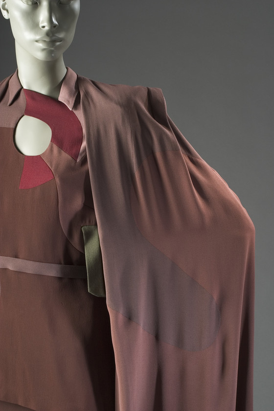
This week’s Rate the Dress pick is a 1945 Gilbert Adrian evening ensemble from his Modern Museum Collection.

In addition to fabulous costumes for Hollywood movies, Adrian designed glamorous ready-to-wear outfits – often with a very theatrical twist.
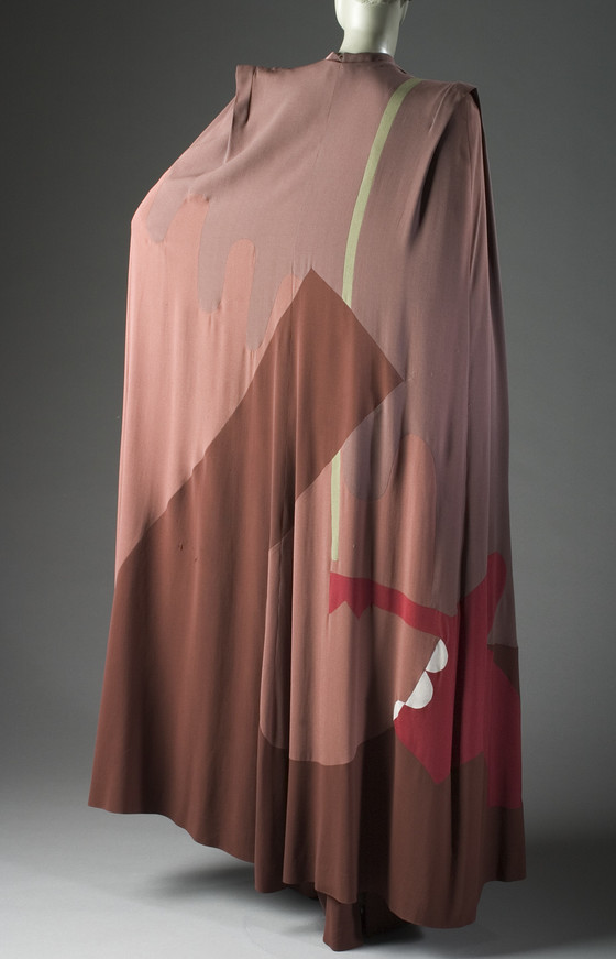
Because Adrian’s outfits were ready-to-wear, they existed in multiples, and copies of some of his most famous designs are held in more than one museum collection. This Cubist inspired ensemble was displayed when he received the third annual American Fashion Critics Award in February 1945, and I can show you examples of it from both the Metropolitan Museum of Art, and the Los Angeles County Museum of Art.

The Met says of the ensemble:
With a palette inspired by Cubism, Adrian extended the abstractions of his earlier designs of the 1940s. Harper’s Bazaar described this series as, “intricate as a puzzle and as modern as Picasso.” Exploiting the dynamism of the Futurists and the geometric minimalism of the Constructivists, the interconnecting cell-like shapes reflect an abstract bimorphism. Adrian, however, eschewed the utopianism of the Futurist and Constructivist movements with a design philosophy that was firmly grounded in the realities of American life.


From a less artistic perspective the ensemble gives a nod to current affairs, with motifs that reflect camouflage (bringing fashion, art, and camouflage full circle, as the first modern wartime camouflage, Dazzle, was partly created by cubist artists, and would inspire its own fashion), and fabric piecing that could be emulated by a thrifty and ambitious seamstress who needed to ‘make do and mend’.

This was definitely not a dress for the conservative or classic dresser, but for a bold and imaginative woman, would it have been a striking an inspired choice, or a fashion miss?
Rate the Dress on a Scale of 1 to 10
A reminder about rating — feel free to be critical if you don’t like a thing, but make sure that your comments aren’t actually insulting to those who do like a garment. Our different tastes are what make Rate the Dress so interesting, but it’s no fun when a comment implies that anyone who doesn’t agree with it, or who would wear a garment, is crazy/totally lacking in taste.
(as usual, nothing more complicated than a .5. I also hugely appreciate it if you only do one rating, and set it on a line at the very end of your comment, so I can find it! Thanks in advance!)
I love the front view, I am however not very much convinced by the back view… And I just need something like this in my wardrobe!
9/10.
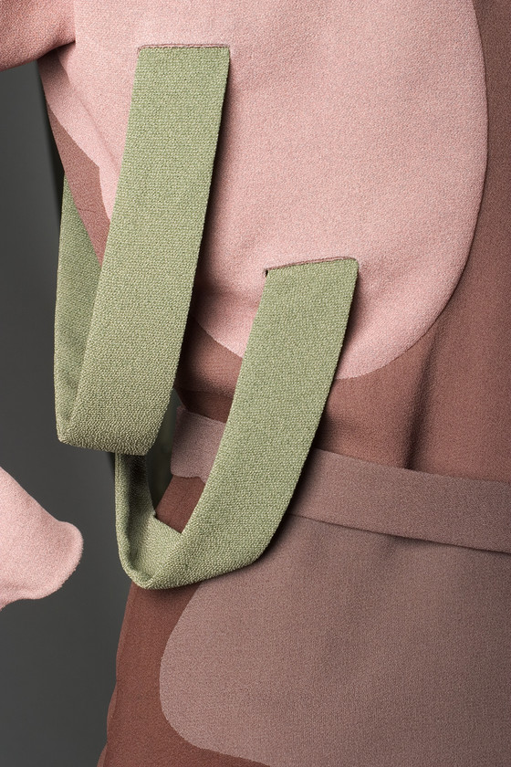
To me it just looks like a very crisp scoop of one of those ‘three kinds of chocolate in one tub’ kinds of ice cream. I might think it charming if that were all that’s going on, but the random bits of pink and red and green seem to clash with the sedate brown, and I’m not quite convinced by the green strap things. Perhaps a right-handed lady could use them to carry an umbrella or sword…? But then they don’t look strong enough, so they must just be There For the Look, and would probably be always catching on fences.
I can definitely get behind the addition of a cape, but its strengths and weaknesses are the same as the dress’s so I won’t type them all again here.
4/10.
I love seeing the dresses each week but rarely comment. This one is too perfect to pass up. Maybe it’s a case of too-wrong-it’s-right, as I normally dislike brown, and what are those strange green loops? And yet I wish I could leap straight into this ensemble. Maybe it’s the rayon? Irresistible. And that keyhole neckline- like wearing a painter’s palette.. but with a cape! I adore everything about this: weird and glamorous, weirdly glamorous.
10/10
It’s definitely Something; but just like a lot of modern art, I don’t think it’s something I can undrstand and relate to. The colour combinations are… not speaking to me. Neither are the shapes.
6/10 because I grudgingly admit it undoubtedly is someone else’s ten.
I love everything except the color. Muddy and washed out. If it was in better colors… Its too bad!
6/10
I like the way LACMA displayed this outfit better. LACMA’s display shows the colors in cooler tones and plays up the asymmetry. The result looks more elegant and adult than the MET’s display.
As for the ensemble itself, I find the color choice intriguing, if not exactly beautiful. I like the blouse (except for the olive green loops under the arm, which look like an afterthought) and skirt. The cape, with its odd, squared shoulders looks as though it were designed for an alien life form. Possibly a Dalek high-fashion model, instead of the droid-like exterminators we know from Doctor Who. Overall, I enjoy looking at this ensemble on a mannequin, but have a hard time imagining a woman on whom it would look attractive.
6.5 out of 10 (because clothing should look good on its wearers, and make them look good, no matter what century it comes from).
I love this! The cape is especially striking with its boxy shoulders. The blouse and skirt don’t look like they would flatter every figure (I don’t think this would be my best look), but I think that this would look stunning the the right person. The colors are a bit weird, but combined with the piecing it looks very high fashion instead of something I would raise my eyebrows at in a thrift store. I can just imagine this ensemble striding through a posh art show in New York.
8/10
Everything about this says confident sophistication – the colors, the shape, the fabric.
I would love to wear this, but i would particularly love to have an event at which the wearing of this outfit was appropriate.
10 of 10
Ok, my reaction to the first photos from the LACMA was no…just no. Ugly!
All the badly sewn curved seams are revealed more with the cape hanging at the awkward angle.
But it was interesting to see it from the Met, because it made sense! The shape on the left of the cape (as you Look) come together with the shape from the blouse and skirt.
Then you look back at the other, you see that if they would turn the skirt a bit, it too would line up with the blouse and become like the painting style it aspired to be.
The boxy shoulders would be of the period and would also keep a cape from slipping so much.
But even with it starting to make sense, meaning I can see where they were going with the idea, I still don’t like it , at all.
So, 3/10. 3 for nearly getting the painting concept in the styling.
I absolutely love the concept and I want to love the outfit, but I can’t. It’s the colours. The pink and brown palette doesn’t do anything for me, and those green straps on the blouse are just silly. If it was done in reds and browns without the salmon pink, or green tones with deep blue accents, I would be all over it. But, as it is:
7/10
This feels so right to me: asymmetrical but balanced, guiding the eyes through the “painting,” and such a flattering cut! I’m also a fan of how the fabric drapes, and of the weight of it. My favorite part is the semicircular motif at the neckline. It is a great focus point. Also, the broad shoulders of the cape have that little pleat that looks so futuristic and ultra-modern! (I mean twentieth century ultra-modern, of course.)
My biggest complaint is that the colors wouldn’t compliment my own coloring, so I wouldn’t wear this example myself. They aren’t my favorite colors, either, but I can overlook that because they look fairly good together and reference the art style.
Also, it appears one version has a collar on the blouse, which I think it looks better without. The belt, I can take or leave.
Solid at 7.
Hmmm…my first reaction was to recoil in horror, but I’m glad I continued looking. It grew on me. I would never wear it (too short to pull it off and the color would be terrible on me), but on the right person it would be striking.
The Los Angeles museum display is preferable. They’ve ironed it better and allowed the cape to drape in a way that complements the dress.
I take points away because of the odd bits of green. They’re totally a distraction.
8/10
I totally got the museum display of choice wrong! I meant to say I prefer the Met’s version!
I universally loathe nearly every color used … I don’t like modern art as a rule… but.
But.
THIS was created by the hand of an artist, who knew women’s bodies, the flow of the eye, and beauty.
Impressed.
8/10
Proving beauty is in the eye of the beholder, given other comments, I love this. My only quibble is with the weird olive green loops. They seem very random.
9.5/10
I like Modern. I love Sonia Delaunay.
This … nuh- uh [ shakes head].
Colors bad. Liverish looking texture. Hate green loops. Extremely fussy.
Only because they may have been better at one time– colors may have faded, and for mildly artistic unconventionality…. 2.5/10
After my first look, I was hesitantly prepared to say the dress was interesting and avant garde and at least showed impressive workmanship in getting all those curvy puzzle pieces sewn together smoothly, though I really didn’t care for the color scheme or find the overall effect striking in a good way.
I took a second look at the back of the cape, and saw a legless red Jedi defending himself from a falling skyscraper with his trusty green lightsaber, and now I can’t un-see it, no matter how hard I try.
And after a third look at all those brown swirls, I could really go for a glass of chocolate milk. (Though I’m not sure whether I should be adding or subtracting points for that. I wouldn’t hate it if my clothes reminded people of chocolate milk.)
So…some points for audacity and dedication and making me laugh, but nothing else about this dress is really doing it for me.
4/10
1 There is nothing about this ensemble that I like…colors, style, fabric. Yuck.
youtube.comIt makes me think of the Phantom Tollbooth… I expect the wearer of this ensemble to yawn delicately and droop, and start singing “Don’t say there’s nothing to do in the doldrums”: https://www.youtube.com/watch?v=CP4xMXA_d3U
I like the painter’s palate look of the neckline, and think the piecing is beautifully done, but I don’t love the dress. I find the colors sad and drab. It’s wonderful; it’s just not my kind of wonderful.
7 of 10.
My dream ensemble! I would wear this everyday with so much confidence.
10/10!
Love this! It’s wearable art. The way the curved pieces were so cleanly sewn together..I’m amazed. I love the interesting shapes and contrasting colors., too
It get a
10 out of 10 from me
I love it. Especially the shoulders and keyhole neck. I don’t mean on me, but as a piece of design. Knocking one mark off for the putty colour
9
I kind of love it! The colour put me off at first, but the whole thing grew on me the longer I looked at it.
8.5/10
As someone with a great appreciation of the artistic influences of the early 20th century and of Adrian I should swoon over this ensemble….but….I don’t know…there is much to love and yet somehow it isn’t quite right. Lalaith’s comment about the colours looking like ‘three kinds of chocolate in one tub’ sums up the colour palette perfectly and I must say I rather like the colours and tones. I like the surrealist shapes and curves, the silhouette and cape and I am most impressed with the handling of bringing all the curved lines together…but…there we go again…I just don’t know why I’m not swooning. It is an ensemble I would love one day and wonder why I loved it the next. So how to rate the dress:
Hmmm….as I’m in the middle I’ll give it a 6 out of 10.
Perfect. A masterful and superb design. Love the dusty, muted colour palette (very much the ‘vintage’ colours adopted by Biba and Barbara Hulanicki in the 60s/70s). I think the muted colours works superbly to offset the extremeness of the surreal graphics and make the outfit stylish as opposed to too outlandish to be seen in. I love the disposition of the pattern and think all three pieces look comfortable and very easy to wear (unlike a great many evening outfits). And a medal for the sewers who battled all those tightly curved seams and odd shaped pieces and junctions into submission. I couldn’t even begin to machine that — I’d have to hand sew the whole thing — which would take me forever and much unpicking and would never, ever get finished. I even love those little green strap pieces — quirky without being a full-on Schiaparelli shoe and three lobsters on your head.
10
From the Met: “The construction of his “Modern Museum” dresses was unique and inimitable. Since pattern pieces were inset rather than applied, each seam needed to be perfect. Pinning or basting the fabric distorts the seam line and leaves marks on the fabric. According to Adrian’s assistant, the wrong side of the fabric was marked very lightly to show where the seams should match. The two pieces of fabric had to be held in place by hand during stitching. With curved seams, the machine’s foot would be raised while the needle was in the fabric, the fabric turned around the needle, then the presser foot lowered.”
May I please raise my rating to a 9?
I am puzzled that one museum says rayon and one says silk for the fabric …
As a previously skinny ginger, I approve of this dress! I love the colors and the cut.
That seaming is impeccable.
10
I love the neckline and the sheer artistry of the piecing. The colors turn me off, most especially the loops.
7
It’s artsy, it’s forties, it’s shapely yet modest. Certainly presses all my buttons.
10/10
This is a magnificent dress–construction, design, material, colors–an art lesson constructed for a woman’s body.
10/10
I am amazed by all the positive reviews of this ensemble but that is one of the beauties if RTD that we all look at things so differently. For me: it’s a bit of a mess, I hate the colours, and I can’t see it looking good on anybody. Having said that, it does look a lot better and crisper in the second museum’s presentation, so that shows what a difference the styling can make. The neckline is clever. 3/10
I’ve seen this design dozens of times, and am still in awe of the piecing! And while lots of others have criticized the bits of green, I think they are actually what makes the whole color scheme work; without them it would be much too muddy. Definitely not a style I want to wear, but it’s still really impressive, hence the rating I would normally only give something I’d like to wear myself.
10/10
Oh, rats! I can’t believe I missed the rating on this. It’s one of my all time favorites, and would always get a 10 out of 10 from me! I love it so much I made a tunic copying the shape piecing (I use silk crepe a lot, so I had lots of leftovers for the job). I wish I could snap a photo, but it’s packed away right now. I sewed everything but the straight seams by hand to get the reverse curved perfectly set. I love, love, love this dress/cape ensemble!
Perfection. 10/10