
This week’s Rate the Dress, in contrast to the three that proceeded it, is quite muted and restrained, and not just one colour (though the primary fabric is admittedly equally monochromatic)
Last week: a very green 1810s dress
Some of you really loved last week’s dress, mostly because of the picture it brought into your mind of the young lady who would wear it, and how she would look dancing.
Others, not so much, either because you didn’t like the colour, are opposed to small puffed sleeves on principle, or felt the hem treatment made it odd and bottom heavy. A number of people on instagram observed that if it was displayed as it would have been worn, with better petticoats, and the hem a good few inches off the ground, it would look less awkward and bottom heavy.
The Total: 8.2 out of 10
Quite good, but not a patch on the week before it!
This week: an 1890s wedding dress is muted purple with cream and mouse-brown
After three weeks of very bright dresses, I wanted something a bit more muted this week. At first I thought I’d choose something with no colour (well, technically, all the colours), like a white frock. And what’s more white than a wedding dress? But then I found this not-white wedding dress, and thought it was just the right mix of of-its-era, while having different and interesting details for us to comment on:

This dress, with its leg-o-mutton sleeves, and stiff A-line skirt (which could easily be made from the Fantail skirt pattern), is very 1893. Without a provenance identifying it as wedding dress, it would just be a well made, but not unusual, afternoon ensemble of the era.
It’s also not unusual as a wedding dress of its time. While white wedding dresses were fashionable and widely recognised, many brides still chose to be married in other colours, for a variety of reasons: personal preference, economy, style of wedding, and family mourning.

The muted grey-purple ribbed silk that forms the main body of this outfit is more plausible as a very-end-stage-of-mourning colour than the definitely-not-mourning purple Victorian dress I posted a few weeks, but there are no other details in the design that would clearly indicate this.
It’s possible that the bride opted for a colour and design that would be unexceptional for a bride who had lost a member of her more extended family, but would also be wearable and fashionable as a non-mourning garment, but without more details of the provenance, we can’t know for sure.
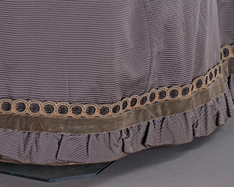
It’s more likely that the bride was simply following a general fashion for more muted, restrained colours for wedding dresses, if the bride chose not to wear white. These darker colours were more suited to afternoon wear, when most weddings were held, and also allowed the garment to be more wearable after the wedding, which was one of the main reasons for choosing a coloured gown (and, of course, there are always exceptions to most trends: Te Papa holds an electric blue afternoon wedding dress from the 1890s)
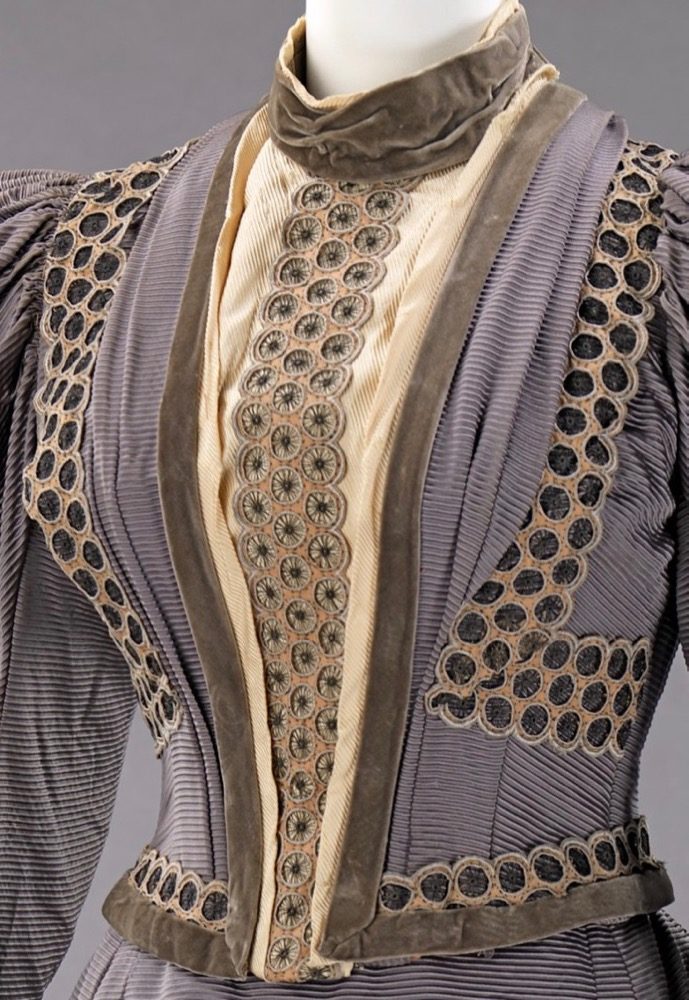
Whether it was half-mourning, or simply general fashion, the style, maker, and materials suggest the bride who chose this dress wanted an elegant, well made item, that would look good on her wedding day, and for many events after that, without every demanding to be the centre of attention. It’s the epitome of Victorian ideals of retiring womanhood and restrained modesty: the dress the plainer older sister would wear to her simple wedding to a minister, while the flashier younger sister who nabbed the local lord got the big white wedding dress (and in numerous 19th c & Victorian novels, starting with Sense & Sensibility, the plainer older sister is definitely portrayed as the more admirable character).
Does it play the part well? Would it tempt you from the big frothy white dress?
Rate the Dress on a Scale of 1 to 10
A reminder about rating — feel free to be critical if you don’t like a thing, but make sure that your comments aren’t actually insulting to those who do like a garment. Our different tastes are what make Rate the Dress so interesting. It’s no fun when a comment implies that anyone who doesn’t agree with it, or who would wear a garment, is totally lacking in taste.
(as usual, nothing more complicated than a .5. I also hugely appreciate it if you only do one rating, and set it on a line at the very end of your comment, so I can find it! And 0 is not on a scale of 1 to 10. Thanks in advance!)
The dress is exquisitely made, and the decoration is interesting but restrained. Alas, the color scheme–muted lavender, brown, and cream–is not at all to my taste, either to look at or to wear.
7 out of 10 for its other design virtues.
I find the fabric quite lovely and the, and although the color scheme is not to my personal taste, I can appreciate that the subtlety would be appropriate under certain circumstances (and might be quite striking on someone with blond or bright auburn coloration), so I can’t deduct much on that account.
I do not care for the trim, and it bugs me that I can’t figure out quite why.
8 of 10
I agree with you on all points.
As a 72 year old who has lived on the North American great plains most of my life, I can attest to the fact that many, many brides wore a dress that was not white and could be worn long after the wedding. Indeed, some women anticipated being buried in the dress they wore at the wedding. One of my grandmothers got married in black. Even after 1950 this was possible. The sister in law of a friend of mine got 100 black anguses from her father for a
wedding present (no small gift I might add) and that was it. I got married in blue silk and I still have the dress. I’ll have to lose weight to be buried in it, but that’s another story.
As for this dress, I think it is beautiful – beautifully made and would have looked fabulous on me at my wedding. I give it a 9.
You wouldn’t necessarily have to lose weight. They could always slice it up the back and make it fit!
Lovely, other than I this it can use a better trim than the lighter brown holey stuff. I liked the lavender, cream, and darker brown Details, but the holey stuff is throwing me off.
7/10
The ribbed silk is amazing. How did they get silk to do that?
8/10
I am trying to decide whether the trim echoes peacock plummage or jewels in a bezel setting or even typewriter keys. At any rate, I rate the dress a 9/10.
I think the dress is beautiful. I love the hem design. I’d wear it with a matching hat. A definite 10
I like the colors, because I think they work together. A brighter color I don’t think would have gone with mauve color at all.
But that circle trim is just awful. Too small on the skirt, too big on the bodice, but it just isn’t working for me. It’s not just the scale either, I just don’t like it.
7/10
I like it. The colours work pretty well together, and the ribbed silk is lovely.
The trim is weird, but oh so fun! It looks like little bicycle wheels! It works much better against the cream than the purple though.
8.5
At first I would have given this bride a 7. I thought the colors were meh. I wondered if there wasn’t enough money for fine lace, and a homestyled trim was made using Dorset button techniques. Then I reflected on “waste not, want not”. The wearer probably wanted to be economical and wanted a dress that would last for years. There is nothing too trendy, that would soon prove to be outdated. The mutton legs are not too plump. There is nothing fanciful happening in the lines or trim of the skirt. The pallet is “play it safe”. It can pass for most times of the year. So my appreciation rose when I though about the pleasure this woman took each time she was able to wear her wedding gown once again. I also noticed that the bodice was wonderfully figure flattering in its lines and color blocking. So, I found it interesting how the charm of this dress slowly washed over me.
9.5
At first glance, I love this dress. The lines and tailoring are wonderful. The soft pleating complements the puffiness of the sleeves and the white silk. The gold trim with its bold circular motif makes a statement worthy of a dress for a special event like a wedding.
At second glance I think the trim on the bodice is too bold for my taste, but I can’t think of anything else that could take its place. I don’t like how the trim is caught in the sleeves, but placing it at any other angle would have changed the whole dress for the worse, and having it thinner would have been too little for the design.
Overall, I still love the dress. It is understated elegance that can be worn as a special occasion dress to prolong its usefulness.9.5/10
like this dress a lot. The color is lovely. The weave is unusual, and as such does not need a whole lot of embellishments. The trim that is there is unusual enough to make it interesting. A very practical dress that could be used for special occasions after a wedding. 10/10
This dress scores highly for form, fabric, and wearability. I agree, though, with others who have a problem with the trim. All those wheely, spotty circles! And I’m not keen on the grey velvet. Yes, it is probably a winter dress, but it seems too heavy with the silk, and clamps the wearer around the neck with its fuzzy hand.
7 out of 10.
Not sure why, but I just can’t quite get behind this dress. The colour, economy, suitability for various occasions, not-whiteness, I can respect, but trim, not so much. As a side note, is it possible the trim may have aged to that fawn-grey colour? This rating is a gut instinct, sort of, but that’s what makes reading the comments interesting!
6/10.
LOVE!!! I declare myself head cheerleader of Team Honeycomb Trim. love this so much. It’s part fanciful, part restrained and to me is the perfect foil to the silk ottoman with its strongly textured surface.
I also love the colours together with very equal weighting of intensity. Low contrast. The play of textures is enough contrast I feel and this adds to its understated luxury.
It s so very smart – I am sure it had a wonderful hat and I hope the marriage was a happy one. My only tiny quibble is the plain expanse of skirt – I can’t imagine what could have been on it but it feels like a lot of plain. So,
9/10
The silk fabric is lovely, and I understand the reason for the muted colors. The silhouette is “smart.” I don’t care for the overall look, though, mostly due to the honeycomb trim. (So glad others mentioned that–it was the first thing I thought of when I saw the dress.) Makes me think of the book The Beekeeper’s Apprentice.
7/10
I think the dress is well thought out and well executed. Suitable perhaps for an older widow remarrying, not trying to look like a flooffy white lamb. Tasteful.
8/10
I love the color palette, the textures, the styling and that trim (yes, I called it “honeycomb,” too!). It’s very elegant, not ostentatious, and would work for a variety of occasions. That’s why I vote 10 for the dress of a longgone kindred practical spirit.
The purple ribbed silk is gorgeous! I generally prefer clear (rather than muted) colors, but these are all harmonious. The silhouette is neat and trim. The spoke trimming is interesting and effective, for the most part. I think I would prefer not to have the L-shaped portions of it on the bodice, but I suppose the overall effect loses some impact without it.
Poor Elinor, suffering in silence. Thank goodness Lucy Steele didn’t have enough integrity to stick to the disinherited son!
7
A beautiful dress and the trim on the bodice definitely adds to it in my view. It could have been worn by a widow remarrying or the bride might have chosen to be married in her going away dress which was quite popular at the time
I would rate it a 9
I like the colour scheme and can imagine wearing this dress, although perhaps to attend a wedding, rather than to be married. I think the double circle trim on the bodice is a little overpowering, and would have been better balanced by a single row on the bodice, and a double row on the skirt, but I imagine thrift perhaps did not allow for so much trim as would be needed.
9/10
Mmmm. Not really feeling it, to be honest. I do like the fabric a lot, but I just kind of look at it expectantly, waiting for something interesting to leap out at me. I’m actually quite surprised that this was professionally made, because to me it looks dressmaker-made – which isn’t a bad thing, just that there are some details (such as the velvet ribbon being clearly whacked on top of the eyelet trimming) which look seriously clunky. Actually, all the velvet looks added-on, which is probably why it doesn’t look as good as it ought to, it probably looked much more polished before the velvet ribbon was added to titivate it up.
The terrible job of mitering the eyelet trimming on the bodice is also kind of inexcusable. Was that added on too? Would make sense….
I don’t know – I kind of feel like this dress has been re-trimmed, and not especially well. But if it didn’t have the eyelet and velvet, it would be so plain and nondescript.
Hmmm. I actually think the trimming does the dress a disfavour, but the dress would be dull without it, so yeah. 4/10,
The mitering is *not* tidy, that is part of what bothered me about the trimming!
Everything about the trimming just gets worse and worse the more I look at it.
Not feeling the color scheme, even though I gravitate toward more subdued colors. It just doesn’t stand out or have a very big wow factor. Which is o.k. but not what I would personally look for in a dress for such a memorable event.
However, this dress is another example of exquisite Victorian dressmaking. Such an eye for detail. I never cease to be amazed by their ability.
I give it 7.5.
I like the soft color combination, and the texture changes from velvet to ribbed.
The trim … more on the hem and less on the bodice would have looked more balanced. I think the center of the bodice would have looked better with no trim.
8.5
The silhouette is beautiful and I love the sleeves. But that holey stuff looks like a wasps nest and as a wedding dress I am very underwhelmed…….
6/10
Ooh, I love the fabric. Ribbed silks(bengaline, gros grain, faille, etc.) are something I’m a bit obsessed with. I just love that texture they have. Unfortunately for this dress, the silhouette of the 1890s is not one I’m fond of. I’ve seen plenty of fashion plates and extant garments of this era that are truly hideous. It usually comes back to the huge balloon sleeves, and then other design elements that are huge to compensate, but there are plenty of other ugly design details popular in the era. It’s my least favorite decade of the 19th century. But this is a less egregious example of the era. The design overall is fairly restrained, and with a very beautiful color scheme. It would have probably earned a 6.5 or 7 from me. But that trim! Is anyone familiar with the term trypophobia? If not, look it up. Because that is what that trim is triggering in me. Ugh! I can’t get over it.
4.5
love the colours, always being a sucker for purple in its many shades. love the cut, and the ribbed fabric. But that sea-anenome trim has got to go!! 9/10