

Last week’s Rate the Dress was extremely revealing, and rather incomplete. This week I’ve got in the opposite direction, with a very covered up 1890s dress, that even comes with its original matching hat.
Last week: a ca. 1908 evening dress covered in metallic embroidery & beading
The vast majority of you adored last weeks dress, and appreciated the way it melded historical references (medieval sideless surcoats & neoclassicism) with an extremely modern feel that wouldn’t be out of place on today’s red carpets.
You correctly noted that the dress was missing a very important feature: an underdress which filled in the neckline, and the sheer gates-of-hell-esque side mesh.
And then, a few of you thought it was terribly tacky…
The Total: 9.2 out of 10
(I’m mildly amused that this weeks rating is 8.4 — both numbers that always look like they are pregnant to me!)
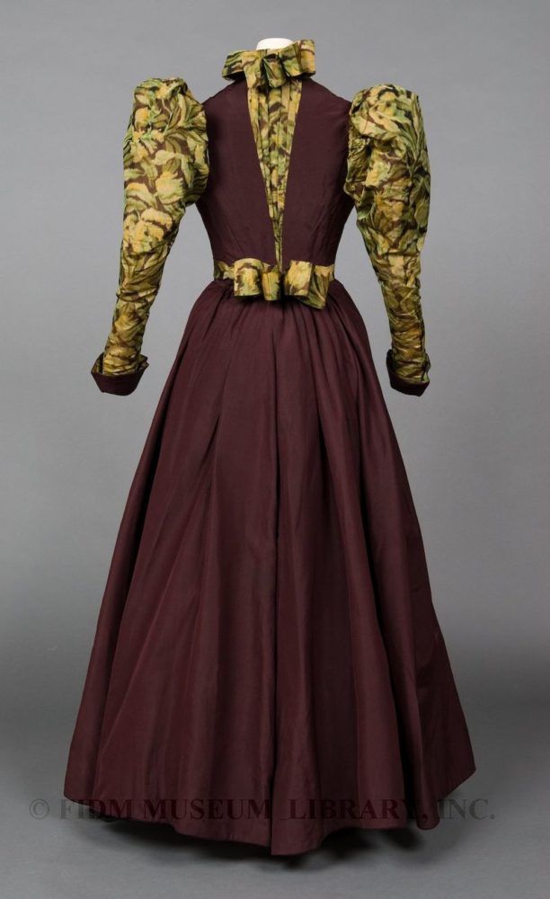
This week: an 1890s dress in plum and leaf print chine
Today’s pick is a classic 1890s day dress, though the choice and combination of fabric make it rather striking and unusual.
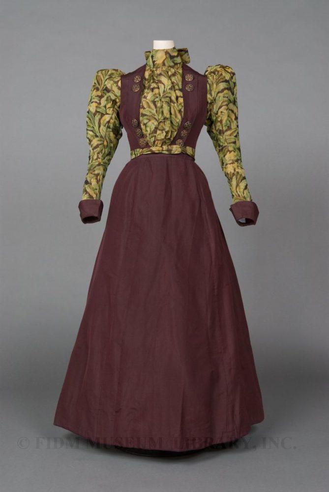
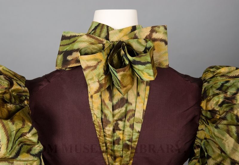
The sleeves and bodice front and back are made from a chine silk with a leaf pattern in shades of green on a dark plum.

The chine silk has been perfectly matched to a plain plum silk taffeta for the skirt, bodice sides, and cuffs.
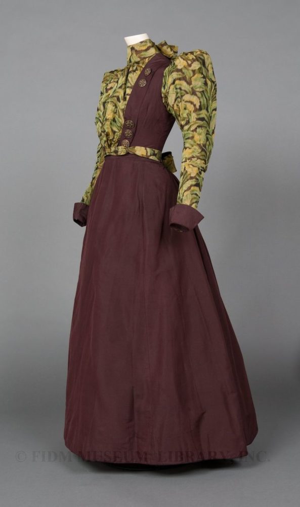
The skirt and bodice are separate pieces, the join hidden by the leaf print sash, and the bodice closing beneath the puffed silk at centre front.
Not only is the ensemble perfectly matched but it also comes with a coordinating hat: a little percher designed to sit tipped over the front of the face, with a wired flourish of the chine silk.


The hat is unexpectedly bright: a flourish of vivid yellow and orange to contrast the muted purples and greens of the dress.
What do you think of the ensemble? The dress, in its muted greens and purples, with its jaunty topper, typically 1890s in shape with a rather quirky twist to the design. Do you enjoy the combination, find it whimsical? Or is it just a terrible mis-match?
Rate the Dress on a Scale of 1 to 10
A reminder about rating — feel free to be critical if you don’t like a thing, but make sure that your comments aren’t actually insulting to those who do like a garment. Phrase criticism as your opinion, rather than a flat fact. Our different tastes are what make Rate the Dress so interesting. It’s no fun when a comment implies that anyone who doesn’t agree with it, or who would wear a garment, is totally lacking in taste.
(as usual, nothing more complicated than a .5. I also hugely appreciate it if you only do one rating, and set it on a line at the very end of your comment, so I can find it! And 0 is not on a scale of 1 to 10. Thanks in advance!)
I like the back better than the front. The patterned part of the bodice in the front seems too wide. Button placement feels a bit slap and dash. The skirt is a bit too plain. And the hat is horrid. Poor little thing may have not aged so well. The colors are jarring when placed with the rest of the ensemble. If this was worn backwards, perhaps I’d give it a 4. As is, it is a…
2
I was not a huge fan of this when I started reading but then I got to the hat! I love the hat and think it completely transforms the dress. The cut and shape of the dress is lovely. It’s the colors that bring it down in my opinion. If I we’re only rating the hat I’d give it a 9 for it’s playfulness and color. Since it’s a full ensemble and I have to take into account the dress, I think the shape and style are nice but the colors a just a bit boring. So final score is a 6.
I am not a big puffed sleeve sort but it was the fashion…so
I love the color combination. I like that the high gathered top of the sleeve is balanced with the cuff. I am fascinated by the choice of a print-Looks almost like a modern camo print.
I can almost hear the scroop.
I like the lines of the dress and find the plainness of the skirt works.
Imagining the wearer with her hair up, I like the back interest
The hat itself is horrid BUT it adds something to the dress…Makes me think that the original wearer had a sense of humor even when she conformed to convention
9
I quite like the colours and the print up close but not from a distance. It has that fuzzy eyesight feeling like your eyes can’t focus properly when it’s seen in the full length pictures.
The buttons are lovely, very arts and crafts style. The hat is pretty, a lovely touch and a great bonus to have it still with the trimmings in tact.
6/10
I do not like the print fabric up close. Further away pics look better to me. However, I like the shape and the lovely plumb color. I bet the hat looks wonderful with it. This outfit I am giving an 8/10 because of the print fabric.
I’m sensing that this dress may not be on the most perfectly fitted mannequin. There’s quite a bit of odd warping and twisting going on, especially around the waist. I love eggplant/aubergine, and I normally like a nice chine silk, but I’m not loving this one, it sort of looks a bit mouldy/sort of algae-y. Plus I dislike orange generally so I’m kind of grossed out by the hat trimmings. The general cut is fine. But it’s not a successful outfit. It does not spark joy.
Sigh. It’s not actively revolting. I don’t hate it. I just think it’s…. “Oh. That’s unfortunate.” I’m going to give it 4/10, just because I can’t justify going any lower or higher.
I do think the way the dress is mounted does not show it off as well as it should, as the front waist seems a bit too high as though the wearer is slouching or in the early stages of pregnancy. But the dress itself is beautiful, l find the combination of the aubergine and different shades of green works. It makes me think of the combination of these colours in nature, with the leaves turning from green to gold and even purple. The style is simple and one of my favourite eras, so I give it a 10
9. I actually like the dress very much. The colors are so of the period. The colors and design feel radical, as if the woman who chose this was for free love and campaigning for giving the vote to women. It has an artist’s quality to the blouse fabric, as if a Willaim Morris type A&C artist, designed it. Althought, the cut of the dress would have been more revolutioary, I suspect.
I’m in love! That’s a dress that I’d pull out of my closet every time when wondering what to wear to work today, knowing very well that this is just perfect for every day. It is almost decent with the beautiful aubergine color, but has just the right amount of fun with the leaf print and the sassy bows in the back, And these gorgeous buttons! I’m not the biggest fan of the hat, I find the yellow flowers to missmatched color-wise, but the dress itself is beautiful to me. If I ever sew something 1890s (which is not unlikely) I might try and recreate this.
9,5/10!
Ugh! I think it’s nasty. Colors are drab (could be the passage of time) and the leaf pattern belongs on a curtain. Buttons too big and sparse. Hat just needs a patching pigeon. 5/10.
I really like it! That era is not my favourite (the sleeves are a bit much) but this seems jaunty. I’ve never seen chine leaf print, which is pretty cool, and I thing there’s a great balance between the print and the solid. The bodice is shaped bit like a waistcoat, which really makes the outfit for me! And the hat is great. The whole thing looks perfect for going out on an energetic walk in spring or fall, when the landscape would be similarly toned!
9/10
The solid color fabric looks brown on my monitor, for some reason, not plum. In addition, the belt? bottom of the bodice? is crooked and a bit too high. I attribute one of those factors to the vagaries of monitors and the other to a display glitch, but they make it harder for me to judge the dress properly.
The pictures of the hat are useful, because I think they come closer to showing the true colors of the printed silk. I like the hat, but I think the dress looks dull and dowdy, with the mottled green-yellow-plum? print and the schoolgirlish look of the faux vest over the printed silk. It’s too bad, because I wanted to like the dress, based on the bodice close-up and the odd button-like trim. But the more I see of the full-front view of the entire dress (I actually like the back view better).
6.5 out of 10.
Sorry about the sentence fragment: I meant to say “The more I see of the full-front view of the entire dress, …the less I like it.”
If I were a posh British lady going to Australia for the first time, this is the dress I would think would be a good idea. The plum color is nice, and I like the buttons on the front. Otherwise, I just can’t get past the eccentricity of it all. Just too much.
3/10
I love the shape of the dress, I love the plum colour, I love the buttons, but, well, the green patterned fabric makes my eyes hurt. It feels like that fabric would be better as an accent pillow than a bodice and sleeves. And the hat really seems odd, and not in a good way. I feel like a less busy pattern would work better for the accent fabric, but aside from that, the dress is great.
6/10
I like the shape of the dress and the colour matching is good, although the print is rather large and curtainy. I don’t like the buttons much but at least they don’t go over the bust. The hat spoils it I think it’s awful. Whoever wore it was a confident lady. I think the mannequin isn’t right and of course without the right undergarments it would make all the difference.
So it’s 6/10
This is hard for me to rate. I can see some charm in it, but it doesn’t please me much personally.
The chine reads as the endpapers in a faded old book, and the taffeta could be the binding (though more of a prune than a plum, in my opinion.) I like the bows, the pleats, the front puff, and the buttons, but the sleeves just aren’t sitting well with me. Maybe it is more how they have been stuffed for presentation than how they would have appeared on a human, though. The shape of the skirt is quite handsome.
I have to love the hat, though. By itself, it is good, but it makes the dress so much more fun and playful.
For the sum somehow being less than its parts,
5/10
The colors are great – enough of the print to make a statement but not too busy.
Interesting choice to have the floofy bows on the back neck and waist for some exit interest, with such an unadorned skirt.
The bodice opening in this era is always too wide for my modern eyes – as if the bosom is trying to free itself.
I’d have to see the hat with the dress and a period hairstyle to really make an educated rating.
9.0
Am I alone in thinking it looks like Victorian camp gear? I intensely dislike the green business but I like the plum. 5.
I love the secondary color combination and the cut of the sleeve is exquisite. I think the skirt looks rather bland and heavy – adding some green trimming would improve it. The front proportion of the belt seems skimpy, just a bit more width would be balanced with the charming back bow. The orange flowered hat is a bold choice – a glowing spark contrasting with the deep plum. I see this isn’t very popular with others, but I’ll stick with my first reaction. 9
Just looking at it makes me uncomfortable. Perhaps it’s the arrangement on the dress form as some have suggested, but it looks bunchy, and is not helped by the bunchiness of the print. I normally favor green, but i just don’t like that fabric.
5 of 10
My initial reaction was “Sweet Jesus No,” and I’m not even sure *why* – it’s not the worst dress we’ve rated, but there’s something about it I’m having a really visceral reaction to.
I do like the plum parts, but to me the printclashes fiercely. I don’t care for the pleats, or the giant neck-bow, and while puffed sleeves are never my thing, they seem like an even bigger crime here.
The hat is fun. I think I’d like to see it with something I like better.
5/10, for being a right-down-the-middle mix of “Do like, don’t like.”
Another dress that is borderline ugly but in a way that really, really charms me. It has character, it suggests something of a personality even without a person inside. It actually feels like a character design rather than an extant garment – and I mean that in a good way. In fact, looking at it makes me think of the Jasper Fforde novel Shades of Grey (absolutely no relation to a similarly titled and more famous novel, haha – this one is set in a somewhat surreal pseudovictorianish comical dystopia in which society is controlled by selective colorblindness).
It’d be a much lovelier dress without the silly pattern, sure, but it’d be a much lesser experience.
I’m probably the odd one out here, but whatever, still giving a 10 for this delightful monstrosity.