

I swear I wasn’t thinking about a continuous theme at all when I browsed for this week’s Rate the Dress! But what do you know…it’s once again a back vs front dress, this time with a very ornamented front, and quite plain back.
Last Week: an 1890s Liberty Tea Gown
Although tea gowns weren’t primarily meant for tea parties, the ratings for last week’s Liberty example were rather like black tea with milk: very popular with most (at least that’s how tea goes amongst most of the people I know), and vehemently opposed by a small group (you know who you are, oh thee of ‘tea should NEVER be taken with anything but lemon’!).
Those who didn’t care for the tea gown were either not a fan of the droopy sleeves, or not a fan of orange.
The Total: 8.5 out of 10
Not quite as good as last week, but eminently respectable.
It was quite a fun score to add up, because I put the votes in columns of 10, and add up each column, and then add the columns and divide by the number of submissions. Every week I try to guess the exact final total as I add, and this week I got it spot on just by glancing at the numbers.
This week: a mid 1920s evening gown by Callot Soeurs
The Goldstein Museum of Design describes this 1925 Callot Soeurs dress as a classic example of 1920s Egyptomania sparked by the 1921 discovery of King Tut’s tomb. However, I personally don’t see anything specifically Egyptian inspired about it.

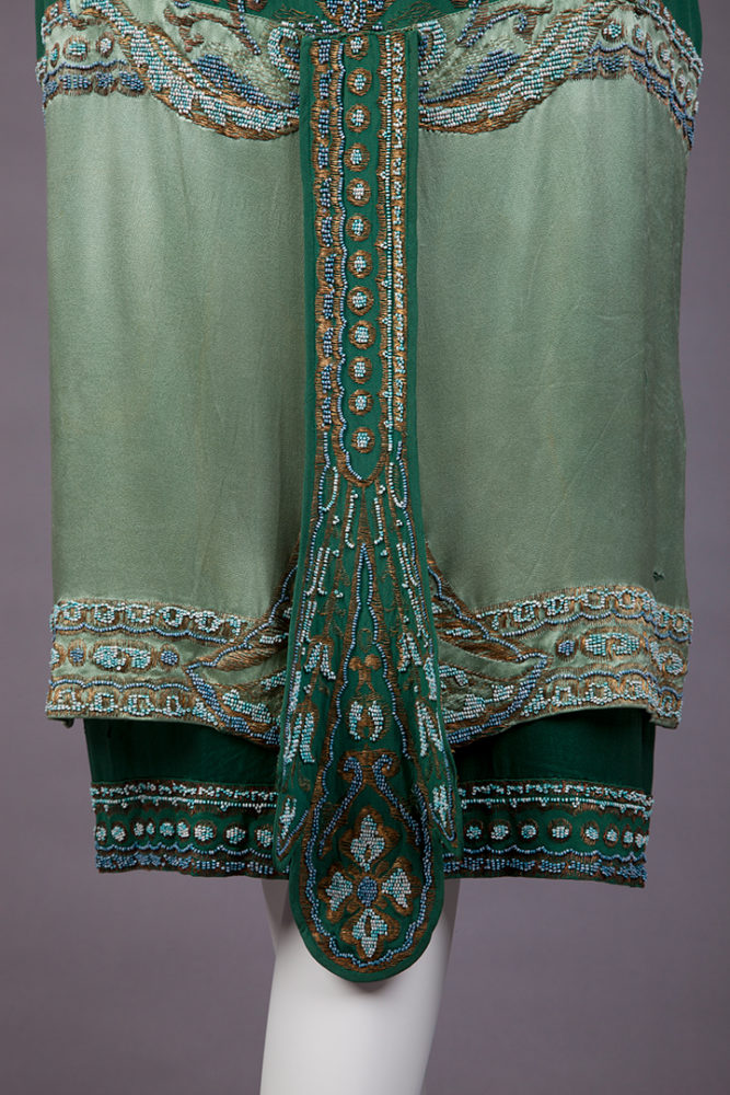
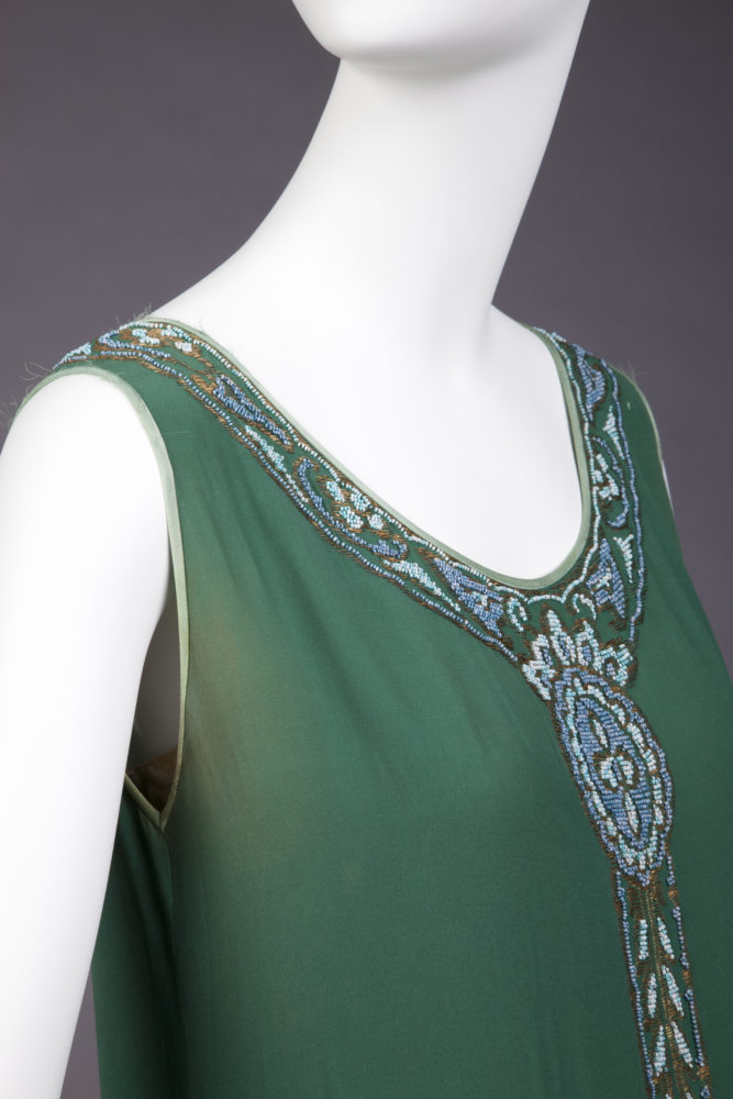
Other than a slight resemblance between the dangling central ornamentation of the dress, and the elaborate belts or central border of men’s shendyt, none of the design elements seem to owe their inspiration to Tut’s tomb or other Ancient Egyptian art or artefacts. Instead they are typical of the types of generic orientalism that were popular in dress design throughout the 1910s and 20s – well before Carter’s discovery.
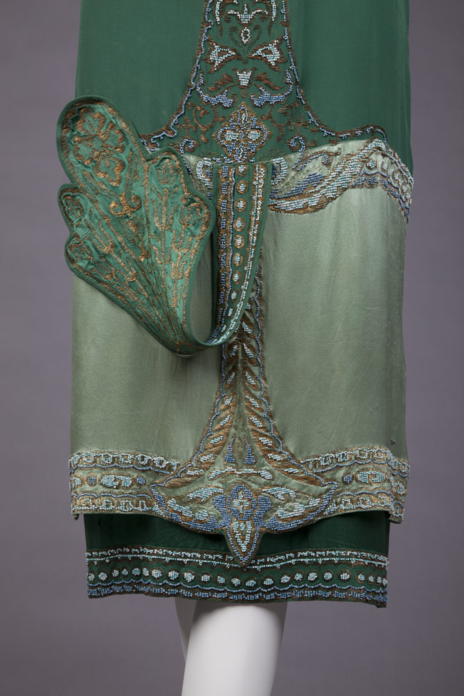
The design could just as easily be inspired by a peacock feather. Or, with its formal central rose or cross, delicate trellis work, and acanthus leaves, the dress could be inspired by illuminated manuscripts and the dangling belt of a medieval gown.
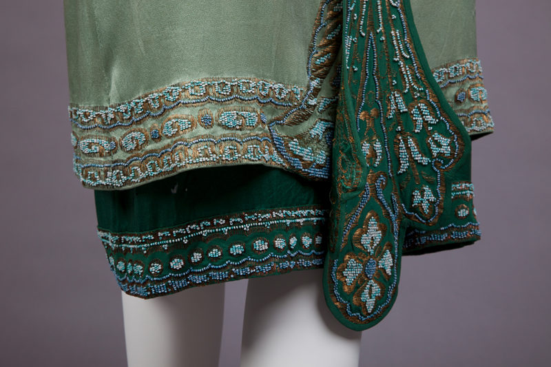
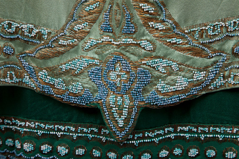
Or perhaps the basis for this dress came from the far east. The border of beading around the neck, and running down the front of the dress, do seem to evoke elements of late 19th century Chinese dress. The blue and white of the patterning, combined with the jade green hues of the dress, could have been taken from different varieties of pottery. Chinese textiles and pottery were both imported into the West in large quantities, and the textiles in particular were popular sources of inspiration for designers.
It’s actually typical of the the work of Callot Soeurs that the inspiration for the dress is not as literal as to indicate one easily identifiable source. The design house’s brilliance was in delicately combining and re-imagining many pieces of inspiration into garments that were evocative, without being obviously derivative.
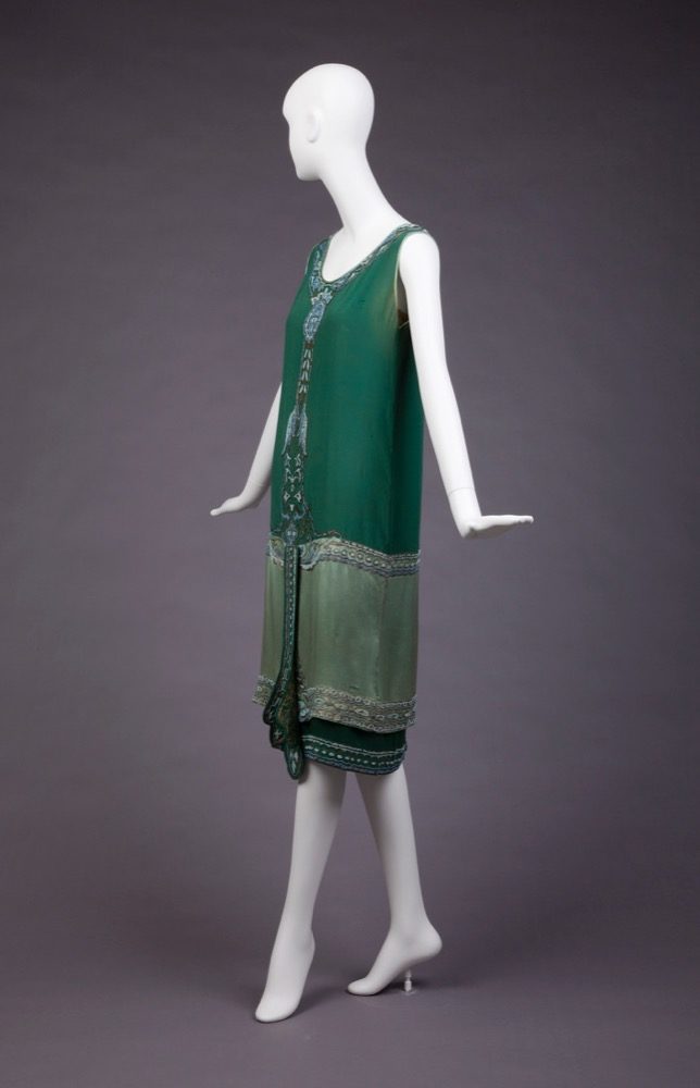
While the inspiration for the dress is unclear, the actual construction is quite simple, but interesting. Like many 1920s dresses (including, quite fittingly, the 1920s tea gown in my collection given to me by the wonderful Karen), the dress is made in two parts. It includes an underdress/slip, with a plain top, and a skirt that forms the dark green under-layer, and a second overlayer of the lighter green.

This method of construction provides a built-in slip and the opportunity for a layered tunic effect without the need for a joining seam. It allows the overdress to float about the wearer, without the weight and bulk of the underskirt dragging it down.
So, what do you make of this dress, with its simple silhouette, but clever construction, and ornamentation of un-specific origin?
Rate the Dress on a Scale of 1 to 10
A reminder about rating — feel free to be critical if you don’t like a thing, but make sure that your comments aren’t actually insulting to those who do like a garment. Phrase criticism as your opinion, rather than a flat fact. Our different tastes are what make Rate the Dress so interesting. It’s no fun when a comment implies that anyone who doesn’t agree with it, or who would wear a garment, is totally lacking in taste.
(as usual, nothing more complicated than a .5. I also hugely appreciate it if you only do one rating, and set it on a line at the very end of your comment, so I can find it! And 0 is not on a scale of 1 to 10. Thanks in advance!)
Love this shade of green, and I can just imagine how walking around with that beading swinging around. Like most twenties dresses, I think “gosh, how straight up and down must you be to wear this?!” I’m going for a 9.
I love the color scheme–green is my favorite color, and this dress combines some very nice greens. The bead work is elegant and beautiful.
But the dress itself? It’s rather simple, maybe too much so. It does not stand out as a beautiful object, in and of itself. On the other hand, it would make a woman with the right build and coloring more beautiful.
So not quite a 10 but deserving of an excellent score.
9.5 out of 10.
What an artistic dress, how to make a simple shape stunning.
Love it. 10 / 10
Interesting! I didn’t see Egypt in the beading. I saw Native American beadwork – particularly of the Pueblo people (the motifs remind me of the squash blossom necklace) and Plains tribal beadwork.
Beadwork: https://kqdesigns.com/jdfront.htm
Squash blossom necklace: https://bit.ly/2mdqG55
There was a lot of growing interest in using these designs for fashion in America at the time this dress was made, but I don’t know how much the Callot Soeurs would have been aware of that.
The Callot Souers always seem to be designing for an L.M. Montgomery heroine, and this one especially makes me think of Valancy Sterling’s green dress (though hers was beaded in red.) The contrast of the two greens – so perfectly matched in tone! – really won me over, with the delicate blue beading added to it.
I’d give it a 10/10.
8.5
I’m not fond of the color but it is elegant nonetheless. I like the deading work on it!
I would give a 7
While I admire the intricate beadwork and love the shade of green of the majority of the dress, the lighter green fabric does nothing for me on this dress…7/10
The dress is elegant and the way it is made is interesting, with the over and under layers seperate. Not really my era, but the beading and the colour scheme are beautiful. I shudder to think of the amount of labour involved and I have the greatest respect for those who actually did the beading. So worn by the right person and because I love the beading, I give it a 9
Very much appreciate the green tones, and love the beadwork (which would helps to turn the flimsy fabric into structure and also helps to control the movement – I think Miss Fisher would adore it.
9 of 10
As a sucker for the 20’s, Callot Soeurs and green, so this is mostly a gimme. I do think the hanging beaded thing on the bottom looks a little like a bell-pull and is a little heavy, and drops it to a 9.5. But overall, just a beautiful dress that I would wear in a heartbeat.
I love the color and the beading. The hanging ornament on the front of the skirt seems awkwardly attached and I find it distracting.
9/10
When I saw the first picture, the closeup of the beading I thought of Native American quill and bead work.–Not Oriental at all!
Love this…9
My favorite color! I think it is elegant and beautiful. 10
Love the color, layers, beadwork (close up and from afar), lines, and shape. The back is disappointing though
9.5/10
Love it! So distinctive and elegant.
9/10
Love the colours and proportions here – and the slightly narrower underskirt … it is simple / but ornamented – feminine but not girly.
9-10
I love green and both these greens are beautiful and go together nicely. I think the beadwork adds interest to the simple shape of the dress. I love it!
10/10
10 the dress is splendid, so beautiful such work and detail it is just wonderful.
To me the overlay looks a lot like the clothing on the three warriors on Babylon’s Ishtar Gate, which was excavated 1890s-1917 and under reconstruction after WWI.
https://commons.wikimedia.org/wiki/File:Persian_warriors_from_Berlin_Museum.jpg
But there is Doucet’s June 1923 classic –
https://gallica.bnf.fr/ark:/12148/bpt6k55172574?rk=493564;4
It’s definitely a keeper:
10
Actually I think there are three different green tones on the dress; a dark one at the very bottom, a medium shade on top, and a pale one over most of the bottom area.
The attention to detail and using high quality materials is indicative of this house. I give this dress a 10!
This is just gorgeous! And I think a large part of the Egyptomania influence may be in the colors: Eau de Nil and its darker variant, Nile Green, became extremely popular after the discovery of Tut’s tomb, in everything from jewelry to bathroom fixtures.
Love the colors and the design. My only quibble is the beaded overlay, which feels a bit heavy. 9.5 out of 10
(First time poster, but I love your blog, and the rate the dress posts!)
That’s an interesting theory. Do you have a source for that? I did a survey of mentions of colours used in fashion advertising and fashion columns in NZ between 1900-1930 a few years back. Both Eau de Nil and Nile Green were extremely popular colours throughout the early Edwardian era, with mentions of both in fashion advertising and columns peaking in 1909, and declining significantly afterwards (only 15 mentions of NG in 1922). Though the names are still in use they don’t experience a resurgence in popularity until 1925. This is weirdly delayed if it was a reaction to Tut’s tomb. Additionally, mentions of Jade green beat out eu de nil and Nile Green by at least 10 to 1 every single year between 1920-1930.
NZ fashion columns almost invariably came out of the UK, and popular colour names were based on descriptions published by French designers, so they can be taken to be reasonably representative of fashionable Western dress.
After some digging around, I couldn’t come up with a direct source, and I think I was conflating some dates – that’ll teach me me to rely on my memory! It did send me down some fascinating research alleys, though, so thank you for that 🙂
It does seem much more likely that by 1925, eau de nil and Nile green were well-known colors and this dress was a call-back to the earlier fashion rather than a direct response to the Tutankhamun finds. I actually have dresses in Nile green from about 1910 and 1925, which tracks with your color survey.
Interestingly, I found a 1923 color mixing guide for artists in a collection of trade catalogs on Internet Archive which doesn’t include either color name, but does have Egyptian green and Nile blue.
It’s green, it’s pretty, and it looks comfortable. Sure, it’s a little forgettable, but I would wear this everywhere.
8.5/10
The shape and colors are delightful, and the free feeling it must give the wearer, especially given the helpful, clever structure, make it super in my mind. I’d find the central pendant annoyingly flappy when moving around, though unsure how that could be amended without spoiling it. 9 of 10
I really like the idea of this dress. The colors are beautiful, as is the beading, and the layering. But I can’t really get over the bottom front thingy, it just looks a bit odd, and draws the eye to a weird place.
7,5
Simple elegant sheath. Three shades of green are lovely. Bead and thread work are beautiful, however, I can do without the addition of the Bell Pull down the front. It covers up so much of the bead work design which is done to look like cording. I would give this dress a 7.