
Last week’s Rate the Dress was quite popular, although not everyone was on board with its colour. For this week’s Rate the Dress I’ve picked a very different dress, but one in the most-suggested alternate hue for last week’s frock.
Last Week: an 1882-3 day dress in fawn brown
Last week’s dress was way, way, way more popular than I thought it would be! I just didn’t expect people to be in to fawn brown, all the pleats + lace, and the very unusual front pocket situation. But it turns out you just really, really like pockets. And some people even like fawn brown!
The Total: 9.2 out of 10
A very elegant effort.
This week: a blue velvet robe de style by Poiret
This week’s Rate the Dress is a robe de style by Paul Poiret. While the overall shape is typical of a robe de style, in typical Poiret fashion it combines unusual and inventive elements to give a twist to the standard shape.
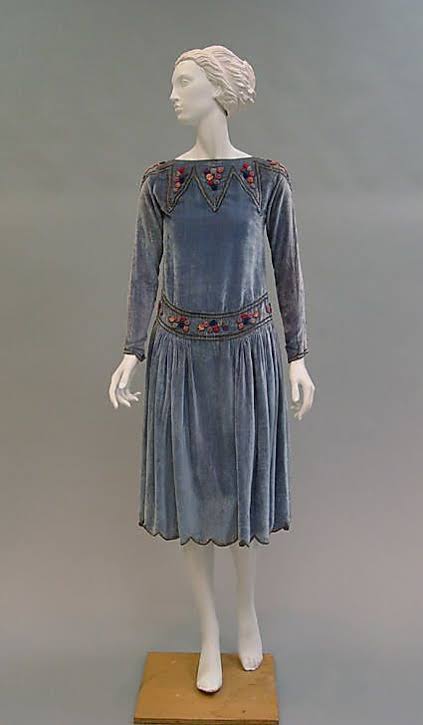
Metropolitan Museum of Art, 1982.249
This take on the robe de style features multicolour embroidery on a blue-grey velvet ground, forming a pointed collar which frames the neck, and a girdle which emphasises the dropped waist and fine pleating of the skirt. The effect is medieval-esque, turning the dress into a garment that is both the princess’s robes and the jesters tunic.
The girdle of embroidery dips to an unexpected point at the back. Unless the Met really messed this one up, and put the dress on the form backwards.

The dress is both winter and spring in its colours and materials: cosy enough for cold days, but with a playfulness that suggests new flowers.
What do you think? Has the experimentation worked?
Rate the Dress on a Scale of 1 to 10
A reminder about rating — feel free to be critical if you don’t like a thing, but make sure that your comments aren’t actually insulting to those who do like a garment. Phrase criticism as your opinion, rather than a flat fact. Our different tastes are what make Rate the Dress so interesting. It’s no fun when a comment implies that anyone who doesn’t agree with it, or who would wear a garment, is totally lacking in taste.
(as usual, nothing more complicated than a .5. I also hugely appreciate it if you only do one rating, and set it on a line at the very end of your comment, so I can find it! And 0 is not on a scale of 1 to 10. Thanks in advance!)
The more I look at it, the more I like it. The colors are elegantly subtle, and the shape looks both comfortable and stylish, and I actually like the soft curve of the waists in front and the dipping “V” in the back. My only quibble is that the velvet might be a touch heavy, but only a touch.
9 of 10
It’s bad when even the mannequin looks like she might have a bit of a tummy. I blame the curved girdle at the front. It probably would have looked a lot better with a smaller dipped V in the front as well as the back – as is, it’s not doing the mannequin any favors.
The color looks bluish gray on my screen but that may just be me. It look rather drab and the colors of the embroidery aren’t bright enough to bring it more to life. The velvet (velour?) seems thin – you can see through it below her knees in the “front” picture.
4/10
A thought about that tummy. I believe that most women actually have a tummy and that this beauty ideal of having absolutely flat front-minus-huge-brests is quite contemporary. So perhaps in the time it wasn’t an issue at all and it is unpleasing for modern eye only.
The whole boyish look comes from the 1920s. The ideal look of the time was to be completely flat on the front. Even during the pigeon front about 20 years prior to this dress, the look was a flat lower stomach with more of puffed bust.
i think it’s very pretty. but i also wondered if it was meant to have the V dip in the front!
oh—and i’d rate it at an 8/10.
I like the subtle colors, although time hasn’t been kind to the dress. As Isabella noted, the fabric is quite thin, and it appears to me that the velvet has rubbed away in places. Or maybe that’s just light reflecting off the fabric? I suspect the original wasn’t that thin and I don’t want to knock off points for its current condition. I like the scalloped hem and I also like the point of the waist in back. Typical of its time, the dress shape looks rather sack-like, and the dipping curve at the waist in the front doesn’t help things. It’s making a rather mixed impression on me. 6/10
I reckon it’s back to front – look at the sleeves, they are bunching at the front because the back ease has nowhere to go, but look stretched at the back. That’s how I read it anyway.
I don’t like it! It feels gimicky to me and the colours don’t feel right. I generally can get on board with PP stuff but this feels like an unresolved concept.
4/10
Quite like this one. Would happily wear it. 9/10
Gorgeous. Silk velvet, so gathers and drapes beautifully, and the embroidery is stunning. I’d happily wear it too. 10/10
Beautiful! I like the subtle colour, the embroidery enhances it. A great look for the period. 10/10 for me.
Unexpected uses of velvet are my favorite! At first glance I thought this dress was something much lighter, wool broadcloth or something. I love the combination of a fancy fabric with a playful decoration scheme. The only thing I don’t like is that this is indeed only a dress for the fashionable 1920s figure–not just slim, but broad-shouldered, with no hips or bust to speak of. I suppose it would also look very well on a slim man who wanted to wear dresses–more men than women have the body shape for this cut.
9/10
I think the dress’s color has faded unevenly, making it look grayer than it originally was. I also am inclined to agree with Leimomi’s conjecture that the dress was put on the manniken back-to-front. It’s not just that the “front” neckline is straight and high and the “back” neckline has a charming dip; something about the fit through the upper arms and shoulders seems to be off.
The velvet of the dress seems surprisingly thin and drapey to me. Overall, I like everything about the dress except the attributes that are not likely due to Poiret’s design.
10 out of 10.
I love the colour and the neckline embroidery. The tiny buttons on the cuffs are adorable, and I even like the scalloped hem. My only quibble is the girdle, which I don’t like at all. Perhaps if the v was at the front it would be better, but as it is I’m not a fan. The embroidery on it is lovely though.
9/10
Backwards or not (and I rather think it is backwards here), I rather like it. The colors are work well together, the trim is pretty without being either too femme or too cliched, and overall it looks like a very wearable dress for a variety of figure types and complexions. Someone mentioned that the trim on the front (as shown) gives the appearance of a belly; I don’t see that at all, nor do I see why it should be a problem if it does! Not my favorite historical dress, but quite a respectable effort on the designer’s part nonetheless.
8/10
I like it lots. I was about to say I love it until I read the comments about it being backwards on the mannequin. I looked again and think they may be right. Nonetheless, I love the waist embroidery & the overall silhouette a great deal.
8/10
The fabric looks more worn on the backs of the sleeves vs the front, which suggests that the V waist side IS the back. But I would love to see it the other way around to see how that looks. Overall very subtle and sophisticated to my eye.
ceci
I love the color combinations. Frankly, I think it would work well if it was worn back-to-front or front-to-back! I would wear this in a heartbeat. 10/10
the more i look at it, the more i lean toward the idea that this dress is on reversed. the sleeve fit is odd—tighter on the back view and folding at front, as if fighting a normal curvature of cut or wear. even the cuff buttons seem to be hitting the underside of the wrist instead of the outside. and if poiret was referencing medieval-esque ornament, a girdle pointed in front and curving around the waist in back would make more sense? finally, the neckline looks a bit straight for the front (unless it was an envelope cut neck, which this isn’t), yet gently curved in back.
sorry for extra commenting! i do love a puzzle…
I agree. After reading the comments and the reasoning behind them, I also now think the dress is on backwards. I had noticed the poor fit at the upper arms, but didn’t think much of it since dresses often don’t fit that well on mannequins. And I actually prefer the straight neckline in front, but the curved neckline would make more sense in front. At any rate, it doesn’t change my score.
I do think the dress on backwards, and I feel it could also do with a lining or interlining as it looks a bit droopy.The colours are beautiful , the embroidery complements them too. A lovely dress, just feel it would have looked really elegant if it were floor length, but then I live in maxis 🙂 so, thats just me
On the whole, I would give it a 7
Yep, looks to me like the dress on backwards, also. Assuming that and mentally de-wearing the celvet, 9/10.
Ah, sorry Leimoni, it looks like I accidentally posted twice! Please disregard this comment and use my one below (the 9/10) when doing the scoring
Thanks! Not your fault – the commenting system glitches all the time.
What an interesting dress! I like the smoky blue color, especially, and the trim, but especially the boat neckline with the slight dip in back. I imagine if we were to dig into Poiret’s drawings and photos, we could figure out which way the front is.
I own a very vintage couture cushy silk velvet lined jacket bought so long ago that it was just “old clothes” at the time. The velvet is amazingly drapey fabric, and it crushes easily, and shows lights and shadows in extra definition: I believe that’s what could be exacerbating the tummy and arm lines.
I give it an 8.
Natalie
It has interesting elements. Circus baubles, medieval architectural shapes, modern length and loose silhouette. I don’t know if reversing it would alter my opinion. I just can’t find anything I like about this one. Credit for uniqueness only.
2/10
I think it’s the right way round, just our modern sense of what looks right makes it look back to front. Whilst I can appreciate the work that went into it and the embroidery, there is nothing in the combination of colour and style that would tempt me to wear this one.
3/10
I too like this and agree that it does look as if it is back to front. As the velvet is silk that would be thin and drape beautifully. Even now silk / viscose velvet looks thin like this. I love the colour so subtle.
9/10
Love Poiret, love this period, love the color. Who cares which side is the front?
9/10.
Except for the scalloped hemline which to my eye appears too cute for the elegance of the dress, I find everything about this dress pleasing. A bit of a genius was Paul Poirot with the colors of the embroidery.
9/10