
Last week’s dress, and the reactions to it, were rather restrained. This week I’ve picked a very un-restrained dress, from an era that was rarely restrained. The first-bustle-era reception gown we’re looking at combines bold fabrics, bold colours, and bold textures for maximum impact. Will you find it find it pleasingly exciting?
Last Week: an early 19th century embroidered morning dress.
Reactions to last week’s embroidered morning dress were slightly more muted than the week before, both in the ratings, and in the number of people who were inspired to rate. You thought the dress was restful and comfortable, and perfect for a slow day after a big evening. The main complaint was that the embroidery didn’t have enough impact, though Emma Louise commented how balanced the dress would look with a richly coloured Kashmiri shawl, which is exactly the sort of accessory it might have had.
The Total: 8.5 out of 10
Very respectable, but not one for the rating history books.
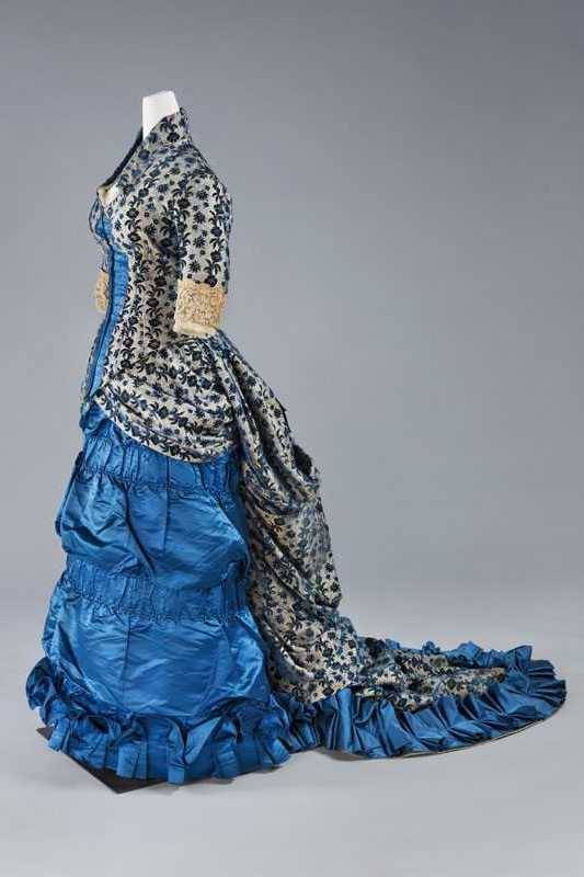
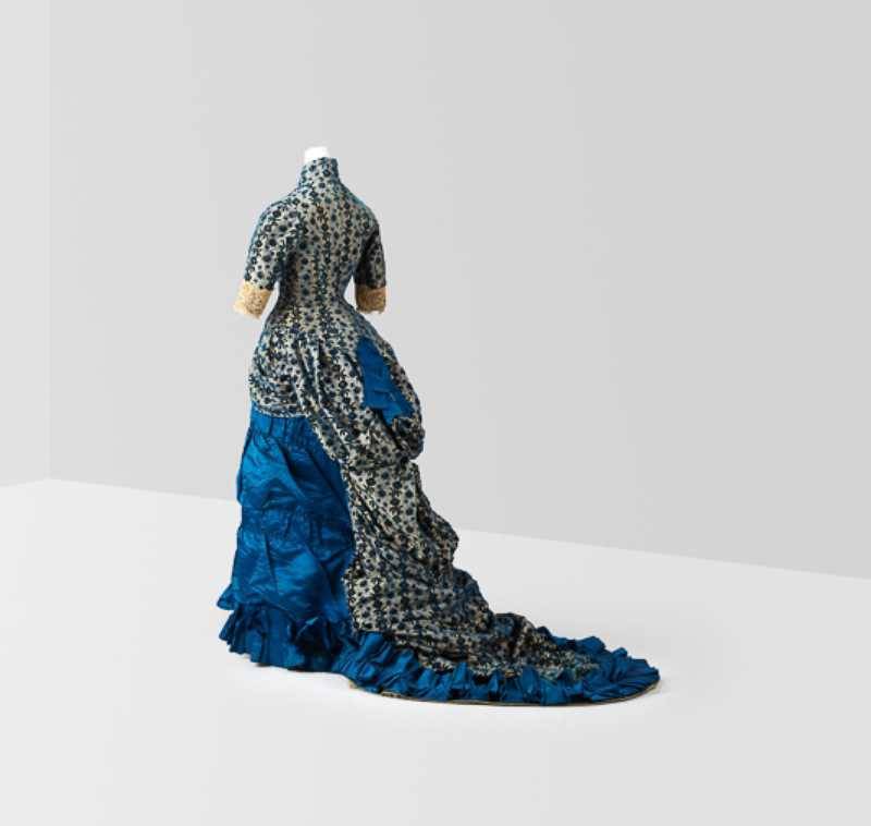
This week: a brilliant blue and floral late 1870s bustle era reception gown
Late 1870s fashion is rarely subtle, and this end-of-the-first-bustle-era reception dress, in vivid sapphire blue satin and black and ivory floral brocading, combines the era’s love of the still-relatively-new aniline dyes and lavish textural trim.

Reception gown, ca. 1876, Centraal Museum
While the patterned fabric and the coloured fabric are are unrelated, they have both been used very deliberately. The stripes of the floral have been carefully arranged to heighten the illusion of curves, emphasising the fashionable hourglass figure. The plain blue satin is used as the perfect canvas for fabric manipulation, arranged in a series of pleats and ruches.
Reception gown, ca. 1876, Centraal Museum
The structured geometry of the pleats and gathers in the blue silk provides a counterpoint the the naturalistic draped fall of the floral bustling. A single lavish bow in the blue silk pulls the two fabrics together.
Reception gown, ca. 1876, Centraal Museum
What do you think? Is it an elegant representation of its era?
Rate the Dress on a Scale of 1 to 10
A reminder about rating — feel free to be critical if you don’t like a thing, but make sure that your comments aren’t actually insulting to those who do like a garment. Phrase criticism as your opinion, rather than a flat fact. Our different tastes are what make Rate the Dress so interesting. It’s no fun when a comment implies that anyone who doesn’t agree with it, or who would wear a garment, is totally lacking in taste.
As usual, nothing more complicated than a .5. I also hugely appreciate it if you only do one rating, and set it on a line at the very end of your comment.
admittedly, this is not my most beloved era of fashion, and i often find the ensembles heterogenous and overdone. this one is a bit of both, but by no means the most extreme exemplar of the period. the bright blue must have been very exciting at the time, and while it is not exactly subtle, i do think it a pretty colour. the print used on the bodice and bustle is complementary to the blue satin, overall. i am not a fan of all the frou-frou ruching, ruffling, tucking, etc, nor of the blue bow stuck at the back, nor the lace cuffs. however, all these things i dislike are very much ‘de la mode du jour’, and this dress is not the worst case scenario i’ve seen at all. (restraint is very relative, in fashion…) i am sure someone looked very fetching in this dress in its day. it’s just not a frock i covet for my own wardrobe.
rating: 6/10
Superlative, when seen from the back, and sides. Not so elegant in frontal view, in my opinion. Not sure what I think of the strip of blue pleats in front. But it’s well-executed, and certainly a standout of its era.
8.5 out of 10.
If you send me back in time and give me the right figure, may I please have this dress? It is exactly the sort of thing I’d love to wear!
Ironically, though I love the dress and wants it, it doesn’t make a 10 for me… the detailing isn’t perfection. The dress just makes me happy.
9/10
I love the solid blue fabric color. I can’t think of another thing to say about this dress that wouldn’t be offensive to anyone who likes it. 2/10.
I cannot like it for myself – such business muddles my brain, but I have to give it credit for exquisite workmanship and design for it’s day. Although I don’t wear blue myself, I can appreciate that it’s been used with great skill and impact.
8 of 10
I like the bright blue, and the lace at the end of the sleeves. I don’t like the print on the rest of the dress or the big ruffles around the hem. This era also isn’t my taste, so that doesn’t help. The right person might look great in this, but it’s not my style.
4/10
I like the blue. And unfortunately that’s about it. I think this is probably my least favorite read the dress dress that you have ever posted. Not a big fan of this particular aesthetic overall. I realized it was very well-made, and some people would enjoy this dress. For that reason I’m going to give this a five out of 10.
The only thing I like is the colour. Even though it looks well made and is fashionable for its period, I just can’t like it.
2/10
Well, I don’t think the pattern goes with the brilliant blue well, it’s in a weird place where it doesn’t match, but is matching enough to not be able to score points in bold contrast. And I can’t unsee the big superhero “i” on the front ^_^
Other than that its a perfectly ok ensemble.
6.5/10
I don’t think there’s anything I like about this one. It’s just all too much. The blue’s pretty but I don’t think it really suits the dress.
1/10
3/10 too much frill, and the print is too bold.
It reminds me of the White Queen in Through the Looking Glass. As a costume it’s stunning but looks uncomfortable to wear. I do admire the fabric manipulation. 7/10
The shaping of the bustle and train is gorgeous, I love the blue … but that fabric contrast is too much. On my monitor it looks like there is a blue element to the flowers which would help tie it together, but it’s not enough. As usual, I wish I could see this dress brand new and in motion.
5/10
Oh dear – far too much everything!
Escapes 1/10, because the fabrics could be beautiful separately and in a different context.
2/10
hm, this one has everything, doesnt it…
I adore the late 1870 shape, so that is big plus for me, also the neck execution is quite unique.
On the other hand…
The fabrics have nothing common. Eugh.
The wonderfull blonde lace clashes with the rest of the dress.
I dont like the execution of the blue plaquette in front of the bodice. I quite like the shape, but the overall effect is not what I would expect.
7/10
My first reaction to seeing the photo of the front of the dress is that it looks like a Christmas ornament. My appreciation for the design and workmanship in the dress improved with seeing the side and back views. But it’s not a harmonious whole for me. I like the blue; I like the patterned fabric, but they just compete with each other. That said, there is still something that I like about the dress. Perhaps it appeals to my preference for clothes that stand out? I can imagine wearing this dress to a party or to promenade with the intention of making a statement and being noticed. 5/10
oh my, I really don’t like this dress.
The blue is such a beautiful color, and then it gets bogged down with the print (they belong on different continents) and the beige lace. And those awful barrel hoops around the skirt. And the twisted-up train that looks like what happens when a sheet gets wrapped around three shirts in the dryer — actual people were supposed to wear this???? Sorry, I can’t get above 3/10.
I love this dress! I have owned multiple items of clothing in various patterns of blue, black, and white. I love the restraint of the closely fitted black and white print on the bodice and sleeves, followed by the explosion of poufy tiers separated by ruching on the skirt, and the elaborate opened box ruching at the hem. I hope the lace on the sleeves and around the neckline was originally whiter. I love the angles of the blue plastron on the bodice being echoed by the seams where the stripes of black flowers are mitered. I love how the soft depth of the slightly fuzzy brocade is contrasted with the rich luster of the blue taffeta.
10/10