
The re-launch of Rate the Dress came at the same time as the launch of the Cassandra Stays, and this week’s Rate the Dress is interrupting the Cassandra Stays Sew-Along, so I think it’s only fitting that I do a Rate the Dress featuring a garment that could be worn over the Cassandra Stays!
Last week: a 1910s dress in white and orchid purple.
Ooof, a very mixed bag of reactions to last week’s Rate the Dress! Everything from a perfect 10 to a devastatingly low 3! Most of you liked the dress…except, that is, for the back collar. But others felt that there were too many discordant details, and rated it accordingly.
The Total: 7.7 out of 10
Better than last week, but with a greater spread of ratings.
This week: the Marchesa a la modé in puce and coral
Looking back over Rate the Dress, portraits to be rated do not attract as many comments as extant garments. They do, however, sometimes attract more interesting and in-depth comments, so I’m hoping that will be the case this week.*
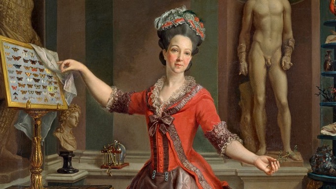
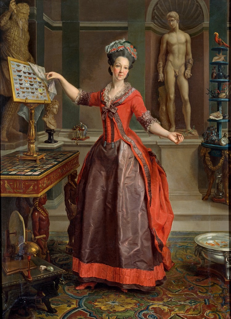
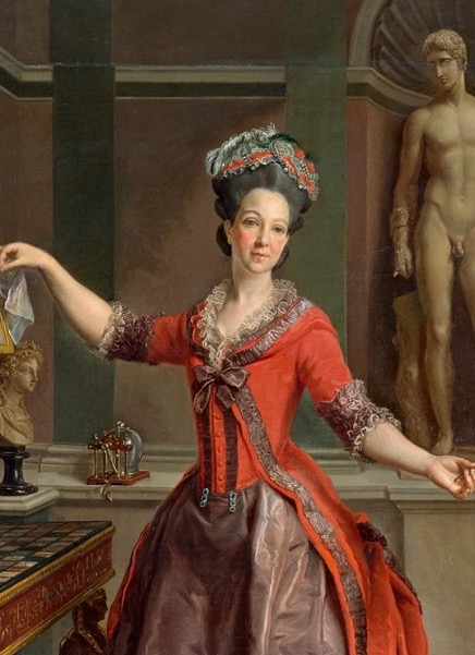
This week I present The Marchesa Margherita in a very fashionable late 1770s ensemble.
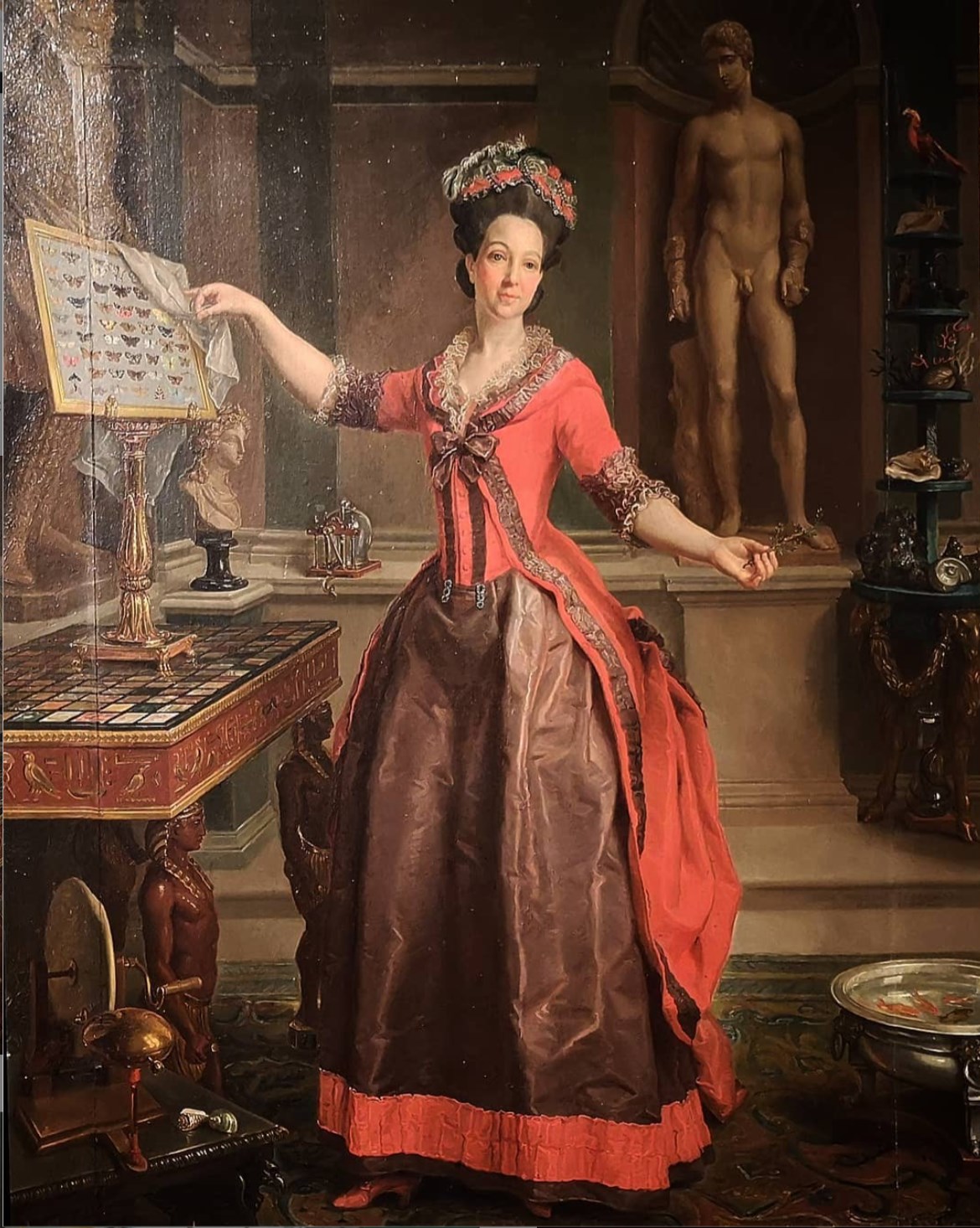
Portrait of the Marchesa Margherita Sparapani Gentili Boccapaduli by Laurent Pécheux, 1777, Palazzo Braschi
I found two different versions of the Italian aristocrat’s portrait: one darker and more muted, and another bright and clear, with every detail visible, from her butterfly collection, to her Egyptomania table, to her goldfish bowl. The portrait is intended to show off the Marchesa’s knowledge and interests, attributes that made her a famed salonière, as much as her looks or fashionable dress.
Portrait of the Marchesa Margherita Sparapani Gentili Boccapaduli by Laurent Pécheux, 1777, Palazzo Braschi
And her dress is very fashionable. Extremely a la modé for 1777. The Marchesa wears a petticoat in dark puce, trimmed with a flat ruffle of vivid coral around the hem. The colours of her petticoat are reversed in her upper garments: a polonaise with cutaway, buttoned front, bustled skirt, and hood. Narrow flat ruched puce trimming frames the hood, front of the cutaway, and the skirt. The sleeves are edged with deep cuffs of ruched puce silk.
Portrait of the Marchesa Margherita Sparapani Gentili Boccapaduli by Laurent Pécheux, 1777, Palazzo Braschi
The whole ensemble is finished with lace frills at cuffs and down the neckline, and a fashionably high hairdo topped with a pearl and feather trimmed turban. Her shoes are in coral to match the ensemble and balance the coral bodice and overskirt. She wears no jewellery other than matching clips at the bottom of her bodice, which features the shallow round dipped waist that was in vogue in the late 1770s.
The contrasting colours and reversed petticoat and upper colour scheme were very fashionable in this period, but there aren’t that many surviving examples of the style, so it’s wonderful to see a portrait that demonstrates the look so clearly, with all the styling and accoutrements.
So, what do you think of this distinctly 1777 moment in fashion history? Does the Marchesa’s dress match her curious mind and vivacious personality, or should she have gone for a more timeless look?
Rate the Dress on a Scale of 1 to 10
A reminder about rating — feel free to be critical if you don’t like a thing, but make sure that your comments aren’t actually insulting to those who do like a garment. Phrase criticism as your opinion, rather than a flat fact. Our different tastes are what make Rate the Dress so interesting. It’s no fun when a comment implies that anyone who doesn’t agree with it, or who would wear a garment, is totally lacking in taste.
As usual, nothing more complicated than a .5. I also hugely appreciate it if you only do one rating, and set it on a line at the very end of your comment.
*not that your comments haven’t been interesting and in-depth, I just think quite a lot could be said about the clothes in this portrait!
I like it and I would certainly wear it. Something irks me about the jewel clips and the lower part of the bodice, but I can’t articulate what…
9.5/10
BTW, “go to look at someone’s collection of butterflies” is clichéd innuendo in my country; she is quite the brazen hussy to show us hers! 🙂
I think I got it. She does not have the “fashionable shallow round dipped waist” bodice, she has one with longer line on, and she is faking it by the clips (basically fancy safety pins); And the result is a bit sloppy and not flowing smoothly. I would like the long bodice better (there is suspicious shape under the front of the skirt, in that place) .
I like it. Not a color combination that you see very often, and I did not expect it to work as well as it does. Even though it is covered in frou-frou, the dress still feels simple and elegantly understated. The way the dominant color flips between the petticoat and the robe is very pleasing. That being said, the puce in the petticoat is a bit too dominant for my taste. That’s a lot of puce. A few more touches of coral to help break up all that puce would have been nice. Perhaps small coral vertical stripes down the front would have helped. She kind of looks like a beribboned mushroom cap on the bottom. However, on the whole, it’s a lovely dress that communicates the style and taste of the lady wearing it. 9
I more or less like it, I really like the overall style, but two things about it irk me.
One, I agree that the puce is a bit much for me. I’m not sure I would love it more with more coral accents on the skirt, though. It’s just… the two colours together just don’t do it for me. I do wonder, though, based on the slight red shading in the skirt, whether in reality the fabric was changeable with one system of yarns in matching coral, and whether it may not have worked better in reality.
Two, that fold of fabric from her bust to her shoulder! Kudos to the painter for capturing it, boo to the tailor / seamstress and the fashion of the time for restricting the wearers liveliness. 😀
For me, it’s a lower rating. Purely personal taste. I’m not bowled over, and would be much more in a different colour scheme. I do actually love the overall style of the ensemble but in its existing form I would pass it over for closer inspection under normal circumstances. I think this is also further proof of the fact that this particular point in fashion history never really spoke to me; I have hugely neoclassical tastes so I start liking the 18th century more in the next decade when those become more apparent. 🙂
7,5/10
(Basically, to me, 1750s-1770s is a bit of a black hole of “nope, I’ll leave that to the maximalists”. 😀 )
This era/region is entirely out of my zone, so feel free to laugh at my uninitiated musings. First, this Elder Polonaise is interesting in that there isn’t a lot of hip involved. I vaguely recall, when I looked into the origin of the 19th century interpretation (not realizing it was a sort of revival), seeing more of a built-up hip in the 18th century trend. I don’t know this era at all; is that significant? It feels, to me, like a statement, in the spirit of Rational Dress, for a wealthy lady to dispense with all that hip structure. But maybe that was a French thing to begin with… I’m well out of my depth.
Still, I snagged Scroop’s mantle collection exclusively for the hoods to enliven my personal overshirts, so I strongly approve of the djellabanaise on principle. As has no doubt often been wished: would that all portraiture had a mirror lurking in the background.
Those jeweled clips are suspiciously close to little pleats at the waist. Is this a possible waist size regulation measure? And, most importantly of all, is that parrot alive or stuffed?
I like the coral color, the hood, the (to my inexpert eye) relative simplicity of the hip underpinning, and the little matchy-matchy shoes.
9
Ack, I did not realise it was a hood! You’re definitely much better versed in this era than I am.
it’s a lovely example of its genre of portraiture…i think of it as the instagram of its day, an image shouting “look at me! i’m SO cool and sophisticated!” yes, i’m poking a bit of fun at the ego involved, but i genuinely enjoy the genre because i love seeing what people deemed worthy of inclusion in such images at various times, and seeing where their personalities shine through beyond the simple ‘look at mah cool stuff’. of course, there is always a more serious aspect to these; many of the items represent colonial adventuring and all the cruelty and cluelessness that goes with it.
as for the dress, i love its overall look and design, and think it very suited to her personality (as i read it in the portrait), but i do not love the colour combination. murky brownish-purple plus coral does not work for me aesthetically. so i cannot help deducting a point or so for the ick factor there, despite liking the rest of it.
rating: 8/10
What a splendid combo of colours! I’m admittedly a lover of puce which you don’t see very often, and combining it with that dark hot pink is fabulous.
My only criticism is the puce petticoat needs a little more texture, it’s a big block of puce. If it were sprigged with little pink flowers it would tie the whole ensemble together nicely.
An aside – isn’t the word puce absolutely awful?
9/10
I love it, practical, the apron unclips, I assume to show the skirt in its whole glory. It’s 18th C so it (I assume) has pockets and if by any chance anyone comes to visit while you’re busy with your crafting or collecting you unclip (what I assume is) your apron and voila! You’re ready for dinner/coffee/light tea. She can even lift her arm to shoulder height while wearing this glorious outfit! I want one and I want one now 😀 I just want it in a less orange colour and without a brown (possibly) apron
Almost forgot… 8/10
Am with Hayley: the coral and puce combination is wonderful. The taffeta may be a shot fabric with coral in it, which would tie the ensemble together in such a chic way.
Another meaning for “puce” in French is “flea”. The puce can speak to a taste for insects (see butterflies), and the coral a taste for the sea (see seashell collection).
Can easily imagine that the painting is full of symbolism and possibly in-jokes that would have viewers delighting in their hostess’ sparkle and wit, aside from the evidence of her intellectual curiosity (whether or not it was of the dabbling sort).
Here is a case when the clothes and their surroundings are rich with story. What a great way to celebrate the return of Rate the Dress!
9 of 10
Flea and Sea! That’s brilliant! I never would have realized that. Thank you for the insight.
Delightful! This does show quite a lot of character, and like the previous commenter, I wish I were in on all the jokes and references that surely abound.
I don’t care for the clips or the hair too much, but the rest of the ensemble feels really balanced and elegant, which is a trick with that color scheme. 9/10
It might be that I am currently tuned into 16th century landsknecht fashion, but I love the use of colours and the big contrasts between the puce and the coral. I definitely prefer this to the more muted and pastel 18th century fashions. The only thing that irks me a bit are the two dark vertical stripes that end in the clips. I can take the stripes on their own, but together with the clips I don’t think they look balanced with the other colours of the petticoat and gown.
8,5/10 from me
Contrary to most other commenters I much prefer the puce to the coral which, even at the best of times, has never been a favourite colour. As painted here the puce looks full of depth and almost as if it might shimmer in flickering candlelight. The coral by contrast is just brash. All that apart I don’t find the dress particularly attractive. The waistline looks lumpy and the bodice too fussy. As a whole it’s just …..OK. Not horrible or ugly. Just OK
7/10
I like the block colouring, and the way the dominant colour flips from bodice to skirt. As for the colour puce when I wear it, or indeed most purples, it makes me look Very Pale. I’m therefore wondering if that is why it was a popular colour historically?
Also I’m curious why the fish are swimming around in what looks, to my untrained eye, suspiciosly like a chamber pot!
I love this, and the amount of detail you can see on this painting is pretty impressive.
I’m not a fan of the clips at the bottom of the bodice, but I do like the trim, the zone front, and the color choice.
8.5/10
Puce isn’t my favourite colour and I’d change to a different contrast colour if I was to wear an outfit like this, but it’s well executed and looks great on her. 8/10
I like the trim and cut of the bodice, but I don’t care for the red/mud brown color scheme, nor the odd, mostly plain brown underskirt.
A (slightly puzzled) 7 from me.
PAX
It’s interesting to see how the artist managed to fit all of the Marchesa’s various interests into the portrait without making it seem cluttered. Even some 250 years later, the portrait still shows us her elegance and knowledge, giving a fine insight into how she wanted to be perceived. This painting gives interesting information such as the fact that butterfly collections don’t look much different today than they did in the 1770s. However, I don’t think most people nowadays keep goldfish in silver basins. 🙂
As for the dress, the hood feature is interesting, and the whitish lace keeps the dress from having too plain of a look. I do like the flipped color combo, without it the colors might be too overbearing. The trim is just right for the style and date. The silk is beautifully painted, you can tell it’s silk with a nice sheen. The skirt is a bit plain, if anything maybe she needs an organza apron. But maybe then it would be too cluttered. What I’m not fond of is how the bodice and skirt meet. The fabric seems to pucker/not lay right, and then there’s the odd metal clips that seem random. Overall though, it’s a smart dress in its time period, definitely a 1777 moment in taste.
9.5
I’m am admirer of 18th Century fashion. This is the first time I’ve seen bodice clips. One commenter mentioned clipping an apron over the skirt front then easily removing the apron hen guests arrived. I like the coral but not a big fan of the puce. I want the shoes! I love her collections as well.
9 out of 10