
I had this week’s Rate the Dress all picked out, and the post written for the dress part. All I had to do was add in the ratings from the last Rate the Dress.
And then I discovered I’d already posted the frock I’d picked for this week!
So, back to the drawing board, which is why this post is a bit late.
Last week: A very-fitted 1880s dress in cut velvet
Ooooh, last week’s dress was divisive. Some of you loved the bold pattern and ‘sleek’ silhouette, and thought it was ‘delectably severe’. Others could not get past the pattern placement on the bust (personally I love it when Victorian dresses do that, because it’s such a excellent illustration of how perceptions of ‘good’ placement change!), and thought it somehow both ‘dolorous and loud’, with a ‘dismal’ colour scheme.
If nothing else, there’s something to be said for a dress that evokes very strong opinions!
The Total: 7.4 out of 10
Not a single person gave the dress a rating of 7.4 out of 5, so sometimes the average really does not reflect the predominant sentiments in regards to an outfit!
This week:
Last week quite a few of you didn’t care for the dark colours, and the week before some didn’t care for the bold, clashing colours, so this week I’m seeing if pastels are more popular. Since my first pink choice has already been used, here’s the standby:
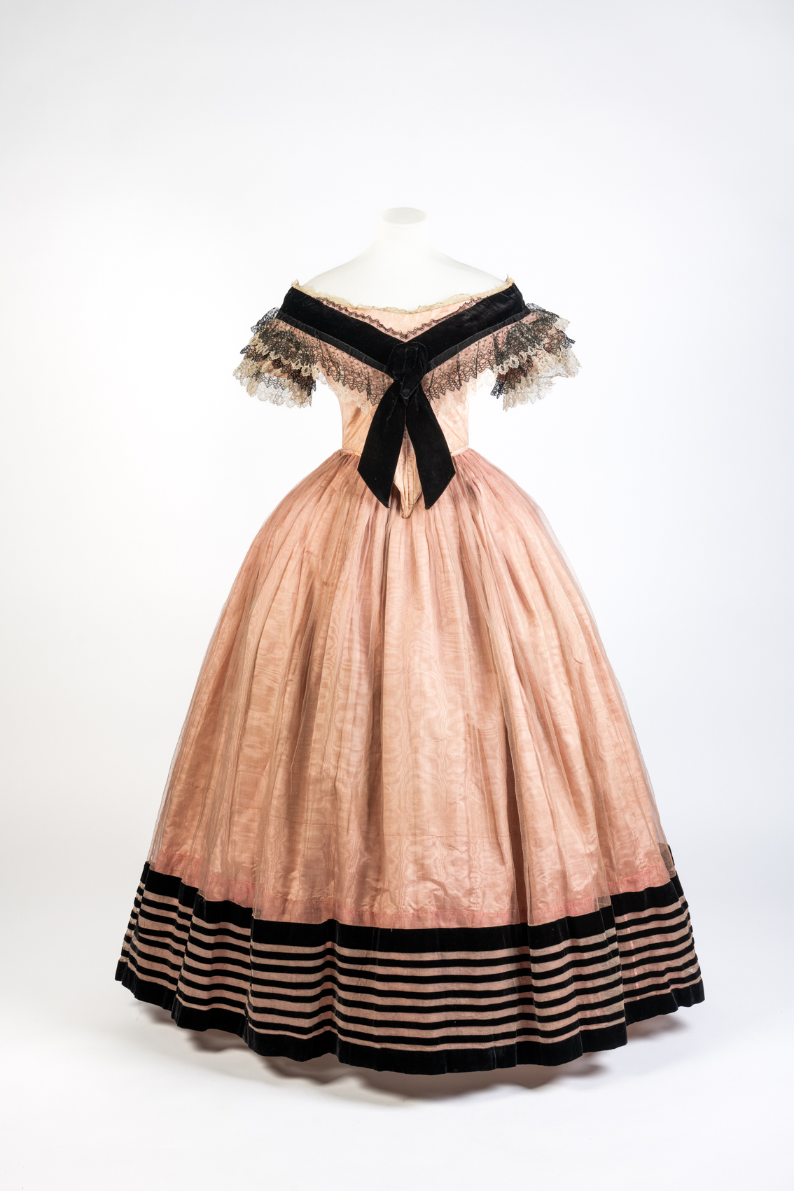
Pink Silk Moire Evening Dress, early 1860s, Fashion Museum Bath
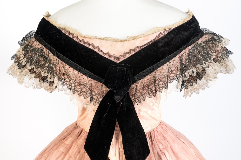
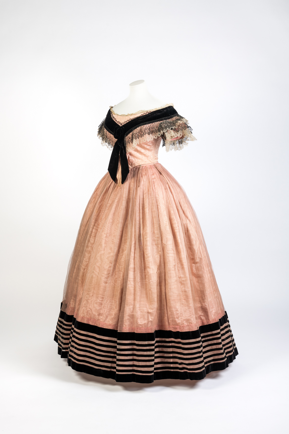
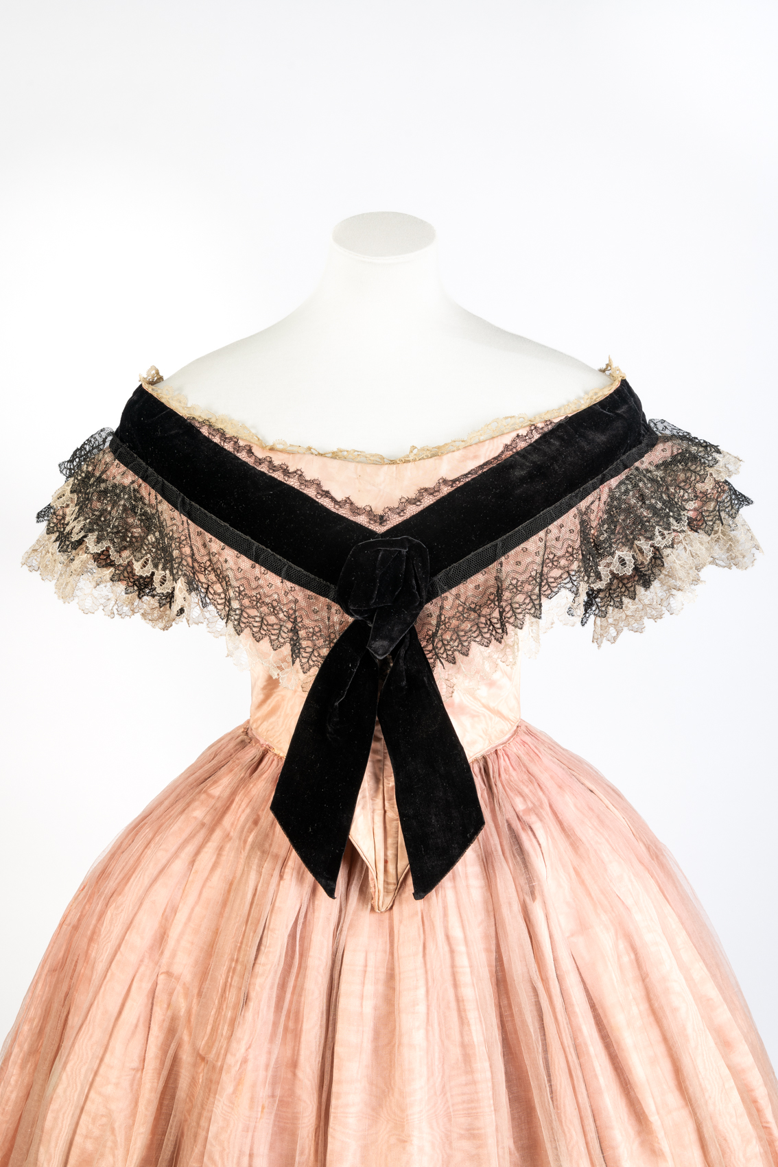
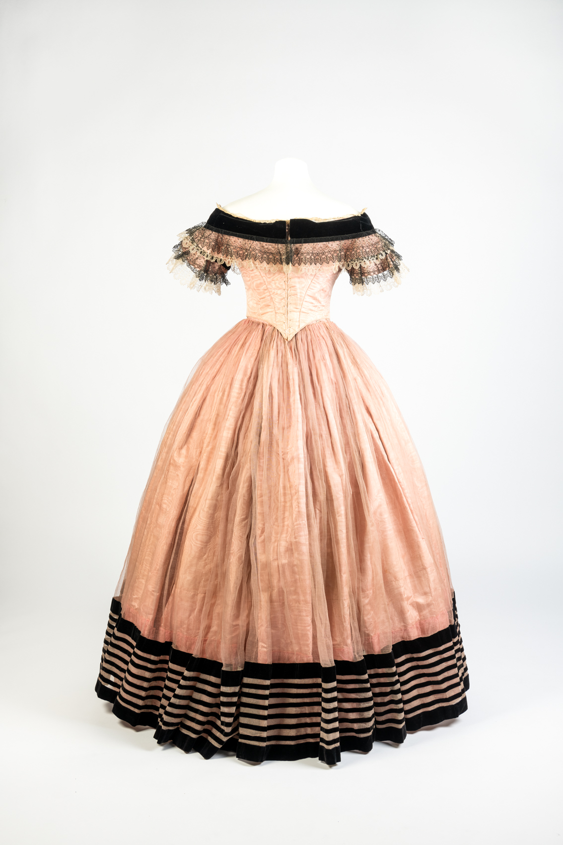
This early 1860s evening gown is made of pink silk moiré, trimmed with black velvet, blond and black lace (probably machine made), and sheer silk. It is probably in two parts, with a seperate bodice and skirt. The skirt is tightly gathered in to the waist with tiny pleats. There is slightly more fullness at the back of the skirt than the front, as fashion transitions from the bell shaped hoop of the 1850s to the elliptical shape of the 1860s. The bodice sits off-the-shoulders, creating the sloped shoulder silhouette that was fashionable at the time. The neckline is framed with a shallow V-shaped ‘berthe’ in velvet ribbon and lace. The lace trim of the berthe merges with the lace ruffles of the short sleeves. The bodice comes to an exaggerated point at the waist, and is finished with narrow piping.
Pink Silk Moire Evening Dress, early 1860s, Fashion Museum Bath
This dress has a hint of the frou-frou of the late 1850s/early 1860s in the layers of delicate blond and black lace that frame the ribbon bertha. At the same time the striking stripes that frame the hem anticipate the bold, graphic decorations popular in the mid-1860s.
Pink Silk Moire Evening Dress, early 1860s, Fashion Museum Bath
This dress does, admittedly, have a very stark contrast between the pink silk and the black velvet trim. However, pink and black are a very classic colour combination.
The pink moiré fabric and harsh black lines are softened by an overlayer of delicate gauze, to which the black stripes are stitched. The overlayer would have added movement and interest as the dress was worn, particularly if worn for dancing.
Pink Silk Moire Evening Dress, early 1860s, Fashion Museum Bath
What do you think? Is this pink and black confection just the thing for the belle of the ball? Can it at least beat the rather lacklustre ratings of the last few weeks? Or is it too, not to your taste?
Rate the Dress on a Scale of 1 to 10
A reminder about rating — feel free to be critical if you don’t like a thing, but make sure that your comments aren’t actually insulting to those who do like a garment. Phrase criticism as your opinion, rather than a flat fact. Our different tastes are what make Rate the Dress so interesting. It’s no fun when a comment implies that anyone who doesn’t agree with it, or who would wear a garment, is totally lacking in taste.
As usual, nothing more complicated than a .5. I also hugely appreciate it if you only do one rating, and set it on a line at the very end of your comment.
From the back, this dress is lovely. The black trim at the hem, the shape of the skirt, and the lace trim around the sleeves and the black bertha all work really well to produce a beautiful and graceful dress.
However, from the front it’s a completely different story. The massive black ribbon Bertha just dominates the dress and is totally out of proportion. If it were half the size it is, it would still make a statement, but not be so totally overpowering. Tame the Bertha and the dress is stunning. As it stands, it’s ridiculous. Perhaps if it had some pink flowers or some sort of embellishment at the center of it, it might work better, but just hanging out there? No thanks. 7-10.
I love this! Pink and black is such a great combination.
The bold stripes of the overskirt and the big black ribbon add a modern, clean element to contrast the romantic lace. If the berthe was differently shaped it might be too massive, but the ribbon shape gives me christmas gift or sailor warrior vibes. 🙂
The only drawback for me: that looong tip of the bodice. I get that it harmonizes with the ribbon tips, but I’d still prefer a shorter tip similar to the backside.
So overall a 9.5
I like pink and black, and the top half has drama and charm. The skirt, however, is on the Holy Toledo! side.
I love the subtle pattern on the pink silk. And the shape. But, dance as you will, that bottom bit is a bit much!
7 out of 10
If Queen Victoria didn’t wear this, she should have. It’s totally her – soft and sweet and fluffy with a super hard and bold dark streak. It almost has a nautical nod as well with the bow and stripes.
10/10
I’m not a bit fan of the 1860s but this, for my personal tastes, somehow manages to pick all the best features of it without overdoing it! Overdoing it is a big reason why I don’t enjoy the 1860s. 1860s are a decade for bold maximalist people and that’s not me. This is amazing. The stark bold black is tempered by the pink; the bold saccharinity of the pink is tempered by the black. Would wear, and that’s the greatest compliment I can personally give an 1860s dress. 😀
10/10
I like this period – the overall shape of the dress is graceful, if a bit generic. I’m partial to moiré and velvet, and the lace is nice – the black one and the blonde one, too.
But. The skirt decoration is disparate in style with the frothy bertha. The thick velvet ribbon on the bertha is trying very hard, but it cannot compete with the striking geometric of the skirt. As already someone said, it just looks ridiculous.
I get that big geometric ornaments were *the* fashion of the day…I would either soften the stripes somehow (maybe some lace/black netting underneath the stripes?), or add some stripes on the top of the bodice, on the sleeves or at the neckline.
8/10
Hmmm. I really like the skirt-overskirt contrast. I expect it’s lovely in motion, with the stipes floating over the pink skirt. I love the lace, as well. The color contrast there also creates a sense of froth. But the back of this dress, the closure through the velvet and lace, is just distracting me. The lace hides it well, but that bold velvet ribbon doesn’t. Disharmony, especially where that back lacing could have been an adornment all its own.
Is this one of those revivals or callbacks of an earlier fashion age, with the deep bodice point and visible lacing? It rather feels like one.
The front ribbon treatment is … emphatic. It looks silly on a mannequin, but the more I look at it the more it reads “flirty” and/or “nervous” as worn. Can you imagine this in a ballroom or at some function or event? What would those ribbon ends be for, if not for our lady to play with, like a fan or a stray curl in the same situation? Keeps the arms in a prescribed Posture of Deportment, as well, I imagine. Those ribbon ends were for fidgeting gracefully, in my eyes.
But, then, I read far too much into *everything*!
8
This is delightful! It reminds me very much of an illustrated children’s HMS Pinafore book I had as a yoot, and it fills me with affection on that level. I enjoy the vague high femme nautical flavor.
The silhouette is graceful and well-balanced, and I think the layers of lace in particular are beautiful. The bold contrasts give it interest and hold the eye.
10/10
I really don’t like the huge hit of black provided by the ribbon on the bertha. And the black on the lace looks to me like the bertha caught fire and the lady decided to wear it anyway. The overall shape is graceful, if bog-standard and I actually don’t mind the black stripes at the hem. They need to be balanced by something, but in my opinion the black ribbon at the top is too much. 5 of 10.
I loved the dress until I scrolled down farther on the screen and saw the stripes on the skirt. That combined with the black bertha made it seem somehow like a child’s sailor suit and doesn’t really match the concept of an evening gown.
Nevertheless, I read B’s comment above and remembered HMS Pinafore as well (a favorite of mine), so that made me more disposed to like the dress. In addition, I like the frillyness of the front; it’s just the trim on the skirt that I don’t like. So all in all:
8/10
Actually, the dress seems to grow on me! I actually find it really cute. I modify my rating (if that’s allowed!) to:
9/10.
That’s allowed!
Frilly and fussy, just like the Victorians loved but not over the top. I love it, it’s chic and feminine without being too much.
I give it a 10/10
I like it, especially from the back. Pink and black is a classic combination for good reason! The wearer just needs some lace acessesories to tie it all together.
8/10
In the first image, when you can only see the bodice, I wasn’t in love with it. I’m not a big fan of the dropped shoulder silhouette. But, then I scrolled and saw the next image with the hem and I fell in love! I love the bold graphic stripes contrasted with the light pink. The hem makes up for my lacklustre feelings on the bodice.
8/10
I think nicole had already said everything I wanted to
8/10
PAX
Finally, an 1860s dress I would wear! It’s not really the stereotypical “Victorian era dress” that most people would think of. The skirt doesn’t appear cumbersome, it’s not overly lacy, and the pink and black balance out both visually and textile-wise. A refreshing combination of elements.
10/10
I like this fashion era and I like this dress. Plus I actually like the ribbon trim at the bottom of the skirt. I think it anchors the design and would have looked arresting as the wearer moved. What I don’t like is that dangling ribbon on the front of the berthe. It looks to me as if it was accidentally sewn on back to front. The trailing cross over ribbon would have added some needed interest to the back and the front would have been much cleaner and more elegant.
8/10