
It’s always so interesting to see why people do or don’t like a dress: because it appeals to them intellectually, or on a purely aesthetic level. Because it would look good on you, or wouldn’t. Because you can imagine it on you, or because you can imagine it on exactly the right person who is very different to you. Because you like the era, or don’t. Because it reminds you of a dress you owned and loved, or something you got made to wear, and hate.
So many reasons…
Last week: a 1910s dress in peach pink and cinnamon silk
Last week’s dress rating was really one that lived and died on people’s associations. It got some really high scores, and some really, really low scores. And a lot of middling scores, which rather perfectly match the final total of…
The Total: 7.3 out of 10
And the score droops and deflates like the limp drapes of the dress itself…
This week: a brown & blue bustle-era dress
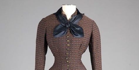
I have a fascination with historical dresses made from two very distinct fabrics. In some eras they don’t exist at all, in others they are more common. Few examples of any era are as clearly and crisply defined as this particolour ca 1880 dress, which combines brown and blue across the skirt.
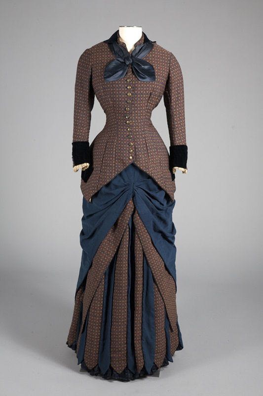
Day Dress, Augustine Martin, Wool, Silk, Metal, ca 1880, France, Drexel Museum
(I’ve called it bustle era, but without a side view it could be more natural form, without much obvious back definition).
What do you think? Is this dress going to be an alliteration dream: a brown and blue bustle era beauty? Or is bizarre a more appropriate B?
Rate the Dress on a Scale of 1 to 10
A reminder about rating — feel free to be critical if you don’t like a thing, but make sure that your comments aren’t actually insulting to those who do like a garment. Our different tastes are what make Rate the Dress so interesting. It’s no fun when a comment implies that anyone who doesn’t agree with it, or who would wear a garment, is totally lacking in taste.
(as usual, nothing more complicated than a .5. I also hugely appreciate it if you only do one rating, and set it on a line at the very end of your comment, so I can find it! Thanks in advance!)
Update:
I’ve finally found time to tally the score for the late Regency evening dress with pomegranates and oak. You can find the rating on the blue francaise post.
10 !
Sober yet elegant (and oppressive !), I like very much its shape and plits, and motives.
My reactions to this are decidedly mixed. The combination of blue and brown I find suitably practical but depressingly drab (reminds me of the lot of governesses). I can appreciate the almost architectural quality of the construction, but I also find that the various lines of the skirt pieces and the line of buttons direct the eye to the crotch area, which is a strange effect in an otherwise sober garment.
7.5 due to a sense of confusion
Can I have it, please?
10.
Oh, Cyranetta, I’m so glad I’m not the only person whose attention was immediately drawn to the crotch. It made me feel like a pervert for even noticing. I like the vertical lines in the skirt with the alternating fabric, and that’s about it. Not going to score this one.
I rather like it. The mix of colours/patterns and the shape make it subdued yet interesting. The only bit I don’t like is the shape of the bottom hem – it rather makes the striped section look as if it is made of ties sewn together.
9/10 (point detracted for hem shape)
I love this. The color scheme and design are quiet and dignified without being boring. It would be wonderful to know whether it’s a bustle dress or not, but from the front view alone, I’m going to say….
10 out of 10.
Err…the skirt ‘s top layers do draw up in just the wrong place in front, don’t they? Deduct five points for vaginafication. I really think it would be fun if the striped part of the skirt were divided into loose slacks and worn with the bodice; sort of Victorian-inspired 1960s, right? The cute tie works perfectly for that.
The colors seem awfully drab together for my taste. I would like to see some detail pop somewhere, but it is all a balance of dark against dark, without contrast.
That being said, the overall balance of the use of each fabric against the other is pleasant, and the dress feels like it is trying to be interesting in an understated, menswear sort of way. I can’t hate it completely.
5/10, or “meh.”
I’ll take a point off for the cuffs. They jar to my eye and don’t go with anything else on the dress. I love the silhouette, tailoring and the combination of colours and textures. And although I see the fanny action, I also don’t find it that distracting as to me the colours and draping downplay it. But then, I’m not really a vagazer in the first place, and even though I know it’s there I really also don’t find it distracting at all. It’s just really easy for me to not notice.
I think it’s a beautiful 9/10, losing a point because of those cuffs.
Oh hang on! There IS a black velvet collar too, I didn’t notice it at first because of the tie. But actually I think 9/10 is still a valid rating so I’ll stick with that.
I love the tie and the cuffs, but not so much the the stripes ending in points. They make me think of fairground tent trimmings. I’m usually a big big fan of a blue and brown combo (see my wardrobe), but this is somehow just off. Definitely thinking governess here! The hip sash is classic natural form era, and 1880 is right in the middle of the period. I’m glad they used the blue for this sash as the fabric has a softer drape than the brown. I’m not concerned about the position of the sash, this is very normal for the period. I wouldn’t refer to this as a bustle dress, small bustles began to reappear in 1882, at this point in 1880 ladies were tying their petticoats together to make them narrower.
7/10
I’m not a fan of the cuffs or collar but I find the colours contrast well and I like the shape of the skirt and the use of the fabrics. I didn’t see the eye being drawn to the crotch issue until I read the comments though!
8 out of 10 from me.
I don’t hate it but don’t love it much either. The colors are great; I can see it worn in colder months. And I love bustle era and natural form dresses. What I don’t like is the overly fussy dagged hem. The skirt is busy enough with the contrasting fabrics in such narrow stripes. And the silk neck scarf is tied in a very curvy draped bow. While I realize that is probably the museum’s doing, it contrasts poorly with all of the straight lines in the balance of the dress.
I’m so sorry…I forgot my score at the end of my comments.
6/10
I liked it until I scrolled down to the bottom of the dress and saw the alternating vertical stripes. Reminds me of a school days attempt to sew a skirt out of ties, which was a flat failure. And it seems like the brown fabric is more robust and forcing the blue sections into deep folds, and the lack of symmetry is bothering me.
8/10
I really like the vertical stripes. But the vaginafication, as Nicole B so aptly penned, is a mind scrambler. The hem is fun. I wish there was more cream present in the ensemble, to set off the darker values. I dont hate it, but it’s not quite right.
7/10
I wonder if the overskirt is on sideways or backwards? Its pretty unusual to have a drape gathered dead center front like that. In any case I like it overall. 8/10
The centre front gather is actually a really common feature in fashion ca. 1880. There are many, many variations of it in fashion plates, photographs, and extent garments from around this date 🙂
I love the colours together, but the dress seems oddly proportioned to me, like the fabric placements are just ever-so-slightly off.
7/10
Interesting what different eyes see!
Like some other commenters, the way the lower part of the skirt is cut makes me think of necktie skirts.
Unlike other commenters, I didn’t think of the gathered bit as (cough) inappropriately placed. Not in that way, anyway. Perhaps it’s my differing assumptions about the proportions of the body beneath, but I saw the gathering as one of those annoying ‘features’ that pulls the fabric in tightly just where you need room for a) your thighs, and b) walking.
I feel like the collar and cuffs don’t quite fit. The dress does nicely with its subdued brown, blue and cream colour scheme, without adding bits of intense black.
Overall, though, it’s an interesting look without tipping into bizarre.
8/10
No.
Brown and navy are a wonderful, classic, and interesting color combination. Would be serviceable for years of wear, not show dirt, go with any number of accessory options…
But no.
Why?
– The top ends in a weird place proportionally at the thigh. IF the blue layer underneath was fluffier, if the top was 6″ shorter, if… but no. It looks odd.
– What’s going on with that ruching/folding of the navy in front? Looks awkward.
– I’m going to assume the bottom two skirts are just out of proportion because of wrong underpinnings/lack of movement, but as shown this looks like a dress in which you wouldn’t be able to walk.
I’m going to be charitable about the cuffs and assume that when made, they matched the rest of the navy. No marks off, but if they didn’t, there would be. I’m also going to pretend that the navy scarf at the neck isn’t arranged like that. I feel like someone should be administering the Brownie Oath or something.
Could be a wonderful dress – but not.
5/10
I love this dress! Its so crisp and clean and clearly delineated. Its the kind of dress that I worry the back view would absolutely ruin it, but as it doesnt exist, I can ignore that fact.
Bonus love for the celebratory bunting/spartan skirt along that bottom hem.
10/10
I immediately thought “necktie skirt.”
I did not recoil in horror, because this garment might remind a viewer that women have certain body parts. It’s not like the dress had giant appliques arrows, pointing to the crotch. And even if it did, so what? I’m kind of scandalized that so many people are acting so scandalized. I also can’t tell if all this pearl clutching is genuine, or just for show.
As for the dress, I’ll give it a 7. Better than I could ever sew, but not thrilling.
LOL, pearl clutching. Nah, I just think it looks awkward, gathered as and where it is. Sort of like those speed-skating suits from the Winter Olympics with the anti-friction thighs.
Or, maybe I’m just a perv! 😀
I love this dress. Elegant and the colours are very appealing to my eyes.
I like the different lines in the skirt. The top seems to elongate the body but maybe a little long.
9,5!
H’derp. I missed last week’s, didn’t I. >.>
I like this. It didn’t hit me with an anatomical highway sign the way it did some of the others, though that area is also probably my least favourite part purely because that blue isn’t doing it for me with that brown. I think I’d be more into it if the colours were more pleasing to my eye. The overall design is nice, though, and I do like the pattern of the brown.
8/10
Very tailored, sober and respectable, but with interesting detailing. Just what one should wear to the meetings about the next charity bazaar.
The black collar and cuffs bother me because they don’t match the skirt. Blue and brown is a good combination.
I like the contrast stripes under the swags. They would look interesting as you walked, especially if they are actually pleated (hard to tell with the way they put it on the mannequin).
9.0
I like the fabric and color combination. I also like the contrasting black velvet collar and cuffs on this melancholy-hued dress. Black, brown and dark blue are an interesting combination. I especially like the buttons and the scarf and the elegant fit. But then I get to the skirt and the simplicity and subtlety of the bodice are lost. I think I would like the whole dress a lot more if the skirt was plainer.
So for me: 7.5 out of 10.
The top half of this dress is fine. Very sober and elegant. The bottom half not so much. Too many folds, lady garden issues plus I don’t really like the colour combination of blue and brown = boring. 5/10
I like it! Not as an outfit–I don’t think the draped, flowing skirt goes nicely with those extremely structured jacket points BUT I’m delighted that the skirt reminds me of an umbrella and the jacket of a fish’s mouth. Or tail. But I don’t think it would be worn by a woman who wanted to find humour and whimsy in her clothing. On the other hand, I do think the jacket is fabulous on its own, and would be nicer over either a plainer skirt, or the skirt with a shorter jacket with a rounded hem.
6/10
No. I have waited to reply, looking at the dress several times, but I just find this one dreary and oppressive.
The hem is interesting and I do like blue and brown together, so
2/10
Gosh I just love this dress!
10/10
I’m basing the vote on first impression: unlike some others, I LOVE blue and brown together, and these two specifically are just perfect, and I love the silhouette of course, and it’s so easy to imagine a real lady wearing this.
When I stop and really examine the elements that other posters don’t like, especially the tie bottom, some things seem a bit off, but I like giving things the benefit of the doubt 😛
One of my favourites!! Like everything about it.
10/10
I’d give it a 6. The colors are cheery without being gaudy, I like the bow and the buttons, and the fabric is sufficiently different to be a really nice contrast. I’m not a fan of the front gather placement, but I think I could get over it. I really don’t like the hem on the stripe portion but again I feel like it would be one of those gowns I liked enough over all to wear many times and feel pretty in.
Not my usual era but this dress gave me pause. Give it an 8.
I echo the comments of others, the jacket is so elegant but not the skirt. Are the cuffs actually brown? If so they really go with the brown and blue outfit.
This was probably made as a very practical daytime outfit when clothes couldn’t be washed or cleaned easily and there was dirt and soot everywhere and it would have looked cleaner than something lighter coloured. Cities were filthy places. It does rather look like a country outfit rather than a town one.
7/10
This dress with its sharp, crisp tailoring is an absolute pleasure to behold. And so nicely presented! I so wish there was a side angle because I want to see more!! I love the pairing of the brown and blue and the contrasting textures. I love the structured simplicity of the jacket. Only three small things let it down for me. I find the introduction of the third colour and texture – the black (velvet?) unnecessary and unbalancing. The pointed hem feels a little too frivolous and ‘circusy’ and out of character with the classy elegance of the design and similarly the necktie feels a little too twee for such a stunning ensemble.
8.5 /10.