
When we bought our lovely little cottage four years ago, the master bedroom was painted purple floor to ceiling. It was awful*. When I saw today’s Rate the Dress it instantly reminded me of our previously-purple bedroom: not because it is necessarily awful, even really the same colour, but because it is a lot of purple, and because friends said of our bedroom “that colour might be really nice in something else, but not as a bedroom.”**
Last week: a 1920s day dress in printed silk
It was very easy to tell what people would give as a rating for last week’s dress, depending on what words you used for it. Those who found it ‘subtle’ or ‘delicate’ or ‘refined’ rated it above an 8, those who felt it was ‘blah’ or ‘washed out’ or a ‘sack’ gave it significantly less.
side note: Catherine says it was a rice cake: healthful but not appealing. I happen to adore rice cakes. And a whole host of other very delicately flavoured foods with dry crunchy textures. My sister once tried a new cracker, said “Ugh, this tastes just like cardboard” and then handed the packet to me and said “Here, you’ll love them”. She was not wrongThey are now my favourite crackers – preferably eaten with goats cheese or avocade, which are also ‘you either love it or you don’t’ tastes. But also totally lovely plain. Taste is so subjective! As our rating is about to show…
The Total: 7.3 out of 10
Not a universal palette pleaser then!
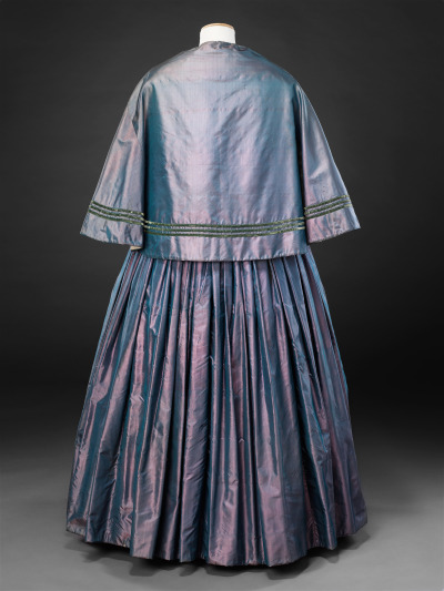
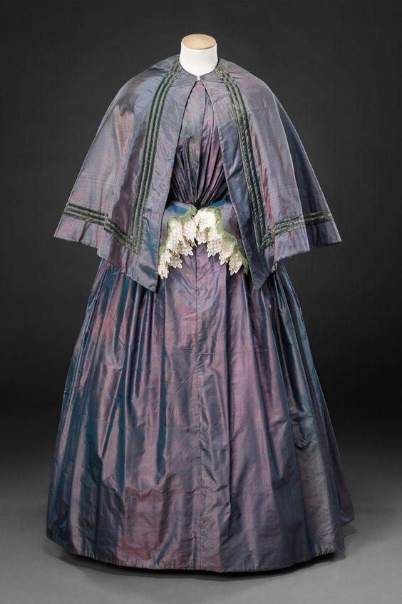
This week: a shot purple dress and matching cape
Now that I’ve rather put you off the dress by comparing it to the extraordinarily terrible paint job our poor bedroom once suffered from, let me assure you that other than being a lot of the same general colour, this dress has nothing in common with the bedroom. It is, in fact, one of my favourite shades of purple!

As a fashion colour we usually associate purple hues with the end of the 1850s, and the invention of aniline dyes. However, fashion plates and news articles make it clear that the colour was already becoming popular before the discovery of mauvine: Perkin’s breakthrough just helped to extend the hues notability and longevity.
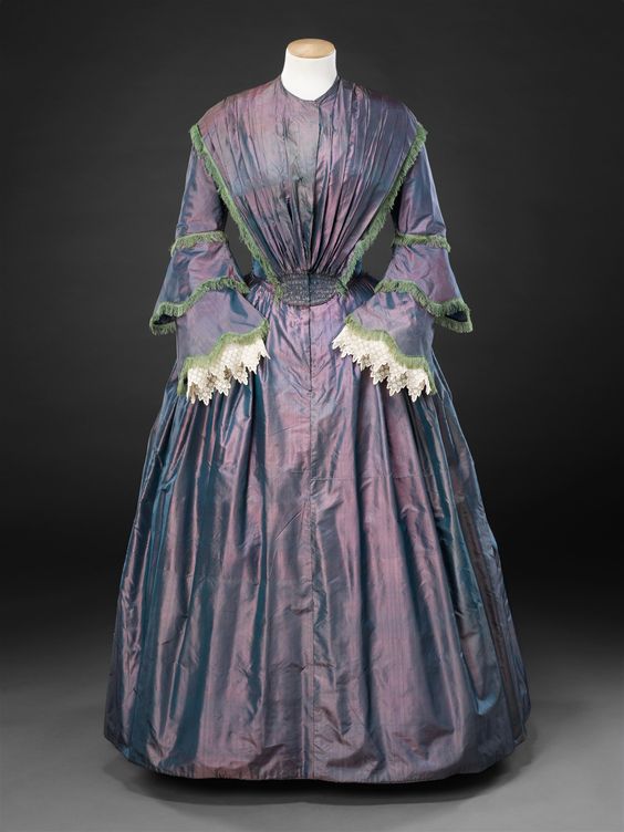
The specific dark lavender shade of this dress is absolutely typical of the shades of purple that were most fashionable in the 1850s, before mauvine took over. Queen Victoria wore a dress in a nearly identical shade of purple to her eldest daughters wedding in January 1858. There is no evidence that Victoria’s dress, like this gown, was ‘shot’ or changeable silk, but it was certainly a similar colour.
This dress, with it’s perky green trim, and Victoria’s similarly hued festive frock for her daughters wedding, are evidence that another prevailing fashion history myth, that all purple and lavender clothes were half-mourning, is just that: a myth.
Fashionable woman wore different shades of purple to various celebratory events throughout the 19th and into the early 20th century without any association with mourning. There were a number of things that signalled that a woman was in mourning, or half mourning, and they went well beyond setting aside an entire colour segment exclusively for half mourning.
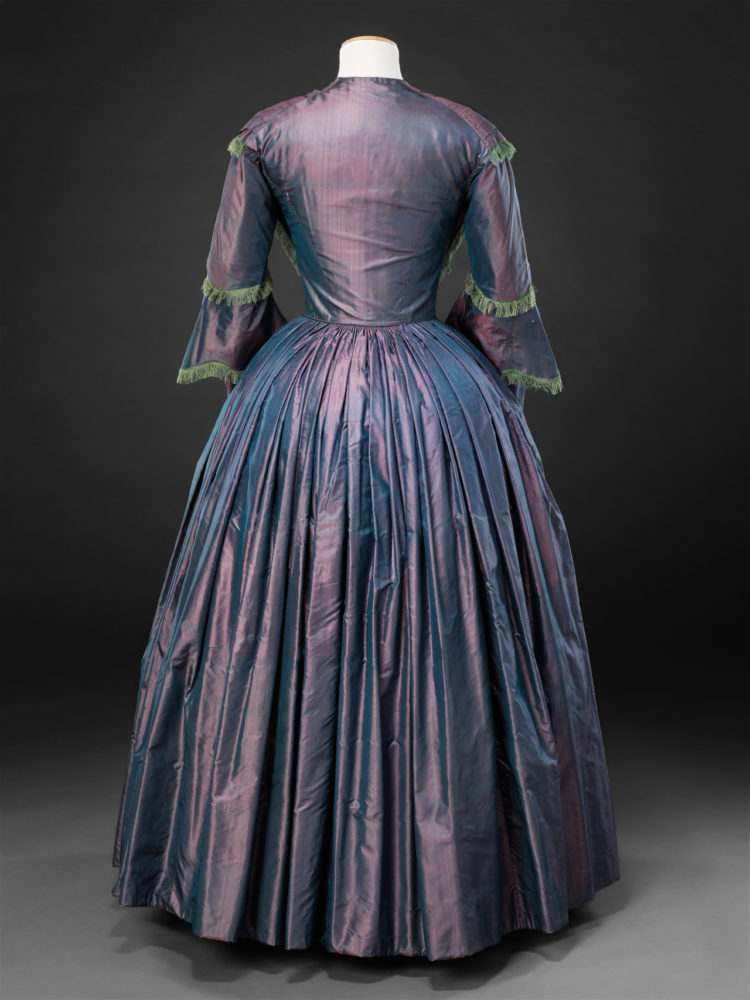
So, it’s not a mourning dress, and it’s not necessarily awful at all! It is a fabric that rumples and shows every crease very easily, and age has not helped that, so please don’t mark it down for its current presentation.
What do you think of all the purpleness?
Rate the Dress on a Scale of 1 to 10
A reminder about rating — feel free to be critical if you don’t like a thing, but make sure that your comments aren’t actually insulting to those who do like a garment. Our different tastes are what make Rate the Dress so interesting. It’s no fun when a comment implies that anyone who doesn’t agree with it, or who would wear a garment, is totally lacking in taste.
(as usual, nothing more complicated than a .5. I also hugely appreciate it if you only do one rating, and set it on a line at the very end of your comment, so I can find it! And 0 is not on a scale of 1 to 10. Thanks in advance!)
* So awful that the day we took ownership I sat in the car in front of the house waiting for the realtor to show up – with paint and rollers already in the backseat. I carried them in along with our new keys!
** It was a particularly unfortunate choice of purple as a floor to ceiling bedroom. I might have been more forgiving had it been the shade of this dress!
I think the color modulations of shot silk rescue it from the purple being overwhelming, especially given the volume fabric in outfits of this era.
The lace is a lovely contrast, as is the simplicity of the linear green trim.
9 of 10
The dress could have used a pressing, but I’m not marking it down for that.
I am marking it down because I do not like the color. To me, it’s not overwhelming at all.
To the contrary, it’s too grayish, and the green trim gives it a greenish tinge that makes it even less appealing to me. Because there is very little decoration on this costume other than the color, that seems to me to be a reasonable basis for my rating.
6 out of 10
(P.S. I happen to like rice cakes myself, when spread with a little butter, but I know many people do not like them. It seems to me that the same fate applied to last week’s RTD.)
By the way, I should mention that I like the shape of the dress, including the sleeves, and the way the trim is applied; my problem here was with the color scheme.
I love it! Purple and green is a favorite color combination of mine, and I have a weakness for fan front dresses. Also, the flounced sleeves are perfection! However, that seam down the center front of the skirt bothers me, and the dress as a whole seems to be missing something – but what I don’t know.
So I’ll give it a 8.5/10
6 out of 10.
I love the purple fabric and that’s why I’m rating this as high as I am. I actually didn’t see the green trim on first glance so that’s a little lost. From the back I think the frock is lovely from the front, meh. I just can’t bring myself to love fan fronts when they’re done in such a stiff fabric. For me they always look best in a soft drapey fabric.
But oh, that fabric, I would make an 1860s ballgown out of that in half a heartbeat!
I’m a sucker for shot silk as well as muted purple and green but I wish it carried more of the green through it. The capelet adds some interest without being too much. It would be the perfect dress with a little collar to match the cuffs and green scallops or stripes on the skirt to match the sleeves or the cape. 9/10
I love the fabric. I really love the fabric! I’m sort of a sucker for plummy purple and the changeable silk is lovely. I like the silhouette is nice, especially with the capelet. I am deducting points because the dress’s neck is too severe for my taste. A pretty lace collar would balance the gorgeous sleeves.
8/10
Purple and green is one of my favorite color combinations, of course it has to be the right shade of each, and this is spot on. The shot silk is gorgeous and there is just enough green trim to add interest, and the cream lace adds just the right touch of elegance. Given that this is not my favorite period for dresses, this one is lovely and I would wear it in a heartbeat. 9.5 It also looks comfortable!
I love the fabric and the style, but I think I would like it better without the green trim. Still, it’s lovely.
8.0/10
PS Alyssa, I always scroll past comments without reading before I make mine, to avoid being influenced. So I wasn’t copying your purple and green comment.
This dress is a little earlier than I generally like, but I love the color and the trims, and I would wear this. 9/10
Love it! The purple is luscious and the green trim works beautifully. Absolutely adore it. And rice cakes.
Oops, 10/10
I love love love this dress! I can imagine a bonnet with very delicate pastel flowers with it. If I could score it higher, I would 10/10!!!!
I’m a sucker for shot fabric, I love the depth to the colour and how it moves with the wearer so this one already has a step up the points ladder for me. I also love it’s simplicity, the sleeves with their green trim, lace a scalloped tiers balance out the dramatic pleating on the bodice, I wish there was a close up on the detail at the waist, I tried zooming in but it wasn’t clear enough to see the details properly.
My only issue is also the centre seam on the skirt which is why this is a 9/10
Oog. I love the silk itself, but the dress they made with it… The first thing I saw was the green trim, and the first thing I thought was “Seaweed,” followed by, “This would make a great ballgrown for a woman of Innsmouth (or similar sea monstress ilk)”. It’s slightly better with cape, because cape hides (what to me are) the worst offenses of the sleeves and bodice.
6/10
Not a fan of the shot silk or of the purple/green situation. The shape and structure of the dress is pretty nice though.
6/10
I could see myself in this dress in the Dickens Festival, it is simple and elegant and wearable.The fan pleated front is very flattering as it draws the eye inward to make the waist look small . The silk is what really makes it, the fact it is not a solid colour but changeable gives it a charm of its own. I dont think I would wear the capelet with it ,but it is a charming dress. I didnt think it was half mourning by the way, the green trim would never have been allowed. More likely , many older ladies felt such colours were more age appropriate.Alas it was also thought OK as you got older to look like a walking haberdashery shop…….something this dress avoids
My rating 9 as the front seam in the skirt lets it down a bit
I think it’s a lovely colour and fabric and the green trim goes nicely with it. It looks simple and elegant from the back but I’m not so fond of the fan front, it seems a bit wide and unflattering (but maybe that is just the way it fits the mannequin. Or maybe the fringe along the sides should be removed…?). Perfectly nice dress anyway, I give it:
8/10
I was a little unsure of it at first, but I like it, especially when the cape’s included. It’s a little magical. The fringe reminds me unhappily of Spanish moss, but the sage color works pleasingly with the varying shades of purple. That said, aside from color and the general impression of expansive iridescenty opalescenty purple, there’s nothing about the cut or embellishments that especially appeals to me.
And I’m amused that in the painting, Victoria still feels more like a focal point than the actual bride. I guess it’s good to be queen.
7/10
Love the purple! And I’m delighted to learn that purple =/= half-mourning. Unfortunately the green moss trim doesn’t do it for me, and I’m distracted by the seam down the centre of the skirt.
8/10
Wow, that purple colour is gorgeous! I also like moss green. I wish I could give this dress a higher score because I love the colors and the color combination and the general sillhouette, but I hate literally everything else.
I really dislike the tiered sleeves. And that fuzzy looking trim– maybe it’s suffered from age? The trim on the cape is way better– I wish the sleeves were coat sleeves with that trim instead. And it annoys me that the cape’s trim just goes right up to the collar and stops. I wish it turned and went around the collar in a circle instead.
4/10.
A glorious colour, and I love shot silk to bits. The back view is particularly lovely, the smooth, sleek bodice contrasting with the delicate pleating of the skirt. I’m not a massive fan of the cape, but that’s just my personal opinion. Altogether, I think it’s fabulous.
9/10
I really like this color, and I think the green really compliments it.
One issue I do have is the scale of the green trim on the bodice. It looks great on the sleeves, but it looks either the same size, or smaller on the bodice. To look balanced, I feel like it needs to be a bit larger.
While I also really like the shirring, I don’t care for the rounded-ness of the dip in front. If it were cut straight across and still shirred, I think it would look more purposeful than it-started-to-point-but-then-didn’t.
Also, I really like the cape. Trying to envision this with a contrasting color I think would destroy the “expensive ensemble” look. Having a special cape that you can basically only wear with one dress seems so…..fashionable/impractical.
8/10.
I actually love the color! It works so well with the sheen of the fabric. I like the placement of the trim, just not the fringe. Something about the color of the trim seems slightly off, though too.
(And I too enjoy ‘cardboard’ crackers- with or without toppings)
That being said:
8/10
Yusss #teamitsnotflavourlessitsjustsubtleanddelicate
I’m not a big fan of the purple shade, but I do like the duochrome effect of the silk. I wish there were more color or texture variation here. The white lace is a pretty touch, and I like the shape of this dress with the tiny waist and full skirt. Looks prettiest from the back. I prefer the smooth green border on the cape over the green fringe on the dress. I wish I could see the detail at the waist. The overall effect is just too much of the same.
6/10
I’m not sure about this dress, and I love purple but I wonder if the colour is a bit faded to what it was. This is very likely as the dress would have been dyed with natural dyes. Purple was a difficult colour to dye then and it made the fabric very expensive. Hence Queen Victorias choice.
I particularly don’t like the seam down the front but this maybe because of the width of the fabric didn’t allow using one piece with all those gathers, but a join either side at the front hidden by the gathers would have looked better, and what are those horizontal lines on the skirt? Creases or flaws?
Pity it wasn’t presented better. 7/10
“with paint and rollers already in the backseat” 🙂
I renovated some houses for my sister, and I know the feeling. The “Dr Seuss” house with each room in a different vivid primary color had my nerves on edge, and the other house with the big, battleship grey living room, depression blue bedroom and Pepto Bismol Pink bedroom … the handyman who was doing some repairs told me we had to paint it because working inside was getting him down. Slap on a coat of high-hiding white to make it bearable while you decide what to do.
===========
But I digress …
This has the iridescence of a pigeon’s neck feathers. Lovely color. I’m ambivalent about the green fringe, and would like it a lot better if it were long enough to hang well, instead of that unkempt shaggy thing it’s doing. I would also have liked to see the velvet ribbon from the cape appear on the dress, as a header for the fringe, or just as trim.
The lace undersleeves are also lovely. A nice crisp touch.
I’m not at all fond of the bodice styles of the 1850s, even with that daintily shirred bit on the waistline (personal prejudice because I would look really bad in them). The skirt is lovely, and a good example of how they did the back … pleats most of the way, then gathers. It takes the stress out of a pleated skirt.
A nice, conservative dress for a governess or spinster aunt to wear, and an example of respectable stylishness.
8.5
Its a lovely dress, I like the purple and green trim combination, it just seems that after all the work in the bodice and the capelet, they “forgot” to add any trim to the skirt, or ran out of trim and had to leave the skirt naked.
8/10
Just beautiful. Fabric, color, trim, just everything. Having made fan front bodices, I really admire the mantua maker who created this. It’s also intresting that the back seems to be cut in one piece, an unusual choice. Fashions of the 1850’s were often criticized for being overly gaudy, to many ruffles, to much trimming. Letting the skirt fabric shine balances the bodice beautifully. Can’t help but wonder what type of sound this dress might make while being worn.
Unique item, it’s a 10.