
Apparently I’m on a pink and stripey kick, because this week’s Rate the Dress, like last week’s Rate the Dress, is pink and stripey. Will you like it better? Or will it fare even worse?
Last Week: a striped evening dress from the very end of the crinoline era
An interesting mix of comments on last week’s 1869 dress. Generally you liked the bias stripes, and often found yourself liking the dress more than you thought you should: somehow it was more than the sum of its parts.
I agree with all the commenters who felt it was somehow theatrical or costume-y. It would be perfect on stage, or even on screen: you’d instantly know so much about the character wearing it! Is it time to revive the big cheerful historical costume musical? The Mary Poppins sequel tried!
The Total: 7.1 out of 10
Not a fabulous rating – we’d probably all love it in glorious technicolour, but as an actual ballgown it was a little lacking.
This week: An 1890s reception gown in pink and black
The overriding reaction to last week’s Rate the Dress is that it felt quite theatrical. I realised that my original pick for this week was also possibly more costume-y than everyday worthy, so I decided I should choose something a little more restrained.
Hard as it may be to believe, this pale pink and black dress with its bias stripes and big sleeves is very restrained compared to what I was planning to show you!

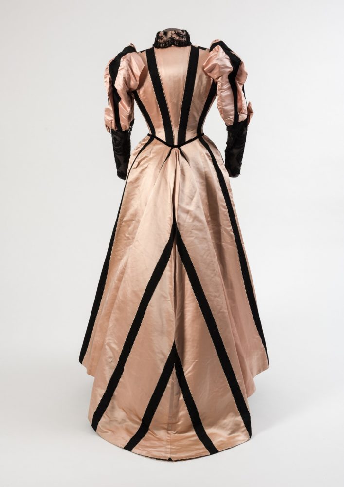
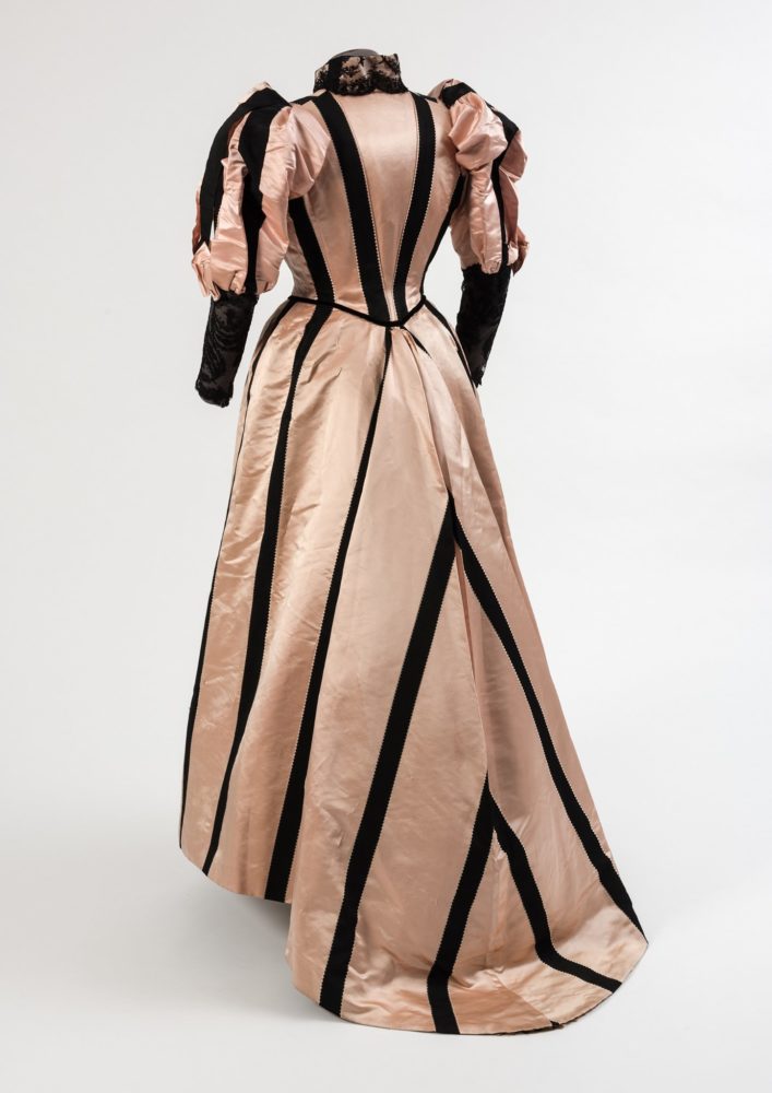
Dress, 1893, Duboys, Paris, silk, French, Fashion Museum Bath
This early 1890s ensemble was probably a reception dress. The high neck and long sleeves indicate it would have been for a daytime event, but the light coloured silk of the base fabric and the train suggests it was intended for formal indoor wear only.
Dress, 1893, Duboys, Paris, silk, French, Fashion Museum Bath
I’ve looked and looked, and can’t quite figure out if the stripes are woven in, or applied on. It’s also possible that they are woven in, but have been very carefully cut out and appliqued on on the bodice. If you look closely you can see tiny pearl beads framing the stripes on the bodice. Added embellishment, or a clever way to hide appliqued edges?
Dress, 1893, Duboys, Paris, silk, French, Fashion Museum Bath
What do you think of this dress? Do you like the combination of the subtle pink and the bold stripes? Is the way the stripes are used to create shape appealing?
Rate the Dress on a Scale of 1 to 10
A reminder about rating — feel free to be critical if you don’t like a thing, but make sure that your comments aren’t actually insulting to those who do like a garment. Phrase criticism as your opinion, rather than a flat fact. Our different tastes are what make Rate the Dress so interesting. It’s no fun when a comment implies that anyone who doesn’t agree with it, or who would wear a garment, is totally lacking in taste.
As usual, nothing more complicated than a .5. I also hugely appreciate it if you only do one rating, and set it on a line at the very end of your comment.
boiled sweet inspired?
9/10
Oh my goodness YES! It’s a humbug!
Or a licorice allsort!
it is so emblematic of its era, i feel it should get some points just for perfectly representing its time…
it has an odd combination of visual boldness/graphic quality and restraint. it’s striking and rich, but not fussy nor overdone. and one must show some love for those perfectly mitred stripes at the bodice and train. the touch of black ornament at the collar (lace, i assume? like the sleeves?) is perfect, a nice match to the lower sleeve/cuff with lace overlay.
something about it is unappealing to me, though. it could be the colour combination, which puts me in mind of poodles and bordellos. (not necessarily together, mind.) or the theatricality of it; despite its lack furbelows, it is most definitely a striking gown, in a very…obvious…way. yet the more i look at it, the better i like it. i don’t think i’ve ever felt this conflicted about a dress yet! hmmm…
rating: 7/10
I’m torn because I normally don’t care for the 1890s, but I somehow desperately wish I could wear this dress! The construction is very appealing, and I absolutely adore the pink and black color scheme – it’s so modern and fun!
8/10
It is definitely striking, especially the sweep of the back construction. For me it is definitely theatrical – I was reminded very much of the “Ascot Gavotte” scene in My Fair Lady.
I do not care for the color combination, though.
7.5 of 10
This dress strongly reads “I am the romantic rival of the heroine in this historical drama”! To my eyes, the pink isn’t really strong enough to hold up against the black trim, but perhaps the colours have faded over time. That said, I admire the way the black trim has been used to call attention to the lines of the dress. And I wish we had a close-up of the seed pearl trim, which classes it up a bit. But the whole dress all together is a bit…extra.
6/10
I love this dress, I love the lace, and the way the stripes give it a beautiful shape, and especially the triangle buttons on the front that I didn’t notice at first. The only critique I have is that the contrast of the pink and black is too high for me.
9/10
I don’t like it much. The two-toned pink/black sleeves strike me as odd (is there actual ruching along the back seam of the upper arm sections?) and there’s something about the bodice that reminds me of a plastic Cinderella doll. The proportions are good, but somehow the combination of pinkish and black gives me an impression of ugliness.
Unusually, the more I look at this dress, the *less* I like it. I was going to give it a 7, but now I don’t feel I can justify that. I’d better rate it, before my opinion of it sinks lower.
5.5 out of 10.
Dated.
I am very confident that this dress would have caused some fashion forward ladies in the 1890s…and today, it is worth taking inspiration from the juxtaposition of black stripes on pink but still
I just had the feeling of it being “dated”, “passe”
so, over the last century plus it has dropped from a ten to
7.5 out of 10
I really like it. I like the clean lines and the colour contrast. The little triangle buttons are cute and the matching black lace on the collar and sleeves is a nice touch. I’m just not sure about the sleeves, especailly the back view, they look distorted & crumpled! I’m hoping that it is either age or something to do with how the dress has been placed on the mannequin.
9/10
I came back to have a look at how the rating is going and after reading comments about the sleeves I’m really curious. I’m really not sure if the dark colour under the lace is another layer of fabric or if it’s the grey of the mannequin, either way I still like it though!
There is something My Fair Lady or Hello Dolly about this dress. I like it but not quite like it. I think maybe the colours are the problem. All the same I’d love to wear it to the races!
7/10
I really like pink and black together, however the shade of pink is not my favorite. I like the boulders of the black trim and the buttons that they chose were very very unusual. Because of the shade of salmon pink not being my personal favorite I’m going to give us a nine out of 10 this time. But if someone were to give this to me I would gladly take it off their hands and enjoy it.
My gosh I love the long ruffles ruched over the puffiness of the upper sleeves, contrasted with the flat lace on the tight lower sleeves. And how the sinuous black bodice pieces echo the v-neck and turnback collar, and then narrow to point at the v-shaped waist in front. I think the white (pearl?) beads are along every bit of the black streamers, too. I really think the delicate shade of pink is exuberantly decorated by the various shapes in black.
I’m not sure how I find pink and black stripes lacking in interest but somehow I do! There’s nothing particularly wrong with this dress but I don’t really like it either.
5/10
I like it, particularly the back, where the stripes and tailoring draw inward. The lines of pearl beads make me think applique, but I have no real clue. I can already imagine the hat and shoes I’ll be wearing with this.
8/10
Striking , elegant, wonderfully flattering with the big sleeves and the way the stripes emphasise an hour glass shape. And not frilly either…love it
OK, it’s a 10
LOVE LOVE!!! Having survived the extremes of 80s fashion, where pale pink and black was de rigeur, I still adore this colour scheme. I love the dress, the proportions, the simple but dramatic design!
10/10
The pink is too pale for my liking, otherwise it is very nice indeed…8/10
I do like the play of stripes across bodice and train, but on the sleeves, no! It reminds me of a football referee (American). There’s also something funky going on at the back waist of the skirt. Strange tucks or gathers, perhaps. But what bothers me most is the solid black of the bottom sleeve. No, just no. 6/10
The stark color scheme isn’t doing it for me, and the dramatic stripes are too in your face. The stripes at the bottom back put me in mind of US railroad crossing signs. 3/10.
I can see it being pretty restrained, in the context.
Also, I need a dress like this, I’m already window-shopping materials and thinking patterns.
The only thing that I’m missing is a suitable house to receive people in. Also being able to receive people indoors, which is currently legal where I live, but probably still not a good idea 🙂
I think that the stripes on the sleeves could have been better if they had been a bit thinner than the ones on the rest of the dress (but of course if they are woven in that wouldn’t have been possible).
9/10
I love to wear this1890 dress in an historical reenacment, I could easy wear asize20,also with a petitcoat andshoes. nice color pink and black
8/10
Not really my cup of tea, but I imagine it would make me smile if I saw it coming toward me on a busy sidewalk. Of course it would wear the wearer and not vice versa. 🙂
I think the placement of the black lines is very figure-flattering and works well with the overall silhouette instead of fighting it. I like the pale, slightly salmon-colored pink with the black; to me it’s fresher and yet more elegant than a bright pink would be. I’m only ambivalent about the forearms being all black, but maybe that might draw attention to delicate and pale hands? Or a special bracelet? 9
I think the stripes are appliqued. You can see the seed pearl (or similar) trim on some of the skirt stripes too. And in the third picture you can see where the black stripe balloons away from the pink sleeve and leaves a gap. And there is a section where the black stripes overlap each other at the top of the sleeve.
It’s certainly very elegant and striking. I think I like it, but I’m not entirely sure. 8/10
I’m fantasizing about this dress in white/black at The Night Circus! I love it. The collar is fab, the buttons are so modern, and the overall shape and stripe placement is so severe and elegant! My only quibble is I wish the black stripes framing the pleats at the center back of the skirt were more pronounced. Still an excellent dress.
9/10
I don’t want to like the 1890s, but this dress has such a bold, but not overwhelming, charm to it that I’m smitten. 9/10.
I don’t know that I’d ever wear this (I’m really not a fan of the pale pink/black combination, especially on myself), but I really, really love everything except the color combination! I love the stripe placement, especially those lovely chevrons on the train, and the way they follow the lines of the bodice.
The little black triangle buttons and the lace collar are lovely.
I would absolutely wear this if the base color were pale blue or green or lavender. I could even see replacing the black with charcoal grey, maybe? Overall, though, I like this enough that I can put aside my distaste for pink-and-black. 9/10
I haven’t read the other comments yet but I’m guessing this is going to be a love it or hate it kind of dress.
I spent a few minutes just staring at the pictures trying to decide what to think and finally just had to laugh. I think I’m more in the hate camp. (I asked my husband what he thought of it for fun and he said he’d give it a one or two)
Being away from the pictures the main thing I remember is a delicate pale pink being completely upstaged by huge black stripes. It’s late victorian meets racing stripes! (or is it early Edwardian) And I know the sleeves were fashionable but it’s just. too. much. It makes you wonder if the owner wanted to be the center of attention a lot?
I have to admit I felt a little bit better about it after finding out it was French. For some reason I imagine an English lady in this dress as a fussy person in an odd hat. The French lady is a comfortably jolly matron with unfortunate fasion sense.
Sorry dress, I’m sure some lady loved you and felt very happy wearing you but you get a low rating from me. 3/10