Do you collect vintage or historical textiles?
If you do, you know there are the things on your wish list that you search for, and save up for, and eventually manage to get. And then there are the things that are so rare, and amazing, and desirable that whenever they do show up for sale they are so ridiculously beyond your price range that it’s not possible. Or the things that just never show up, because they were SO rare in the first place.
I tend to collect more by chance than design. I don’t love shopping on the internet, which limits my options a lot, and I like the thrill of finding something unexpected at an op-shop or antique store. And I like the unexpected stories that develop out of a less-planned collection.
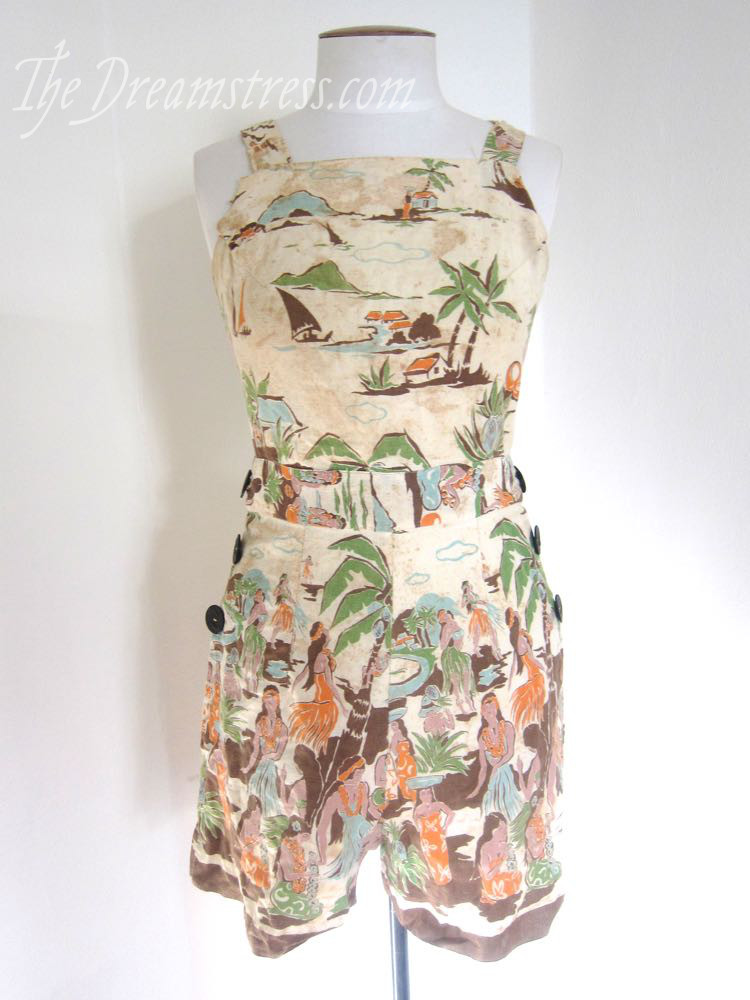
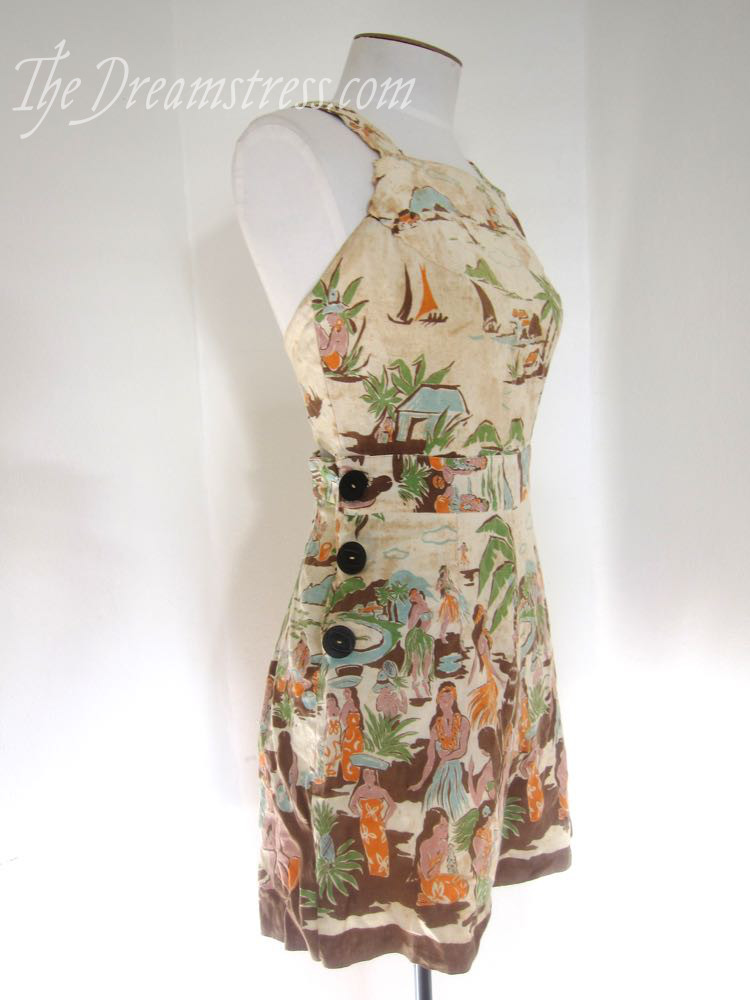
Still, there are some things that I desperately hope that one day I’ll get to love and care for and study. My holy grails. My ultimate wish list. Hallelujah textiles. I was lucky enough to be gifted an amazing quilted petticoat by the amazing Lynne: that was one. And one day I will cave and brave the internet and buy myself a 19th century kashmiri shawl. But I never, ever, in my wildest dreams, thought I’d become the owner of a 1930s Hawaiian playsuit.
Especially not one as AMAZING as this.
(hyperventilating with amazingness)
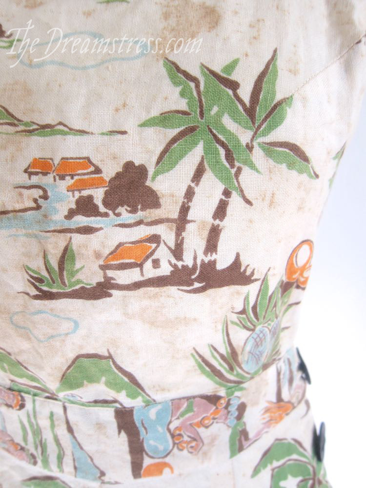
(1930s or possibly ’40s using an earlier pattern)
1930s playsuits are incredibly rare to start with. Unlike fancy ‘occasion’ clothes they tended to be worn over and over again. They were worn for doing things: walks, sports, outdoor chores, gardening. They were mostly the provenance of young people, and we tend to take less care of our clothes. And they were made from light cotton fabrics to start with. So they wore out. So there aren’t that many ’30s playsuits around compared to say, evening dresses.

And Hawaiian/Pacific/Exotic stuff is incredibly desirable at the moment, since everyone has decided they have to have their own collection of Shaheen’s and Aloha shirts, whether they have any connection to the islands or not (grrrr).
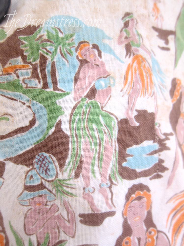 And ’30s Hawaiian & Pacific stuff is rarest of all, because Hawaiian tourism was just taking off, and the Pacific print & clothing industry was in its infancy, just beginning to move away from ready-made Japanese or American textiles, and into their own print development.
This particular playsuit isn’t actually Hawaiian, because it belonged to a Kiwi woman, the aunt of the woman I visited in Tauranga. The owner did have a connection to the islands though – she was born in Rarotonga, as her father was working there.
The playsuit was made in NZ, and the fabric could have been Hawaiian, or NZ, or Tahitian, or from somewhere else.
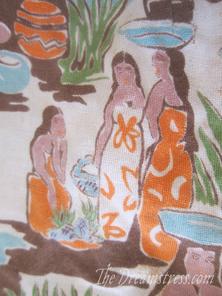
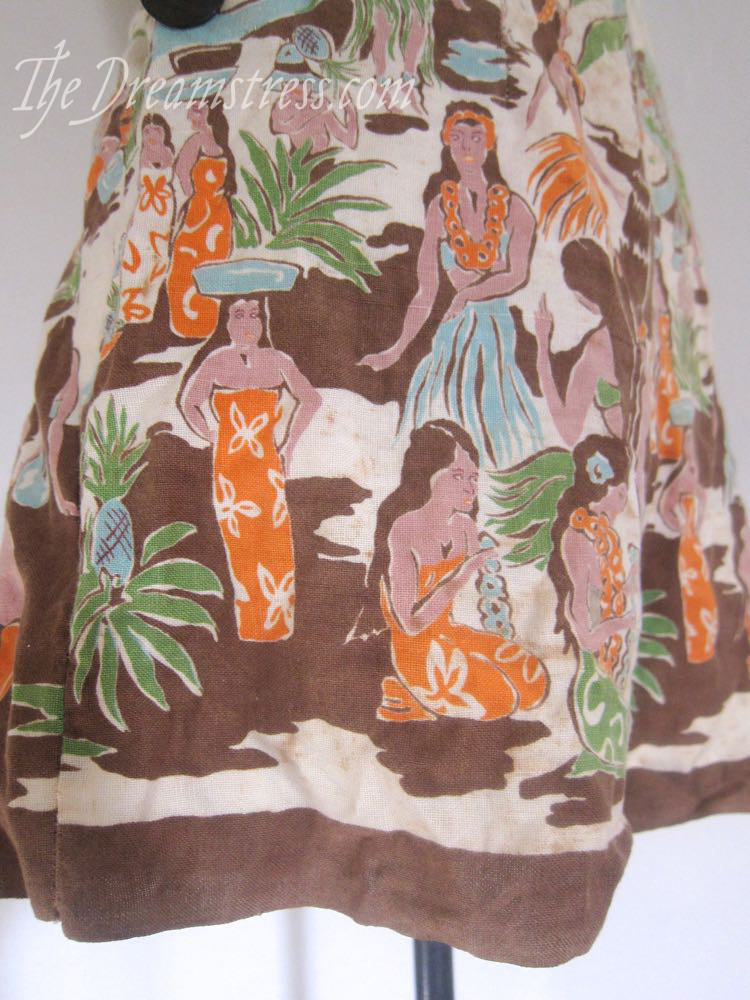
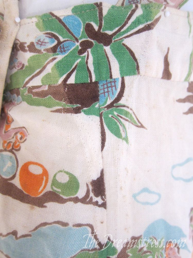
The print is quite amazing. It’s a bit Frank Macintosh, a bit Eric Gill, a bit Gauguin, a bit Eugene Francis Savage. It’s also so amazing and unlike anything I’ve seen before that I’d almost think it was much later, except that the provenance is so good, and the cut and construction of the playsuit is so spot-on 1930s/early ’40s (and so unlike the construction of the ’50s & ’60s garments I saw by the same seamstress).
Check out those buttons:
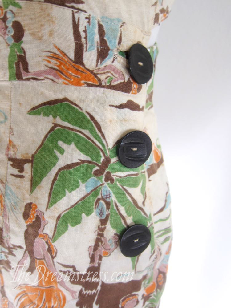 The top one actually buttons, and the others cover hooks and loop fastenings.
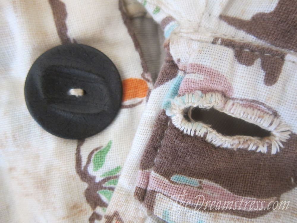
Hand-worked buttonhole:
And the back view:

Swoon!
It is in pretty poor condition (you can see all the age staining) and has been well worn and loved. At some point the back darts were much bigger and took in the waistband as well, and they have been let out, revealing the (more) original colours of the fabric.
I have to decide how much, if any, work I want to do to improve the aesthetic condition of the playsuit. I want it as a study piece (well, let’s be realistic: to look at and love and pet and coo over), so keeping it as safe and robust as possible is much more important than doing anything to improve the aesthetic which might weaken it in the long term.
Oh happiness!