
There was a whole range of opinions on Margaret’s pink cloak over fur surcoat with blue skirt over gold frock while holding red book against red and dark blue checked curtain, ranging from “elegant and royal” to “meh” to “great big pink curtain” (with Mrs C then suggesting that I should make it out of some pink curtains in her stash) to “very sexy medieval surcoat”. Mostly though you thought there were a lot of colours (this could be good or bad) and that it was a pity the cloak hid so much. With everything going on Margaret came in at a respectable 7.1 out of 10
This week, I’ve gone for less colours, though there is still lots going on, and no wraps to hide the dress details.
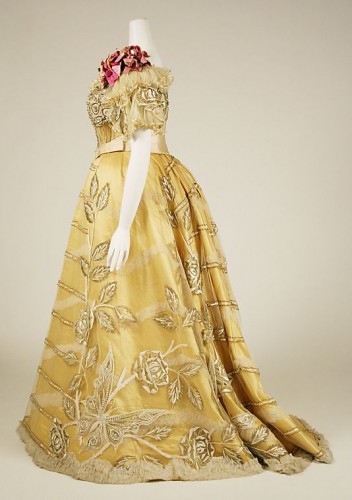
This week’s Rate the Dress theme is ‘All the Challenges‘. I don’t see this yellow (what shade depends on which photo you believe) evening dress from the Metropolitan Museum of Art having much to do with peasants or the seaside (unless, perhaps it was worn to a ball at a seaside resort), but all the other challenge are covered!
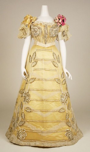
Dress, Evening Duval and Eagan (American), ca. 1889, silk Metropolitan Museum of Art
It features stripes, flora in the form of the roses on the skirt and the corsage on the shoulder (and a corsage is essentially an accessory), fauna in the butterflies on the skirt hem and the echo of butterflies bodice decorations, plus pretty much every possible form of embellishment – lace, beading, ribbon, ruching, ribbon embroidery, bows, flowers! If you really want to stretch it, in some photos the sash is rather like a swiss waist, and corset inspired, like undergarments on the outside (OK, I’m stretching it!).
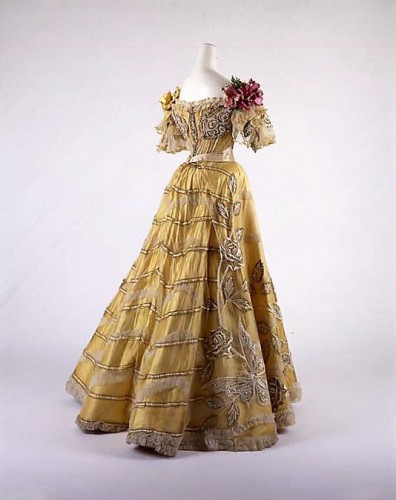
Dress, Evening Duval and Eagan (American), ca. 1889, Metropolitan Museum of Art
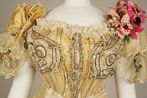
Detail of silk evening dress, Duval and Eagan (American), ca. 1889 Metropolitan Museum of Art
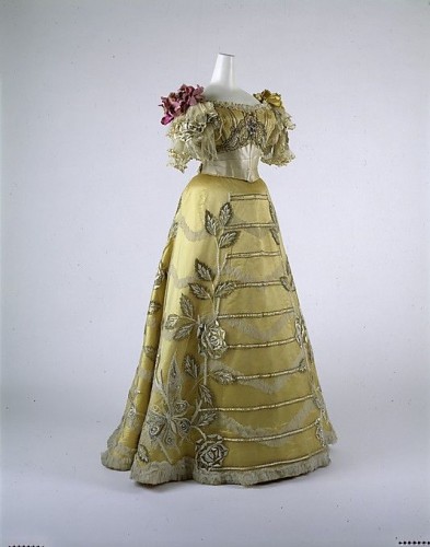
Dress, Evening Duval and Eagan (American), ca. 1889, Metropolitan Museum of Art
Dress, Evening Duval and Eagan, silk, ca. 1889, Metropolitan Museum of Art
What do you think? Is the dress inventive and elegant, Victorian whimsy and maximalism at its best, or is it, well, just trying to do a little too much?
Rate the Dress on a Scale of 1 to 10
It may have been the ne plus ultra for its time, but the heavy incrustations of adornment make me think more of agriculture (or pathology) than fashion.
I like the color (at least as it appears on my monitor), and the basic lines of the garment, but the decoration gives me a feeling of being weighted down.
3 of 10
The dress is very pretty, though in some ways over the top. Having been recently studying decoration and ornamentation, I would say the maker of this dress was trying to do a bit much, having too many different forms of decoration and ornamentation for one dress.
7 out of 10, since I would like it if those funny bows on the shoulder, or the corsage, were left off.
Reason is telling me I shouldn’t like this dress, it’s not my favourite period in fashion, it’s over the top, it appears to have far to much going on….. but something in me would love to be the lady walking in to dinner wearing this dress. With brain and heart having a wrestling match I’m going to give this one 7/10
There are elements I like about this gown, but mostly they are incrusted with elements which I would rather never have encountered & then I’m no fan of yellow. 3/10.
I imagine a Prima Donna Opera Diva would have worn it with elan. But only the most theatrical of people would have been able to pull this off. The color is nice, and the lines remind me of steps to a garden terrace.
7
On first impression I loved it. The bodice close-up cooled me off a bit, not sure about the beaded boob bits like that, although see the connection to “eyes” on butterfly wings. I love the skirt though! Is it just me, or in your second to last pic does the waist thingy extend upwards to a point under the bust in a way it doesn’t in the others? I wonder if that would change the effect of the beaded boob wing eyes
missjoidevivre: I think you’re right. I think the problem is that most of the photographs have the belt on the wrong way around (with the wide part in the back) and only the last one has it on correctly. Any other opinions? (This isn’t my period, and I could be wrong about how the belt should be worn.)
I think the one with the belt on wide is an older photograph, and presumable they would have done better research for the more recent images, and put the belt on correctly, but that’s all conjecture. Perhaps it was worn both was by the original wearer to update it a tiny bit over the course of a couple of years.
I think Pamlin, further down, is right! In photos 2 and 4 I think the bodice as well as the belt is facing the other way!
You and pamlin may well be right–that odd opening does look like a partly-buttoned opening that belongs in the rear.
The photographer/stylist seems to have had trouble deciding which was the front, which the back. It looks like photos 2 and 4, where the pink silk corsage is on the left shoulder and the swiss waist the right way round, have the correct view. Victorian culture jamming!
Sorry, I mean right shoulder!
Argh! Commenting on your blog on my phone is the pits! The submit button is so close to the text for my fingers.
Anyway, …
…change the beaded boob wing eyes. Regardless, I think it’s fabulous so 9.
The shade of yellow of this dress is very pleasant. And it looks beautiful from the rear…and from a little distance. The close-up photographs look kind of tacky, as the design is picked out in surprisingly large beads. The sleeves are rather pretty–including the transparent ruffly organza (?) overflaps. However, I think a dress should look beautiful both close-up and from a distance, and this one doesn’t make that cut. A 6.5, mostly because of that hideous close-up view of the bodice (I’m glad not to have one of the skirt embroidery).
Two words: Edwardian Pasties. (and I don’t mean the food)
Picture #4 doesn’t have them on it, and with a better waist treatment choice, and I like it much more that way. I’m 99% sure they have the bodice on backwards in all the other photos!!
With the pasties and buttons in the back (because, let’s face it, most evening gowns buttoned in the back during this time period.)
7.5/10
(1/10 for the costume preservationist who put the bodice on backwards)
Look at that! Photo 2 has it that way around as well, you can see the pasties on the back and the belt is oriented so the wider part is at the front too. Much nicer that way around.
I looked at this for a while before I worked out why I didn’t really like it: its embellishments are out of proportion. It looks like a dress sewn for a doll (by a very clever doll’s dressmaker!). Try as you may it is very diffficult to miniaturise the trims for such dresses – the braid is too big, the beading is too heavy, the flowers are too big etc etc. And this is what is happening here.
Pleasing colours and a nice shape, but it doesn’t work for me. 5 out 10 – marks for colour and quality.
Not usually a fan of yellow, but the color doesn’t bother me. I am not a fan of the decorations on the skirt, but I just can’t get past the embellishments on the bust (note: I re-wrote that statement about three times to come up with something appropriate). The dress makes the eye go crazy in all the wrong places. Yuck.
2/10
10!!!!! In spite of it being quite batty, I just love it. I think the embellishments on the bodice close up are so like the ridged lines on a shell, or like coral, it is quite seasidelike. I love the embellishments and although there are really quite a lot of them, the very subdued colourscheme saves it all. I am fascinated by embellishments and love to work on them and I am itching to try all of these out now.
I also think that the roses and butterflies are works of art. We are so accustomed to these patterns, being so popular, but seeing such big, graceful butterflies is so exciting!
Oh Miss Momi, can we make this one too?? PLEEEEASE?
The embellishments are fascinating! And you are talking to the right person when you want to make it – I’m such a sucker for a yellow dress! Can we improve it just a teeny, tiny bit though?
Oh yes, I really don’t see the point of trying to create an exact copy of anything. 🙂 Let us talk!
Maybe this is just me being a cranky pants, but I don’t like it. There’s too much of everything, and I think the embellishment on the front of the skirt looks stiff and awkward. I do like the sleeves though.
4/10 from me.
It’s gorgeous! 9.5
I think they forgot the “less is more” rule, for me 5/10, it’s just too busy
I don’t like the eyes on the bust, the excessive (oversized) decoration, or the horizontal lines on the skirt. I do like the colour and the silhouette, though. 3/10
This dress is just really…strange, for lack of a better word. That close-up of the bodice especially reminds me of the female characters in the 80’s cartoon show He-Man and the Masters of the Universe. The creator must have really, really liked to embellish, but it’s too much for me. 4/10.
I like the skirt, where the embellishments, while bold, have enough room to breathe. There’s something almost military about the stripes, even thought they seem to be acting a some sort of trellis for the climbing roses. The bodice I’m less enamoured of, even when it is the right way ’round. 6/10.
I like the horizontal trim element on the skirt, the different decoration going on and the color yet the bodice is too loaded. I think the skirt’s motif would have looked on the bodice.
8/10
looks like a porcelain dolls dress. fine on the mantelpiece.
5/10
I love yellow almost as much as I love ball gowns! There is a terrible dearth of yellow ball gowns in my wardrobe.
I think that it’s a lovely dress, provided the bodice is put on the right way. If the beaded paisley things are in the back, they look fine to me, though they are slightly puzzling (almost as puzzling are the giant shoulder flowers that are inexplicably different colors). I would wear it in a heartbeat. 8/10
To much ornamentation for me, with the beading and the flowers and the stripes. I am also not a huge fan of the skirt shape. 6/10
If I saw someone wearing this dress, at the other end of a hallway, walking away from me, I would say, what a lovely dress! If the lady reached the end of the hall and turned and came back to me, I’d probably withhold comment politely.
I give it a 5 because I only like the dress from the rear and at a distance. 😉
It looks quite lovely in the second and second-from last pictures at an angle and with sort of muted lighting. Not so much in the other pictures. The bodice close-up actually looks pretty clunky and cluttered with cartoon-size beads, and it’s not terribly well mounted on the mannequin with arms, with a dumpy little bum in the profile shot. Tough one, this. I’m not absolutely enchanted by it, but it looks really lovely and quite light and elegant in the armless pictures, and then not so light and even over-laboured in the armed pictures, which I’m sure is slightly more attributable to the quick record shot mounting rather than to the dress. But overall, I don’t think I LIKE it very much – I can think it’s lovely, but I don’t think I love it or even particularly like it very much. Just too much going on there and the decorations aren’t actually in harmony, so I’m going to give it a decidely neither here-or-there 5 out of 10.
THE BODICE IS ON TWO DIFFERENT WAYS!! That explains a lot, I had a nagging doubt something was off but couldn’t think why the pictures were bugging me so. Talk about a blunder.
Yep, it is. It’s driving me crazy, too!
I wrote a detailed comment yesterday just after it was posted, and my mobile connection landed me safely as a spammer. I noticed the two different ways the bodice is put on, just for the record, and I give 7/10 to the 1, 3 and 5 version and 9/10 to the 2 and 4 version.
I do not like the way the bodice is decorated too much, but otherwise I love this, in all its over-the-top-ness (me! wow). I love how the bow on one shoulder balances the corsage on the other, I love the flower-stripe decoration on the skirt. And I love the colour, though it may be difficult to wear.
I try to imagine these dresses as they would have been worn, in a pack of other concatenations of furbelows and passementerie. The need to compete with the rest of the mass makes the decorative efforts seem a little less over the top sometimes.
The skirt’s quite bold, but they seemed to have resisted the urge to overdo there, which is impressive restraint for this period.
I am trying to imagine the man who clasped this woman in his arms for a waltz and got a faceful of pink silk flowers for his trouble–I think the flatter bow is a little better.
But that bodice! Is she trying to emphasize an area that needs a little help? Or sending signals to secret shoulder-blade fetishists out there? I do love the little sleeve ruffles, though.
6/10. It might be higher if I knew which was the right bodice arrangement.
It’s looking at me. Weird, just like that greenish tan Edwardian one, what’s up with these crazy bodice decorations?
The colours aren’t too bad, and the butterflies and flowers look nice up close, but there is altogether too much stuff going on here.
6/10
I think it’s gorgeous, but too over-the-top for me to wear. I love the bright pink corsage; it really adds a striking pop of color. The waistband is very elegant and slimming, and the shape of the skirt is graceful and well-proportioned. The embroidery on the skirt is stunning. I think the only thing I don’t like about the dress is the bodice embroidery. I think the bodice should be much plainer, as I don’t like the circling the boob effect of the bodice embroidery. My rating: 8 out of 10.
I like it much better with the bodice on the right way. I didn’t realize that at first.
I like the shoulder treatment and the pretty color, but the beadwork on the bodice look like embellished breasts. The roses on the skirts are pretty, but I dislike the horizontal stripes. Just a bit over the top… enough for me to almost cringe.
5/10
I don’t know. I just don’t know. I like that the bodice can be worn two ways… I just hate the large beading. If it had been done in smaller beads, I may have liked it a little better. I don’t really care for the shape, and the large floral design is a bit big for my tastes. I do like the chevron effect on the skirt, and the beading doesn’t look so bad from a distance (like on the picture of the back where the bodice is backwards (I like it better that way, but think it would have looked better with the smaller end of the belt on the other side)). Otherwise, I’m just not crazy about this one, even though I usually can’t get enough embellishment.
Six out of ten. 🙁
Photo 2 & 4 show the bodice in the most pleasing orientation to me – with the swiss waist to the front and the embellished bee ‘wings’ and embellished opening in the back. I’d love to see the front a little closer too – it looks very interesting. I think it’s a flora/fauna riot with almost horizontal military lines of embellishment. Makes me wonder if this dress was decorated for a military ball or in rememberance of a military family member. 9/10
Ugh. That was my first thought. 3/10
The more I look at that dress the more irritated I am by the bodice close-up. It’s just off-kilter enough to wind me up – probably because it’s trying to accommodate boobs where it wasn’t intended to accommodate them. On the back, those design details look so much more symmetrical and balanced out. Sadly, whoever mounted this one should be cringing with embarrassment – even if they were rushed for time and mounting multiple dresses in a row for record shots, there’s NO excuse for getting something like this back to front.