
Last week’s 1920s fashion plate got some interesting reactions that divided into three distinct categories: Oooh!, Meh and Blech. Balanced out, the resulting rating was 6 out of 10 – just above Meh, and not a rating that anyone gave the dress! To my surprise, many of you liked the orange dress better than the blue and green one – I should have done a Dress Off!
This fortnight’s theme in the HSF is ‘Re-do’, which leaves the field wide open for me to pick Rate the Dress garments to go along with it. I’ve been feeling like it was time to post something 1820s for a while now (not sure why, it just felt like the right thing to do), and since Stripes is one of the HSF themes I’ll be ‘re-doing’ over the next fortnight, a striped 1820s frock it is:
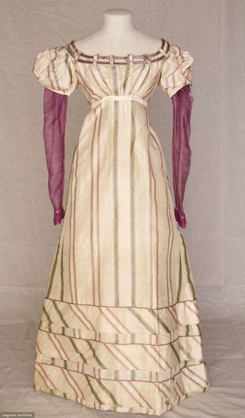
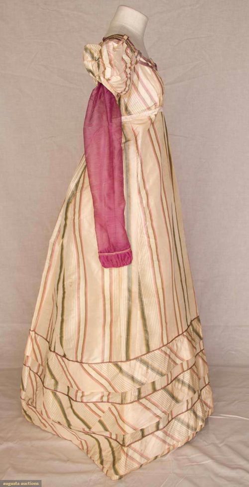
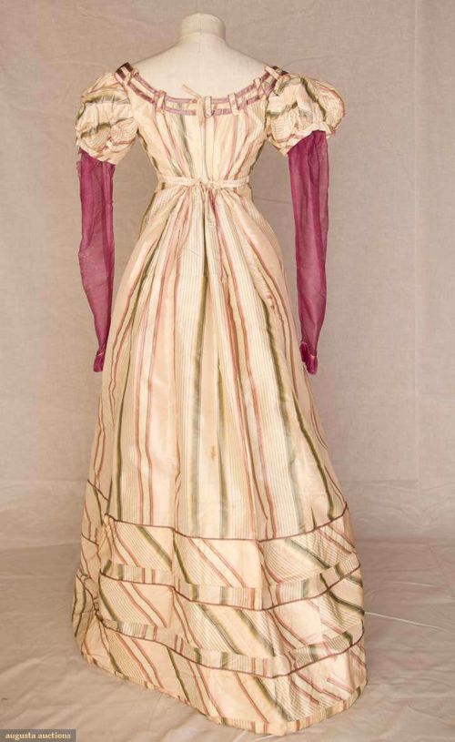

In addition to the fascinating use of stripes (and is that fabric a very simple warp-printed taffeta? I think so!), this dress attracted me because of its under-sleeves of gauzy wool in what Augusta Auctions erroneously calls magenta. The shade is clearly not magenta, because magenta, named for the 1859 Battle of Magenta, was originally a particular shade of aniline dye.
Still, whatever the name, the pop of the vivid pink-purple sleeves with the ivory fabric with its rose and green stripes is striking. I wonder if the trim around the neck originally matched the pinker shades of the sleeve and stripes, or if it always had a distinctly lilac twinge.
What do you think? Do you like this example of late Regency fashions, with its elaborate striped hem trim, button and tab neckline trim, and contrasting sleeves?
Rate the Dress on a Scale of 1 to 10.
It would have helped if the dress had been pressed before being displayed; it’s not showing to best effect.
That said, I’m not much of a fan of 1820s styles. I like the color scheme, but I’m not wild about the slanted striped section at the bottom of the skirt, or the odd “barred” trimming at the neckline. It’s not horrible, but it’s not pretty either–it’s merely interesting. Therefore, a 5 of 10.
I also agree with the commenters that the gauze sleeves are of a color that is “too intense” (i.e., too dark) for the rest of the dress, though it’s a lovely color, in and of itself.
P.S. I very much like the striped fabric, though, and I very much like the overall style of the dress – I’m just thinking they would both work better separately.
I completely agree with everything, except I rather like the “barred” trimming – just would like it more without the buttons, just sewn there flat, that could look good.
I’m thinking stripes may not be the best pattern for this style of skirt in general. This particular pattern/construction, straight with slanted sides in the front and straight with gathers in the back – it makes the stripe look at odds with the shape, even if there were not the diagonal parts. They just can’t match up, even if you try – as evidenced by this dress, where someone clearly tried, and did the best they could I think, by the look of that side seam (though the match-ups with the bodice and in the diagonal parts look a bit dubious).
Which might be why the diagonal parts looks so bad, too – they break the pattern up even more so it does not match at all. Even though someone tried. Having that effort in matching undermined by the pattern itself is definitely not a good design decision.
I think this is lovely, even though it’s not a color scheme that would look good on me.
I like how the stripes in the main section act to narrow the figure, and although they’re oddly like window curtain hooks, I like how the stripes continue over the neckline trim.
I would deduct a point for an oddly-bunched left sleeve, and I would have preferred the bands separating the diagonal striped sections of the skirt to have been with the strip running lengthwise, but presumably that might have been a waste of fabric.
Oops — 8.5 of 10
Badly mounted and looking clunky, especially at the back where the hem is sort of pushed slightly against the ground… I normally quite like this era, but those plum wool gauze sleeves are boggling me. They just sort of stick out. Might look better properly mounted, accessorised and presented, mind you, but I’m really not sold by the sleeves. The striped fabric is nice, but I think it has to be a rather meh-ish 4/10 from me – I just really don’t like the contrast of the sleeves in this design.
I was going to bump up my vote earlier, but actually, I don’t think I’ll bother after looking at it again. We’re also missing a waistband or a belt, which might have pulled it all together. Oddly, I actually REALLY like the neckline treatment.
It’s… nice. Not horrible, not amazing, just nice. I love the sleeve color, and generally I’m a fan of stripes, but the colors are a little too muted for my taste. A little more contrast might help it. I give it a 7.
Pretty! I really like the use of the stripes on this dress, especially on the hem. I also think the neckline detail is nice as well. The sleeves… are a bit intense for the rest of the dress. Perhaps it would look a bit more mellow on a person, but I think the color is a bit overwhelming for the rest of this dress.
8/10
The color combination is unusual but somehow, it works really well here. The pink livens up the dress without being overwhelming. I even like the contrasting directions of the stripes at the bottom of the skirt. I usually don’t like dresses from this time period, but I make an exception with this one. Very nice.
9.5/10
I have said that the 1820/30s is one of my least favorite decades of fashion, but I really like this dress. I think one secret is that it’s not displayed properly, I would probably not like it as much with puffier sleeves or a more pronounced high waist.
I like the colours, I like the use of the stripes, it’s a clear 8/10 from me.
Here’s what would, in my opinion, have worked better for this dress:
1) Do away with the sections in the skirt with diagonal placement of the stripes; have the stripes run in an unbroken line down the entire length of the skirt.
2) Remove the self-fabric bands trimming the sleeves and replace them with ribbons the same color as the gauze sleeves that are there now.
3) Use the same dark pink (?) color ribbon I refer to in 2) to trim the neckline and the lower part of the puffed sleeves, and as a belt for the waist.
4) Use a somewhat lighter shade of the dark pink for the gauze portion of the sleeves.
I still don’t like the dress much–the stripes appear to have been badly handled in cutting the dress pieces. But making the color contrasts more harmonious and getting rid of the clashing stripe directions would have raised in, in my opinion, to a 7.
I agree the presentation isn’t doing this dress any favours, and I normally dislike 1820s fashion, but I really like this dress. It’s bold and fun, but I still find the overall effect quite harmonious and elegant. 9/10, and it would have been 10/10 if it didn’t have poofy oversleeves. I know they were the fashion of the time, but I think they look silly.
It’s very Becky Sharp – made me think of her immediately. For that reason, I think, 8/10.
6/10
I’m not a fan of this era, preferring things to fit in at the waist. But hey, that was the fashion at the time.
I do like the stripes and am loving the “fencing” around the neck and the diagonal work and pleats at the hem – I think both are cleverly cut.
I like the colour scheme too. But I am SO struggling with the sleeves. Perhaps they would look better on, and with some other “magenta” accessories, like a hat or bag.
Thank you for these rate the dress posts, I really like them
I am giving a bit of leeway to the diagonal stripes in the hem panels that don’t quite flow, even the sad matching of the bias strip at the side. I am amazed by the preservation of this gown; silk is notorious for shattering in old garments, so this one must have been very carefully cared for and archived.
7/10
The silk shattering you are thinking of is actually something that is more likely to happen in more recent garments (starting in about the 1840s and ending in the 1940s). It is primarily because silks were sold by weight, so less-than-honest silk manufacturers made them weigh more by processing and dyeing them with added metal. This did make the fabric weigh more, but also made it more fragile as the heavy metals would eat away at the proteins of the silks, making them friable. Silks dyed black were particularly susceptible, as the black dye also weakened the fabric.
That’s why, for example, there are 1840s dresses made from 1720s silks that are still in amazing condition – earlier silks were simply better quality.
Silk also goes brittle if exposed to too much light, but this generally only happens to garments that are on display for extended periods of time.
I really like it. It is bold and interesting, not lacy and tizzy, and I like the colours together – and I am assuming I think safely that all kinds of fading has altered the balance of the various purples, given how unstable blue based colours are for fading.
I would love to see it on a person or a full mannequin, accessorised, but I just know it would come right.
I love the clever panels in the skirt – the maker cleverly lined up all of the vertical stripes so the diagonal insets look like they are interrupting a full skirt. SO effective. And I adore the neck line detail.
Yes it is quite busy, but I don’t think that is crime in a time when women were dressing to be noticed.
I give it a 9.
I don’t think we can adequately assess the sleeves without seeing them on a person. The color of that gauze would be strongly affected by the arm color of the person wearing it. If it were on a fair-skinned Caucasian woman, the sleeves would be rather more pale than they appear here, which might improve the rating from folks who find them too much for the rest of the dress.
9 I think it’s beautiful and I would make it, or a variant of it.
I think the sleeves are too dark in comparison to the rest of the dress, which is a shame. I also don’t like the diagonal stripes on the hem area of the dress; it would have been better without them. Other than that I rather like it, simple and elegant 8/10
Now I normally don’t mind the 1820s but oh the diagonal stripes around the hem… yucky! It makes it look like the wearer is listing to the left (probably not helped by the presentation), and with that in mind, even though the fabric ought to be quite lovely, all I can see is stained old T-shirts on beery, gutted men with brick-tans, moustaches and too-small shorts. It’s the VB dress?
I’m fairly sure if it was plainer I wouldn’t dislike it anywhere near so vehemently, but as it is,
2/10.
Deduct one point for the lackluster presentation, half a point for the odd treatment at the neckline, and half a point for the fact that the sleeves are the only real contrast. That said, it’s pretty. 8/10
I don’t like the diagonal skirt trim, or the way the stripes look on the sleeves, but the rest is okay.
I think the trim around the neckline is quite fantastic. This isn’t an era I am particularly fond of, and the colour scheme isn’t my style, but I think that if this were on a person and properly accessorized, it would work.
9/10
Hm–I think I would like to see it on a real person, properly pressed, and with some movement to it. The sleeves are a bit dark, but I think they might appear less out-of-place on a human body. I like 1820s styles generally, because while they are high-waisted they don’t have the amount of gathers I associate with earlier in the century–it’s a little cleaner. I like the effect of the stripes, which is interesting but not garish. It would have been more interesting if they did not all go the same direction, I think. The trim around the neckline is really charming too.
7/10, for being demure and interesting in concept, but a wrinkly mess in the pictures.
Don’t care for the diagonal stripes at the bottom or the poor display.
Not a terribly exciting dress, so 6/10
I was trying to figure out what to score it and then I read a comment that complained of the diagonal striping. And then I learned that I reeeeally like the diagonal striping. Not so sure about the tabs on the color or the color of the sleeves in real life, but I have an instinctual appreciation for this dress, even if I don’t think there’s ever been a situation in history in which I personally would have worn it.
8 out of 10.
In that close-up of the stripes, it looks as through the darkest shade of the pink matches the color of the sheer sleeves. Unfortuneately, without anything else to pull it together in the display, this gets lost. I wonder if, back in the day, she had a shawl or scarf in the same sheer wool, or used ribbons or flowers in that color range in her headdress.
I like this dress because it shows something we don’t often see*, which is how people remodeled or repurposed clothes to get more use out of them–not something as drastic as reusing the fabric for another garmet entirely, but a simple alteration.
I do like the relative simplicity of the dress decorations–in contrast to a lot of 1820s garments, these look fairly restrained and almost tailored. The tabs holding the ribbon at the neck are especially interesting, although I wonder if the velvet ribbon itself has faded a little. I think I’d have done the middle bias band at the hem so that the stripes went in the opposite direction, but that’s me. I like the trouble they took, as Mrs. C points out, to keep all the vertical stripes aligned.
I”ll take a deep breath and say 8/10, becuase I”m making allowances for the fact that an auction house isn’t going to show a garment with as much eye for effect as a formal museum display would.
*Is it because a lot of museums try to get the garment back to ‘original’ status? Or are these things just not the stuff that makes a good show?
I’m a fan. I was wearing magenta sleeves popping out of a grey top today. The matching up of stripes is a bit lacking, but I love the details of the button tabs along the neckline, and I can imagine the velvet ribbon detail was once a matching magenta…
7/10
I’m a fan. I was wearing magenta sleeves popping out of a grey short-sleeved top today. The matching up of stripes is a bit lacking, but I love the details of the button tabs along the neckline, and I can imagine the velvet ribbon detail was once a matching magenta…
7/10