
For once, you were amazingly unanimous about a Rate the Dress. With the exception of a two dissenting votes down and two perfect 10 votes, all the ratings fell from 6.5 to 9 for last week’s extremely matched brown-pink & blue Rate the Dress yet. Unsurprisingly, the end result was right in the middle of that range: 7.6 out of 10. As Beatrix said “not a showstopper but it’d certainly make you take a 2nd or 3rd look.”
After all the muted colours and half tones last week, this I really felt we needed something bright and bold and crisp and refreshing to rate. This advertisement from the New York Public Library’s digital collection fits the bill perfectly.
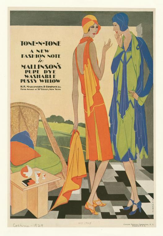
I thought about having a dress-off, but I don’t think it would be a fair battle as we can’t see enough of the orange ensemble to really rate it (though she would definitely win a shoe-off! The blue heels look positively common compared to the orange sandals) so you’ll be rating the green and blue outfit.
What do you think of it? The pale apple green paired with deep blue? The combination of angular piecing and soft, sensuous drapes and folds?
Rate the Dress on a Scale of 1 to 10.
I love both combinations, yellow with orange, apple green with peacock blue, even though both are too vivid to work well on me. (But then the 20th silhouette doesn’t work well on me, either). 9.5 on the right person/s.
Probably looks better in movement and on the right figure – the artwork is fantastic. Not totally sure on the colours myself. Generally, can’t say the outfits are exciting me at all, they’re nice but I’m curiously unmoved. 5/10 – just because I am absolutely devoid of enthusiasm for these, sorry. They ARE nice, they’re not offensive, they’re just… forgettable. I had to repeatedly keep scrolling up to remind myself what they looked like.
I hate her stupid hat. I just hate those hats. They look like swimming caps, and swimming caps are hideous!!!
I don’t even know. The colors are pretty, but I always find it difficult to rate 1920’s stuff. Rarely do I like it, and this outfit is no exception. I think the jacket is just kind of ugly. But the dress isn’t TOO bad.
I think that I always end up liking the 20’s stuff on Actual Human Forms, instead of the oddly proportioned drawings. Which is a good thing, since absolutely nobody looks like the 20’s drawings of women.
So I’m just going to imagine that this outfit is on an Actual Human Form, and it looks so much better.
And the shoes are cute. The shoes add an entire point.
But even with the cute shoes, I’m still only rating it a 3/10.
I just can’t look past that disgusting hat and the ugly jacket. Like Daniel said, it is a pretty forgettable and boring dress.
that old adage “blue and green should not be seen without a colour in between” certainly gets knocked off its perch here. I think it is perfectly in tune with its times; the geometric and soft curve details do not cancel each other out.
I’d wear it, but more likely I’d wear the orange and yellow ensemble.
10/10
Strangely enough, as simple as a color palette the blue and green dress has, I feel like it’s too busy for my eyes to take in. They just start freaking out because all the drapey lines from the jacket. I really wish I could rate the jacket and the dress separately, but alas, that kind of defeats the point! I really like the dress though with its middy-esque feel and geometric accents, especially because it fights the colorocracy established who knows when (and I like fighting it 🙂
A solid 5 out of 10 (with several points docked for dress-hiding jacket)
Frankly, Lisa, I think the impression of busyness is a feature of the way it’s drawn more than of the dress and jacket themselves. (Since we don’t have a picture of the actual clothing, we can’t know that for certain, though.)
Gorgeous! Both of them! I love the colors and the lines. I confess I get a little confused with the blue and green coat, but the dress underneath looks charming! I give it a 9 because twenties silhouettes aren’t flattering on me and it makes me sad.
I think that in real life the blue and green dress would be quite exciting, especially if it was in a fabric with loads of softness and drape. I agree with Catherine that the way it appears in the artwork makes it appear more confusing than it would be as a real dress, and so I’ll give it the benefit of the doubt.
Having said that, I would totally wear the orange one. Orange being one of my absolute favourite colours. But then again, the cut of the blue and green one is more balanced and interesting, even if the colour combination isn’t my favourite. 7/10 for the cut.
Both outfits are nice but I find the green and blue one catching my eye. I’m liking that it has more design elements to give it interest. I agree with Daniel that they’re not most memorable dresses but I’m ok with that as they are daywear (or appear to be ). The cloche hat on the orange set is ok but I’m in agreement with Cheyenne about that blue one looking like a swim cap. The shoes on both look good.
8/10 2 points off for that blue cloche.
Now here’s a dress I do like. Lovely colours and an interesting construction with great use of drape. I love the combination of soft drape and angular lines. 9/10
I love deco but I’m not won over by this dress. The soft drape seems to be fighting against the angular piecing somehow. I love blue but I’m not sure about the green contrast – perhaps white would have been more striking? I should love it but I merely sort of like it. 4 out of 10 from me.
Nope. NOPE. Imagine a real person showing up to a coffee date with that on. They would look like they’re wearing a boy’s duvet cover. 1/10.
I adore the 20s. I have a 20s body, making me so sad looking at the lush 18th and 19th-century dresses that would look awful on me! But then oh irony! At 4 months pregnant, I have the Regency shape I’ve wanted for so long, and then we get a Rate The Dress from the very decade my body just left!
So, I’m a little bitter, although mostly it’s just play. I have strong feelings about patterns belonging only on pyjamas (another 1920s invention), so I love the use of color blocking. But I’ve always disliked the awkward period of blouson tops on dropped waists.
Hmmm….8/10 because I mostly love it.
I really like the orange one, with the little bits of piping and the flashes of yellow in the pleats on the scarf thingy and lining of whatever that garment she’s holding is supposed to be.
The blue/green looks heavy and overdone by comparison. Meh. 5/10
I’m fairly certain that I’m too round to make 1920’s styles look good, so I’m also fairly certain that had I been around in the 1920’s, trying to wear the trendy shapes of the day, I would have rejoiced to have a drapey/swing-y coat to wear over my dresses. I love the scarf/tie in the front of the dress too. It looks like it’s attached, so no worries about losing it. That being said, it still wouldn’t be the best dress I could possibly wear. Also, that particular shade of blue always manages to make my skin look red and blotchy. As an advertisement, it totally works, but as a dress to be worn, I’d have to give it just 5/10 (including the extra point for the coat)
The orange ensemble I love definitely.
On a lovely lady with a light sun tan, willowy figure, chestnut brown hair & gorgeous gaudy hazel or brown eyes.
The blue & green with all the angular piecing- eh even on her waif figure it’s just too many folds & dangly bits. Looks a tad like a set of raggedy curtains over even more raggedy curtains. So 2/10.
I’m afraid my figure is to much like Mae West to pull this drop waisted 20’s shift stuff off.
Uh, looks like a parachuter come back from the landing field, aviation hat and all. The shoes are cute though, 3/10
lol
Those colours are hideous! The cut is uninteresting, and the hat is an awful shape.
The shoes are cute though, and some of the details are okay. None of this makes the colours any less hideous. This is the sort of colour combination you see on school supplies. It really don’t belong on a dress.
2/10
At least the floor tiles are cool.
I like it. 8/10. It’s hard to say whether I like it objectively or whether I would just like to wear it, but the swoopiness is appealing to me combined with the interplay of all those triangles… Those lines might work well on someone tall with relatively broad shoulders like me.