
Set aside your sweatshirting, it’s silk time! For this week’s Rate the Dress I’ve chosen a lavish, high-end dinner dress, complete with matching shoes.
Last week: an 1840s dress in striped silk
Quite a few of you liked the striped/plaid silk dress from last week, but more of you had reservations about it. You felt that the silk was neither one thing nor another (not striped or plaid), and that the dress itself was not one thing or another – and was definitely in need of accessories to bring it to life.
The Total: 7.2 out of 10
A neither here nor there, needs some trimming, kind of score.
This week: an 1870s evening dress ensemble – complete with shoes

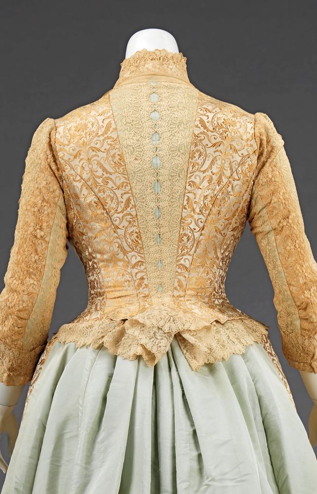
Dinner ensemble Department Store-(a, b) Kingsbury Designer-(c, d) Dupuis-Jacobs, 1874, French, silk, Metropolitan Museum of Art, 2009.300.862a—d
This 1870s dinner ensemble comes complete with perfectly matching shoes, which come with their own quirky design feature: binding and lining in blue on one shoe, and gold on the other. The detail would have been hidden under the wearers skirt most of the time: a secret for herself, and anyone lucky and observant enough to catch a glimpse of them peeping out from her skirt.

Dinner ensemble Department Store-(a, b) Kingsbury Designer-(c, d) Dupuis-Jacobs, 1874, French, silk, Metropolitan Museum of Art, 2009.300.862a—d
The rest of the ensemble is carried out in the same minty green and gold,

Dinner ensemble Department Store-(a, b) Kingsbury Designer-(c, d) Dupuis-Jacobs, 1874, French, silk, Metropolitan Museum of Art, 2009.300.862a—d
I am certain that the ribbon lacing the bodice in the museum photos is a modern recreation – so please don’t discount your rating on account of it!

Dinner ensemble Department Store-(a, b) Kingsbury Designer-(c, d) Dupuis-Jacobs, 1874, French, silk, Metropolitan Museum of Art, 2009.300.862a—d
The predominant fabric on the front of the dress is a lush jacquard woven silk in shades of gold, overlayed with a blond lace which lends subtle depth and texture to the dress.
Dinner ensemble Department Store-(a, b) Kingsbury Designer-(c, d) Dupuis-Jacobs, 1874, French, silk, Metropolitan Museum of Art, 2009.300.862a—d
The same lace is used across the dress, to frame a panel of pale green that runs up the centre back of the dress, as a frill to the hem of the bodice, and to curve up and around the neck.

Dinner ensemble Department Store-(a, b) Kingsbury Designer-(c, d) Dupuis-Jacobs, 1874, French, silk, Metropolitan Museum of Art, 2009.300.862a—d
The spine at the back of the dress is echoed in a line of lace framed green on the sleeves.

Dinner ensemble Department Store-(a, b) Kingsbury Designer-(c, d) Dupuis-Jacobs, 1874, French, silk, Metropolitan Museum of Art, 2009.300.862a—d
The green satin, used in such restrained amounts across the front of the dress and bodice, dominates the back skirt, both in a long smooth bustle, and in the pleats trimming the hem.

Dinner ensemble Department Store-(a, b) Kingsbury Designer-(c, d) Dupuis-Jacobs, 1874, French, silk, Metropolitan Museum of Art, 2009.300.862a—d
What do you think? Will this gold and green ensemble take home the gold rating?
Rate the Dress on a Scale of 1 to 10
A reminder about rating — feel free to be critical if you don’t like a thing, but make sure that your comments aren’t actually insulting to those who do like a garment. Our different tastes are what make Rate the Dress so interesting. It’s no fun when a comment implies that anyone who doesn’t agree with it, or who would wear a garment, is totally lacking in taste.
(as usual, nothing more complicated than a .5. I also hugely appreciate it if you only do one rating, and set it on a line at the very end of your comment, so I can find it! Thanks in advance!)
Although I like the combination of gold and green, I don’t like how it was used in a skirt that looks so drastically different coming or going – as a matter of fact, I was reminded of a centaur (not the most modish impression).
Also, I’m not fond of the lace overlay, which, for me, doesn’t highlight the jacquard (which I find lovely), but muddles it.
On the whole I find the garment rather strange (but I love the shoes!).
6 of 10
This just doesn’t come together for me, especially from the back. I really dislike the hem. The shoes are fun, though. 5/10
It’s rather undecided as to what it wants to be. The back is a rather pleasing 18th century revival; the front is typical 1870’s. It’s pretty in a way, but it just doesn’t seem to have been well thought out. 6/10.
I had the same thought re: back and front.
I’m feeling kinder towards it, though, because both sides are well made, and rate 7/10.
Perhaps age has changed the colors in a way that they don’t seem congruent. That said, I love the gold parts of the dress. 7/10.
The mint green clashes rather than supports the gold brocade, and makes the outfit seem like a bad attempt at a pushmepullyou- the green half needs a different front, and the gold brocade half needs a colour to make it pop. The shoes are nice, but don’t really seem to go with the outfit. The very odd splits in the hem of the gold brocade look like edging on a circus tent.
3/10
I love most parts of the dress. The back of the skirt is the part I dislike, if it hadn’t been green I would have given the dress a 10, now it’ll be a 7.
7/10
The lacing in the bodice seems like a modern swap. It feels too narrow, with a hue that is a tad too bright, compared to the sage in the rest of the dress. The entire color scheme is a bummer for me.
The front and back of the skirt seem like an unhappy marriage. Different colored trim on each shoe makes me think that the designer was young and immature. Most of us go through a mis-matched shoe phase in our youth. I like how this gown takes a look back with historical elements. But this is just not working.
3/10
The lacing is definitely a modern swap – I mention that in the post and request that you don’t discount your rating on account of it 🙂
Sorry, that I missed that. Change my vote to 4/10.
Sorry, that I missed that. Change my vote to 4/10.
Adore the boots. Don’t like the dress. For me, I feel like it’s two massive blocs of unrelieved fabric, too much gold brocade on one hand, too much plain blue satin on the other, and neither intruding on the other. The wit and whimsy of the boots seems absent from the dress, which is strangely unflattering too. I don’t really see much of a vision for the dress, although I do see hints that the designer might have had dreams of Balenciaga in the 50s/early 60s. And now I say that, I can see Balenciaga producing a very similar dress in very similar fabrics in the late 50s, which would look fabulous in that context. It has that element of ugly-chic austere luxury that Balenciaga did so well.
And still, I don’t love it. Because of that, I’m gonna say 6/10.
I love the color scheme–deep gold and pale mint green! A lot. And I love the boots. But again the dress’s design details lose me. The lace only on the front of the skirt,the mint green lacing, don’t add up to a harmonious whole. They seem arbitrarily thrown together.
6 out of 10.
Partial oops. Leimomi did say that she thinks the lacing ribbon is modern. But it isn’t the color of the ribbon that bothers me. It’s the presence of lacing at all; it just looks so out of place on this dress.
I love it. Idk why considering I’m not into gold or minty green but the colors compliment each other nicely. The bodice is lovely too with the lace, gives it just the right amount of texture. I would give it a 7/10
I don’t like the lacing though. Just feels out of place…
I can’t tell where they were trying to go with this…I like the colors and the materials, but not getting the lacing in the front…were they going for a 1700’s look??? I don’t like the solid mint “rear view”, it’s too much of a contrast, they don’t look like they go together. I give it a solid 6.
There are elements that I love. The ruffle on the bustle hem, the princess seams on the back of the bodice and I actually like the lace, it has a very pretty pattern. What I can’t get over is that it looks like two dresses smooshed together.
3/10
I love this dress and would wear it in an instant. The combination of gold and mint looks lovely to me. The lacing in front is a bit off (and would be with lacing in any colour), but gives it a nice little dash of color.
I’m also very fond of the arms and back, the green peaking through the lace is a very nice touch.
The only thing I would really change is to make the slits at the hem larger, so that the mint green underskirt would show more.
10/10
Uncertain. My vanity makes me feel I would not look optimum in this. The lacing seems to work against itself, the waist does not, consequent on that, look dainty. But I like the frivolities of the lace, fawn to mint switches, and quixotic shoes. That make it fun.
7 out of 10
6 out of 10
The plethora of details fight each other. It looks like the gown was assembled from two lots of fabric plus bits, with not quite enough of either lot for a balanced design.
Those shoes are amazing. 10/10 for them 🙂
I feel like the back of the dress is a 9 and the front is a 5. As many people have said, the front and back of the dress don’t work together as seamlessly as one would hope. I’ll average my front and back scores and add .5 for the shoes (which are amazing but wouldn’t have been seen that much).
7.5/10
I guess I’m the person to sku the results, but I love this dress. Yes, I would love if the sage green was another color as it doesn’t seem to go with the gold. The overall design is gorgeous. I’m not too crazy about the mismatched shoes, but they are fabulous in their own right. I question why they would display the dress with this horrible ribbon.(I’m ignoring it for my score). I give the dress a 9.5 taking off for bad color choices.
I like the detailing – the way the blue peeks through the sleeves and the back. The color combination is good, the shoes are adorable, the fabrics are lovely, the ruffles at the hem nicely done.
But it totally loses me with the big picture – the blue plain weave bustle looks grafted onto the gold figured fabric of the front, and those huge tabs at the bottom of the gold skirt are sized for an awning, not a woman’s dress.
I wonder if part of the dress went missing – something that made the back and front relate to one another better.
6.5
I am not sure… I love the shoes, such a nice idea. But I miss the mint of the back skirt in the front. If the whole skirt was golden or more mint it would be better. The form is transitionel moving from 1860 to the 1870. The back remind to earlier forms. Maybe an older dress was refashioned and combined.
6.5/10
I’m fascinated by gowns with contrasts like these, making them look like two dresses at once. It runs the risk of looking costumey, but it’s so dynamic when the right balance is struck.
I loved the initial back view of the gown, that luscious floral gold arranged with such pleasing geometry across the back. The spine and arm embellishments are exquisite.
But the flat expanse of mint on the back made me doubtful, and then I saw the mint lacing. Which I’m not counting, though I am wondering why it puts me off so much. Why doesn’t it work for me? It gives the dress a Porcelain Mantel Shepherdess Come to Life vibe, where an artist had a limited set of paints, so when it came to the lacing, of course he picked the green because they’ll be visible halfway across the room.
Imagining it with ivory or amber lacing is much more pleasing. And looking at the dress as a whole, I rather like the mint train. It might have given the dress an unfinished, we-ran-out-of-the-good-fabric look, but it reminds me more of a regal train. I’m still not sure I would have paired that warm profusion of gold with a cold color like mint. I think it would have looked better with something like rose or even a warm purple. But the mint gives the golds a wintery brightness.
Also the shoes. I love the subtle mismatch. Those are so cheeky.
8.5
I want so, so much to love this, because I ove (almost) all the parts individually – the colours, the fabrics, even the lacing (not as-is, obviously – I can’t imagine who thought that would be a good idea unless they just grabbed for whatever was closest at hand – but as it SHOULD be). But I can’t get past the “one skirt in the front, a entirely different skirt in the back” effect. It doesn’t manage the “Let’s have some fun with a contrasty bustle” look; it just looks…weird and off. And the boots are making my OCD cry, because they are such glorious, glorious things otherwise, but the mismatched colours… I just can’t.
For having so many things I could like, if only they’d been put together better, I’ll give it a generous:
7/10.
I think it would have looked better if they had just scrapped the whole gold front skirt panel altogether. At least it would have been a proper combination of gold and green. Or put some of the gold lace on the back of the skirt, and as for the bottom of the gold skirt, just “what?”
That being said, I love the bodice, it’s beautifully made and the subtle details of the green showing through the sleeves is lovely.
The shoes are fun, but I don’t personally like odd things.
Overall 6/10
I love how unusual the trim details are. I want a bodice with a lace overlay like that now! I give this one 10/10 for being interesting and using great fabric in unusual ways.
Best,
Quinn
I like the bodice, especially from back. It is nicely cut, the pattern of the brocade is joined together skillfuly. I admire the lace over the mint fabric, I like the sleeves. I like most of the front.
But.
It seems to me that two people were working on this dres – the skilled seamstress and the whimsical customer who put some of the designing imput becouse her need to impress neigbours.
The lacing on the bodice (regardless of the color) seems as an aftertought to me, it is disruptive to the flow of the lace. The front of the skirt hangs stiffly without the same feel the bodice has – mabye lack of the mint under the lace? The hem slashes are terrible. The back skirt belongs to entirely different dress.
I just see the silled seamstress doing facepalm as soon as the client leaves.
I also have something against the colors, but I think that fading might be the culprit. Similar thing with the boots – the blue hem should be mint.
7/10 all together.
love love love the symmetry and designs. The front lacing color sticks out as not being authentic – a gold ribbon would have been better, but this was clearly a dress to wear to impress.I give it a 10.
I think I’m in the minority when I say I actually love it, and I can see myself wearing it (and actually fitting into it which is a plus). I adore the entire bodice, and would not change a thing about it. The only thing I would change about the skirt is maybe having less off the green fabric, keeping it peeking out like in the bodice.
8/10
I feel strongly reminded of the traditional costumes in Eastern Tyrol where I come from.
(Not the exact colours though. Pale green silk for a skirt just wasn’t considered a smart choice in that farming society amidst high mountains.)
I am used to that harsh and unmitigated juxtaposition oj completely unrelated fabrics and colours of bodice, skirt and apron.
For that is what I am seeing:
A bodice in as rich a fabric as one can possibly afford. Take silk, brocade, velvet, some gold lace trim and lace the whole thing up whith some nice colourful ribbon. (Front lacing was fashionable in those backward places decades or centuries after the rest of the world thought it so).
An apron, also in a rich fabric, because one can afford it, and anyway a dress has to have an apron at all times.
And then the skirt of some plainer black stuff, because the bodice was expensive enough and we don’t want to seem showing off . (But a good amount of fabric nevertheless because one can afford it, and anyway it can be awfully cold in the mountains)
This dress looks to me as if someone has seen the traditional thing on a journey or in a book and had wanted to recreate the impression.
And the result is weird somehow, because that kind of thing usually only works if you stick to the rules of that society.
If you just take some of the elements and use any colours that might be fashionable the result is some strange neither here nor there thing, like most modern dirndls.
So, in a way I like what I am seeing because it feels familiar to me, but I find it lacking in taste.
I give it 6/10
The low ratings surprise me. I think the colors are lovely and work very well together and the cut and construction are beautiful-over all, it’s a nice, fairly simple design for the period, despite the richness of the materials. The shoes are lovely as well, though I prefer the one with the gold piping, which could have set of either light or dark colored stockings. I do think the dress needs some of the gold brocade carried over to the bustle to balance out the expanse of mint green, which is the only reason it would get a 10 from me. If a bit of well thought out trim in a dark, slightly rusty red were adding, it would be perfection!