
Last week proved that when it comes to bridesmaid’s frocks, there is no pleasing everyone! Some of you rated the orange and beige bridesmaids dress a 10 and said “swoon”, and some of you rated it a 1 and said “ghastly”! The biggest complaints were about the colour (always such an issue with bridesmaids frocks), and the massive 1890s sleeves (which were clearly their eras version of the butt bow, or the pick up skirt – such a trendy must-have, and so awful for some time afterwards!). The dress rated a 6.9 out of 10, which is pretty good, all things considered.
For the record, I think it is divine and I want to go back to 1896 so I can be a bridesmaid and wear it, or be the bride, and wear the wedding dress that went with it (thank you Liz for locating it!).
I’ve been in a bit of an aqua and yellow binge lately, sparked by my Seersucker Sherbet dress, and culminating in the hat to go with it. So when I found this image of a seaside promenade outfit in with yellow and aqua trim, of course I had to show it to you!
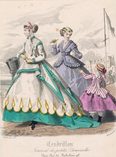
Seaside fashions, August 1866, Cendrillon
How do you feel about this frock? Does it give off a proper crisp, summery, seaside aesthetic, with the aqua and yellow on white trim, long, loose fitting bodice with points culminating in yellow pom-poms? What about the yellow trimmed overskirt, and vivid aqua underskirt which lifts in front for ease in walking, and dips into a train in back? What about the floral and swallow trimmed bonnet?
Is the whole thing an effective twist on the usual seaside look of blue and white with red, or all a bit awkward and gaudy?
Rate the Dress on a Scale of 1 to 10.
Is it a maternity dress? There’s no waist definition and yet the other dresses in the picture are nicely nipped.
That being said, I’m a sucker for aqua and turquoise so I’m giving it an 8 because of the lack of a waist.
metmuseum.orgI don’t think it is a maternity dress. This sort of loose sacque bodice was quite popular for informal wear in the late 1860s. You can see a similar example for seaside wear here, and Monet’s Women in the Garden shows another version.
I love it, and I don’t usually like yellow. I would be a little concerned about the bit of a train dragging in wet sand or being stepped on (a hazard that has happened to me many times, not just at my wedding [talk about your wardrobe malfunction, my dress was strapless and not as well fitted as it should have been]). I love the draping points and the counterpoints of scallops with pointed trim. The colours are perfectly balanced and the wonderful coloured lower skirt that keeps the white and pale yellow from becoming soiled. I especially love the yellow poms at the ends of the aqua/turquoise points. They look like little suns on the sea. I’m not normally fond of this decade’s fashions, but this dress has my sold. I also love, love, love the little girl’s lavender ensemble. 10/10
I think I love it. The color combo is gorgeous and the loose overdress and pom-poms are fun. 10/10.
Love the colors! My only complaint (like Samantha) is the lack of waist definition. With a teal (or yellow) belt it would be amazing, but I think without it loses a few points. I love the skirt though – interesting without being too much. Not sure how I feel about the balls at the end of the pointy bits, but I do like that it incorporates the colors there.
8/10
Really like the gold scallop trim to the white/cream, really like the pointy bits and pom-poms on the over-tunic. It’s a little like that lovely green and cream outfit you showed us earlier for the seaside challenge. It was a bit more practical, but given the period, this is a very charming seaside outfit.
8 out of 10.
Oh dear. It looks like a circus marquee. Scallops and points and no waist. Not for me I’m sorry to say. 2 out of 10 (and I am being generous there).
Sorry folks.
You said it before I could. It looks like a circus tent! Love the color combination of teal & yellow, but I prefer the little girl’s frock to the “main attraction”. ;P
The tails with the pompoms as trim are just too much for me. As are the scallop + spear-head trim details.
3 of 10 for me.
I like it. If I made it, I’d make a more form fitted bodice as well as the looser one. I would think that at the beach, a girl might want to not be laced tightly so there could be some sea shell picking and lounging. Those are happy colors. I give it a 7/10
I do love the colors, and the scalloped trim, but I have to agree with Claire that it all looks a bit circus-y, and not in a good way. I think without the points and their pom-poms it would be a lot better. I do find the loose waist a bit unflattering. And I think the train is just silly, and will get covered in sand and get heavy and annoying very quickly.
5/10. Because I feel like if about half of it were removed I would love it.
Now I must make that violet striped jacket for my daughter. Does it have a hood? Seriously, that’s adorable.
The wedding dress that “goes” with last week’s bridesmaid outfit is, to me, simply ghastly–and not just because it would make me look dreadful. The fabric is nice, but the fabric is the only ornament the dress has, making the dreadful silhouette plainer.
Anyway, on to this week’s gown!
I think the colors work well together, and invoke a crisp “by the sea” charm. But I loathe the weird spiky overskirt, and I’m not thrilled by the yellow spiky and scallopy on the second layer of overskirt. So it’s a 5 for me. Sorry!
P.S. But I *love* the little girl’s raspberry-and-white outfit! I agree with Erin who wants to make the jacket for her daughter, and I wish we could see the front of it!
I agree with some of the other comments…yes the outfit looks like a circus tent and the train is totaly impractical for the beach or at least any beach I have been to.
The colours are okay and the little girl’s outfit cute.
I think I need to look into why the fashions were so odd ( to my eyes)
in those days. Why did they like them or are ours going to look just as crazy and people in the future will think we actually wore some of those runway creations?
3/10
have found a site called fashion-era.com and that is explaining why people wore such daft outfits so often…..I have a lot of learning to do
I like the colour combination and the scalloped edge. I am worried about how small the womans feet are though. 8/10
I’d call it turquoise myself. What a colour combo! It’s not exactly subtle. Slightly unsure on this one, the angularity of the tunic with the points contrasts with the scalloped hem, but not completely incongruously. It is an intriguing tunic, actually – you could almost wear it today by itself. I do like the flowing silhouette of the skirt, though I wonder about gusts of wind. But on the whole, I’m kind of tepid on this, so it’s an slightly unenthused 6/10. (The blue dress is charming, and an unexceptionable 7/10)
What I do like is the little girl’s “hoodie” – a frock coat with purple and white stripes and scalloped hem and a little hood? Cute!
We have multiple options for colours! You say turquoise (I think it has too much green for turquoise, which should be the colour of the stone), I’d call it dark aqua, someone else said teal.
The shoe company that made the shoes that go with my Seersucker Sherbet dress called them Jade, which is rubbish, but the ribbons I sewed to the hat or belt are labelled lagoon blue, which I think is spot on.
Colours, and the way the names of colours, change are fascinating. Did you see the article on colour names in different cultures and how that mirrors development stages?
I have to join the chorus of people comparing it to a circus tent! The pompoms are the last touch dragging it into the ridiculous for me. 3/10.
(The blue-gray one in the background, on the other hand, would have rated at least an 8 or 9 from me. :P)
I like the color combination. It would work for a summer outfit even now–crisp white, trimmed out with yellow and aqua.
I do hope the original beach-goer was planning on keeping this dress on the boardwalk, though (and dresses like this are perhaps the reason for the boardwalk!) because while it’s walking length in front, it certainly isn’t in the back.
7/10 for the colors and admitting a loose bodice was a good idea on holiday; points off for lack of consideration for the ladies’ maid (or the hotel chambermaid) who had to clean up the train when the weared got back from her stroll!
I understand that the yellow on the bottom would stand for sand and the turquoise color would be the water and then the sky on the horizon. I’m all for seaside fashion, whatever it may look like, although I won’t lie, that the traditional dark blue-white combo would be more to my liking.
The dress reminds me way to much of a simplified jesters get-up! No indeed!
The bonnet on the other hand is rather nice, but I don’t believe it adds much to the ensemble except for the classic mid 19th century bonnet look.
2 out of 10
I agree with the people who say it looks like a circus tent or a jesters costume.
This is the weirdest, most confusing 19th century dress I have ever seen.
4/10
I like the shoes and the bonnet.
I am not a fan of drapey over-jackets, but the pom-poms are cute. The color combination is always a winner: Teal + Golden Yellow = Perfect summer beach colors! I am also not a fan of the train, especially in summer or at the seaside. However, the hem of her overskirt is divine!
If you applied the colors and trim to the lovely purple dress behind her, I would wear it in a second, but in its current state, I will give it a 6 out of 10.
I like the colours, and the scalloped edging. There are elements of a very nice dress in there, unfortunately this isn’t it. Too circus-y, and a train and sand are never going to work well together.
5/10
This is not for me. Put me in the court jester/circus group. I am having a hard time with this one. I would give it a generous 3/10.
I love the top part. The top part is very me, and gets a 10 from me.
The bottom not so much, starting with the long tails and pom-poms. That’s about a 6 from me.
So, overall, an 8/10. That’s still a respectable “loves it with reservations”.
I think the aqua colour is just gorgeous. Unfortunately, that’s the only positive thing I have to say about this dress. A train at the beach? Seriously? That’s nuts. And while I love the aqua I don’t like it paired with white and yellow.
But for my money the worst part is the pompoms. Those are beyond dreadful. 2/10.
Ah, color names. How about I, in my infinite wisdom of colors (note the sarcasm), call this blue, yellow and white.
I don’t actually mind the bagginess in the bodice; it looks quite comfy! It’s made interesing by the peaks (valleys?) with the little pompoms on the ends. The neck and sleeve treatment is really cool looking, too. I really like the yellow trim design, but I wish there was more on the top half of the dress–nothing too large and distracting, just enough to keep the yellow continuous throughout the dress. Even the bonnet and the yellow gloves are nice! In fact, the only thing I don’t like about this dress is the hem. I love trains, but if you’re going to make it walking length in the front, I like it to be walking length all around.
Eight and a half out of ten! As a side note, the other ladies are very well dressed, too.