
I had anticipated that last week’s leopard-print suit would elicit a variety of responses, and I was not disappointed. A few of you were utterly horrified, many of you were thoroughly delighted, and some of you belonged to the camp, best expressed by Melissa, that while the outfit was the “18th century equivalent of metallic platforms, it is fabulous anyway.” Thanks to the less impressed, the rating came down to 7.7 out of 10 – pretty good for a guy in a leopard print suit!
Since we looked at fauna last week, let’s rate a flora themed frock this week. If you want flowers, I do believe this 1902 evening gown by Jean-Phillipe Worth fits the bill perfectly:
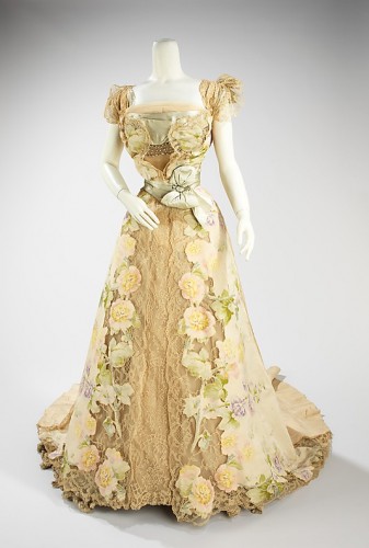
Evening dress House of Worth, Jean-Philippe Worth, 1902, French, silk, rhinestones, metal, Metropolitan Museum of Art
The dress is a walking flower garden and a froth of femininity, with lace and diamantes and satin bows and flower garden chine silk which is appliqued to the lace.

Evening dress (detail of bodice), House of Worth, Jean-Philippe Worth, 1902, French, silk, rhinestones, metal, Metropolitan Museum of Art
The romantic flower garden theme and delicate femininity of the dress are further emphasized by the soft pastel colours, and the blurred soft focus of the chine silk.
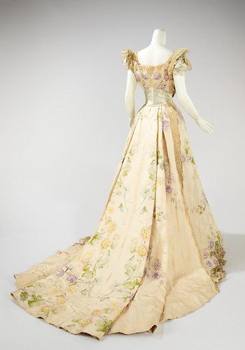
Evening dress, House of Worth, Jean-Philippe Worth, 1902, French, silk, rhinestones, metal, Metropolitan Museum of Art
The intriguing layout of the floral pattern, with distinct areas of unpatterned space, and a strong overall pattern, is very characteristic of late 19th century and early 20th century Worth textiles. It’s slightly unexpected and challenging and provides a bit of tension to counterbalance the overwhelming sweetness of the frock, but could also be considered a bit awkward and clunky at certain angles.
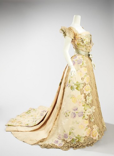
Evening dress, House of Worth, Jean-Philippe Worth, 1902, French, silk, rhinestones, metal, Metropolitan Museum of Art
What do you think? Is the dress too frilly and saccharine for your taste, or is this the way to do über-feminine in the Belle Epoque?
Rate the Dress on a Scale of 1 to 10.
LOVE. 1.5 point taken off for the flowers over ones boobettes, which I think is a little tacky. Otherwise I am all over it. 8.5 outta 10
A little too much going on in the front of the skirt with the lace and flowers combo. WAY too much going on in the front part of the bodice (makes it look heavy and clunky). GORGEOUS in the back. 8/10
8/10, completely seconded! In some parts, it looks a bit… as if an inner structure of bones was peeking through, or something: really too much going on in one place. Overall, though, this is lovely, and quite fresh for a floral frock. It actually reminds me of a dress in a Mrs Stylebook I have – a delicate modern Japanese construction. Maybe something Japanese is going on here, too.
Wow. This really took my breath away. It’s stunningly beautiful and sophisticated. LOVE.
Can I rate it 15/10? No? 10/10, then, for an absolute masterpiece of floral elegance.
10/10. I’ve always loved this dress.
It’s exquisite. That side view really shows why. The transition of fabric to lace is so beautifully executed.
10/10
This is one I wish I could have seen in its own time, because I suspect there has been some discoloration over time, and it might have appeared more ethereal when it was new. Even so, it’s a stunning creation, almost more of a ballet costume than a ball gown.
8 out of 10.
I was going to say the same thing!
Oooh la la! 10/10 for the beautiful lines, the delicate material and for the ‘I feel pretty’ factor x bazillion
Gorgeous!! 10/10
I’ve loved this dress for very long time! I was actually surprised when I saw it under the title of “Rate the Dress,” as I figured most people would love it (and I know how you like extremely varied opinions on these), but from what I see in the comments so far, no everyone is as convinced of this dress’s beauty as I am (though the rating sure wouldn’t be anything negative, by any means).
Like I said, I’ve loved this dress a long time, and I think I may like it more because of it. It seems like when I see a garment for the first time, my opinion can range from very bad to “meh” at the worst, but even with those, after seeing it for a decent amount of time (sometimes just a couple of days), I start liking it a lot more. I think when I first saw this dress I really liked it, but it wasn’t until some time had passed that I began to really love it. I think the cut-outs with the flowers–which I now think are amazingly wonderful–struck me as a little odd the first time I saw it, and that’s why I wasn’t completely in love.
Anyway, to repeat myself yet again, I love it. The touches of green and the rhinestones are probably my favorite parts, but the lace and light color palet of the rest of the dress are oh so lovely, too.
Ten out of ten.
I love the side and back views, I feel the front is a little overdone though so 9/10
lovely dress but the sash (?) at the back around the waist looks odd when I zoomed in on it. If I hadn’t looked at it so closely I would of said 10/10 but that bit spoils it slightly for me.
9/10
I am loving this.
I give it a 10/10.
It’s beautiful how it accentuates the waist. I don’t know the proper term, but the wrap at the bodice is lovely. The lace peeking under the flowers at the hem, there is so much. The back, the sash at the waist.
I was born 100 years late.
Just amazingly over the top but simply delicious!
The whole dress is gorgeous
10/10
6/10
The back is beautiful, but the front has Too Much Stuff on it
The lace and floral aspect of this dress makes it a little over the top for me but I cannot deny that it is a stunning piece of work. I love the muted colour palette and as others have commented, the side view where flowers meet the lace. I would love to see more of Worth’s work as I have yet to find a book on him that does him justice. I love the grey satin sash around the waist and across the bust. It provides a good contrast.
9 out of 10 from me. Thank you for sharing.
I love this, but then I’m a sucker for romantic lace and floral -the more the better – I say 10
Divine. I wouldn’t normally like something that is so busy across the front, but this works for some reason – perhaps because the silhouette is so simple. 9/10.
Straight out of Elswyth Thane’s wonderful Edwardian era Williamsburg novel, “Ever After”. I can envision flirtatious young American Virginia, or perhaps Dinah’s snooty big sister Lady Clare in this gown (the year after their debuts, of course…).
Or Eden! Of course… the more mature but still lovely auburn-haired Eden would be stunning in this dress!
Of course, it really should be worn with above-the-elbow-length ivory kid gloves, and perhaps a feathery fan held just so. Or a little matching bouquet – violets? palest yellow rosebuds with little ferns? – in an engraved silver posey-holder.
Just gorgeous – no doubt it was perfect for the London Season. Just loop up that train, and waltz away with the handsomest gentleman in the ballroom…
(If followers of this blog haven’t discovered Elswyth Thane, I highly recommend her books, which are a bit hard to find but well-worth the hunt).
10/10.
The cover girl from Elizabeth Ann Coleman’s Worth. Doucet and Pingat book!! Love! This is a genuinely exquisite dress – beautiful construction, gorgeous fabrics, and I don’t think it is too busy at all. I think it is a perfect example of its period – not too much going on, the fabric and lace are both allowed to talk for themselves, and so is the actual dressmaking/construction. It is all in complete harmony and balance. I cannot give it anything less than 10/10.
Was there an alternative cover? I remember another dress – one by Doucet – and being so pleased that it wasn’t a Worth dress on the cover. Or perhaps I remember incorrectly.
amazon.comThis is the cover I am familiar with:
http://www.amazon.com/OPULENT-Fashions-Worth-Doucet-Pingat/dp/images/0872731197
Worth co. is above repute, and not just the impeccable workmanship. Few since have been able to walk that sometimes very fine line between sublime and too much as they could. They were the 19th century version of edgy, and can any of us really say we understand the time period well enough to understand all the nuances of a designer in that role?
I like this dress for that very reason. It’s an excercise in pushing the envelope just as far as one could without going over the edge into tacky, and they did it by going all the way, but keeping all the colors so muted. I kind of think Jean-Phillipe did it to amuse himself – or perhaps on a bet, like the one that inspired Norman Lindsay to write The Magic Pudding. I give them a BRAVO, and a 10, less because I love the dress ( though I do) than because I love the little joke.
I really, really, REALLY love the skirt of this dress. If I didn’t think I’d be slitting my own wrists in frustration, I’d try that cut out feature on a dress for me. Because of that skirt, I can forgive the bodice thing that makes me think of Wonder Woman’s cone boobs at certain angles. I think it would be great on a girl who perhaps, needs some enhancements in that department or who feels they are her best asset. 10/10
I love it. While it is not my style it is beautiful. The bosom flowers are a bit, ummm, oddly placed, so I give it a 9. Wish I was the kind of girl to wear something like this.
I LOVE IT! To be honest, it IS my favorite silhouette so I am a bit biased. I only wish the colors weren’t so dull. They make this dress feel less like fresh flowers and more like a long-saved bouquet of dried roses. It’s still lovely, with an air of nostalgia to it, but I would prefer it to feel fresh. I think the lovely subtlety of the muted colors could have been even more striking, if only the fabric didn’t look tea-dyed. I suspect it might have a lot to do with age, so I will dock it only half a point. 9.5/10.
It is very pretty, very subtly coloured, and a lovely shape. I must be having a day when I want a bit more drama – I feel it is a wee bit washed-out. 8 out of 10.
Are you all insane? It’s hideous.
What a way to destroy a perfectly good piece of lace, and a perfectly good piece of floral satin! Mesh them together? In my opinion it just turns too potentially lovely things into one big dog’s breakfast (as we say in Oz).
I will concede that I think the colours would have been very different in its day (that dingy lace hasn’t worn well). And I do love the Edwardian sillhouette generally (though this is the strongest example I’ve seen of making a disaster out of it). And because the back view isn’t too bad, I’ll give it a 3/10.
opps – by *too* I meant two.
The shape of the dress is divine. I love love love the shape of that skirt! But the embellishments… ick. Just too much going on, especially around the bust area. But I do so love the shape of the dress…. I am conflicted.
7/10
I love it, the flowers-to-lace transition is wonderfully clever and beautifully done, but the bodice is just a bit clumsy. I like the sash, and can see that it gives a reason for the fabric across the bust, but it doesn’t quite work for me. It ends up looking a little messy, which is a shame because it’s so nearly a dream dress. 9/10.
SWOON!
Flabbergasted, speechless!
Totally in love.
10/10
Oh wow, that back view! 9.5/10
Looking at the first, almost dead-on view, I got a fleeting impression that those were applied roses down the front edges of the skirt and not printed ones–weird, somewhat flat roses, possibly as the result of age and storage, but still applied and not printed. Well-played, 19th Century French Fabric artiste!
As bodices of this period go, this one is not nearly as over-ornamented as a good many I’ve seen–it’s one of Worth’s points that they knew just how far to go and then stopped there.
Allowing for the effects of time, and a totally different set of ideas about women’s clothing, this is a 10/10.
I had the same impression. I thought the roses were three dimensional at first glance. Still think this dress is fascinating and the color palette is wonderful. Personally, I think the front is too busy. The layering effect of the “tulle sandwich” – the one consisting of tulle, satin, open lace mesh, then tulle again- is a bit too much. But I love the blending of the flowers with the lace. Wowee wow wow.
8/10
Love it. This is one where the whole is greater than the sum of its parts. I didn’t like some of the detail shots, but looking at the entire piece, they work beautifully. 9.5 for me.
Although appreciating the grace and elegant lines of the dress, and quite liking the rear view, I find the “collage” effect disquieting. 6.5/10.
8.5 out of 10. I’m agreeing with the people who say that the front is a bit overdone. Other than that, it’s fabulous.
I have conflicting feelings about this one.
On the one hand, I love the background color, and the silhouette. And the overdress with its flowers and mesh is… interesting.
On the other hand, the overdress is a bit too…interesting. Kind of gimmicky. Kind of like trying too hard. Something Worth should never have to do.
Overall, I come out 6.5.
Love the skirt and train and sleeves, particualrly the way the floral motifs are cutout down the front. Not sure about the stuff going on in the boob department although I think it’s ok. Being me, I wish the colours were amped up a bit (or a lot) but I’m going to assume the somewhat washed out and insipid colouring is largely age related and only dock it a little bit. So 8.5.
So ugly! The belt, the diamantes, and the band of satin across the breast are just horrible, given how busy the lace and floral silk are already. Without them, it might have had a light, airy effect, but this just doesn’t work.
Oops. I forgot to say 3/10. Sorry.
I adore it! it’s like she’s a walking garden. Worth dresses always seem so beautifully balanced to me, 10/10
As a further comment, this dress of the day sent me on a weeklong internet dress hunting spree. So many beautiful gowns! *sigh*
I dislike the waist part but everything else are perfect. The details are lovely and the dress looks like a masterpiece painting. 8/10
I left commenting on this for a while, because I couldn’t make my mind up about it. Normally that amount of decoration on a dress would cause me to run screaming, but to my surprise I actually like it. The more I look at it, the more I like it.
I have to agree with the first comment though – the ‘strategically placed’ flowers on the bodice front are a no-no.
8/10 (would have been 9/10, but for the flower-bra)
9/10. A stunning example of the era