
Last week I thought the rather mad 1860s dress, while not exactly attractive, was at least fascinating, which I feel is sometimes better than pretty. But your responses started out quite unenthusiastic, and went from there to quite enthusiastic, and QUITE unenthusiastic, resulting in a pretty dismal rating of 5.2 out of 10, which is the lowest we’ve had in a long while. At least those of us who liked it won’t have a lot of competition if we decide to recreate it!
This week I’m sticking with the theme of rather odd and oddly placed decoration on a neutral background, and seeing if it can work in some instances.
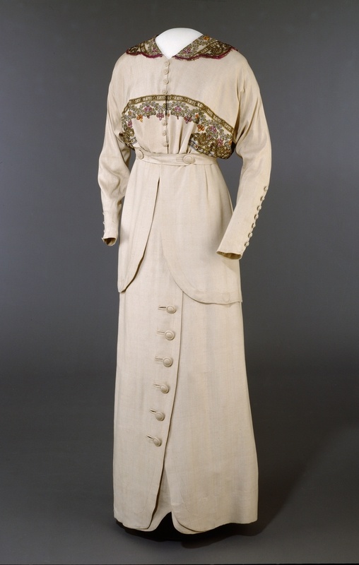
Suit, Josefine Hammarbæck (Oslo, Norway)- 1913, silk and cotton, Digitalt Museum
What do you think of this summer suit that reflects the new, simple, tailored style and oriental influence of mid-teens fashions? Is the creamy neutral sophisticated or boring? The abundance of matching buttons cunning or fussy? Does the trim, drawing attention, as it does, to the cut-on sleeves and flattening bosom, perfectly period or rather atrocious?
Rate the Dress on a Scale of 1 to 10
I could see it work with a very elaborate hat.
I love the buttons on the sleeves as well as the cut of the sleeves. The cut of the coattails is also rather nice,maybe slightly long? The color is fine for summer.
However, the asymetrical buttons on the skirt annoy me because the cut’s just not asymmetrical enough – just blah, no drama.
I like the collar, but again, the trimming/lace doesn’t stand out enough. The outfit could have been dramatic with stronger colours, but as it is it looks a little dowdy and old-fashioned (big surprise here!) to me.
The lace/trimmings that are so strangely placed in a broad band across the breast – I can’t quite imagine what it would look like on a real person.
Still, the whole ensemble somehow appeals to me –
6 of 10
I don’t mind the neutral colour, my sister’s wardrobe is basically in those colours, and it can be really elegant. It’s the placement of the trim that ruins it for me, distracting from the simple elegance. Still there are more good things than bad with this gown though so I’ll give it 7/10.
The color is okay (very pale, but pleasant.) And I like the skirt a lot–the buttoned flap design is striking. But the shape of the jacket is frumpy, and the placement of the embroidered design (which is quite nice embroidery) emphasizes the fact that the jacket blouses in just that place and makes it look even frumpier. 8 for the skirt and 6 for the jacket (which has some nice features, especially the buttons), so a 7 overall.
On first glance, I liked it. The decoration keeps it from being TOO plain, but I wish it had been extended (just a bit) to the skirt. Well, at least there is some edging (?) on the skirt buttons. Looks like a nice everyday dress, even though the color is just a bit dull.
7/10
Not my period, not my taste, from the second decade of the twentieth century I prefer chic, evening gowns with beads and stuff. I just can’t imagine myself in that day outfit. But. I like color, its very accurate for summer, I like sleeves with buttons, I also like those “folk” applications. As for the rest – I hate it 😉
5/10
I don’t normally comment, but this dress spoke with me. This is such a darling, chic suit! I really love how the early 20th Century interpreted the skirt suit. The buttons on the skirt — love love love. The cut of the jacket is period perfect — not my favorite bodice shape, but appropriate. I would probably re-do this suit, but not the trim. I’d find some other way to add visual interest. Although the collar is cute. 😛 And I LOVE waist buttons.
It also reminds me to work more neutrals into my wardrobe. There’s a scene in A Tree Grows In Brooklyn where the girl wears an all grey outfit and they all sing “My Little Quaker Down in Quaker-Town” and talk about how chic and put together the outfit is. All tan can do similar things.
9/10 — I took a point off for the not so great embroidery across the bust.
I like the skirt, maybe even enough to recreate it in a nicer colour, but the jacket is awful. That jacket is a perfect storm of boring, drab design executed in a boring, drab colour.
Yuck. 4/10, and that only because the skirt has so much potential.
I have no idea what to make of this dress. The color is fine, the embroidery is pretty if oddly placed, the skirt is elegant… but overall I feel like something is wrong. It might be the shape of the bodice, or the very tubular silhouette of this era, but I can’t help but feel that it would look kind of dowdy on (at least on me). Perhaps with a different bodice, and some of that embroidery on the edges of the over-skirt.
6/10
I just love Edwardian construction details! Those buttons are marvelous!
But the colours are bland and gross. That cream could be okay with different accents, but these are not nice at all. Blah.
7/10, because the cut and the buttons are so delightful (although the cut is not quite perfect).
Hmm, it could have been so good but it just doesn’t work for me… Like Mom said the skirt is not quite asymmetric enough, it almost looks like a mistake rather than deliberate, the colour is not quite one thing or another, and the embroider whilst pretty, just isn’t strong enough to make the suit interesting and gets lost in the shape of the jacket. So close, yet still so far sadly…. I’d say 4/10.
Btw I love this series!
I think that with the right hat, gloves and shoes, with a lovely eastern-influenced parasol in one hand and a cheeky drink in the other, this would be the perfect mix of subtlety and detail. I think if there was more embroidery it wouldn’t work so well as a summer suit, and if there were fewer buttons the line might be a little sleeker but less sporty and interesting.
9/10 from me. I would totally wear it.
Love it! I see a big hat with the trim playing a bigger part, but even as it is, I think it epitomises everything lovely about this odd moment in fashion. From the slightly barmy “Can’t make up my mind if I am symmetrical or assymetrical,” to the totally smooth shoulder and collarline that almost seems to be slipping back off the shoulders, the waisted blouson with long peplum. It is charmingly, frumpily lovely. I love the modesty of this era, which at the time was daring I guess, shedding all the late Victorian restrictiveness, but to our eyes it is hard to imagine anyone in such a dress having an illicit liaison or running away to be married.
Also, intellectual. I love it. Love it. I wish I could see the detail better, but I love the colours. And I would love it if it were a deep olive green or a russet or a damson colour with the same trim.
9.5/10 because only God and the 18c Century are perfect. 😉
I like the cut and color of this dress. The buttons and the offset skirt are nice details. That said the lace across the jacket’s bust looks awkwardly placed to me but I don’t mind it at the the the collar. Maybe if some lace were at the cuffs and/or at the hem of the jacket or the skirt (or both) to tie it all together.
7/10
I really like the shape and the colour of the dress/suit. I love the embroidery on the collar and although I love the rest of the embroidery I think they placed it wrongly. It should be on the edges of the tails or even on the cuff area. The way it is looks to me like they had a set amount of the embroidery available and they just shifted it up the bodice till it fit.
7/10
I totally love it! The shape is comfy and, I think, flattering. Although the embroidery may seem strangely placed (though I don’t mind it), the combination of it and the rest of the blousy/dolman sleeve and bodice style really help to create a narrower waist and hips, a definite style goal of the time.
I like the color, too. It really allows the details and embroidery to shine. I also like the buttons, even though they are matchy-matchy! They don’t seem to be overwhelming the otherwise quite plan suit, and the buttons on the wrists, especially, add a nice feminine touch.
I give it a 9/10!
I’ve been spending a lot of time in the Edwardian Period lately but this just looks like a sack to me. 3/10
sleeve button details nice, and would like to see a detail of the lacework but it’s pretty dull: 5/10
This is such a beautiful outfit. The sewing to make the design to fit and move to accent the movement of the women is so amazing. I would wear it. I would give it a 10 out of 10 rating.
I like it – except for the embellishment across the chest. It looks like it couldn’t quite bring itself to go for a full-on Edwardian bosom-droop but didn’t really hit the mark for any other look either. 7/10.
And I second Mrs C’s alternate colours!
I love it. I don’t know if it’s in a Norwegian collection or Norwegian originally, but it looks very Norwegian to me. I love the buttons on the sleeves and the skirt and the lace design and placement remind me of earlier Norwegian folk costume. The same goes for the placement if the chest lace band. The placement reminds me of the short bolero jackets that are part of some of the regional folk bunads. Interesting combination and I think it’s pretty. 9
Yes, it is Norwegian by Josefine Hammarbæck (Oslo, Norway)- 1913.
I think it is charmingly, frumpily, sophisticated & elegant.
I give it an 7/10 because although that embroidery across the bust looks fine on the mannequin – I do wonder how on a woman WITH an actual bust that would really look. Would it ‘dangle’ under her ‘train’ so to speak?
I love the cut and color of this dress. The only complaint I have is the placement of the design across the bust. It just doesn’t seem a logical place for it, based on the rest of the design. Love it around the collar, but I wish the rest of the embellishment were around the bottom of the curved edges of the top. LOVE the buttons on the skirt. Overall I quite like it, except for the minor complaint about the placement the floral design elements.
8/10
The tailoring is interesting, and all the little details–the button holes, the design of the buttons, and their placement add a lot to the monochrome pallette without being all bitsy and fussy.
I can’t get behind the trim, though. It’s not bad on the collar, but the lower piece, there in the middle of the bodice, just doesn’t work–and I’m not sure it wold be any better on a live person.
7 of 10.
I also like it. Especially the buttons which are very classy. Yes, the embrodery over the bust is not ideally placed. But it is a very beautiful decoration. I would wear it.
9/10
I like it, a lot. I agree with a lot of you regarding the lower embroidery, it’s misplaced, I think, drawing attention away from the very nice collar, and the other details.
I love all the buttons, especially the ones on the waistband.
I would love to wear this outfit, and it I could draft a pattern I’d love to recreate it. Love the colour.
I give this a 9/10, if the lower embroidery hadn’t been there it would have had a 10 🙂
Well I love it, embellishment placement and all! It’s a dress for someone who does not need assistance from her clothes to get attention, and the style of the embellishment reminds me a bit of those British dresses that were made from Indian shawls.
Also, if you haven’t been to Scandinavia in autumn, you cannot imagine how awesome those colours in the embroidery would look against that background. There has clearly been some thought given to where and when this will be put on rather than just thinking about what would be showy and fashionable. Therefore it is a 9/10, with a point taken off for the slight ‘to be or not to be’ -randomness of the asymmetricality of the skirt.
I like this dress. It looks like something I could comfortably wear everyday.
The color, though bland, is very businesslike without being heavy. The decoration is lovely, though the “side-boob drape” is rather unfortunately shaped and unflattering. I wonder if the blouse is shaped like that or just improperly tucked on the display. Combined with the loose-fitting upper sleeves, it gives the top an unfortunate, frumpy 1980s bat-wing feel. That was the style at the time, but is really not flattering at all. The buttons on the arching skirt are beautifully done, though. And I love the neckline.
All told, 8 out of 10. It’s pretty, wearable, but that bodice droop….no. I would wear it in a heartbeat, but I would definitely add some pleats in the bodice for better shaping!
I like the shape and the buttons, but not the chest trim or the colour, beige washes me out. I know it was popular then, but I’d love it in a purple or deep dark red. I’d wear it in a colour that suits me better, so 8/10 from me.
I never liked buttons, and therefore, I never liked buttons used as a design element… and therefore never liked the suits of this era much – though on the other hand, those without this abundance of buttons, can be really fabulous. I mostly like the basic lines of this. I would like it more if it were even simpler (or maybe embelished in a different way).
The placement of the ornaments really is weird. As mentioned above, it just draws attention to the blousing – which may have been the point, when that blousing was fashionable, who knows? But I do not like the look of that here. Those bits at the sides look kind of unfinished, when they do not continue to the centre like that.
I really like the simple colour, though. I really do; I tend to do beiges and related quite a lot myself. And with the somewhat origami-ish effect of the slight assymetry and layering here, the simple colour works better than a rich one would, I think.
7/10. My original instinct was for less (buttons, blergh! ugly ornament!), but I talked myself into it. 🙂
Hmm… I started drawing it to figure out for sure whether I liked the lines of it or not, embroidery-less and mostly buttonless. Turns out I more or less do – the sleeves, too, are quite a sweet design element, tapering like that without an over-the-top batwing effect (and now I’m seized by a desire to make sleeves like that).
But there’s another thing that really bugs me now. Above the buttoned tab, the bodice seems to be buttoning right over left, lady-like, but under the tab, the tails on the skirt overlap left over right. That’s weirdly assymetrical, an unruly sort of assymetry.
Basically, I think the top is too blouse-y (not meant as the same as “blousy”) for the sharp skirt. And that’s kind of the sum of what I do not like about this outfit – it’s matching, but not matching enough.
I love this outfit! First, it is included in my time period, and is a very stylish and reasonable example. A suit a real woman would wear, feel comfortable, and look attractive. The color is fabulous! Very 1910s and would look great on me. The lace detail is beautiful and well-placed, I love the curve in the skirt (very fashionable) and the big covered buttons. I’m feeling like there should be something more at the neck. And a wide-brimmed hat. But that’s the museum’s fault.
10/10
Great example of its period. Personal rating? Sorry. 5/10. Would work so much better as part of a fuller ensemble with all the accessories, shoes, hat, handbag, etc. It is a great costume but it really needs more context.
Okay, 7.5/10. I’m poorly and ratty and 5 is too harsh.
🙁 Hope you feel better soon!
This is JUST gorgeous. 10/10. I would gladly wear this.