
Draped and layered 1910s dresses just aren’t doing it for you are they? First the blue chiffon and lace frock was compared to curtains and kids dress-ups, and then last week’s pale paisley 1910s frock was given the exact same criticism (only this time you said tablecloths) by some. And quite a few of you thought it was nice but meh. But some of you thought it was fabulous, so it did score enough 10/10 to bring it up to a respectable 8.2 out of 10 – which is pretty much exactly what I’d give the dress!.
I’ve been doing a bit of research into 1860s fashions as a potential project for my HSF Heirlooms & Heritage challenge (not exactly a hint, because I’ve also discovered that thanks to some amazing family genealogy work I can trace a direct line of ancestors all the way back to Baldwin of Flanders in the 9th c (and, through Judith, all the way back to Charlemagne) so maybe I’ll get excited and do something early Medieval – or anywhere in between, because a lot is known about all the Sirs and Esquires that happened before you finally get a younger son who emigrates to America 800 years later), and I can across this dress.
And I think it’s fascinating:
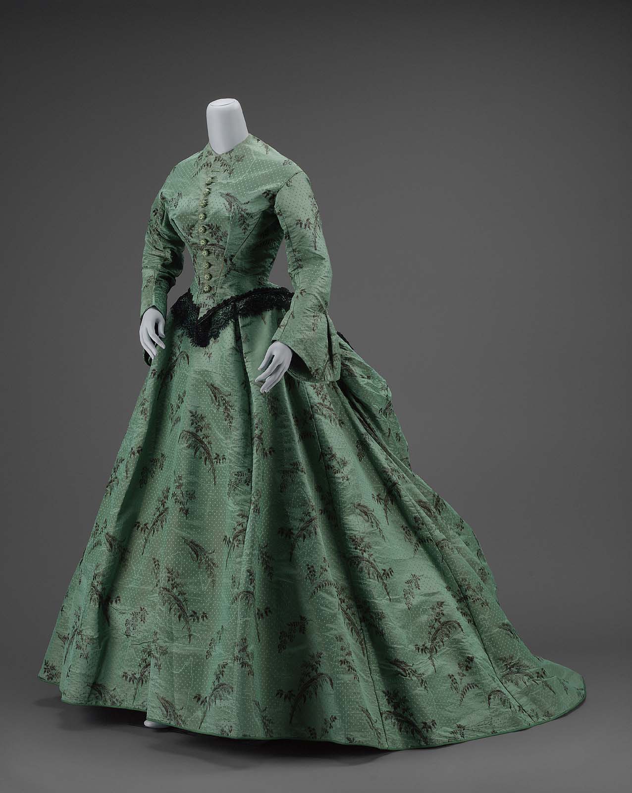
The fabric is apparently a warp-printed moire silk taffeta, and the dress is a perfect example of the transition from the full crinoline silhouette, to the back-emphasis bustle silhouette.

Transitional styles are quite interesting: they can either be incredibly successful, combining elements of the more classic periods to create something unusual and unexpected, or they can be an awkward melding of disparate aesthetics.
How do you feel about this transitional gown?
Rate the Dress on a Scale of 1 to 10
I love the colour of the dress and its lines. The only thing I am not happy about is the neckline as I generally do not like them plain to the throat (pardon me while I gasp a bit from the feeling of being garrotted). Now, my rating: neckline aside, 9/10
Julia: 1860s dresses of this type were generally worn with detachable little collars, shaped like modern “Peter Pan” collars. These were often trimmed with lace and were, I believe, usually white.
I just don’t like anything close to the throat, including peter pans! Now, if this were a V-neck opening up into a standing collar with lace — THAT I could get into. 😉
As one who loves most shades of green and a close-to-natural silhouette, my main impression is favorable.
However, I do not like whatever it is that trims the hem of the bodice (fur? wadded tulle?). It’s both messy and jarring.
8 of 10
It’s lace.
I don’t know why, but this almost feels like 1940s does 1860s to me.
I quite like it.
8/10
(Incidentally, just yesterday, my sister looked at a reproduction of one of those “ladies in a garden” Monet paintings and said “1860s! Yes, it is. I look at their dresses and think 1860s, and lo and behold, it is.”)
I don’t like the lace around the hips, not in the front. And I am not sure if the museum put the right skirt support under that dress because the back looks droopy and sad as if its folds were not meant to drop like this. But the fabric is nice, the cut is nice and the back would look pretty good is there was more support. 8/10.
I think the fabric is glorious – those sprays of printed flowers! I’d wear that now. However, I agree with Rose that the back of the skirt seems a little awkward. I’m not sure whether it lacks the correct support (the museum’s error) or the original cut was at fault. With that in mind, 8/10.
the museum describes the trim as Bobbin Lace. Personally, I don’t think it works – perhaps it is too big?
also the hem is described as being longer in the back, so perhaps that is on purpose?
I do like the flatter panel in the front, skims the tummy…..
never understood the idea of making the bottom bigger than necessary – just imagine asking ‘does my bum look big in this?’
otherwise, considering the era – very nice dress. could use a bit of contrast at the neckline – maybe a removeable collar of the same lace as the trim?
8/10
Sally
I’m going with 8/10…I rather like the soft draping at the back…is that the ‘transitional’ element?… but the high tight neckline makes me claustrophobic. I like the lace in the front and in the back, but wonder about the lace on the side…it almost looks like a black lace hanky tucked in somehow? Is there a historical reference that I’m not getting there?
I believe that the “lace” on the side that is bothering you, may be the shadow of the sleeve.
I love the color, the fabric, the bodice, the skirt and the lace. My only objection, as others have said, is the neck, way too snug for me. 9/10
Well its interesting except for the odd trim on such a severe dress. I like the color. 7/10, and the museum should have added a little removeable crocheted collar because I have the oddest feeling the owner wore something like that on it.
I have a picture of my Great-great-grandmother wearing a dress like this – but with the addition of some of her beautiful Maltese lace at the collar ( I have the lace, lucky me.) Also – she obviously had tie tapes inside the back of the skirt, to give it some shape. I have a pattern for a very similar style, and the tapes are shown – how long and where to sew them, and where to tie them. The purpose of the tapes was so that the clumsy bulky underpinning of bustles etc could be to some extent dispensed with, while still maintaining the overall fashion look, when moving about outdoors – the tapes were often loosened once back inside. (Hygiene was starting to be noticed – you didn’t really want your lovely frock to be a street sweeper and bring all the rubbish inside with you.)
I like this dress, although the colour is a bit dank looking. I see the museum is still chronologically confused, using “ikat” to describe the fabric weave. Someone tell them about Jacquard weaving please. I give it an 8.5 for look, but the Museum only gets a 5 for display – they could have done better.
The ikat refers to the fabric that the floral pattern is a chine a la branche – a warp printed silk. Nothing to do with jacquard weaving at all (unless that’s how the dots were achieved, but that still isn’t what the museum was talking about).
They are still confused though, because technically speaking the fabric is warp printed (a chine), not yarn dyed (an ikat).
You may find this post interesting: https://thedreamstress.com/2013/07/terminology-what-are-ikat-abr-and-chine/
Is it just me, or does that fern/flower/whatever on the bosom resemble a leaping fish?? Once I saw that, I had to find the rest of the school, here and there on the skirt. But floral fishy ferns aside, I do like most things this dress offers. The bluish-green color is beautiful and not over-used – Scarlett O’Hara would grab this in a minute, for trips to town or afternoon calls in early spring. I agree that it probably was worn with a lace or solid white linen collar originally- don’t think black collars were generally the thing during this time period.
As for the heavy black lace trim, it looks to me as if it is placed about a third to a half an inch too low in front – or perhaps it’s just too long to look quite right. The back looks better, and since this era’s dresses were designed to draw the eye to the rear, that heavy trim which looks awkward to modern eyes probably was quite trendy in its day.
So I think I’ll give this one n 8..5, mainly because of those fish. When judging these dresses, I’m never sure whether to view them through modern eyes and with modern tastes, or whether it would be better to put on my vintage fashion glasses. This time, I think I averaged the two…
I’m… green with envy over here. I happen to love any shade of emerald, but I’m not sure about this dress. It’s nice but it doesn’t “wow” me. It’s perfectly plain but the black lace is too dark. In the back it adds interest, however in the front it’s just too much. The shape of the dress is fine, marvelous even, and the fabric has a nice sheen to it but I don’t like those dots. At all. It looks like a reptile. 7/10
By the way, I think an accurate Medieval outfit would round out your portfolio quite nicely. There are too many costumey McCalls patterns floating around.
I love the cut of the bodice (including the self-covered buttons) and skirt, and I don’t mind the shade of green. But I don’t like the trim on the peplum (is that ball fringe? Lace? I can’t tell), or the print. 6.5.
I like the cut, I’m always in favour of having more fabric in the back than in the front. I think the fabric is beautiful. Still there are some things that irk me me, I also don’t like the tight collar, or the lace around the bottom of the bodice, or the cuffs. I would say a solid 7/10 in total.
I have some trouble with this dress: I don’t like the fabric (sooo curtain-like!!!) also neither any special decoration nor dainty look. I can only imagine a spinster or a matron in this dress, hiding form public in the darkest corner of the salon while all the blushing young misses chit-chat with the gents in their elaborate dresses… 4/10
I like this dress a lot. I think it does take the nice things from each era. But I agree with what has been said, the lace at the waistline is a bit too much and it seems like something is missing from the neckline. But I like the color and the fabric and the shape. Yes, the shape is my favorite part. I would wear it, so 9/10.
I love it! I just wish the lace trim around the waist was echoed elsewhere. Maybe there was a detachable collar with the same lace?
9.5/10
I love the dress. I’d wear it, if I didn’t have anything to do except walk around.
I like the fabric and color, but the proportions just seem off to me (maybe it’s the way it’s displayed, I don’t know). I also feel as though the sleeve and back peplum feel too chunky and heavy. 4/10
Yes, yes, yes. I’m not too sure about the pattern and I wish the neckline had something to adorn it, because I can’t bear this lovely dress getting so many negative comments on account of the plain neck. However, I would happily wear this. I like how fitted and flowing the bodice is and the shape of the skirt is charming.
I would give this a 9/10.
Lovely dress. I rather adore the fabric and the colour, very unusual colour and pattern as well. Very elegant and somehow understated, I don’t know why it feels that way to me.
The bodice is beautiful, I especially like the darts, and I also think the crinoline/fledgling back bustle is beautiful. The whole thing says murmurs “dignified matron” to me, especially on account of the neckline. Very, very severe.
The only thing I’m not entirely happy with is the hip-hugging lace fringe. I don’t think it is perfect, but without it the dress might look boring.
So 9/10 from me.
I’d like to imagine the dress was worn twenty years earlier by the same girl who wore the lovely ethereal white dress we got to rate a couple of weeks back.
I think these transitional dresses are fascinating! This is particularly striking to me as it was clearly made for a long-waisted woman, and most of the dresses we see have quite short waists. The elongated basque is also quite striking with the lace peplum frill.
It does need a collar and some kind of undersleeve, and I feel that there is black lace missing from the sleeves too. I love the lightness of the fabric print and the peplum treatment at the back is fascinating but quite isolated – bet there used to be a matching pelerine/cape worn with this dress which is why the upper part looks a bit incomplete. I also get the feeling that this was originally a pure crinoline dress with the back rearranged/redraped to update it a bit. Rating? 6.5/10 as it doesn’t look complete, and there’s a certain imbalance there, much as I lke it.
interesting print, fantastic colour! I want one now!
10/10
Transitional styles can definitely look a bit odd, but I think this one nails it. It’s done a good job of bridging two very different aesthetics, and it must have been quite innovative when it was made. 10/10