
Last week’s Rate the Dress was an 1830s dress in red, and while it got a few mark downs simply for being from the 1830s (sigh) most of you thought the combination of the colour and trim was fabulous, so while a few very low scores dragged it down, it still managed an 8.3 out of 10.
It’s been quite a while since I’ve done any children’s wear, and while that’s always a slightly risky proposition, ideals of how we dress and present children having changed a great deal over the centuries, I’m feeling daring this week. Maybe last week’s red dress has rubbed off on me.
This mid 1880s ensemble for a young girl features a blue and white brocaded silk paired with a teal green taffeta, blithely ignoring the old saying about never pairing blue and green in dress. The cut of the dress takes into account the young wearer: the simple silhouette would allow more ease of movement than one with a fitted waist, and would allow longer wear for a growing girl. The details, however, are entirely in line with standard fashions of the time: one could easily imagine an adult version of this dress, with a fitted waist, the double row of buttons framing an ever-so-tight bodice, and the long skirt basques cascading over a full bustle.
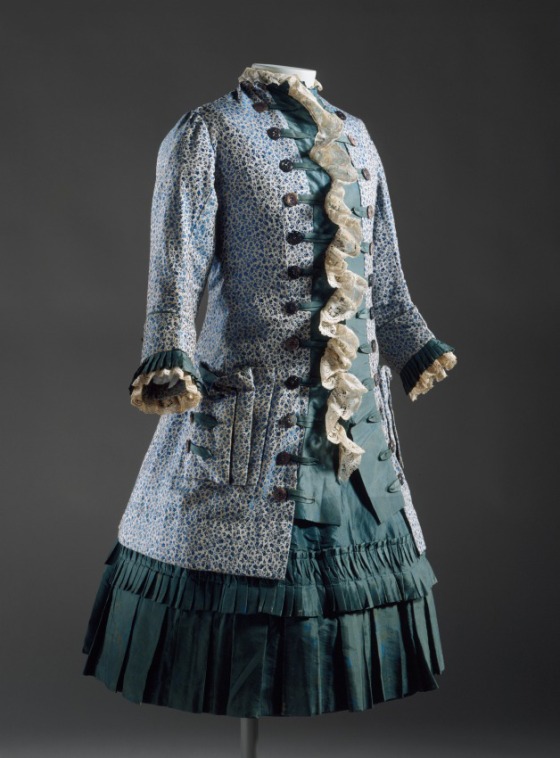
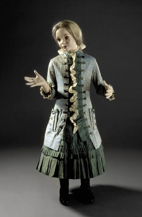
In addition to the standard view, LACMA has also styled it on a girl mannequin, though I must say that personally I don’t think it’s quite doing it justice. She looks just a little short and small for the dress: like a little girl trying on her older sisters outfit. There is something about the cut of the dress that makes me think of a girl just hitting the stage where she really stretches out, and gets quite tall and lanky for her width.
What do you think? Does the pairing of blue and green work in this case? And does the outfit do enough to take into account its young wearer (keeping in mind, of course, that this is clearly a formal outfit)?
Rate the Dress on a Scale of 1 to 10
I think this is just beautiful. If the blue color were deeper, the combination with the green fabric would probably be less pleasant, but there'[s enough contrast.
The pleating and the buttons seem to me quite tastefully done, and the cascade of white trim is not excessive.
I particularly appreciate the pockets, since they do appear quite useful, particularly for someone young.
10/10
Blue and green? I think the colors work well enough together in this dress. I’m no fan of small prints, so I have trouble with the blue print fabric used for the body of the dress on that score.
I like the overall styling. It reminds me, very strongly, of men’s coats from the 18th century. I guess it’s the combination of the lace ruffle, the button trim down the front, and the pocket details.
Nonetheless, I find I don’t really like this dress all that much. It’s not the formality of the outfit (formal dress can look very beautiful on children: I had a black velvet formal dress as a child that I really loved), or the way it fits the mannequin. I guess it’s because the blue and green have faded enough to look … drab together, though the lighting in the bottom picture moderates this effect somewhat.
I’m not sure how to rate this. 6.5 seems too harsh, and 7 too generous–I’ve rated dresses at 7 that I liked far better than this one. And I don’t want to make you deal with 6.75….
All right, I’ll be generous; 7 out of 10.
I absolutely love this. The colors are richly muted, the lace down the centre is a beautiful masculine touch, adding just a hint of a cravat, those amazing triple pockets – perfect for a schoolgirl with her pencils in one and her bonbons in another.
I totally agree that it looks terrible on the mannequin, but I’m going to blame that on the museum, not the dress. It looks to me a little more early teens (12-14, maybe?) than young child in proportion and cut, partially because of how much it’s taking her hips into consideration and that slight slight swelling at the bust.
10/10 – I want it now.
Oh, this ones charming and entirely lovely. You can see a young miss starting to inch towards her longer skirts and coming out with some of these richer colours. I do really find it delightful. 9/10.
It’s a very beautiful dress, though I’m not sure how I feel about the lace at the front, and by 19th century standards it even looks quite practical. I agree the mannequin is maybe not ideal, but that’s not the dress’s fault. 9/10
I love it, it hints at adulthood to come but is restrained enough to still be practical for an active girl
9.5/10
Oooh, my immediate thought was of Cherubino from The Marriage of Figaro. Gorgeous. Putting aside the politics of children’s clothing and taking it in the historical context, so much to love. The frock coat, the lace reference to the jabot, the brocade, it’s yum. I like the colours together and always love a textures mash up anyway.
9/10.
sewcharacteristicallyyou.comAs it appears in the pictures, I have no hesitation about the colors. They don’t clash to me, but harmonize nicely. I agree with Catherine Raymond, that it does appear to pull some historicism (no idea if that is a real word) into the outfit with the bodice. It really does remind me of gentlemen’s coats from the Georgian period. I don’t think the museum did anything for this dress in the way they presented it, but all the same, the top section does seem out of proportion with the skirt basically only peeking out the bottom. The loose fit, the 3/4 length sleeves, and the shorter skirt all combine to be a relatively practical outfit considering the time period. 7/10 for the odd proportions.
Sarah
http://www.sewcharacteristicallyyou.com/blog
Got to give this a 10 out of 10. This is just simply lovely. I don’t normally like small prints but… since this is for a small person the small print works well. I can see myself making something like this for my little girl if I lived at that time. Its truly sweet and I just love it. This was a great pick! The blue and green together is wonderful, it reminds me of spring. I can actually imagine some precious little girl running around in this in the spring when its not hot and not cold but that jacket would be just right for the spring. OH I’M in LoVE with this! Thanks so much for this one.
I’ve never heard that saying about wearing green and blue together. How interesting.
I think it’s an adorable dress with nice details, but I’m not wowed by it or anything. 7/10
‘Blue and green should never be seen
Unless there’s a colour inbetween’
was the rhyme that we used as a skippy-rope chant in the 1960s.
Awfully pretty. Sort of outfit you’d wear for a day at the seaside.
..sea shells she-sells by the sheshide.
The sprigged print is quite Liberty of London.
7/10
If you look up the costuming of Bru dolls they are very similar to this very often.
I love everything about it except the white ruffle thing down the front which I find rather distracting. Otherwise, it’s lovely. I don’t think the mannequin does it justice so I prefer the first picture. 9.5/10
So blue and green should never be used together? Has anyone tried asking a peacock? It does sound rather like one of those rather arbitrary rules the Victorians were so fond of inventing. As for the dress, I think it’s charming and, despite obviously being formal, easily wearable by an active child. At first sight I wasn’t sure about the small print but it grew on me very quickly. It balances the dense green of the skirt very nicely. The only thing I’m not sure about is the ruffle down the front. It looks like an afterthought and doesn’t add anything to the whole. 9/10
I love this – the ruffle is clearly a reference to a 18th century cravat or jabot in accord with the coat-and-waistcoat styling. It’s well proportioned and not overdone or ridiculous, and looks easy to wear and comfortable by the standards of the time. 10/10.
Super cute! Wish I had a girl I could dress up in something like this! 8/10
The cut is darling, I love the neat rows of buttons, and I agree that it’s just the thing for girl in the “awkwardly in-between, stretching out” stage. (Though that mannequin–Eeegahhh! Ok, I’m better now. Wait, no, she’s looking at me…) But I’m in the minority–that print is a little too ditsy and twee for my taste, and I think it would have been a sweeter ensemble in two solids, even (gasp) blue. I’m not fond of the lace ruffle, but I can see how its addition would keep a young girl from looking too regimented in the tailored outfit–a little dose of softness. I’d ditch it, but perhaps the girl who wore it liked it.
8/10
I really like this dress. The colors really work and I like the girl’s version of this style. I think the only thing that is throwing me off a bit is the center front ruffle that goes all the way down through the buttons. Perhaps if it stopped at the chest I would like that part better. 9/10
I LOVE it! I agree that the mannequin isn’t quite right, but the dress itself is adorable. I like seeing children’s clothing that is more streamlined and less “cover this girl-child in floof and ribbons.” I like the pleats on the dress, and the single long ruffle. And it has pockets! Cargo-ish pockets! It seems so functional. I actually think the colour combination makes it look somewhat less like an “ensemble,” but I like it; it looks less fussy than it would if they were coordinated perfectly. I think it looks more like a little girl went to her closet and picked a dress she likes and a coat she likes.
10/10
I love everything about this dress. I like how clean-lined and un-fussy everything is, while still layered with pretty details. This seems like an eminently practical dress for the age of the wearer (which I agree, is likely older than the mannequin, or at least significantly taller) and those pockets! *swoon* 10/10
I love this. 1880’s is a fav of mine. I give this a 10/10.
I do need to push thoughts of, ” how could they restrict the poor children in something like this” but this was how it was. And I do take into account this looks like a fancy dress of the time, so I hope the girl did not need to wear it as a regular everyday garment.
All that aside, this is great.
That skewed mannequin makes this look like something from a Doctor Who episode. Looking beyond that, I have no issues with the colour combo and especially like the skirt pleating details. 10/10
I love it. Never heard the blue and green rule, and certainly the colors harmonize very nicely here. Cool green is also a flattering hue if you have a delicate complexion prone to redness, so it may be good for a young girl getting into puberty. The small print keeps it from being too severe for a child, while the clean simple cut keeps the print from getting too busy. I love the 18th century coat inspiration, the button trim, the self-fabric pleated trim, and the big practical pockets. The 3/4 length sleeves would help keep those cuff frills from being soiled. It manages to look both stylish and practical (for the era), despite the jabot-like lace frill (sure to get in trouble if any eating was to occur in this outfit!). A 10/10.
I love it! I want to make it! 10/10!
The sky is blue and trees are green… yet no one ever accused God of being bad at color martching! While some shades of blue and gree are not ideal together, many harmonize nicely. After all, in additive color theory, green already has blue in it (blue+yellow)! Yet the idea of them looking bad together has history. From Louisa May Alcott’s An Old Fashioned Girl:
“It ‘s fearfully and wonderfully made, but distractingly becoming, as you shall see. Trix thinks I ‘m going to wear blue, so she has got a green one, and told Belle it would spoil the effect of mine, as we are much together, of course. Was n’t that sweet of her? Belle came and told me in, time, and I just got pink, so my amiable sister, that is to be, won’t succeed in her pretty little plot.”
“I guess she has been reading the life of Josephine. You know she made a pretty lady, of whom she was jealous, sit beside her on a green sofa, which set off her own white dress and spoilt the blue one of her guest,” answered Polly, busy with the flowers.
I wonder if the blue/green thing works differently by candle light or gas light?
Undoubtedly – one of the appeals of aniline blue dyes was that they didn’t look green under certain lights unlike normal blue dyes.
Thank you, I was hoping you’d have an answer like that!
nationaltrustcollections.org.ukSpeaking of green – here’s another gorgeous child’s dress from the same period, but the photographs are SHOCKING – it looks khaki in the photos, but in person it is a lovely grassy green. The daisy embroidery is also sublime. I’ve seen it displayed a few times and it’s just such an enchanting dress in person.
http://www.nationaltrustcollections.org.uk/object/1362523
OOoh, I can see how that definitely has potential! So sad when photos are so horrible. You’d never know that was a grass green! It took me a moment to realise I was seeing the back view first, and then the front.
10/10