
Last week’s Rate the Dress was a 1900s number with a hint of green velvet, and you definitely liked it! The pigeon breast lost a few points, but the overall reception was very, very good.
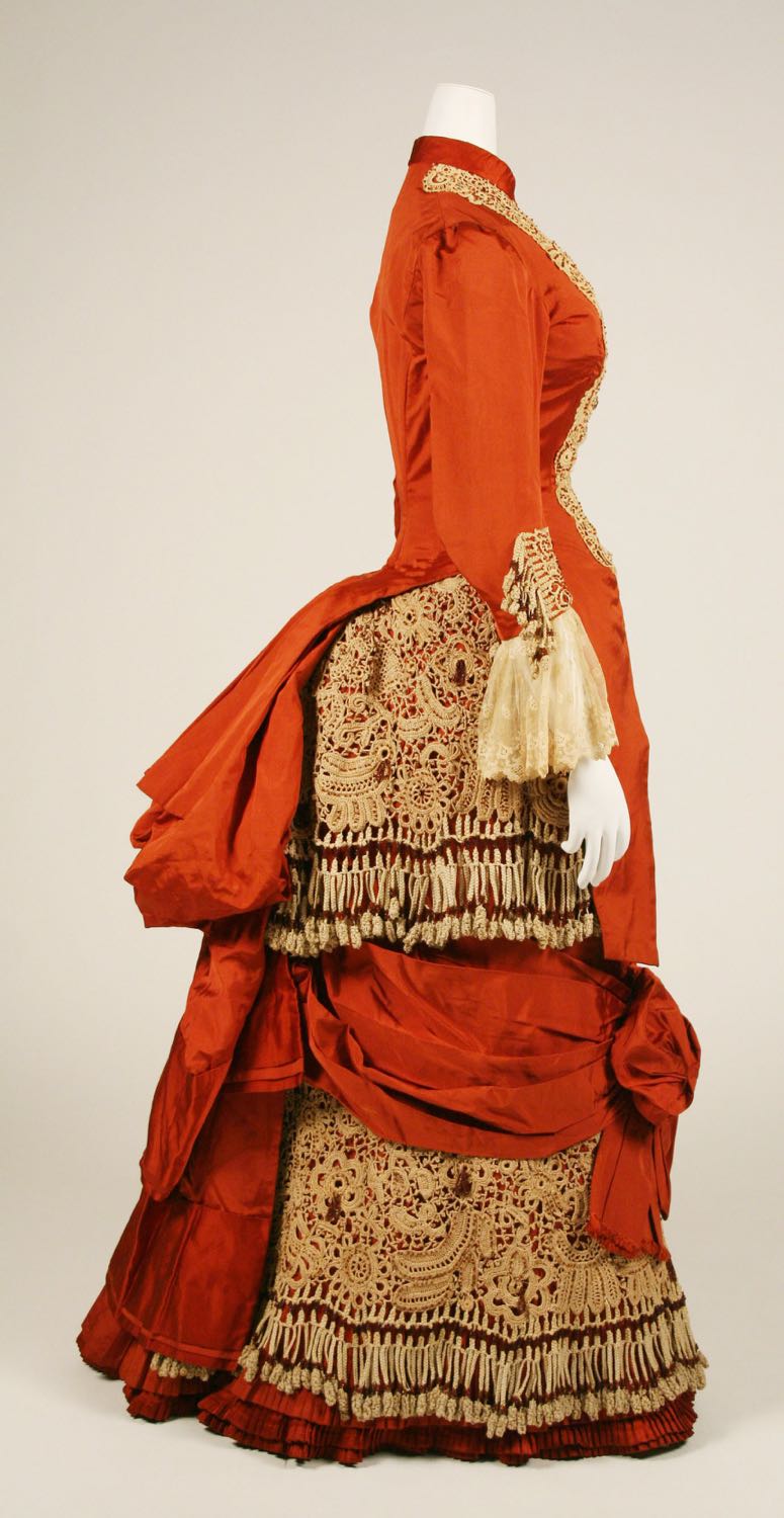
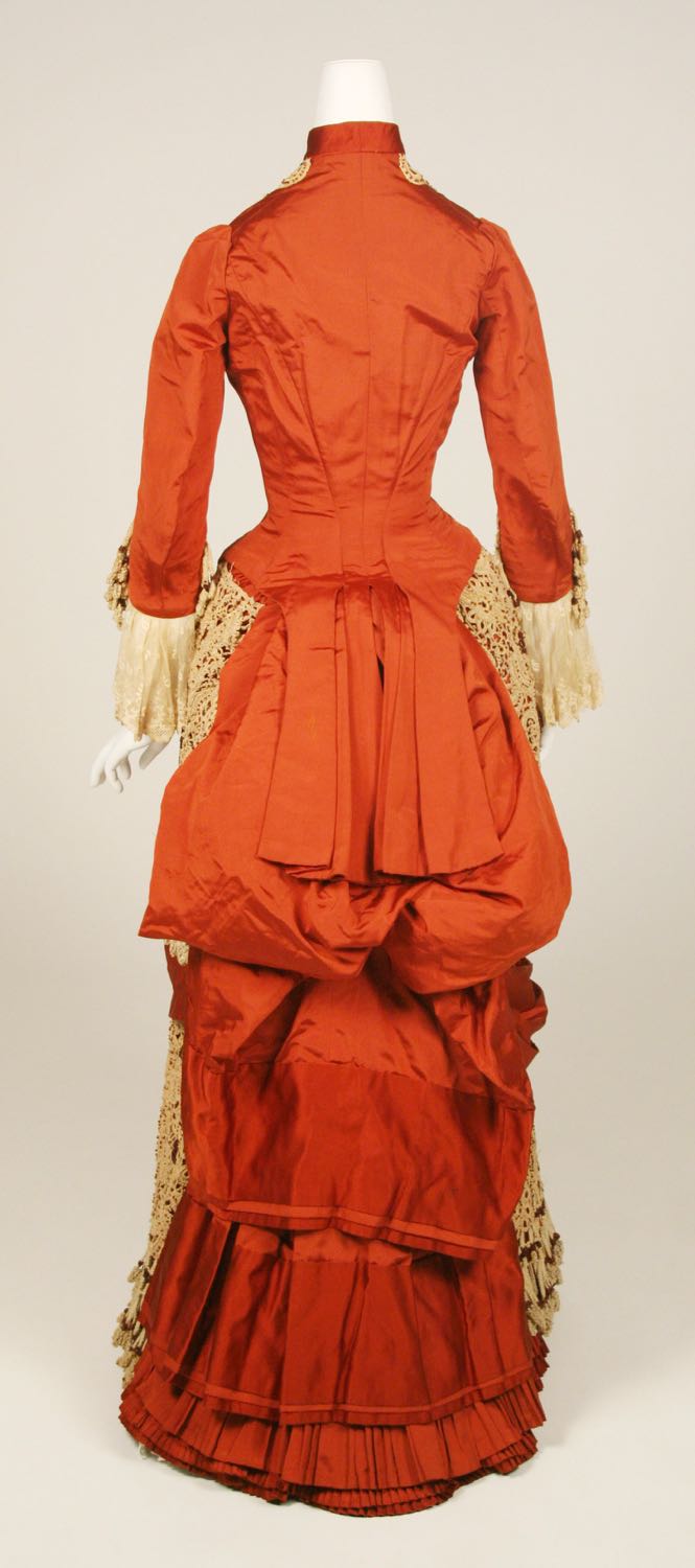
This week we’re going red, with a ca. 1880 dress that combines unusual lace, unusual tasselled fringe, and an unusual bow effect to the front skirt.

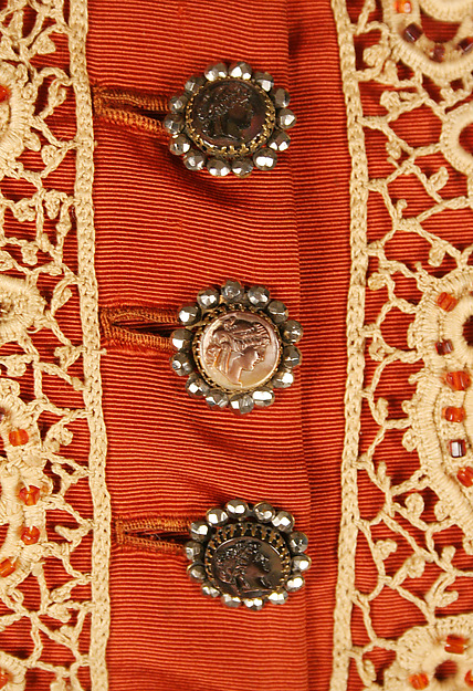
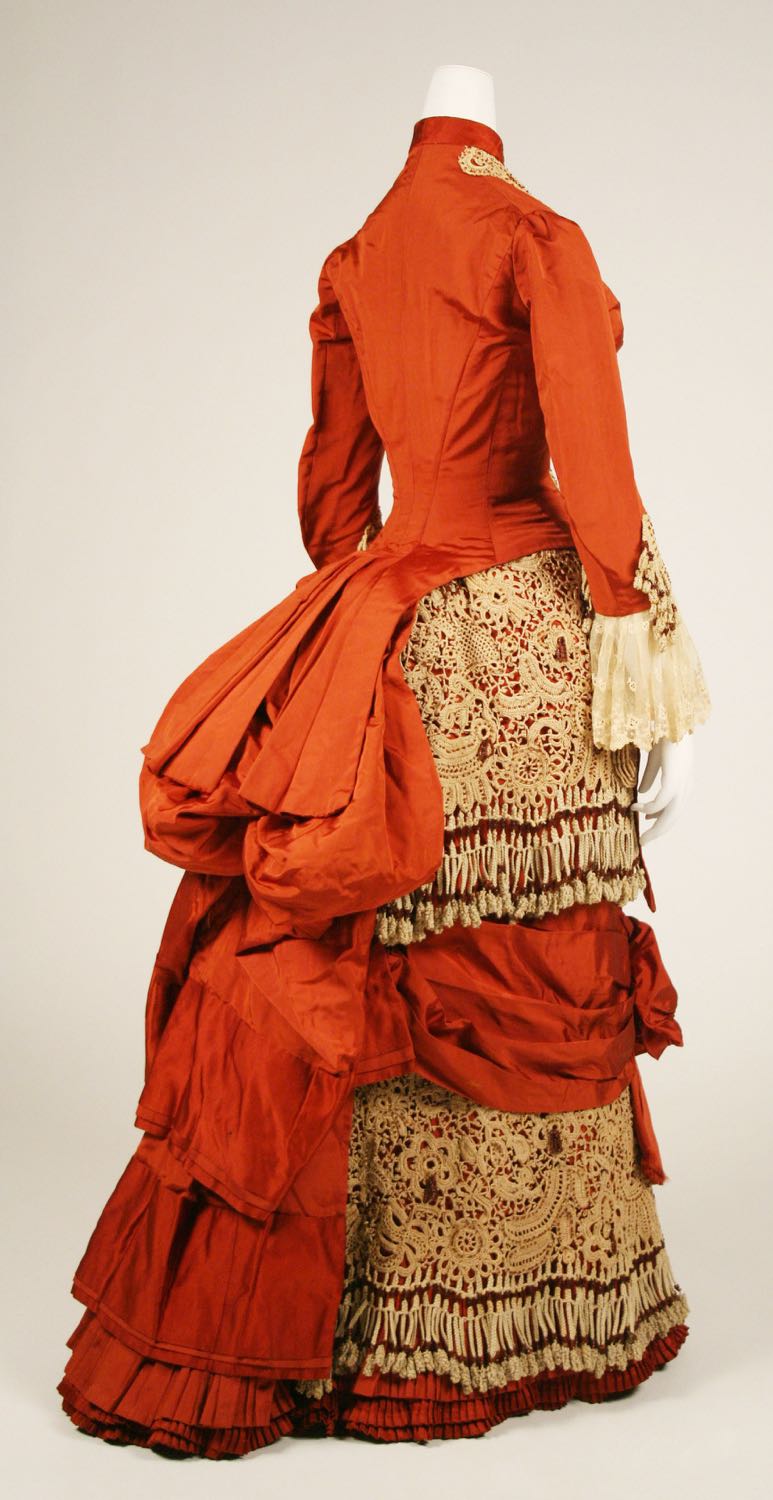
Dress, ca. 1880, American, silk, cotton, glass, Metropolitan Museum of Art, 1982.219.2a, b
Dress, ca. 1880, American, silk, cotton, glass, Metropolitan Museum of Art, 1982.219.2a, b
Dress, ca. 1880, American, silk, cotton, glass, Metropolitan Museum of Art, 1982.219.2a, b

Dress, ca. 1880, American, silk, cotton, glass, Metropolitan Museum of Art, 1982.219.2a, b
Dress, ca. 1880, American, silk, cotton, glass, Metropolitan Museum of Art, 1982.219.2a, b
You liked a lace skirt last week. Will this one get the same enthusiastic approval?
Rate the dress on a Scale of 1 to 10
I like the color scheme of this one! It’s hard to go wrong with red and gold. And I like the buttons! And the high collar.
The rest… not so much.
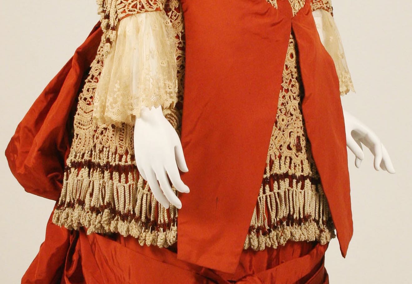
There are too many odd, asymmetrical details about it. The large, off-center bow at mid-thigh. The fact that the lace trim was only applied to the *front* of the cuffs. And the lace itself is very strange, with that long fringe ending in pellet-like objects. From a little distance, the effect of the lace is that someone decorated the dress by gluing lots of pieces of uncooked macaroni to it.
So my rating is a 5.5.
I’m having a hard time finding a positive approach to this dress.
I actively dislike the fringe (not the idea of fringe, but the scale seems way off) and that bow, which would make the women wearing it look like a mere gift-wrapped object.
The jewelled(?) ornamentation on the bodice lace strikes me as design excess (come to think of it, almost everything about this garment strikes me as design excess).
I like the color of the fabric, but not the texture.
Sorry, dress, but only 5 of 10
I straight up LOVE this dress! The 1880s are one of my secret vices. Everything is so columnar and tiered, yet that Victorian aesthetic of more is more has to override everything.
I think if there had been more than the 2 textures, this would have lost me. But at the “simple” 2 fabrics and the marvelous fabric manipulation, I give this a 10/10. I checked to see if there was anything it could do to be better, and the only thing would be to not have the bustle so crumpled.
10/10
I am not a fan of this dress, saying it mildly. The lace on the bodice does not even meet! It is all askew. Possibly the presenter did a bad job; but …… just, no 2/10
It looks like 70s macrame plant-holder fringing on the skirt!
The engageantes on the sleeve are lousy. Sorry, but they ARE. They look horrible on this dress, and make the woman look like she has freakishly long bony wrists because of their length and where they terminate at the top of the hand – you “see” the wrist where the solid sleeve ends, then there’s the deep sheer engageante and then the hand. Not attractive at all.
I like the colours.
Why don’t the buttons continue all the way down the bodice front? Why is the lace all a bit wibbly wobbly and not quite symmetrical, yet not off enough to make an assymetrical statement? Why are the layers in the back slightly skew-whiff too? Obviously some of that is because the dress is not properly mounted, and is on a mannequin that is slightly too small, so that the sleeves and bust are collapsing in slightly, it may look better on a correctly padded mannequin, but I’m not sure all the wibbly wobbliness is due to just that.
Oh God, are those random little tufty rust tassels randomly speckled on the skirt lace? WHY?
The bodice itself is beautifully cut and I like the tails on the back. The red silk is lovely fabric and well chosen for the design, and I even kind of like the silly big bow, although I’m not entirely convinced. The lace could even work too, in principle, but all those tufty tassels need to be plucked out, and the draping and edges need to be more resolved The tasselly fringe doesn’t do it for me at all – it looks like the bodice should be replaced with a big aspidistra shoved in the top of the skirt and the whole shebang suspended from a hook in the corner of your shag pad, opposite your hanging basket chair.
This dress should work. There’s a lot that works, but at the same time, there’s a lot of unresolved or indeterminate finishing which just makes the beading and tasselling on the lace look really silly, it’s like the dressmaker just wanted to run amok with the fun sparkly fluffy stuff before having actually finished neatening up the basis, like a child in art class being really impatient to get at the glitter. And that makes the end result look like something that could have been REALLY nice, but because the maker got impatient and started rushing the basic work, the end result seems lacking.
6/10. It’s not all bad, but there’s a lot wrong with it.
UGH, it’s like someone shot at the dress and the rust tassels are suggesting little squirts of blood coming out of the bullet holes. Yuk!
Cannot unsee. Rating just dropped. 4/10.
Daniel: Thanks for mentioning the semi-sheer engageants; I agree with everything you said about them, and almost mentioned them in my post. Didn’t notice the strange little rust-colored tassels on the skirt lace; they certainly don’t improve matters either. I’ll stand by my rating, though.
I think the model has incredibly long arms, the sleeves seem quite in proportion.
I think some of the “wibbly wobbly” is because the lace is Irish crochet lace, which can be made to be symmetrical and matching but wasn’t necessarily. The darker fabric behind it doesn’t help; when it’s a tone-on-tone like so many of the garments that used Irish crochet lace were, the effect can be much more pleasing and have a natural “field of wildflowers” kind of feeling.
Yes, this is definitely Irish crochet lace which is made by making motifs, then joining then up with netting in a pleasing pattern (frequently not symmetrical on purpose). Not bobbin lace as someone else suggested earlier.
I don’t think Nina actually thought it was bobbin lace, just that the way the fringe hangs looks like hanging bobbins 🙂
Just reading the other comments now after posting – you nailed it, this is hanging flower basket! I can’t un-see that now.
Although I find the dress completely over the top with tassels and lace and bows, i really like it. I imagine it would be so fun to wear this and all those tassels move when you walk… For me this is one of those “wow, this is a lot of everything. It’s even kind of weird if you stare at it for a bit too long… but I really like it”-dresses – so it gets a 10/10 !
I love the colour and overall silhouette but hate the tasselled lace. It makes it look like she was in a hurry to wear it and left all the bobbins on to finish it later. 5/10
On the other hand, I’ve just realised that this dress references the featherwork in the last post very nicely colour-wise.
Daniel beat me to it – I was going to say that it was interesting down to the waist but then it turned into a 70s macrame lampshade.
6 out of 10.
Oh my, I have not words for how much I love, love, love this dress! Not a color that looks good on me, unfortunately. I wonder if I could make it in blue? Cannibalise a crocheted tablecloth?
I have no complaints, see no negatives. Is it over the top? Yes, just enough! Solid 10.
First, for some reason my computer presents the colors as rust and cream, not red and gold. That said, I do like the color and texture of the fabric. I do like the top half the dress, the lace in bodice, the buttons and the selves with lace cuffs. But, the skirt with it’s layers and bow, and tassels are too much. Confusing and discordant. So, 4/10, the lace and bead work are lovely but ill used.
I have no idea why this double posted…apologies.
I find this dress a bit visually confusing. I just dont know where to look. And now someone mentioned it, its hard to get the 1970s macrame out of my head…Way too much going on and it’s unbalanced. The bow in the front looks like a big mess, like the fabric was hiked up and scrunched into a bow to show off the tassels.
I would like to see this dress with one layer of the lace, no tassels and no bow in the front. That might take my rating from a 4/10 to a 7 or 8/10.
Well, some people here may wonder at my taste but I don’t care, I LOVE this dress!! It’s actually been a favourite of mine for a few years now. I have dreams of reproducing it. I do also see it more as rust and cream/ivory and I love the colours in addition everything that makes this over-the-top. Big 10/10 from me.
Me too! I’d wear this like a shot, in the existing colours. I’m sure the simple top and elaborate skirt would work in movement – the tassels particularly.
I’m another who didn’t get in as quick as Daniel – the skirt looks like it should be gutted and hung in a bathroom with a spider plant in it.
As for the asymmetry of the lace on the bodice, it looks to me as if the original wearer may have been a bit wobbly herself. Looking at where the waist sits, it looks to me that it’s higher on the left (as we see it) than on the right. Maybe, when on a real person with scoliosis it would look quite symmetrical.
Not the best example of 1880’s for me – there’s just too much going on. It gets an extra point for the awesomeness of the colour and the rest is for the bodice alone (sans lacey on the sleeves): 5/10.
When I see this dress, I imagine a young wife of the merchant class, over doing it a bit when dressing to impress as a hostess. I love the big bow on the front. 7/10
It was a fascinating trend that fringe era. I also enjoy the a-symetry. I can’t imagine how difficult it would have been to launder. 10/10
6. The workmanship is fantastic, but it looks like something Scarlett. O’Hara would have ordered. Just too much.
I’m fascinated by all the different comments! There are problems but I believe it is mostly because it’s so ill-fitting on the mannequin. The macrame fringe looks to me as if it was added after seeing it in a ladies magazine and the wearer said Oh let’s do that on this dress. The color is great though I’d like to see it in person as on my screen it looks tomato soup red. Also because we have so few examples to study it is difficult to know if this was a one off or a regional trend or something many people were wearing. Other than the macrame fringe I think it’s lovely. 7/10
I liked the bodice. Then I scrolled down.
What is going on? The skirt looks like those ridiculously elaborate curtain arrangements one sees in fancy hotels. A shame, for the color scheme is very nice.
All in all, 4/10.
I also liked the bodice, then scrolled down — and I’m still laughing at that skirt! I know this ticks lots of boxes for its era — and it’s a lovely colour — but it’s such a fright of a frock that I feel strangely compelled to like it. Even though it looks like it weighs a ton and would be hard work to walk in, even though it looks like Scarlett wasn’t content with just the curtains this time and had her way with the lampshades and the crocheted tablecloths as well, even though those sleeves are an absurd length, I’m still liking it. And if you’re going to have a massive bow on your right knee then this is clearly the one to have. I always find it hard not to see heavily draped and bustled dresses through modern eyes — as rather comic, unwieldy and absurd — but this one does amuse me so it’s an ‘against my better judgement’ 8.
The other comments seem to be saying they like the torso, but not the skirt and they like the colors – for me it’s the opposite. There’s too much contrast between the two colors for the design, and while I don’t particularly like the lace fringe, I applaud the seamstress for going for it, even if it didn’t work. And that torso….on its own it’s fine, if messily constructed, but the simple shape and lack of much patterning makes it completely terrible for the skirt. It’s almost like the dressmaker had some left over fabric after finishing the skirt and made a top from it, but not meant to go with the skirt.
Even if the engageantes were from the same fringe on the skirt, it might help. I like the fabric on them, but it doesn’t go with *anything* else on this dress. I agree with Daniel, that they should have been either raised or lowered – I would say raised so the solid ends at the elbow, but that’s personal preference. And the lace on the collar and cuffs doesn’t go all the way around, and ends before the cloth does with no ribbon or anything to bring it to a satisfying end at the waist… It just sort of stops. the whole torso looks rather cheaply made, masquerading as an expensive garment to me.
The first thing that stood out to me was the way the top hangs down, obstructing our view of the lace. Show it off! I want to see more of it! The smooth, geometric shape of the tails also doesn’t work with the draping of the skirt. It doesn’t match the other orange draping, or make a statement by going against the lace. It’s also too wide – at first I didn’t see the edges and thought it went all the way around. The edge of the bustle on the back is bothering me too – it doesn’t tuck under or fall gracefully, it just stops and goes up and down.
Draping issues aside…the rust colored tassels are something I didn’t even notice until they were pointed out by the comments. Even then I had to look. They’re unneeded on the lace, and lost in its pattern, especially with being a color similar to hte orange the lace is covering.
But really, I just want to reach out and cut the bottom of that torso off! I like it from the side, but those tails are just driving me nuts!
I’m giving it a 6, because I like the idea of it and I really like that the dressmaker took some chances and it’s a lot- but the colors, torso, and sleeves are just a little too much. My favorites are the ones that I have mixed feelings on and I can anaylse deeply, so!
I love this general shape, and I like orange. But this all feels a little much. All that heavy lace … and the orange mandibles on the front. I don’t think the orange and the lace harmonize very well. It’s memorable, I’ll give it that, and it would be fun to see all that tasselly movement while the dress was in action, but there’s something very clunky and garish about it.
4/10
Wow. This dress has a lot going on, despite having just two basic colors. I don’t care for the fringe, it looks clunky to me. I think thinner, more widely spaced fringe, with beads at the very end, rather than the bunchy crochet, might’ve looked nicer. I really like Irish Crochet lace, and can appreciate the amount of work that went into it, but the mismatch between fineness, scale, and pattern of the lace on the bodice and on the skirt are bothering me. It also looks like the main body of the fringe is a slightly different shade of thread than the lace it is attached too. I like the idea of bead embellished Irish Crochet lace, but it seems overdone on both the bodice and the skirt, though not in the same manner. The red beaded tassels on the skirt seem to be applied in odd spots on some of the motifs, and look awkward. There seem to be too many little beads applied to the motifs on the bodice for my taste. The lace on the bodice is misaligned, which makes the whole thing look wonky. I’m wondering if it came loose, and was reattached rather haphazardly. The fringe looks odd on the sleeves. The filmy lace at the end of the sleeves looks awkward and doesn’t go with the rest of the dress. The sleeves would be cleaner and more effective without it (maybe a later addition?). I don’t care for the front extensions of the bodice, they look odd with the rest of the dress. I think the asymmetrical bow might work if there were no bodice extensions. The pleated drape of the back of the bodice over the poofy bustle, and all those layered, pleated, effects in the back are all sitting funny. The silk fabric looks really nice, and those are really neat buttons, with nicely worked buttonholes. Though the faceted beads round the buttons ought to be a different color to harmonize with everything else. There are a lot of interesting details, but they just don’t all work together. Rating 5.
I hope you continue with the lace theme, I’m really enjoying seeing the different types.
Oh! I just found the close-up photos at the museum website – now it makes sense why the thread of the fringe is a different shade. It looks like macrame’ fringe added on to the Irish crochet. Of course it would’ve been hard to find the same shade, and even if they looked really close at the time, the thread could’ve aged differently. And there is even more beading on the skirt; too much for me, but at least it ties together with that on the bodice lace.
Also, regarding the buttons – I suspected that the rest of the buttons that one would expect on the bodice might be missing. If you enlarge the front view photo at the museum’s website, you can see there are four more buttonholes below the last button. The enlarged view also confirmed that the lace on the bodice is sewn into the bottom seam, which just doesn’t look right to me.
I see it now, and that does make me feel a bit better, although I don’t think it would affect my rating much even if it had all the buttons!
I know what you mean!
OOoooh! That’s just given me an idea with how to
upcycle me mum’s crochet tablecloth!!
My goodness, this is such a Calamity Jane outfit – I love it!
9/10
I like the overall shape and the concept, but the lace reminds me of lace tablecloths and I must admit I’m having a hard time getting past that. 7/10
I tried to like it, I really did. It’s not working for me. The silhouette and proportions seem off, I like natural form but this is so… chopped up? The lace on the bodice ends abruptly at an awkward length, so do the buttons (at a different length), the front flappy bits that can’t decide whether to be a hip length cuirass bodice or waist length, the sleeve length does not work with the dress, the layer cake skirt…. it just does not work as a whole for me. I can’t decide if the bodice was supposed to be symmetrical and got distorted over time, or is poorly displayed. Even the skirt is sort of asymmetrical but no really. Maybe the lace yellowed and this was more red and white (I hope so), the current color combination is not appealing. I don’t particularly like the lace (is this Irish crochet lace? that’s usually so much more delicate in design) – it looks to me like someone cut up a bedspread and used as a cheap source of lace and too big clunky fringe. I like the fabric, that’s about it.
4/10.
There’s a certain sexual predilection (I shan’t look it up because I’m on a work computer) which involves treating people like furniture or inanimate objects. Something about this era always reminds me of that… the women look so upholstered! Look, in the drawing room– It’s a divan; it’s an ottoman… it’s our hostesss! Ironically, this fashion for staid, bound women conincided with their actual growing independence and suffrage. Perhaps sofa-fashion was a reaction against that? “I know I threaten your male-ness by voting, but I can’t bend at the waist or get into carriages without you, so it’s not so bad”? Or maybe I’m bringing too much of my modern perspective into things. At any rate, the giant bow that looks like a hobble is not my favorite.
Women of the time were encouraged to beautify their homes with handicrafts, such as crochet, macrame, tying bows on things. It’s not too much of a stretch think this dress is advertising her femininity–as so defined. “I’m a self-made woman: look at my handiwork.” The beads sewn on the bodice lace, the ornamentaion trying to make up for mediocre dressmaking skills… I could see myself making this (at an earlier point in my life) and for that reason feel softly protective of the imagined dressmaker/dresswearer. I think I understand where she’s coming from. That said, I don’t actually like much about the dress. The bodice is okay. The skirt is too much muchness. 3/10.
And lo and behold, saith the Lord to the macrame antimacassar, why lookest thou so sad and downtrodden? Has thy love forsaken thee? Rejoice instead, verily, yea, for thou shalt find two hundred metres of orangey-red silk and thou shalt meet and mate and be one dress and live happily ever after as a behemoth of a cream-and-orangey-red lace-infested monstrosity. And men shall see you and cover their heads and weep.
1/10 because the orangey-red is actually quite nice.
I just noticed that the “bobbin” fringe is decorated with little rust-colored tassels, the same ones that speckle the lace on the skirt panels and made Daniel think of oozing bullet holes. Coordinated, but strange.