
Last week I presented a black and white trompe l’oeil 1860s summer frock, to mixed reviews. The majority of you gave it very high ratings based on sheer cleverness, most of the rest thought it really good, but not quite resolved, but for a few of you, it really wasn’t doing it as a frock. However, since only a sprinkling of the raters weren’t fans, it managed a rather nice 8.3 out of 10.
I’m spending the week at the Katherine Mansfield House & Garden, helping the museum identify and organise their textile collection (so far I have looked at all the doilies. So many doilies…doyleys…d’oilies…d’oyleys…there are enough for dozens in every spelling!).
In honour of my week, today’s Rate the Dress pick is an extravagant 1900s day dress that I could imagine being worn to Mansfield’s Garden Party.

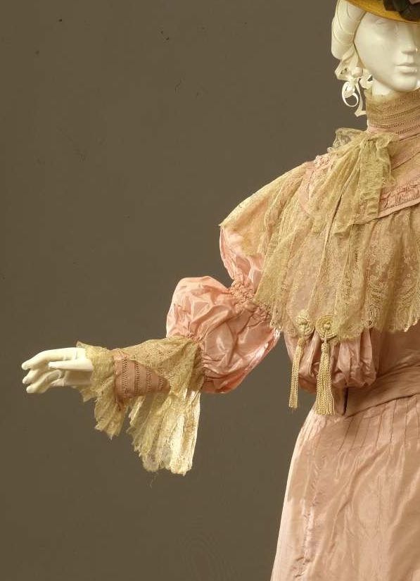
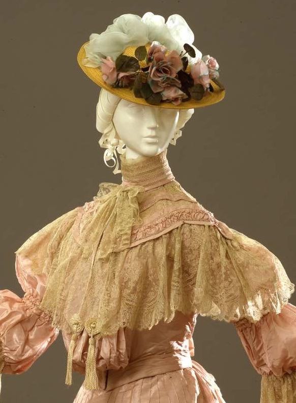
This pink ensemble is the height of turn-of-the-century exuberant frills and femininity: with lace, ruffles, flounces, and puffs from neck to hem.
Day dress, silk faille with mechanical lace, ca. 1904-1905, Sartoria Robes & Confections D. E. Carena, Firenze, 00000107, Galleria del Costume di Palazzo Pitti, via Europeana Fashion
The hat appears to be a replica, but gives an idea of the sort of frothy confection the frock would have been paired with.
What do you think? Does if make you swoon with its sweetness? Is it the epitome of elegance for its era? Would the wearer, surrounded by the scroop of her skirts, have felt the pink of perfection in her rosy attire?
Rate the Dress on a Scale of 1 to 10
This one is hard to judge because it appears that the lace has suffered much from the ravages of time. If I had been designing it, I would have omitted the bow around the neck, the tassels at the center front, and the hanging lace around the sleeve cuffs. All that said, the dress is rather charming. 7.5 of 10.
I can see past damage to the lace, but I’m having trouble with the colors – which I suspect have not aged well. If I mentally lighten the lace and darken/intensify the pink, just a little for each, I think they’d work together better. Also too ruffle and lacy for my personal taste. For somebody else to wear without the effects of aging, I think 8.5.
Even though I don’t have the gazelle-like elegance to pull this off, I covet it – it;s almost like wearing a waterfall, and it’s hard to imagine anyone wearing this clomping rather than gliding. Since the colors used are close enough in value (or at least would have bee), the sheer complexity of the trim and treatments don’t befuddle my eyesight.
9 of 10
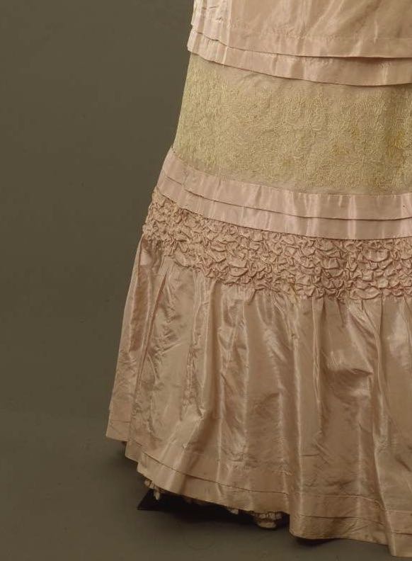
I’m going to assume that the lace has yellowed. As white and pink, I would think the colors would be decent. While pink and ecru might work in some situations, I don’t think it does here. So we’ll be kind and assume the lace has aged. I am not sure what to think of this particular era. For me it is rather too frilly and frothy. Keeping in mind that is the way they liked it, I still don’t like the lace insert in the skirt, and I think the lace bertha and the large lace sleeve “cuffs” are a little out of proportion. If we have to have that much decoration, I think they could be toned down a little.
6/10
Sarah
Nope so sweet it makes my teeth ache
I think this is the dress of Green Gables-era Anne Shirley’s dreams! Pink, puffed sleeves, all the frills and furbelows… from Anne’s perspective, 15/10.
From mine, however, it’s a bit… saccharine for my taste. I’m also not a huge fan of the broad panel of lace around the knees; it interrupts the flow of the skirt in a weird way. It’s gorgeously made, though, so I say 7/10.
I was hoping that someone else would make an Anne reference! But I always assumed Anne had innate taste, so would manage to find a frothy confection elegant in some way. But this…is irredeemable. Puffs AND straight lines? Misplaced lace breaking up the proportions? 6/10
Unfortunately, this kind of dress always makes me think of a shapeless pile of hankies. While I normally love this era’s flowing skirt shape, this one feels very stiff. It just feels so….
(scrabbles for appropriate adjective)
(fails horribly)
(settles)
…..boringly overdone. Even setting aside my dislike of this style, it doesn’t distinguish itself in any way. My eyes keep skating over a redundancy of froths and lace and puffs without finding anything interesting to settle on.
It isn’t an ugly dress, but it’s not my cup of tea.
5.5/10
I for think it’s adorable. (I’ve alrady mentally un aged it)It’s pastel. It has all the ruffles,puffs and laces one might dream of.
Of course, hardly anyone could wear it and not look like an oversized cupcake. But on a right person? Still not a Perfect Dress but a very good one. 8.75/10
I’m also picturing it with the lace whiter, and the pink a little more rosy. On a young, slender woman it would have been delightful.
8/10
The colours are exquisite, like a delicate tea rose in early summer. The dress is beautifully made with incredible detailing, but the skirt in particular looks oddly disjointed with the lace panel halfway down. 8/10.
Nope. Too fussy and frothy. 5/10
I agree with comments above about the discolouration over time, but what really bothers me is the hat! It’s too small, throwing the dress out of proportion – there’s a reason those shoulders are so emphasised – and the trim distracts from the gown. The gown deserves either a proper 1904 hat created to go with it, or nothing at all. The gown might look great on a “queenly” 5’8″ period beauty, but by me it’s a bundle of washing 6/10
Not really a fan. It’s a great dress for the era, totally on trend, but I think the fabric is just a bit too stiff and metallic, in a way that veers more towards 1980s prom dress fabric than soft Edwardian frou-frou. The sleeves give a quite strange effect. I actually quite like the lace, but I really dislike the shade of pink in this dress – again, it’s a bit 1980s bridesmaid, even though it’s not really that 1980s a colour. The detailing is nice, but the fabric is just too hard for the style, I feel – it needs something softer with a slightly softer drape and handle. The smocking in particular looks moulded/beaten in metal, rather than suggesting soft, supple fabric manipulated.
I don’t hate it. I think I’d like it a lot in a slightly softer fabric and definitely in another colour, that pink really is not nice. But it has to be a 6/10 as it is.
Also, I think the hat is spot on for 1904/5 – we don’t see those notoriously huge Merry Widow hats until the next couple of years, so this seems very appropriate in scale for the era. The first half of the 1900s was VERY pyramidal, as I’ve argued in my book on Edwardian Fashion – very wide hemlines sweeping upwards into a relatively narrow point, as we see here, and by the end of the decade, the silhouette is more inverted with slender skirts and huge hats.
Thank you! I was going to chime in myself and say this. The bigger hats are a later trend.
I love the lace. Not as part of the ensemble, just in particular. Especially the lace around her neckline… which is too bad for the rest of the bodice because that lace is so nice that it should be the bodice’s only decorative feature. The “chemisette” and sleeves and whatever is hanging under the lace just have to go. All eyes should be on the lace flounce even if that would be neither a 1904 nor a tea gown look. 6/10
I think I could pull it off, and I love this and want to make it right NOW. (Mentally searches through pattern and fabric stash) I don’t love the hat quite as much. I would love to see it with a hat that resembles the one from Mary Poppins’ white outfit, but in matching colors, of course. I would like to have the lace on the skirt a bit less straight, though. 9/10.
Yikes! What a fire hazard – I can see some components working
better in ivory-cream and as a wedding dress. The colours are a
bit too flesh-toned realism for me. 3/10
It looks a bit overwrought- but my seven-year-old self would have adored it, and that tilts me towards generosity in my rating.
6/10… At least it isn’t *ugly*.
I totally agree with everyone on the colors, and I’m willing to trust that the original colors were coordinated. It’s definitely a dress meant for a young debutante, and it works for that. One thing I don’t get is the roll of fabric under the lace of the bodice. It looks out of place, and more than a bit inelegant. 8/10
I cordially dislike this dress. I must agree with the hankies comment – my own interpretation of this was a pile of overfluffed meringues. The skirt retains some elegance, if you removed the lace knee-band, but the bodice is supremely overwrought. Un-aging the lace moves it up to a 4/10 (by slightly improving the colour choices).
Love the shade of pink, but the rest is all a bit too much for me, it’s so OTT with no real distinguishing stylishness apart from its too-too muchness (hello Nellie Oleson!).
There are several individual elements I like, but my favourite is the little vertical pintucks just below the waist – almost lost, being overpowered by all the froth. Lose the bows, tassels, weird puff of pink fabric under the lace bertha, elbow oedema, and the ugly kneeband lace overlay, and you’d have a very beautiful, pretty, elegant dress, especially if the lace was originally white.
The quality of the sewing/technical skills is pretty amazing though. I was going to say 6/10 but the super seamstressing that went into it bumps it up to 7/10.
From the collar down to the bust this seems a quite attractive, if very standard, dress for its era. And that’s about all I can find to say in its favour. I find the fabric too crisp and shiny, the colours off-putting, the plain upper section of the skirt looks like an apron that’s just been popped on for quick bit of (unlikely) housework, the pouter pigeon arrangement of the bodice looks too heavy, the ‘oedematous’ elbows as a previous commentator rather marvellously referred to them look a bit too swollen, even the ruching on the skirt seems unappealing to me. I’ve tried visualising this in different colours, or all one colour, or even in all white and that didn’t improve things that much either. It seems I just do not like this dress. It’s a sadly unattractive 2.
Not my style, but rather charming. It’s hard to tell as it hasn’t aged particularly well, but I’m guessing it was originally either pink and white or pink and cream, and that’s a color combination I don’t like. I think it makes the woman wearing it look like a cake.
I really like this one! The lace band around the knees is jarring and I’d omit if I were to make one myself but otherwise I think it beautiful! I have no problem whatsoever with OTT frothiness, lol! And I actually really like the colour combination as is. I’m sure the lace has yellowed over time but I hope only slightly. I’d still like it if the lace were a little lighter but white or just off-white would make me dislike it. For me, the ecru shade helps take the edge off the saccharine-ness.
Because of the odd lace band around the knee it’s not perfect but I give it a solid 8.5/10
Beautiful! 10/10. I could imagine my grandmother wearing this lovely dress. (The hat looks too small, but I can ignore that!)