

I think I may have slightly cheated with last week’s 1900s blue silk Rate the Dress. Apparently I described it so thoroughly, and detailed all it’s good points so eloquently, that I convinced some of you to like it even if you might not have otherwise.
I definitely enjoyed writing about the dress, but I wasn’t consciously trying to make you like it. Ironically, I only think it’s OK! It definitely doesn’t make my heart go pitter-patter as a whole. It did make (almost all) of your hearts go pitter-pattern though – or, more accurately, skip a beat. Claire dubbed it the swoon dress!
The total: 9.3 out of 10
This week: a ca. 1845 ball gown
For this week’s rate the dress I’ve chosen a ca 1845 ball gown in classic white.
“Oh no, not another one of those!” might well be your instant reaction. After all, aren’t all 1845 ball gowns much the same? Yes, maybe…
However I think this one has enough interesting design details to merit your consideration. And that’s even without the very unusual inclusion in the skirt embroidery.
(everyone madly scrolls down to see it)
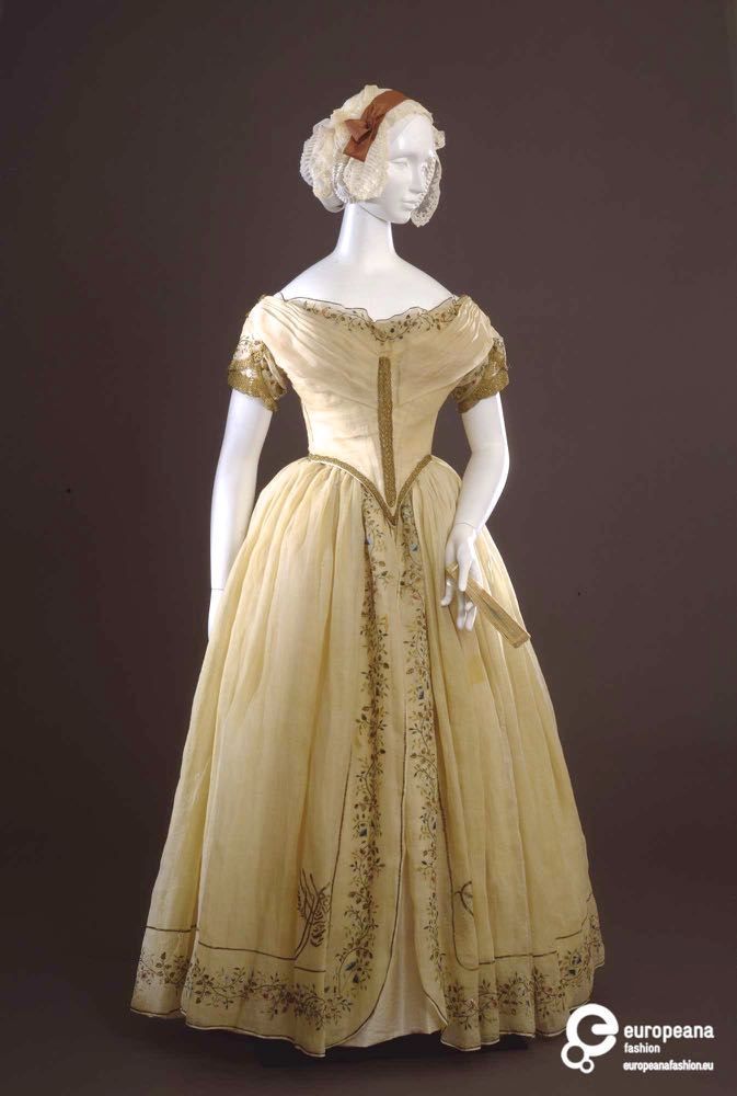
As noted, this is in most ways a classic ca 1845 ball gown. It has a fitted bodice, with front point and pleated bertha assisting the illusion of a tiny waist. The pointed waist is further highlighted by an edging of gold passementerie. Another line of gold passementerie connects the bertha and point, drawing the eye down the the vertical lines of the organza overskirt.
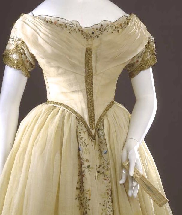
The weight of the gold trim at the waist and down the front of the bodice is balanced by gold fringing and passementerie on the multi-layered cap sleeves, which further draw the eye away from the waist, and add to the impression of a wide bust, and small middle.
The sleeves are decorated with delicate polychrome and gold embroidery, which is echoed in the ruffle that peeks out from the bertha and frames the wearers decolletage and face.
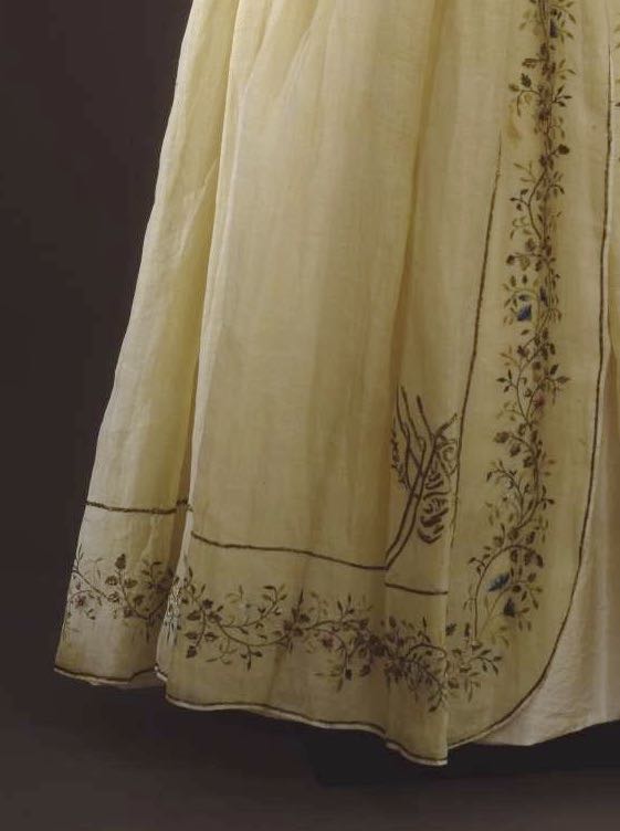
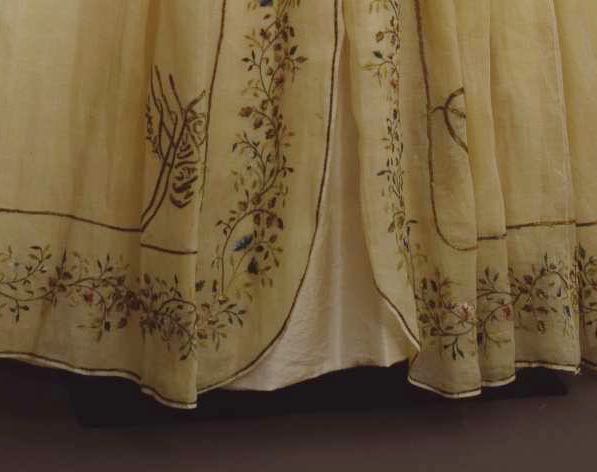
More elaborate variations of the same vining floral embroidery decorate the organza overskirt, framing the front opening, which reveals a hint of the taffeta underskirt.
The dress at this point would still be…
“You know that 1845 ball gown with the gold trim and vining floral embroidery?”
“Which one? I can think of half a dozen that might fit that description”
…were it not for the rather amazing turn the embroidery on the skirt takes.
On either side of the skirt hem the gold border branches out into Arabic script. (as identified by the museum). Why? What does it mean?
I don’t know the answers to either of those questions, but it probably indicates that the fabric for this dress was embroidered in India, by a (almost certainly) Muslim embroiderer, or in the Ottoman Empire, or by an embroider in Italy with familiarity (for whatever reason) with Arabic. The first seems most likely to me, given India’s long history of supplying textiles for the Western market, but Italy’s proximity to the Ottoman Empire, and trade links, do make the other two options possible as well.
I have so many questions about this dress and why it was made based on the fabric. Was the fabric made for the dress, or re-purposed from another item? What does the writing mean? Did the original wearer understand it? What about other people who saw it worn? What did they think
And then I have the usual question which stands completely apart from the Arabic embroidery. What do you think of the dress on a sartorial level? Would it stand out from other gowns at a ball, and enhance the wearers charms? Would you have found it compelling without the unusual addition to the embroidery? Or is it still a boring white ca. 1845 ball gown, just like all the others?
Rate the Dress on a Scale of 1 to 10
(as usual, nothing more complicated than a .5. I also hugely appreciate it if you only do one rating, and set it on a line at the very end of your comment, so I can find it! Thanks in advance!)
Time has not been kind to the fabric, or the gold thread, of this dress. Despite that, it’s easy to imagine what it must have looked like when new. In candlelight, it must have been ravishing.
I think it is divine–except for the heavy gold braid that runs from the point of the bodice to nearly its top. I understand why the braid does not go all the way to the top–it would spoil the delicate line of the organza at the top of the bodice. But the braid still looks coarse and incomplete in the context of the rest of the decoration.
So I say 9 out of 10.
Omg! Like the female Viking warrior recently found! Anyhow, love the split. Love historicism. Goth Elise would have loved that historicism. 10 from teenage Elise. 8 from adult Elise.
No swooning from me this week sorry. I feel a bit underwhelmed even with the mysterious arabic script. I like the embroidery and perhaps the fabric but that is all.
5 out of 10
Gotta agree with the clunky of the central strip of gilt braid on the bodice, especially how it doesn’t connect to the lower bodice edge braiding so it looks randomly slapped on. I otherwise really love the use of gold braid on the bodice to give it structure and appropriate touches of weight and the embroidery is exquisite. I think it’s a lovely dress. Gonna give it a 8/10
I don’t like the heavy gold braid on the bodice (although I do like it on the sleeves). But I love the rest of the gown. I think it’s beautiful. I think the Arabic script is intriguing but the dress stands out to me even aside from that. The embroidery and fabrics are so delicate and complement each other beautifully and suit the style of dress wonderfully.
9/10
I’m in agreement with some of the others on the gold braid down the front of the bodice. It’s somewhat visually jarring and has an ‘unfinished’ look. I love the gold braid and fringe combo on the sleeves, and the addition of the gold on the bodice hem helps break up the white.
It’s the exquisite, delicate embroidery that really saves this dress. I love the divided organza overskirt with the beautiful embroidery trailing down and then around the hem.
It would be fantastic to know the meaning of the Arabic, but that feature neither adds nor detracts for me – it’s merely a quirky detail.
I’m going with 6.5.
I like die dresses from this time, this one must look nice when it was new, brighter and sparkeling. But the dress is similar to many others of this time and the arabesque won’t make it very unique to remember.
7 of 10
9/10 I pretty much love it. Feminine. Floaty. Otherworldly. I can imagine how the skit would lift some with waltzing around a ballroom. I agree that braid down the front is a bit bulky, but I love everything else.
I like the shape of the bodice and I like all about the skirt… but the look and embellishment of the bodice are quite underwhelming to me. Wish I knew what the Arabic says.
6/10
Like quite some commenters before, I do like the dress and especially the beautiful embroidery, but not the golden braid down the front of the bodice. Somehow this braid seems out of place or too big or too chunky. I’d prefer embroidery in gold stitches or maybe even a very small gold braid.
The Arabic script might be a reference to some historic connections or maybe a theme ball.
8/10 as I really do like the beautiful embroidery and the colours which must have been spectacular in a candle-lit ball room, but the bulky braid, unfortunately, gives the dress a somewhat unfinished look.
theguardian.comThe Arabic script I mentioned above, was also found (maybe not the SAME Arabic, but still Arabic script) on a Viking dress. (https://www.theguardian.com/science/2017/oct/13/viking-burial-clothes-woven-with-allah-unveiled-by-swedish-university)
Looking forward to reading more comments!
Well, my feelings on 1840s gowns are on the whole far more enthusiastic than other people’s feelings are (I’m guessing from what people keep saying about 1840s gowns), and this is actually the first white, embroidered, gold-trimmed one I’ve ever seen so there, AND I LOVE IT.
Period.
10/10!!!
But to elaborate, I love how very subtle the fringe is, compared to every other mid-19th century fringe-on-a-dress I’ve ever seen. And how the gold doesn’t overpower the delicate fabric and embroidery. And the overskirt/underskirt 18th century revival effect (surely that’s what it is), which might be your typical 1840s feature but is also the first time I’ve actually seen it on a dress and not a fashion plate. And that neckline is also subtly different. Come to think of it, it’s precisely the subtlety of it that I usually love about 1840s fashion, and certainly what I love about this dress.
Or maybe more of 17th century, with the rest of it, except I haven’t observed enough of that to make an instant connection…
The embroidery is beautifully crafted, and I would so love to have seen it before time dulled its impact.
I have to agree with those who don’t care for the ‘highway” of passementerie at the center front bodice. In addition, I would prefer no embroidered ruffle on the bertha..
8 of 10
I think it’s beautiful. Considering how people dress today. I like to think of a time when such a beautiful dress could have been worn everyday. Kind of romantic I give it a 9.
I’m so intrigued by this one! That arabic script is beautiful and fascinating. I was quite charmed by the gown anyway, but the arabic mystery added a whole other layer!
9/10
I shared this post with a friend who has a doctorate in Arab studies, and she had this to say:
“Actually, I don’t understand why the museum in question didn’t know exactly what this is! A designer who knew neither Arabic or Turkish, but who admired the imperial Turkish embroidery https://en.wikipedia.org/wiki/Tughra
put a nonsensical design on the skirt. Exactly the same thing happened when the Christians took over Moorish Spain. Carvings in the Alhambra are Arabic, later Christian copycat builders used the same style, but “arabic” letters mean nothing.”
Oh, how interesting! Like Anglos co-opting Chinese writing!
gogmsite.netPlease, take a look of the Empress Sisi of Austria, Queen of Hungary. Her ballgowns are mostly white, and the replica of her Coronation dress 1854 (white with green-gold details) has whole hem leght of arabic-styled embroidery!
The dress is part of the collection of the Sisi Museum, but I can’t find a good picture of the dress. This one sadly don’t show much of the embroidery under the shaal.
http://www.gogmsite.net/early_victorian_-_1837_-_18/empress_elisabeth_of_austri_2/empress_elisabeth_of_austri/empress_elizabeth_trousseau.html
It was a style back then.
Europe had a true fever for orientalism: ottomans, turks, moors.. it was everywhere: arcitech, decorations, music, potraits, clothes.. etc. .. and then 1860 the next big thing came from the east: Japonism.
I was going to make a similar comment, but you were faster 🙂 The mentioned dress was worn at the occassion of the “Polterabend” which means eve-of-the-wedding party, according to my translation program. So when you would google “Polterabendkleid Sisi” or “Polterabendkleid Kaiserin Elisabeth”, you would find other pictures from other angles. On the majority of the pictures the reproduction of the dress is shown. The real dress isn´t on display in public anymore, because of the fragility. I think the real dress is shown here: https://goo.gl/sTN6GK
Some sources say that the dress was examined by the Insitute of Arabic Language, University of Vienna, and that the emboidery is a tughra and a phrase which says: Oh Lord, what a beautiful dream. Kind of sad, at this point of history nobody knew, how the life of empress Elisabeth was going to be.
I saw the Rate-the-dress-dress last week and over the weekend I was in Vienna and lo and behold – there was a dress with another arabic ornament in the Sissi Museum. I was so excited, especially since I did not read the comments until just now and was wondering what the Arabic might mean. Pictures of the dress in the museum are rare since you are not allowed to take pictures. Otherwise I’d have taken hundreds, I so wanted detailed pictures, but there was a guard in the room and I wasn’t feeling too brave.
It’s lovely. Nothing about it looks clunky to me, it is ‘of its time’, and I’m very accepting of all different periods and their individual aesthetics. The script, nonsensical or not, is part of its charm. 9/10