
It’s the last week of March, which means the last week of #GreatWarMarch themed Rate the Dress picks. Next week will be something totally different. Maybe 18th century. Maybe 1860s. Who knows! Definitely not from 1900-1924 though! To finish up our month-long celebration of Edwardian fashion & history, this week’s Rate the dress is a really, really, fascinating iridescent silk taffeta number from the mid-1910s.
Last week: An Edwardian Evening Dress
Poor dress last week. Not only did it have a less-than-ideal mannequin, but no one loved it enough to give it a 10! It did get some rather nice ratings – but also a lot of not nearly so nice numbers. The layers of detailing, particularly the organza ruffles, velvet cords, and floral corsage (so, pretty much all of them) came in for a lot of criticism. Just about everyone agreed that the cut-out layer was glorious, but the more that got added on top of it, the less you liked the dress!
The Total: 6.4 out of 10
Wah wah.
This week: A mid-1910s iridescent silk taffeta ensemble
Lauren of Wearing History shared this dress on Instagram as part of #GreatWarMarch, and I thought it was so fascinating. It’s so striking – just perfect for Rate the Dress.

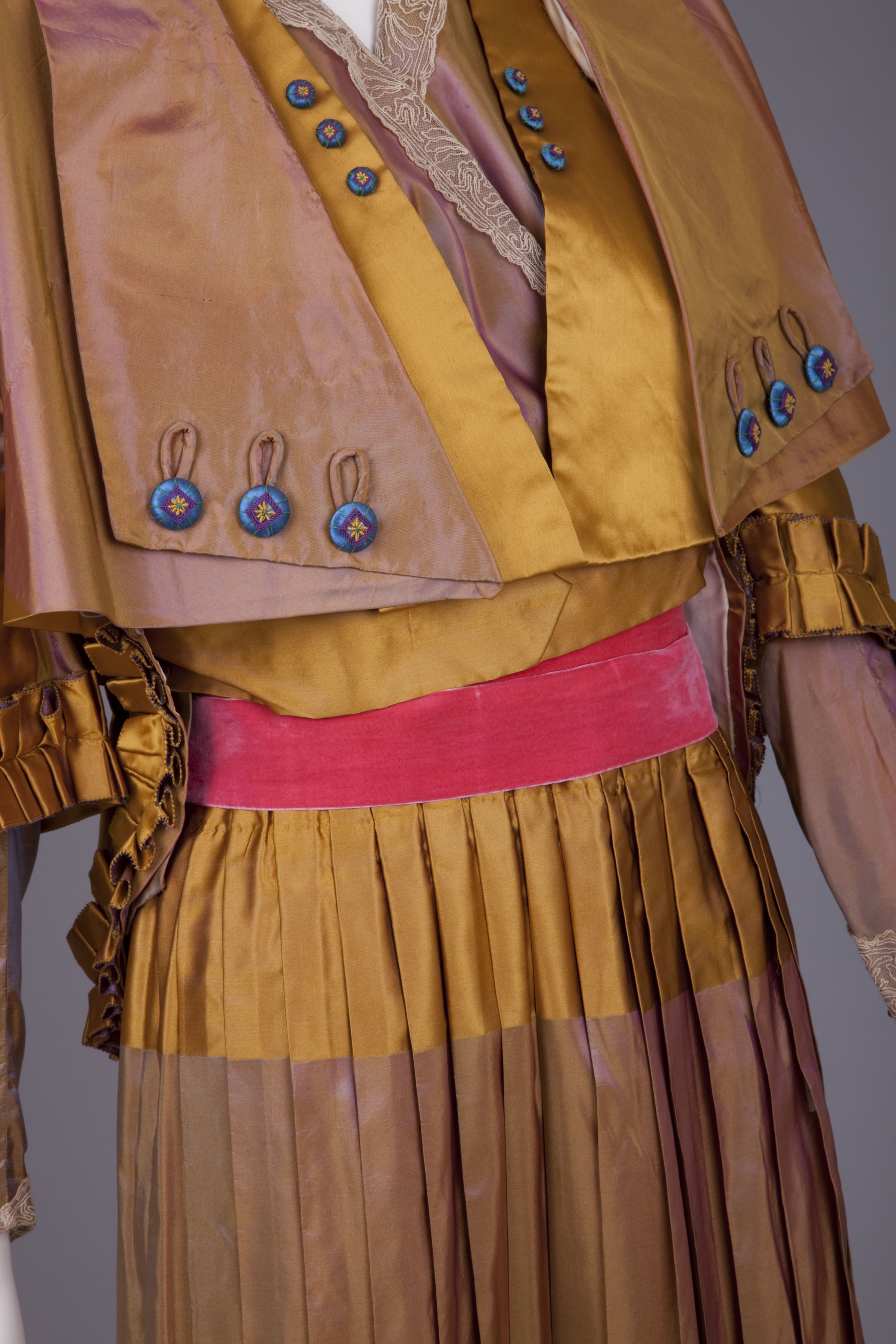
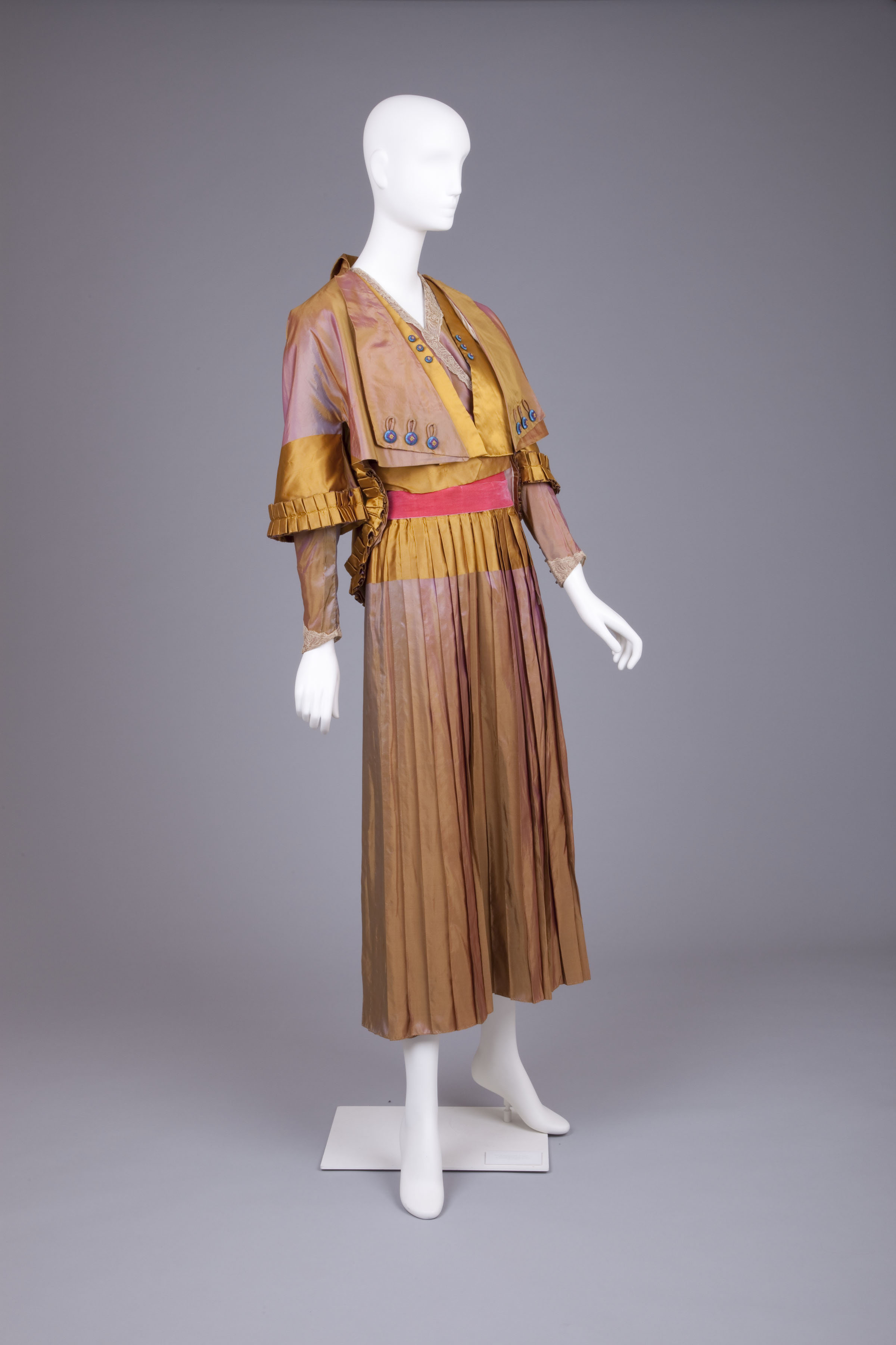
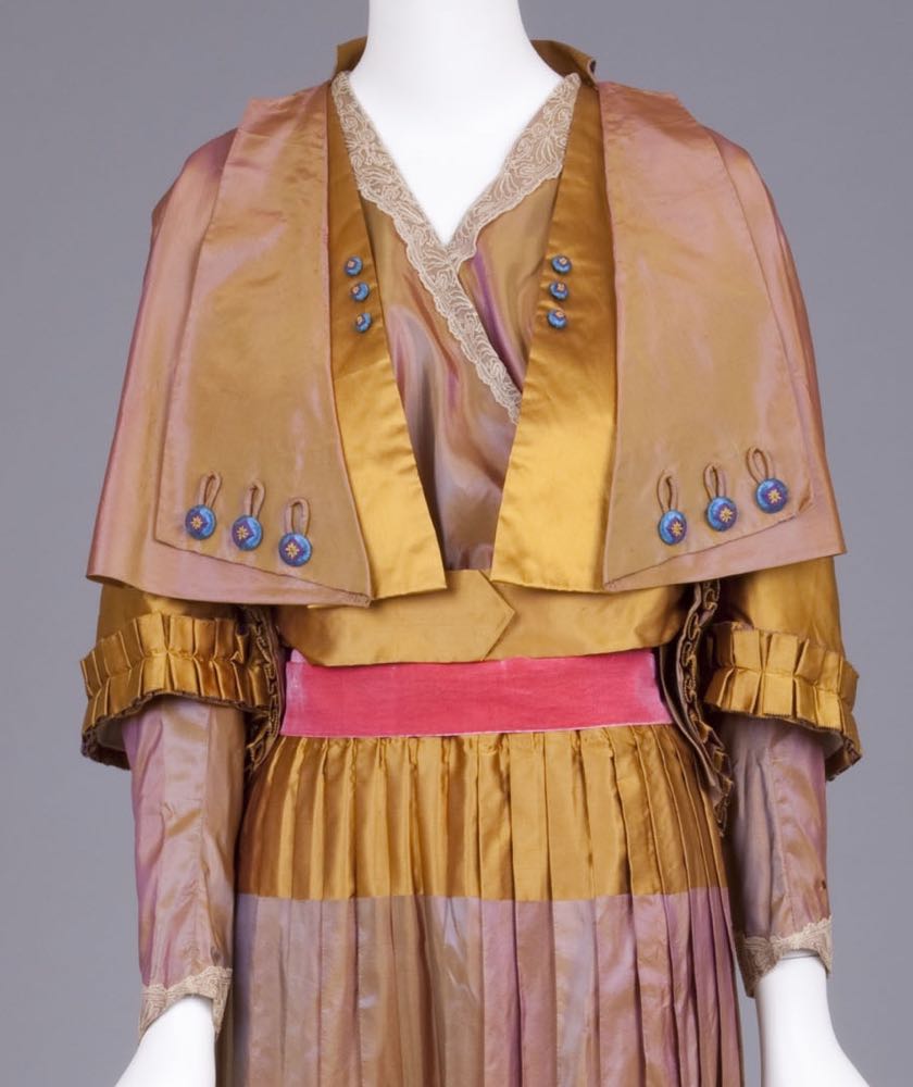
Dress, mid-1910s, ‘Landum Minneapolis’, silk taffeta, Goldstein Museum of Design, 2006.043.006a-c
This outfit was probably worn by the donor’s grandmother, Martha F. Harris Hynes. She was born in 1882, so would have been in her mid-late 30s when she wore it.
Dress, mid-1910s, ‘Landum Minneapolis’, silk taffeta, Goldstein Museum of Design, 2006.043.006a-c
The Goldstein Museum of Design identifies this as an evening dress, but the long sleeves, higher neckline, and overjacket are all unusual features for an evening garment. This is more likely a formal afternoon ensemble: the type that might have been worn to a wedding (usually held in the day in the 1910s) or a very formal daytime event.
Dress, mid-1910s, ‘Landum Minneapolis’, silk taffeta, Goldstein Museum of Design, 2006.043.006a-c
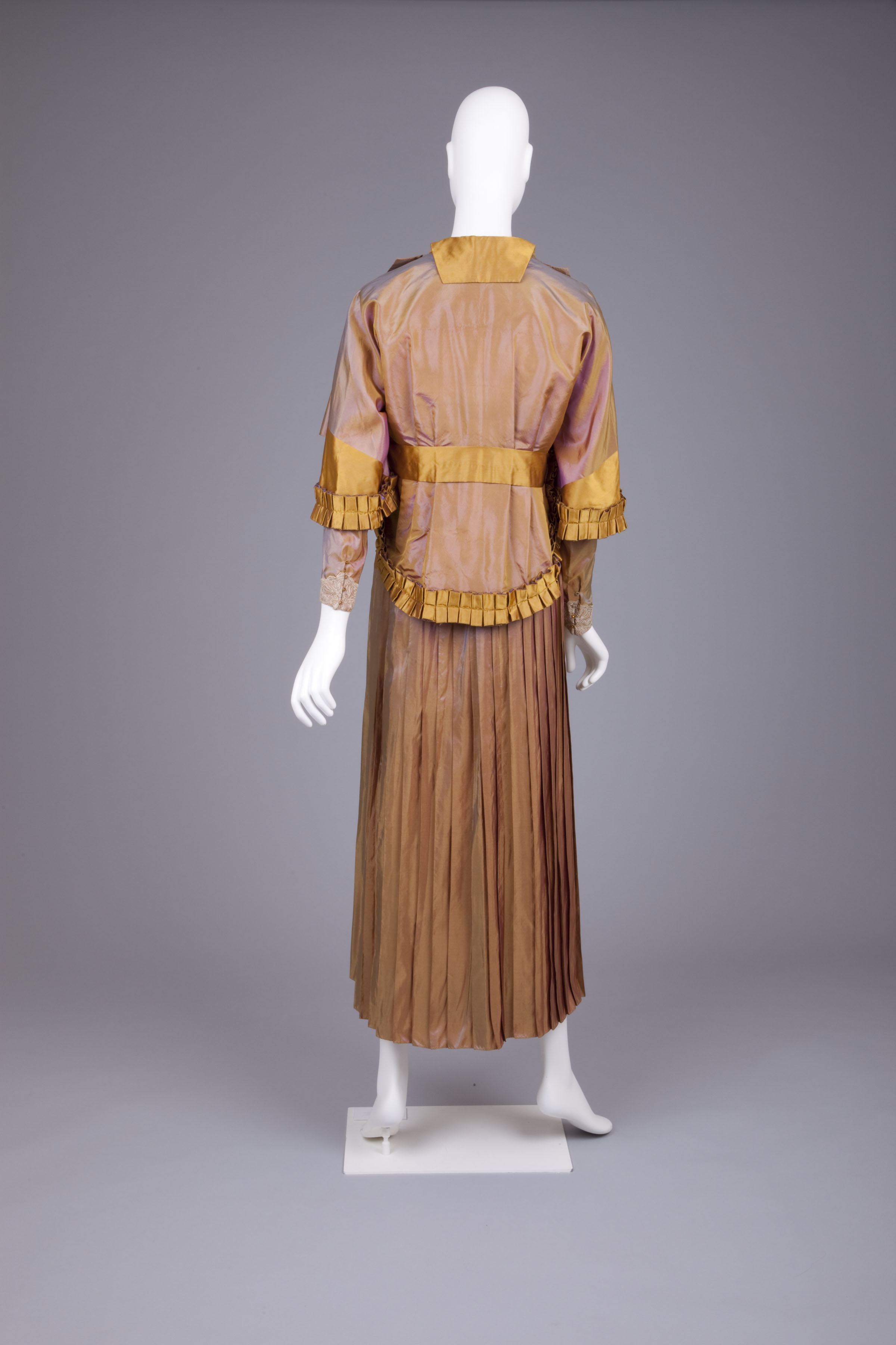
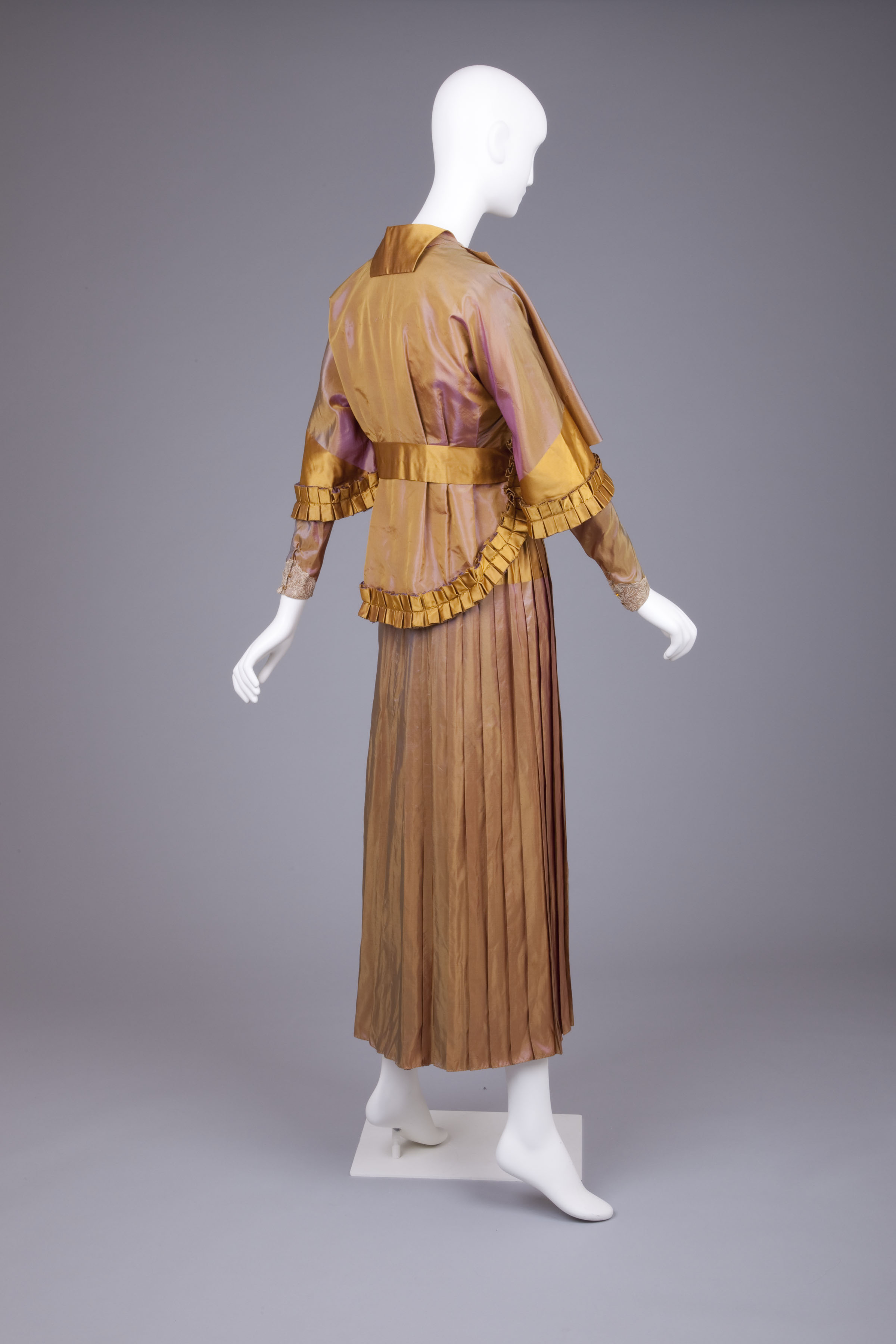
The outfit consists of a jacket with 3/4 sleeves, cape-effect at the front, and ruffled peplum back. A belt of the brighter gold silk taffeta holds the back of the jacket snuggly to the body, and sits above the vivid pink velvet sash of the dress. Sadly there are no image of the dress without the jacket.
Dress, mid-1910s, ‘Landum Minneapolis’, silk taffeta, Goldstein Museum of Design, 2006.043.006a-c
Typically of mid-1910s designs, this ensemble includes a bold and playful mix of colours and design elements. Complementary hues are offset by touches of clashing colours. A nod to Orientalism is combined with ruffles and a back view with more than a touch of 18th century inspiration. Vertical, horizontal and angled lines all work together to bounce the eye around the garment.
Dress, mid-1910s, ‘Landum Minneapolis’, silk taffeta, Goldstein Museum of Design, 2006.043.006a-c
From some angles the garment is simple and harmonious, from others it’s visually assertive: a vivacious mix of colours and elements.
Dress, mid-1910s, ‘Landum Minneapolis’, silk taffeta, Goldstein Museum of Design, 2006.043.006a-c
What do you think? Does it work?
Rate the Dress on a Scale of 1 to 10
(as usual, nothing more complicated than a .5. I also hugely appreciate it if you only do one rating, and set it on a line at the very end of your comment, so I can find it! Thanks in advance!)
This is truly dreadful. The color combo, the shape, the mis-match of trims. The pleats look nice. I wonder if someone was trying to extend their budget by assembling items already on hand, instead of buying what was pleasing and harmonious.
I give it a 2.
I love this; I love the usual color combination
I’d give it a 9 just because nobody’s perfect.
I love coppery shot with blue silk, my sister’s bridesmaids wore a dupion in this combination. It’s not often that pulling the two colours out of a shot silk works as the blended colour is not related to the originals. But as this silk is definitely dominated by the copper gold, I like the plain elements in this colour. Not so much the blue buttons and definitely not the pink sash. A softer blue for all of these elements I think would be more harmonious.
Having said that I love this suit! I love the clever jacket, and am now thinking and plotting on the idea for myself. I LOVE pleats, the layering, the smartness of it all, and the general sense that maybe there’s one more element to the design than most people would like so it cocks a snook at the minimalists, which always pleases me!
I feel it is an outfit for a very particular woman and she is a chestnut headed, tall and broad shouldered powerhouse of giving zero f##ks. I can imagine a hat of angles and presence and buttons, devoid of a single bow or flower. Someone who turns a lack of frivolity into a new sort of frivolous.
9/10. 1 point off for the blue and pink.
Oh I love this! It has the kind of colour combinations, shimmer and design that work so well in nature but rarely translate in man made designs. Except here it really works! I keep thinking orchids or some other exotically plumed plant. Love the details, the pleats, the layers, the dashes of brilliant colour. The elements all really combine to make me happy 🙂
10!
No, I’m so sorry. This doesn’t work for me.
I like the colours of the dress itself, I don’t understand why the sash is pink, for me it’s just so wrong.
I think the dress without the jacket looks quite nice, if we lose the belt.
I really don’t like the jacket, I think it’s the pleating and the collar that makes me find it disharmonious and though I love the buttons, I don’t like them here.
So, sorry little dress, I give you a
3/10
As ever, thank you for sharing. This looked very interesting. I thought I was going to love this and then I looked closer. The pink sash, the blue buttons the overly shiny fabric, those colours…oh dear. It ends up looking like an assortment of completely random components. On the plus side I love the 3/4 sleeves, the pleated skirt, and most of the jacket if only it didn’t have pleated trim on the sleeves. I like the longer sleeve showing beneath the flare of the jacket sleeves. I think if this had been one matte colour it would have worked for me, as it is, I neither love nor dislike so I give it:
5 out of 10.
The silk is gorgeous. And I love most of the colors–the oranges and golds. Even the blue on the buttons is a charming highlight, though I’m not so fond of the bright pink sash.
As for the cut of the dress, the extra wide lapels are intriguing, and the pleated skirt adds a refreshingly modern look. But overall the front view seems a bit flat (though the rear view is quite elegant).
I neither hate nor love this dress. It has so many idiosyncrasies that it would be hard for a woman not to let the dress overpower her–never a good thing. On the other hand, the dress has many beautiful features.
7.5 out of 10.
I love it. When I saw the top, with the pink sash and the blue buttons, I thought it was awful, but as a whole, the thing works. Even the pink sash; it’s so wrong it’s right in context. I’ll give it a 9.
I like it. It’s kind of over-the-top with too many colours and too many lines but I think on the right person it would be fantastic.
8/10
I agree with Ava this looks like an attempt to create an outfit from what was on hand. The pink silk, gold bands and even the blue buttons work. But the neckline (which should be square IMO) and cuffs need to lose the lace. The strange flap of collar on the back looks like it was all that was left. They should have skipped the gold ruffles and used that fabric to make the back harmonious with the front.
4/10
I love it in all of its mismatched glory. If you described this dress to me without the photos, two colors of iridescent silk taffeta, overjacket with 3/4 sleeves with blue buttons and pink sash. I would have hate it but somehow it works. The designer of this outfit is a genius, all the contrasting details centered around the waist/chest. I would love the see the dress without the overjacket. But even without seeing the two parts of this ensemble I give it a 10/10. And I only give 10 to gowns I see myself wearing.
I repeat, 10/10.
I don’t like this at all. In particular I think the cape-like jacket is really unattractive, both from the front and the back. 2.
Although I find it almost hynotically fascinating, I can’t exactly say that i like it. There’ s just so much going on that i just want to tell it to calm down!
The main silk fabric is quite lovely, as is the flow of the pleating, but that’s all I can find attractive.
6 of 10
I like the use of the shot silk and all the styling.
I think the little blue buttons are charming.
But I think the pink belt is far too much. I was hoping you would say the museum added it! What a relief to see the back view without the bright pink taking over. Someone should have said to her. “No. Just No.”
But if you remove the belt (please) it would be a wonderful shimmering reminder of autumn!
9.5 I think.
The vivid orange is very nice, and the soft copper is also nice, but together? It looks like something that was left partly out in the sun and faded unevenly. The blueberry buttons are cute, and so is the pink sash, but I can’t help wondering how much nicer it would be if the strange capey stuff weren’t there and the ruffly bit around the elbows were removed and that lace had a chance to strut its stuff in front of a less drab color.
All in all it’s very disjointed. An ‘ooh, I want that and that and that’ dress. The individual parts are nice, but they’re all competing for attention and eventually you just want to look at something that doesn’t give you a headache. Quite a number of dresses could be created by recreating historical stuff but fixing the perceived errors, and this one could launch a thousand.
4/10.
Absolutely love it. A glorious origami sunset of a dress. Love the shimmering coppery pleats, love the little blue buttons, love the pink sash. Makes me very happy.
Actually, I think my favorite part of the dress is the way it combines those colors in a way that few things in nature, other than a blazing sky at sunset, do. So from the back I miss the pink and blue. The back view is my least favorite. It’s so…sedate? plain, almost, compared to the front. I wish there were a few of those deliciously blue buttons somewhere on the plain golden satin trim. (The pink velvet I would save for front only.)
I also love the intricate cut and construction and fabric manipulation. Lots of familiar-feeling details and references (Napoleonic greatcoat layers of lapels! Obi-like double colorblocked midsection! Long tight undersleeves! Sporty pleated midi-skirt!) that add up to something completely unexpected and delightful. Like hearing a great song for the first time.
10/10 for what the fairy godmother should wear to Cinderella’s mid-1910’s wedding.
Sorry, typo! Please delete 🙁
Done!
Oh no, as others have commented too many pleats & colours, & no, no to the blue buttons.
The main silk is a lovely colour but not with all the other colours & fussiness.
Sorry not for me,
5/10
I go back and forth on the colors, but for me, this is just the right sort of streamlined paired with just the right sort of overfussed. It’s bold and feminine and the blue buttons are perfect.
I’m sure this lady has an important function to get to. Give her some improbable boots and a dirigible and let her be on her way.
8.5
Love the colours – love the jacket – the only element that causes a bit of doubt for me, is the line across the hips caused by the joining of the 2 colours … often not a good idea to put a line there ! I would like to see this one on a real body with the proper petticoat and moving – I’m sure all that silk shimmered beautifully.
I give this 8.5
For me this was love at first sight- based solely on the color scheme. The colors remind me of a really gorgeous sunset. I even like the blue buttons! I am subtracting half a point, because there is too much going on at waist level. Getting rid of the ruffles would make it perfect — 9.5.
Wow… I haven’t hated a RTD dress in a while, but this dress makes my eyes bleed! It reminds me of when I was old enough for prom, and all the dresses that season were synthetic organza nightmares in garish tropical shades, ombre dyed and covered in sequins. I don’t like orange and pink together, and adding blue doesn’t help. And when the front has diagonal lines and a V-neck, the straight-across waistband and vertical pleats in the skirt seem too abrupt a switch. Plus, what’s with those revers that make the boobs look huge, wide, and saggy? Do they flap around when she swings her arms? And the squarish back, like the dress was made for a man. WHY?! So much to loathe…
Color sense is so individual, isn’t it? Some commenters above have compared the colors favorably to a sunset, and yet I’ve never liked sunsets, because I don’t like pink/purple/orange together.
Since there’s nothing here I like, I give it a 1, for construction. It is at least not sloppy.
1/10
I like it, especially the jacket. It would be interesting to see the construction of the jacket. I would also like to see what it would look like if the sash was the purple or blue of the buttons.
8/10
From the back I love it, not sold on the collar, but otherwise it looks very nice.
The front….. I do not like that hard color split on the skirt, it annoys me.
5/10
Ouch. The shot silk, the copper silk and the blue buttons all work together, but please lose that PINK BELT.! The back is quite attractive. The front would be better if it lost the outside fold and that weird yoke-ish piece on the skirt. And the collar should be a shawl collar. Also, Diane was right when she said the lace needed to go. I ‘m not sure about the ruffles or the shape of the jacket skirt either. This dress has either too much Oriental influence or not enough. 3/10 for just not working.
I would give the button trim a 10 … all by itself. I like the pierrot jacket styling, the flap on the collar not so much – it would have been more graceful if it blended in with the faux cape. The pleated self-trim is good.
The double belt effect, with the hot pink and then the gold (belt?) is awkward. I’m not liking the patched-together blend
But as an example of what the stylish married woman was wearing in my Grandmother’s day (she was born in 1886) it’s awesome.
8.5
I love this outfit. Seems to have what strikes me as Japanese inspirations in the jacket. If it fit me I would definitely wear it to an event of some kind. So unique!
I just cannot imagine this as an Edwardian dress. I am thinking of dresses my grandmother wore and I cannot imagine her even touching this one. May she rest in peace.
You do pick some absolutely marvelous things for this. Even though I don’t particular like the collision of styles and colours involved in this I am amazed at the confidence of the design. Striking, impressive and wonderfully made. This could easily head down the runway in a contemporary fashion show without looking obviously antique. I would have loved to have seen the complete outfit — I hope that the hat and shoes that were worn with this were equally chic and rather outre.
10
hideous. 3/10 and that’s primarily for technique.