
We’re taking a little break from the Otari Hoodie Sew Along for the regularly scheduled Rate the Dress post. Have you’re say on this week’s historical dress, and then we’re all go on Hoodie sewing again!
Last week: Roses & Fringe in the 1910s
Some of you loved the dress, but not unreservedly: it only got one 10. And while many of you could overlook the butt-heart, by and large you did not like the fringe.
Despite my hate of fringe, I actually loved last week’s dress. It reminds me of the Miss Universe dresses that represent each country. It’s like there was a Miss Universe pageant in 1910, and Hawai’i participated with the most tasteful of the themed dresses. Orchids, flower leis, and a nod to a grass skirt.
The Total: 7.6 out of 10
There have definitely been better received 1910s evening dresses!
This week:
I usually like to mix up my eras in Rate the Dress, but today I’m breaking with tradition and showing a dress from the same years as last week’s frock.
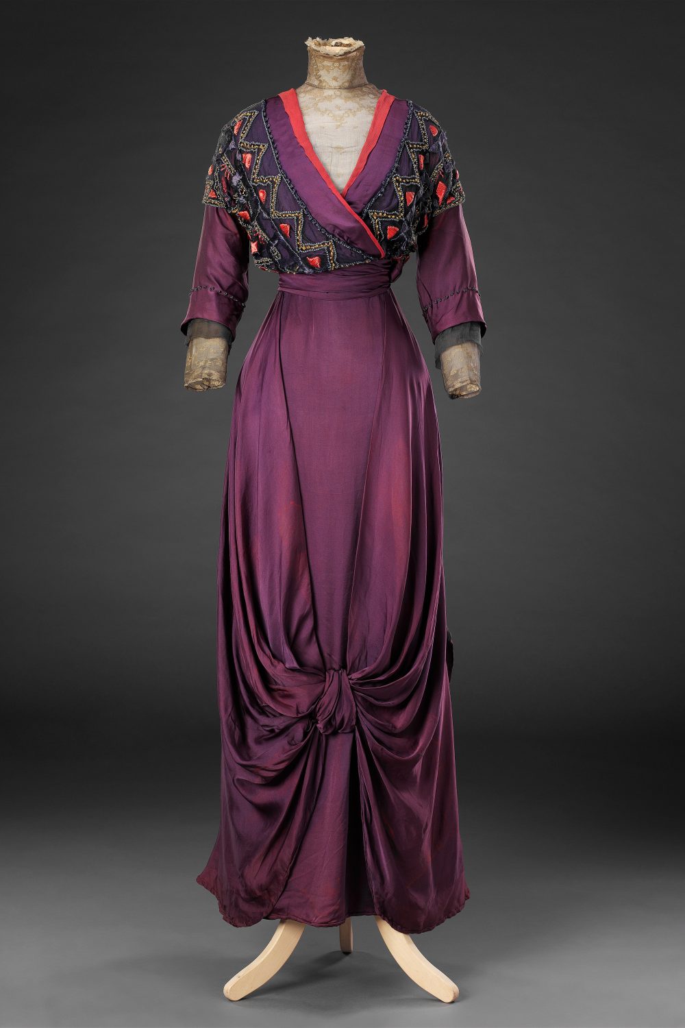
This formal day dress in deep grape purple, with accents in vermillion, is possibly by Liberty of London.
It certainly has a hint of aesthetic influence in the colour combination, and ornamentation in the bodice, but is still within the range of conventional dress.
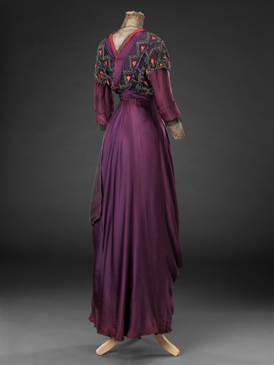
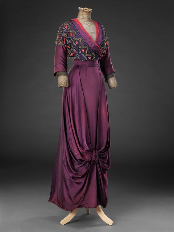
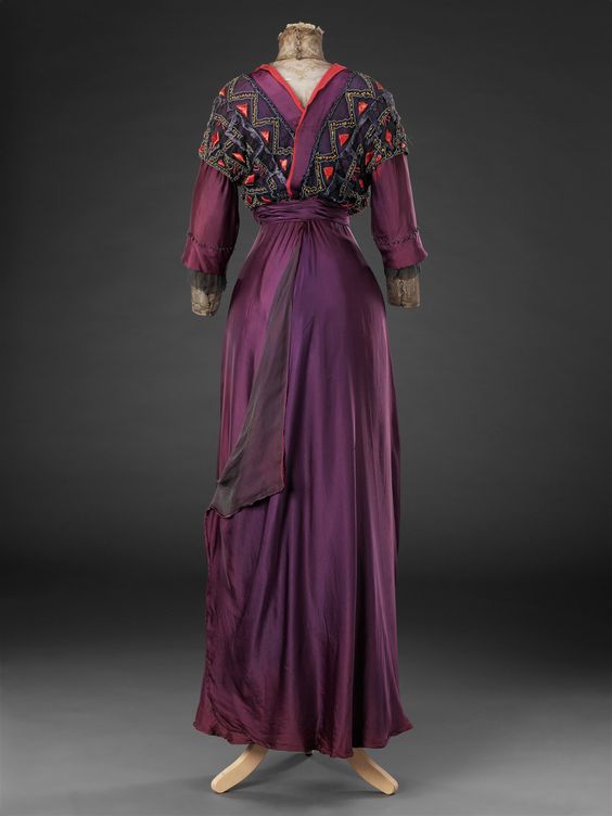
Like many 1910s dresses, this one is made by its details: three layers of sleeves, tiny lines of beading along the bodice trim, and french knots marking the hem of the outer sleeves.

Rate the Dress on a Scale of 1 to 10
A reminder about rating — feel free to be critical if you don’t like a thing, but make sure that your comments aren’t actually insulting to those who do like a garment. Our different tastes are what make Rate the Dress so interesting. It’s no fun when a comment implies that anyone who doesn’t agree with it, or who would wear a garment, is totally lacking in taste.
(as usual, nothing more complicated than a .5. I also hugely appreciate it if you only do one rating, and set it on a line at the very end of your comment, so I can find it! Thanks in advance!)
The grape colour is gorgeous, and I love the drape of this fabric. However I personally can’t get on with the vermillion edge to go with it. I soft pink or a pale blue would have given the same amount of contrast without the argument between the colours.
7/10
9.5/10
Just gorgeous! This is everything that I love about clothing in general and this era specifically; luxe fabrics, deep and vibrant colors, interesting layers and trims, the silhouette is wonderful and the aesthetic influence is just fantastic.
A bit of a knock down on points for the ‘coral’ trim — not quite the right color, but contrast is good overall, and I don’t care for that ‘flap’ folded at the back either; it looks unfinished to me. I think the bow knot in front is interesting, but would rather that be in the back with a smooth front. I want to wear this today! Just a beautiful gown.
This to me is so beautiful. The different colours in the trim lift it for me, in a way that nothing ejse quite could. I would wear this happily, and I’m sure feel every bit as “fashionable” as the original owner…
9.5/10
I have very different reactions to Rate the Dress outfits. Some I know, on sight, that I either love or hate, and then I have to figure out at least some of the reasons why in order to write a comment. Others I have no particular reaction to; usually I decide that’s because they are a mix of good and bad.
Today’s RtD is a mix that doesn’t trigger dislike or love for me.
I love the purple; it’s an unusually beautiful shade. The red and black bodice trim struck me as discordant at first, but I think I’m coming to like them, and see that they have a place in the design.
But I’m much less fond of the skirt drapery. The knot in the lower center front seems almost like a joke, and the black chiffon layer across the back seems oddly incomplete, as though there was supposed to be something else there in addition, but isn’t.
On me, the combination of features would look simply absurd; like a child wearing mom’s clothing. But I can imagine women who would look wonderful in this dress, and would make the dress itself look more beautiful.
7.5 out of 10.
I love everything except the knot thing at the front of the skirt. That sort of ruins the line of the dress for me.
9/10
I love the grape color, and I actually like the coral contrast although it wouldn’t have occurred to me to choose it. I agree with Pepper that I don’t care for that flap thing in the back and would like the dress more if the knot were in the back. 9/10.
I should clarify that I appreciate that the designer didn’t go with the ordinary, conventional placement of the knot in the back. All the same, I think it would look better there.
I love everything about this dress, so much so that I’m saving the picture in my to make file. 10
I also like the combination of colors – unexpected and striking.
Not fond of the knot in front (nor would I care for it in the back). It gives me the impression that the seamstress by mistake had the train in the front and had to figure out a quick way of dealing with the excess fabric.
9 of 10
I like it and purple is not one of my favorite colors. The main fabric of the dress is glorious in its drape and richness of color. Any other color than the vermilion would make the frock look insipid. Not a color combination I would gravitate to but it works very well.
I love the color combination. The drape is beautiful, and the criss-cross bodice very flattering. Definitely designed for the tall and willowy, not the short stumpy likes of me, but I like it, mostly. The long sleeves give it a house robe look; maybe 3/4 or short puffy sleeves would appeal to me more.
9/10
Nope. Not a favourite for me. The skirt, with its drape and its soft front knot, is very pleasing. The colours in the top do not please me at all. Nor do the big zig-zags. It’s as if someone has said to themselves, “I need to make this top special.” And it wasn’t a good day for design. I know you can put those colours together – I might like them in a hot coloured summer garden. But I wouldn’t want to wear them.
4 out of 10.
I love the color and accents and the top. The only thing I don’t like is the drape in front. Awkward looking to me.
9/10
I love the color, the richness and the drape of the dress. The knot in the front gave me pause, but I imagined the dress without it and thought the skirt would be too dull for the bodice. The knot creates interest without going too far with, say, fringe. This is a 10/10 for me.
9.5 I love it but taking a half point off for the vermillion … I like a pop of contrast colour but a lemon or jade or aqua / Tiffany blue might have been a better choice
At first I disliked the color, but then I looked closer at the zoning of color that helped it come together, much like a quilt or woven plaid. I wish there was a close-up of the embroidery at the collar and cuffs. P. S. I don’t know why I dislike the bow in front, it just bothers me.
7.5
Love it. The drape, that gorgeous plum colour. The orangey trim is unexpected but I think adds the perfect hint of contrast.
10
Wow … definitely some Ballets Russe, Leon Bakst and Sergei Diaghilev influence, but not so much that it looks like a costume from a ballet, but a gown a fashion forward woman would wear to the ballet matinee or host a luncheon in.
I would totes wear that dress with ethnic coral and silver jewelry.
I like the way the skirt doesn’t get in the way of the satin texture – the knot creates draping for texture but it’s not fussy. The embroidery (I cheated and went to the collection for closeups) on the bodice is well thought out – it looks casually wrapped as if the designer came back from the peasantry with a shawl, even though that casual effect requires serious planning.
I like the intensity and sophistication of the colors – it’s 2 of the 3 colors of a triadic scheme on a color wheel. The third color would be a shade of green or bluish green, depending on what that purple really looks like – interesting that some people have mentioned it would be a better color than the coral. I happen to like coral and dislike most greens.
I’m puzzled by that rear flap but it’s not bothering me enough to warrant taking off half a point.
10
thejohnbrightcollection.co.ukHere’s a link to the museum … you can zoom in on details.
https://www.thejohnbrightcollection.co.uk/costume/dress-by-liberty/
Thank you for this link. Now that I’ve gotten a closer look at the bodice, I am even more impressed with the embroidery and bead work. The way the coral fabric is attached looks much worse, although probably that is due to age.
I included that link at the bottom of every single image of the dress in this post – just as I link to the object’s museum or auction house page with every single Rate the Dress that I do 🙂
Unfortunately, although the text is correct, the links aren’t going to the collection. They are going to the previous dress’s page.
https://thedreamstress.com/2018/10/rate-the-dress-ring-a-ring-o-roses
Hmmm, not sure why that was happening, but that’s definitely not the html I have for those links! It does seem to be working again now though (at least from my phone). Thank you for the heads up!
Absolutely not! I don’t like purple, or angularity/triangles, or wrap-effects. Of course the front skirt bow is misplaced, and the cuffs aren’t coherent, and the collar is messy. It doesn’t look too bad at first glance though, so
5/10
I love these colors together, and combine them myself sometimes. I would wear the top of that dress as a blouse in a jiffy. The whole thing has so much drama and incredible richness!
The skirt flap in the back is a little off-putting, but I dig how the knot in front invokes harem pants. The purple fabric drapes so gorgeously. This is the kind of dress I would go back in time to wear. Mmmm.
8/10
I love this one! The colours are fantastic, and both the front and the back are beautiful. I would wear this in a heartbeat.
10/10
Love this one! I find the colours to be simply glorious, especially the range in purple tones, and the delicious swoop/bow on the skirt? . Not sold on the sleeves, and the bodice could lend a little more coherence, but perhaps it looks better up close?
8/10
SO IN LOVE AM I with this dress, and zooming in on the detail just confirmed it. I love the gold lace and purple, the touch of coral to my warm palette loving eye is the perfect contrast to the purple. I love the lines of this era always anyway, and the knot is fun. It’s what they did and without it, the skirt would have been a big blank .
Love it, it’s perfect.
10/10
It would have been 7.5 but that strange knot, or whatever, on the front of the skirt has reduced it to 6.5. I think that would look better on the back?
Love the colours and the style otherwise, although the cleavage seems to dip too low for my liking.
Oh, I love this. I adore deep violet, and think the contrast with the vermillion accents looks lovely. This is such an elegant piece; I would totally wear it. The only quibble I have is the skirt drapery. It doesn’t really feel like a natural continuation of the trimming on the bodice. Not that it clashes or anything. But the skirt trim on a dress like this should feel like an almost inevitable extension of the bodice trim. But that’s a small matter. It’s still a wonderful dress.
9/10
10/10!
The detail work in close-up is great, though the attachment of the coral fabric hasn’t aged well. I love the color and drape over all, but that knot in the front is very awkward for me. It boule bounce heavily with every step, as it looks to be right at knee height.
6/10